Daily insights for city builders, delivered every morning at 6 AM ET. I’m Brandon Donnelly — a Toronto-based real estate developer and founder of Globizen. I’ve been writing here since 2013.

Tag: urban growth

  • What makes cities grow faster?

    In may ways, this recent article by Brian Potter about how fast cities can grow, feels intuitive: Small cities tend to grow faster than big cities (on a percentage basis) and, as cities get bigger, their growth rates tend to decline. It is, however, still interesting to see the data behind this intuition:

    A city of less than 100,000 might be able to have growth rates of 10-20% or more, and cities of up to 3-400,000 can potentially have growth rates in the neighborhood of 10-15%. Potential growth rates tend to fall as cities grow larger, and cities above 1 million people almost all grow at less than 10% per year, and usually less than 5% per year. The US, the Middle East, Southeast Asia, Africa, and South America all seem to have followed this basic pattern, assuming the data is reliable.

    It is also a good reminder just how much of an outlier China is:

    Unsurprisingly, since 1950, Chinese cities have mostly exhibited higher growth rates than US cities. Only around 12% of US data points are above a 5% growth rate, whereas for China this is close to 50%. China also has 2.5x the fraction of cities growing above 10% per year, and 3.3x the fraction of cities growing above 15% per year.

    And some cities are outliers even within China. The most notable here is Shenzhen, which saw enormous growth after it became China’s first special economic zone in 1980. At a population of around 200,000, Shenzhen was growing at 35% annually, and it was still growing at over 20% annually when its population crossed 2 million.

    Just imagine these numbers compounded. Even small variances can result in significantly different outcomes over time:

    New York’s growth rate, however, declined less than Los Angeles or Chicago as the city grew larger. At around 3.5 million people, New York was still growing at over 3% per year, compared to less than 1% for LA and Chicago. This may not sound like much, but it’s the difference between doubling in size every 23 years vs. every 70 years.

    Now here’s what I’m wondering after reading the article: Should we be thinking of city size as the single most important factor in determining urban growth? Because my mind immediately went to population densities, zoning controls, and other factors that might constrain or encourage growth.

    But the data seems to suggest that, for many cities, this doesn’t seem to matter over the long run. It is as simple as saying, “this city has X number of people and so it’s more than likely growing at somewhere around Y% per year.”

    That said, what’s up with China? What is it that allows a city of 2 million people to still grow at over 20%? Is it the sheer influx of people migrating from rural to urban areas? Or is it that you need a one-party authoritarian state to really clear the way for growth?

    As cities get bigger there does appear to be a natural tendency toward slower growth. Part of this is the low base effect. But the declines are not always consistent and there are meaningful outliers. I am now curious to know what, for the most part, causes these differences.

  • Atlas of Urban Expansion

    Since 2012, a team at New York University has been working on something called the Atlas of Urban Expansion. What they are doing is collecting and analyzing data related to the quantity and quality of urban growth around the world. Everything from population densities to how well the streets were laid out during each geographic expansion.

    The Atlas defines a city as having at least 100,000 people, which is a commonly used benchmark. According to this definition, there were 4,245 cities on the planet as of 2010. Included in their study is a representative sample of 200 of them, all of which can be found here.

    They are also, rightly, looking at each city in terms of its extrema tectorum — the limits of its built-up area. This is as opposed to using administrative boundaries, which wouldn’t be as relevant in a study like this.

    I really like the animations that they created depicting urban growth from 1800 to 2014, because they show: (1) where each city started (the dark nucleus); (2) how different urban shapes emerge as a result of geography, transport, and other factors; and (3) how land consumptive many of our cities have become in recent years.

    Image: Atlas of Urban Expansion

  • Shaping Cities in an Urban Age

    Shaping Cities in an Urban Age is the third book to come out of the London School of Economic’s Urban Age project. It was published last fall. The first two titles were, Living in the Endless City (2011) and The Endless City (2007).

    If you’re familiar with the first two publications, you’ll know that these books are heavily illustrated. Lots of maps, charts, and diagrams. So they make great coffee table books. But they’re also filled with insightful essays — this one has 37 of them.

    In this particular book the focus is on the following:

    “It identifies current trends that are making cities more fragmented, less equitable and environmentally more damaging, and argues powerfully for a more integrated social, environmental and spatial approach that can inform and inspire city-makers that are shaping an increasingly urban world.”

    I am sharing this with all of you today because I have always really enjoyed these books. They have a way of quickly putting things into perspective globally.

    Around 2.5 billion more people are expected to live in an urban agglomeration by 2050. And 90% of this growth is expected to happen in just two places: Asia and Africa. This is an unprecedented shift that will obviously create many challenges and many opportunities.

    This book is about that.

    Image: Phaidon

  • A mapping of development potential in Toronto

    I first met Monika Jaroszonek in 2017, right before she started RATIO.CITY. Since then she has developed some pretty incredible tools for the city building space.

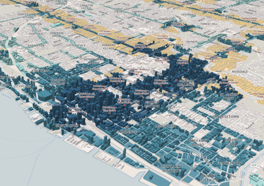
    Yesterday the company published this interactive visualization looking at development potential across the City of Toronto. The mapping looks for the following:

    The tool then ranks each development site – AAA, AA, A – according to how many of the above criteria it meets.

    It also flags land that it refers to as “Missed Opportunity.” These are lands located within 500m of a Major Transit Station, but that are designated as Neighbourhoods (considered stable) or Employment (whole other discussion).

    Based on this filter, about 5.6% of the City’s land is a “Missed Opportunity” and about 1.2% is AAA.

    When you look at the visualization, that is one of the first things you will probably notice; a lot of our transit infrastructure is currently underutilized as a result of land use policies.

    Image: RATIO.CITY

  • Shift toward the center

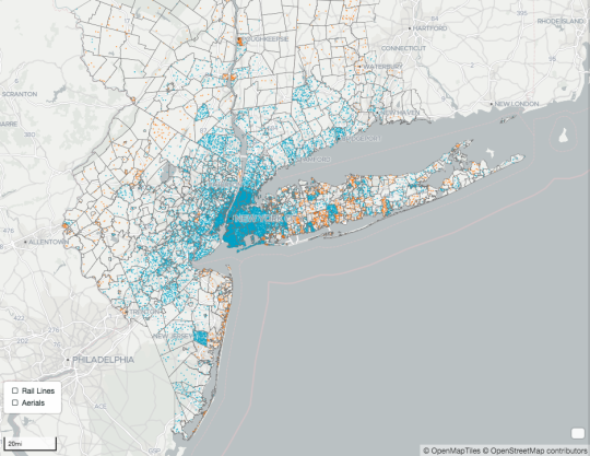
    The New York City Department of City Planning has a very cool “metro region explorer” online that allows you to explore population, housing, and employment trends in the tri-state NYC Metropolitan Region. Start here and then click on “Learn More” to cycle through the slides and data.

    One interesting takeaway is that population growth continues to centralize in the region’s core. Since 2010, 60% of the region’s population growth has taken place in the five boroughs of New York City, and in particular it has occurred in neighborhoods with strong rail transit.

    There has also been a slowing in terms of the number of residents leaving New York City. Historically, people moved to the city in their 20′s and left in their 30′s. That trend is slowing.

    I suspect this has to do with a combination of factors, including the shift toward a city-centered knowledge economy; the desire for walkability and urban amenities; the phenomenon of people getting married later in life (if at all); and so on.

    The people who do leave the city are also more likely to leave for other parts of the U.S. than other parts of the region. This has led to a decline in the number of prime age (25-54 years old) workers in the suburbs.

    Check out the Metro Region Explorer, here. There’s a lot of good stuff in there.

  • The world in 2050

    The United Nations recently released its 2015 version of World Population Prospects. It looks as if they put out and revise this report every 5 years.

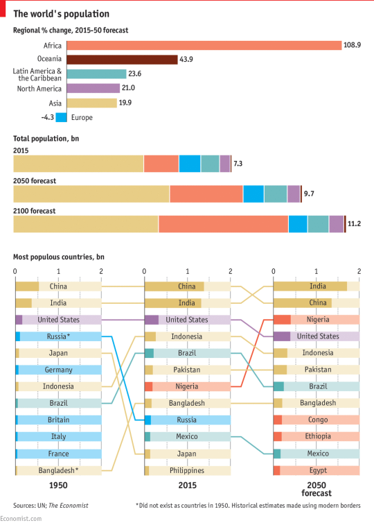
    The Economist then took some of their data and assembled it into the following charts:

    image

    It’s obviously extremely difficult to predict what will happen in the world by 2100, but to the extent that forecasting is possible, the world’s population is expected to reach somewhere around 11.2 billion people. Today it’s 7.3 billion.

    The bulk of this growth is expected to happen first in Africa, and then in Asia. By 2100, Africa’s share of the global population is expected to grow to 39% and Asia’s share is expected to decline to 44%.

    If you’ve been following population trends, most of this shouldn’t come as a surprise to you. The meaningful population growth happening in the world today is happening in the developing world. 

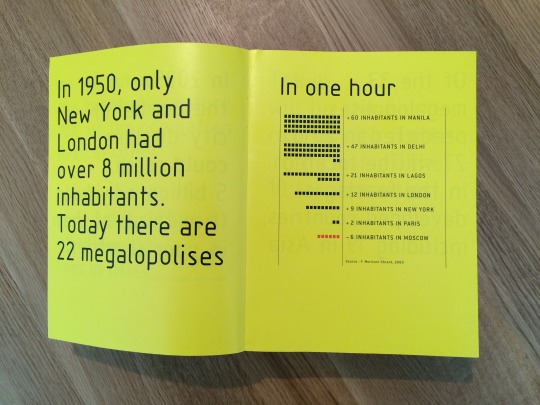
    That’s why architects, such as Rem Koolhaas, have been studying cities like Lagos (Nigeria) since the late 1990s and early 2000s. Below is a photo from a book/research project that I love called Mutations (2000). I pulled it from my bookshelf this morning.

    image

    It’s interesting to think about what all of this will mean for the global economy and for global governance. 

    The United States is about to be alone when it comes to advanced economies with a globally competitive population. Europe is shrinking, which leads me to believe that a strong EU is likely important. And we now have lots of megalopolises with big populations, but with very low income levels.

    Nigeria is the largest economy in Africa, but per capita income is somewhere around $3,000.

  • Risk-oblivious, risk-aware and risk-adverse

    image

    Yesterday when I was researching for this post on Lean Urbanism, I came across a really interesting way of describing and classifying the groups typically involved in the emergence of a new neighborhood.

    It came from New Urbanist Andres Duany, who explained the process, here, using 3 groups of people: those that are risk-oblivious; those that are risk-aware; and those that are risk-adverse

    Risk-oblivious are people like the artist, who go into a crappy neighborhood and magically make it hip. They’re the ones that give the neighborhood its character. They’re the first catalyst.

    Risk-aware are people like real estate developers. They know risks exist, but they believe they can manage it, as well as profit from taking it on. They take the neighborhood to the next level.

    And finally, risk-adverse are the boring people who only come to a neighborhood once it’s absolutely clear that it’s a safe investment. Duany typecasts this group as the “dentist from New Jersey.” There’s much less value creation at this stage.

    Most of you have probably heard of this cycle of urban renewal, but I thought it was really interesting to frame it in terms of risk tolerance.