Daily insights for city builders, delivered every morning at 6 AM ET. I’m Brandon Donnelly — a Toronto-based real estate developer and founder of Globizen. I’ve been writing here since 2013.
Some of you may want to debate the “center of the world” title (New York may be more deserving), but Laura Parker of National Geographic recently published a great essay describing the tremendous growth that London has seen over the last 30 years thanks to in part the deregulation of the financial services industry. Here is an excerpt:
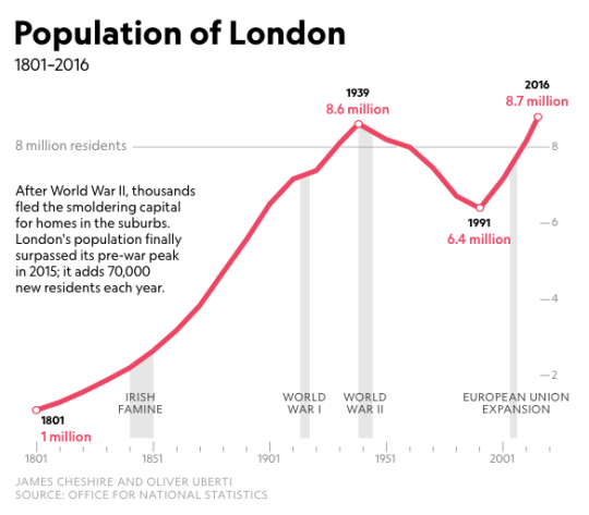
As the manufacturing industry splintered, the docks of what was once the world’s largest port fell victim to shipping modernization and closed. The death in 1965 of Winston Churchill, the great prime minister, marked “the last time that London would be the capital of the world,” the Observer noted. Population continued a downward slide, bottoming out at 6.7 million in 1988. By then London’s fortunes had changed with deregulation of the financial services industry, known as the Big Bang, along with the shift to electronic trading, which enabled London to rival Tokyo and New York. A new financial district rose on the ruins of the West India Docks on the Isle of Dogs, a marshy nub that juts into the Thames. Canary Wharf, as the district is called, became London’s first modern large-scale regeneration project.
According to National Geographic, London’s population grew by about 1.2 million between 2006 and 2016. That’s a pretty incredible number and is why the city estimates that they need about 66,000 new housing units a year just to keep up the growth. Like many supply constrained big cities, they’re not meeting that target.
For the full essay, click here. It comes packaged with some incredible photographs by Luca Locatelli.
About 7.5% of American children born into the bottom quintile of the income distribution will eventually make it into the top one fifth. In the UK this number is about 9%. And in Canada and Denmark, the numbers are 13% and 13.5%, respectively. (The upper bound for these numbers is 20% since you can’t have more than 20% in the top 20% of the income distribution.)
Because of stats such as these, Freakeconomics recently asked: Is the American Dream really dead? And if so, should it instead be called the Canadian Dream, seeing how it’s more readily obtained.
Of course, it’s not necessarily as simple as 7.5% vs. 13%. Upward mobility exhibits a lot of regional variation. In the American southeast, the number is closer to 4%. Whereas in the San Francisco Bay Area, the number is up there with Canada and Denmark. However, this phenomenon is so location-specific that even kids growing up in San Francisco are twice as likely to get to the top 20% compared to kids growing up across the bridge in Oakland.
There’s also a question of spread. Canada and Denmark have less income inequality, meaning you don’t have to travel as far to get to the top of the income distribution.
Still, the reality is that it is becoming harder for Americans to climb the socioeconomic ladder. The number of 30-year old Americans who today earn more than their parents is dropping compared to previous decades. So what needs to be done? What is causing this erosion of the American Dream?
It turns out that city builders have an important role to play in solving this problem. Because where you live – and in particular where you grow up as a kid – matters.
The Freakeconomics episode examines a study that was done by Raj Chetty, Nathaniel Hendren, and Lawrence Katz, called: The Effects of Exposure to Better Neighborhoods on Children. And their findings were exactly that. Place matters. The study reexamines the findings of a program that was administered in the mid 1990′s in the US called Moving to Opportunity (MTO). This program randomly offered families living in high-poverty neighborhoods the opportunity to move to neighborhoods with far less poverty.
Upon initial review, the program was seen as a failure. There were some positive health outcomes, but no meaningful changes in income. But when Chetty and company took another look at the data – now with more time and IRS data on their side – they discovered that the impact was in fact dramatic. Relocated families raised children that earned 30% more, were 27% more likely to go to college, and 30% less likely to be a single parent. The key, however, was that the children had to relocate when they were young (< 13 year olds). The older they got, the less benefit they received from moving, eventually reaching a plateau where there was basically no benefit at all.
Here are the 5 things that ended up having significance in their findings:
Residential segregation by income and race is bad. Mixed neighborhoods are good. The southeast is filled with segregated cities and that’s one of the reasons why they underperform in this exercise. San Francisco, on the other hand, was far more mixed in the 80′s and 90′s when the kids belonging to this study were growing up. One could debate whether that’s still the case. I guess we’ll find out in a few decades.
Single parent households seem to have an impact on upward mobility. However, the data suggests that it’s not just about whether the child in question grew up with married parents. The percentage of single parent households in the neighborhood also matters. Because even children in dual parent households in a neighborhood with lots of single parent households, showed muted upward mobility.
Social fabric. Connections to family and friends matter. It’s about having a support network. (Freakeconomics mentions a book called Bowling Alone that is now on my reading list.)
Not surprisingly, the quality of public schools matters.
All of the stats for this post were taken from this Freakeconomics Radio episode. For me, it is such an important reminder that the way we plan and build our cities can have meaningful and longstanding impacts on the kinds of children we raise.
For some reason, I woke up extra early this morning, well before my alarm. As soon as I came to and noticed the time, I immediately reached for my phone to pull up Twitter and see what happened with the UK referendum. And frankly, I was shocked to see that they had voted to leave the EU.
Once I saw what had happened, I then went to my computer and started looking for maps of the voting results.
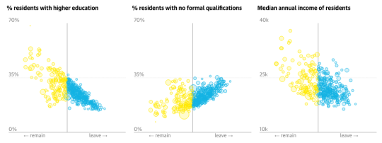
They also found that the best predictor of how people voted (with Scotland being a bit of an exception) was whether or not they had a degree. Residents with higher education were more likely to vote “remain.”
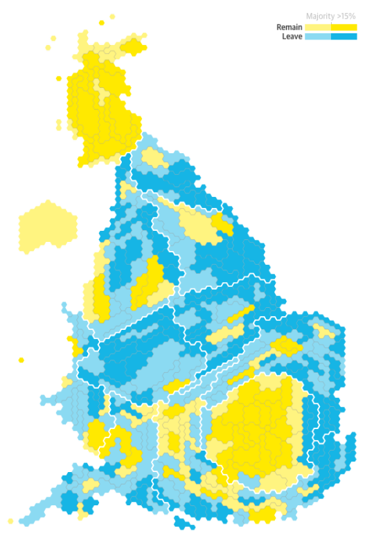
Here’s another vote map from the Telegraph, broken down by 12 regions:
According to these regions, only Northern Ireland, Scotland, and London voted to remain. If we get a bit more granular though, the map turns into this:
Not surprisingly, it is London and other big cities (remain) vs. the rest of England (leave). Here’s another case of urban divide.
I’m listening to The Foreign Desk this morning while I have my coffee. Steve Bloomfield is interviewing two different politicians: one who believes Britain should remain in the EU and one who believes Britain should leave the EU.
(Each interview is about 15 minutes short.)
The back and forth is largely centered around two things: the economy and immigration. Will the British economy be better off in or out of the EU? And on the immigration front, will “in” translate into millions of Turks flooding into Britain should Turkey join the EU?
My general view is that a strong economy should trump concerns over foreigners. But I don’t feel as if I know enough about this precise topic to take a firm position.
Regardless, I very much enjoyed The Foreign Desk episode this morning and I would be open to discussing this issue in the comments below if any of you are also interested.
I may never do another “Tweet of the Week” on ATC, but I couldn’t resist sharing this one of New Year’s Eve on Well Street in Manchester’s city centre.
So much going on this pic of New Year in Manchester by the Evening News. Like a beautiful painting. pic.twitter.com/szKKRM4U4i
But then Roland Hughes of the BBC remarked that its composition was similar to a Renaissance painting and that the guy in blue laying in the middle of the street, reaching for his beer, could be thought of as a parody of the reaching God in Michelangelo’s The Creation of Adam. So he tweeted it out. Since then it has gone viral.
For those of us who weren’t in Manchester on New Year’s Eve, we clearly missed one epic party.
A close friend of mine (from Urban Capital) sent me the above video this morning. It’s of the “Sliding House” in Suffolk, UK. If you can’t see it above, click here. You have to watch the video to fully appreciate the house.
Built as a place to retire, the Sliding House consists of a building envelope with fairly typical punched windows that physically slides overtop of a minimal glass structure. This allows the building to adapt to the changing seasons (or to the moods of its occupants).
This concept of adaptable architecture is incredibly interesting to me. Because for a lot of climates — where the temperatures can swing dramatically from hot to cold and vice versa — it can actually be incredibly difficult to design an efficient building.
When it’s cold, you’re trying to trap heat inside the house. And when it’s hot, you’re trying to exhaust heat to the outside. So by default, the building has to be adaptable.
In its simplest form, this could mean an operable window. But in a more elaborate form — like in the case of the Sliding House — the entire skin of the building might adapt.
And if it means having to rely less on active mechanical systems then I think it’s a step in the right direction.
A few weeks ago I wrote about showcasing the Architect This City community. The idea was that there are lots of interesting and talented people who subscribe to this blog, but that there’s no scalable way for me to connect with everyone.
So I wanted to provide an opportunity for you to share a bit about yourself on this blog. I could selfishly learn more about the kinds of people who read ATC; you and/or your company could benefit from a bit of exposure; and you all could get the opportunity to connect with one another.
I didn’t get quite as many responses as I thought I would — which is partially why it has taken me so long to write this post — but I did get a lot of positive feedback on the idea. So I’m excited to share 5 of the people and companies that did respond.
Darren Davis @ Auckland Transport (Auckland, New Zealand)
Proudly car-free Principal Public Transport Planner, and arch transit nerd, at Auckland Transport. Auckland Transport is in the midst of the biggest redesign of the city’s public transport system since the introduction of electric trams in 1902. We are taking a once-in-a-generation opportunity to reimagine public transport by going back to first principles, in an exercise inspired by Human Transit and strongly influenced by its author, Jarrett Walker.
We are a consulting engineering practise — structural, building envelope, restoration, and special projects & renovations — bringing together engineering and intuition to enhance building performance. Entuitive is creative, collaborative, and advanced.
Taya Cook, Development Director @ Urban Capital (Toronto, Canada)
We develop forward thinking condominiums with a focus on urban location, fantastic design and superior customer experience. I work there. Really B, do you need more reasons for awesomeness?
Currently managing a Europe-wide €4m ERDF funded project, ‘Stimulating Enterprising Environments for Development and Sustainability’ (SEEDS). SEEDS is working with 8 partners across 6 countries towards establishing acceptance of the temporary use of abandoned places and spaces as an integral part of longer term planning.
Urbanspace Gallery is a unique venue, dedicated to diverse exhibitions and events that explore how cities work and how we might improve them. Our purpose is to present issues related to community, public space, housing, transportation, planning, governance, and sustainability (among others) in order to further the discussion about our own city and others around the world, while fostering a space of learning and reflection.
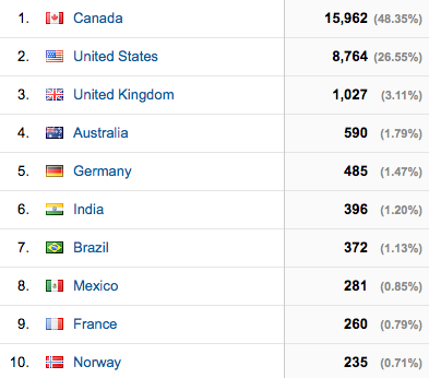
Most of the people who responded were from Toronto and Canada. And that’s not surprising given how local a lot of my content is. Half of the ATC reader base is currently from Canada.
But I did also get emails from many other places all around the world. It always amazes me to see where people are reading from. My only wish is that I could learn more from them (you). So drop me a line. I hope to do another community profile sometime soon.
Yesterday I came across an incredibly fascinating chart from Eurostat, analyzing housing tenure (in 2011) across Europe. Here it is:
And here’s what I found interesting.
Working from left to right, there seems to be a clear difference between Eastern and Western Europe in terms of the amount of leverage they use to buy homes. If you look at Romania, not only does over 90% of the population own a home, but they also don’t seem to have any outstanding mortgage or housing loan. That means they’re buying their homes in cash.
By the time you get to the United Kingdom, you start to see numbers that are comparable to Canada and the United States. The percentage of owner occupied homes is sitting at or below 70% and the majority of them have a mortgage or loan.
But as a whole, Western Europe seems much more likely to rent than Eastern Europe. And in the case of Switzerland, more people rent than own. Why is that? This seems odd given its economic strength. But the same could be said for Germany and Austria, which also show relatively low ownership rates. Here’s one possible explanation.
Finally, I found it interesting that in Denmark, the Netherlands, and Sweden, there’s virtually no such thing as subsidized rental housing. If you rent, you’re paying market rate (at least according to this chart). I wonder if this has something to do with there being less income inequality.
If anyone has any insights on some of these points, I’d love to hear from you in the comment section below.