Daily insights for city builders, delivered every morning at 6 AM ET. I’m Brandon Donnelly — a Toronto-based real estate developer and founder of Globizen. I’ve been writing here since 2013.

Tag: travel

  • Off to New York

    I’m packing and getting ready to leave for New York right now. I’ll be there for both Canada Day and Independence Day. My out of office message has been activated.

    I have a lot going on at the moment (which I’ll soon be able to share on this blog) and so I’m looking forward to getting out of the city and disconnecting a little. (I’ll, of course, still be blogging.) I’m generally not very good at down time. I like to keep busy and I like to work a lot. 

    But every now and then my body tells me that I should do otherwise. I also notice that I start getting decision fatigue. I am sure many of you probably feel this way as well. So I said no to a lot of things this week and I have very few things planned for New York. I’m content with that.

    A big city is probably not what comes to mind when many of you think of down time. But one of my favorite things to do is just wander around a city, look at buildings, and absorb it all. In some ways that feels like a luxury because most of the time I’m too busy rushing around. 

    But who knows, maybe I’ll end up on a beach somewhere. That’s the sort of thing that can happen when you don’t have much in the calendar. Either way, I’m off to New York for some rest and relaxation. Talk tomorrow.

  • Let’s fix the UPX train, together

    I am a big fan of the UP Express train that runs from downtown Toronto to Pearson Airport. 

    I love the station architecture, the branding and identity, the trains themselves (with wifi), and the local retailers they house at Union. I also happen to live a stone’s throw away from the downtown station. So I can go from door to bum in seat within 10 minutes.

    But despite all this, it has become clear that something needs to be done to fix the UPX train. Just last weekend a friend of mine and fellow urbanist, who was visiting Toronto from Vancouver, sent me a text message saying: “This UPX train is really nice, but why is it so expensive?”

    Indeed, that seems to be the general consensus. Here is the opening paragraph from a recent Globe Editorial article:

    Toronto’s high-end airport express train is a failure. A city that urgently needs better transit has been saddled with a deluxe boutique rail service that cost $456-million to build and runs nearly empty, 19 ½ hours a day.

    So today I thought we could collectively brainstorm some ideas for how Metrolinx – the public agency that operates the train – should address this issue.

    I’ll start by sharing my thoughts as a rider and then, hopefully, you all will share yours in the comment section below. I know that there are people from Metrolinx who subscribe to this blog, so I am sure your feedback will get through to them.

    My thoughts are twofold. Like many others, I think the pricing is off. But at the same time, I think there should be a focus on enhancing the value proposition of the service.

    Bur first, let’s talk about price.

    At the time of writing this, a one-way trip from Union Station to Pearson Airport on the UPX is $27.50. If you happen to have a PRESTO card, it’s $19.

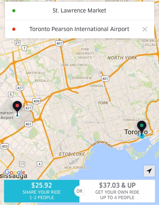
    The alternative for many is probably a taxi. So let’s also look at some Uber fare estimates. For someone like me leaving the St. Lawrence Market area, I’m looking at $25.92 with UberPOOL (meaning I’m sharing the car with 1-2 other people) or $37.03 if I insist on riding solo.

    image

    Against the non-PRESTO fare, UberPOOL is a cheaper option and it’s door-to-door service. Against the PRESTO fare, UPX is potentially $6.92 cheaper. But if you’re someone who has to take the subway to the UPX station, then it’s only $3.67 cheaper (add $3.25 for the subway) and it’s not door-to-door service. So for the vast majority of people, I suspect that UberPOOL would win out in this particular scenario.

    If you happen to be traveling with someone, then UberPOOL and UberX are probably going to be cheaper no matter how you slice it. And again, you’re getting door-to-door service. So I think the consensus is right: fares need to come down.

    But I don’t think Metrolinx should be solely focused on price. They should also be thinking about ways to create additional values for riders. 

    One of my favorite travel experiences is that of Hong Kong’s airport train. There, they have airline check-in counters in the city so you can collect your boarding pass and check your baggage up to a day before your actual flight. This is a huge value add because it means you can check out of your hotel, liberate yourself of your luggage, and spend the day in the city before leaving on the train to catch your flight. You can’t do that with an Uber. And lugging bags around a busy city, sucks.

    My point with all of this is simply that you can’t expect people to pay more or roughly the same, if they are not getting additional value. And right now, the train isn’t door-to-door and taxis are. (Though, the train has a travel time advantage during peak times.) So you either make it cheaper or you create additional value. Or, you do some combination of the two, which is where my head is at.

    What are your thoughts? Please respond in the comments below so all the feedback is public. Thanks.

  • The PRESTO Push

    image

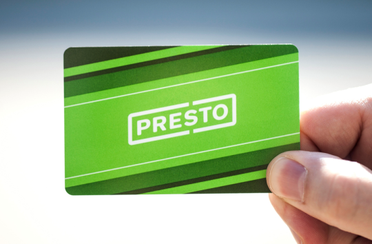
    Back in 2004, I spent a summer living in Asia. And one of the things that I remember really standing out for me was Hong Kong’s Octopus card. It’s a refillable card that you just tap to get onto transit. Lots of cities have them.

    But the cool thing about the Octopus card was that you could use it so many other places besides just on transit. I don’t know know what it’s like today in Hong Kong, but I remember also using it in taxis and to buy breakfast in the morning at Pret a Manger. That was pretty incredible for 2003.

    This was also great for me because I’m one of those people that dislikes carrying around paper money/change. I almost never spend my change and so it just ends up just accumulating in a container beside my front door. Here in Toronto we also use microscopic transit tokens, so that adds another layer of inconvenience.

    But that’s all changing.

    Toronto now has its own version of the Octopus card and it’s called PRESTO. Technically it launched in 2009, but I only recently noticed the card readers appear at my home subway station (King Station). So tonight I decided to finally pull the trigger and order a card. I’ve been waiting 11 years for this moment 🙂

    And I was doing that, I noticed this message on the website:

    image

    Not surprisingly, we seem to be pushing to get PRESTO rolled out before the world comes to visit. And I think that’s a great thing.

    One of the big benefits of hosting an event like the Pan Am Games or the Olympics is that it creates a hard deadline to get things done, which is something governments often need. It’s a bit like tidying up before guests come over for dinner. You find a way to do it before people arrive.

    There’s a lot of debate about whether or not it makes sense for cities to spend the money on playing host city. But I don’t think we should ignore the fact that they can be a great catalyst for city building. Things get done. And oftentimes done is better than perfect.

    Good news: I’ve been told that the PRESTO system will be compatible with mobile phones and near field communication. Because let’s face it, cards won’t be around that much longer.

  • Guest Post: Three minutes that rule the world – Will demolishing the Gardiner East actually make traffic worse?

    Today on Architect This City, we have a guest post by Darren Davis, who is a transport planner in Auckland, New Zealand. He’s a regular commenter on this blog, and I know he’s been following the Gardiner East debate quite closely – as many urbanists around the world are. I appreciate him offering and taking the time to write this piece. Thank you.

    ——————————–

    The decision this month on whether to demolish the Gardiner East Expressway and replace it with a surface boulevard or to rebuild it with a similar elevated structure will be a watershed moment for Toronto, akin to the decision not to have freeways in the urban core of Vancouver in the late 1970s.

    There are numerous good reasons why removing the Gardiner East elevated structure is the right move for Toronto, covered previously by The Globe and Mail and in the Council for Canadian Urbanism’s open letter to Toronto City Council. If you aren’t aware of these, I strongly recommend reading them. 

    Also of note are two things:

    1. Just 3% of Downtown commuters drive on the Gardiner Expressway East, a tiny fraction of the 68% who arrive Downtown on public transit.
    2. The “remove” option does not reduce traffic capacity over the “hybrid” option but could reduce travel speeds in uncongested conditions (read on for why I don’t think that this will happen in real life).

    However, one element of this debate that has not got much airtime is the transportation modelling that claims an additional two to three minutes travel time with the “remove” option over the “hybrid” option which retains the elevated expressway in a slightly modified form. 

    Toronto Mayor John Tory has stated that "I didn’t get elected to make traffic worse. And let’s be clear, removing that piece of the Gardiner will almost certainly make traffic worse.” But is it in fact true that demolishing the Gardiner Expressway East will make traffic worse as the transportation modelling claims?

    The key thing to understand is that transportation modelling, which tries to predict future travel times, is the product of a bunch of assumptions which may not in fact be borne out in real life. 

    For example, the effect of induced traffic, where additional traffic capacity leads to additional traffic being attracted to the route, is reasonably well known but generally not factored into transportation modelling. Induced traffic happens because increased travel speeds attracts traffic that would have otherwise avoided the route at congested times; attracts people to drive where they previously used other modes and encourages trips that would not otherwise have taken place. The effect of induced traffic is to quickly nullify the benefits of adding traffic capacity.

    However, what is less well known is that the reverse happens where there is either a reduction in traffic capacity (not the case in Toronto as the “remove” option retains the same traffic capacity) or speed.

    This is because in this situation, four things happen:

    1. Some travel re-routes. The “remove” option with a widened Lakeshore Boulevard as part of the street grid simply gives more ability for traffic to re-route away from congestion over an elevated expressway structure where drivers are literally trapped until they reach their exit.
    2. Some travel re-times. Some people will retime trips to avoid congested travel times, such as starting and/or finishing work at less congested times.
    3. Some travel changes mode. Some people will be encouraged to change mode by the perceived worsening in traffic conditions.
    4. Some travel is avoided entirely. Some people will choose not to travel at all in the peak of the peak. For example, this could take the form of working from home or shopping on the internet instead of by car.

    Transportation models only take into account the first item but not the others. The modelling is also sensitive to traffic growth assumptions and assumed mode split and trip distribution. Often transportation models assume continued growth in car travel even though per capita kilometres travelled peaked about a decade ago.

    While this may all sound well and good theory, does this actually happen in practice?

    In Auckland city centre, we have extensive experience with the reallocation of road space away from general traffic. Many busy key city centre approach routes have had general vehicle lanes reduced to make way for bus lanes (which generally carry around 65-70% of the people moving capacity of the street). 

    This has involved up to a 50% reduction in private vehicle capacity (whereas in Toronto, the “remove” option retains the same traffic capacity but may slow throughput). Auckland has done two of these in the past twelve months – both involved converting a general traffic lane to a bus lane. 

    Don’t get me wrong: There is sometimes pain at implementation with about a three week period of congestion as car drivers adapt to the new reality – and most likely negative media coverage will accompany this. But after about a month, equilibrium will be restored and life will continue much as it did prior to the change. 

    Part of this is that there will be various “optimisations” during this introductory period where signal timings are adjusted and other tweaks made – the sort of tweaks that can only be fine-tuned in a real world situation. But a bigger part of this is that the four factors above – re–routing, re-timing, mode change and avoided travel – come into play.

    I cannot overemphasise enough that life will return to normal surprisingly soon if the Gardiner East Expressway is demolished and replaced by a widened Lakeshore Boulevard.

    My advice

    When people talk about two to three minutes of extra travel time, take the foregoing into account and take those claims with the very big grains of salt that they deserve. If Toronto makes the right choice and chooses the “remove” option, my bet is that the biggest surprise of all will be how little difference it makes to peak travel times for the 3% of Downtown commuters who used to use the Gardiner Expressway East.

    Disclaimer

    The author of the above post is an employee of Auckland Transport, however, the views, or opinions expressed in this post are personal to the author and do not necessarily represent the views of Auckland Transport, its management or employees. Auckland Transport is not responsible for, and disclaims any and all liability for the content of the article.

  • Day 1 in Quebec City

    I just checked into the Chateau Laurier Quebec after a busy day touring the city. I don’t have a ton of time to write this post before dinner (though I have a few post ideas brewing). I did however want to share some of the day’s events and some of my photos.

    After I landed I went straight to Île d’Orléans. I had never been there before so I’m glad I got the opportunity. It’s about twice the size of Manhattan and it has a population that hovers somewhere between 7,000 and 10,000 people depending on the season.

    The first stop was a “sugar shack”, which is apparently a big deal in Quebec and in the springtime. The place was packed. Here I had a traditional Quebec lunch (which was great) and I learned that all of the Canadian stereotypes are actually true. We really do put maple syrup on everything.

    After lunch I then asked if we could stop at a few of the local wineries. I love wine and I love wine culture.

    imageimageimage

    I picked up one bottle of “wine” from Cassis Monna & Filles. It’s actually made from black currants though, which I was told was illegal to grow in North America for a long time. It’s far more popular in Europe.

    The winery is run by a father and his two daughters. And I thought they did a great job with their brand story and their overall identity.

    After leaving the island, I then went to the Montmorency Falls. I had no idea Quebec had falls, but they do. And the vertical drop is bigger than that of Niagara Falls.

    image

    Finally, I finished the afternoon with a quick tour of downtown and the OMA designed expansion to the fine arts museums. It has one aggressive cantilever.

    Here’s a video of the project. Click here if you can’t see it below. 

    [vimeo 111133943 w=500 h=281]

    If you’re interested, you can also follow my social posts on the Porter Escapes website by clicking here.

  • Architect This City x Porter Escapes (in Québec City)

    Towards the end of last year I received a one line email from a reader asking me what I thought about Porter (the airline that operates out of Toronto’s island airport downtown).

    I followed suit and responded with one line: “I’m a big fan.” I then pasted a few links to posts I had written where I talked about Porter, the island airport, and why I think they are good for Toronto.

    It turns out that was the right answer 😉

    Because today I’m excited to announce a fun collaboration between Architect This City and Porter Escapes. This weekend I get to explore Québec City and do something I love to do, which is photograph cities, think about cities, and write about cities. (And eat poutine.)

    Here are my travel essentials for the weekend (I wish it was a better photo):

    image

    The first thing I should tell you though is that Porter Escapes is different than simply Porter. Porter Escapes is their “packaged vacation” company, so it’s designed for people who want a simple way to book entire getaways (flight, hotel, activities, and so on).

    In my case, I’m going to be staying at the Château Laurier. I also have a bunch of activities planned out for Saturday during the day. Stay tuned.

    I had initially planned to squeeze in some snowboarding at Le Massif and try out the nicely branded train that goes from Québec City right to the mountain. But my back and shoulder are still tender from my spill in Banff.

    Still, I hope you’ll follow along on Twitter, Instagram, and Snapchat, and using #PorterEscapes. And if you happen to be in Québec City this weekend, let’s grab a pint and poutine.

    I’ve also been told that Porter Escapes will be launching a special promotion over the next few days for escapes specifically to Québec City.

    Note: I’m supposed to tell you that it’ll be at a price point that you should never expect to see again (i.e. it’ll be a steal).

    Happy Friday 🙂

  • Did we hit peak car?

    image

    The total number of vehicle miles traveled in the US used to largely do only one thing: go up. This is made it fairly easy for the Federal Highway Administration (FWHA) to forecast how much more Americans were going to drive in the coming years – they just extended the trend line.

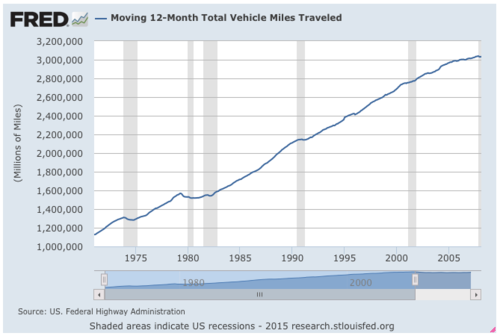
    Below is what that looked like since the early 1970s (via FRED Economic Data). You’ll see that the total vehicle miles traveled went from somewhere around 1.1 trillion miles to around 3 trillion miles in and around the late 2000s. The shaded areas represent recessionary periods.

    image

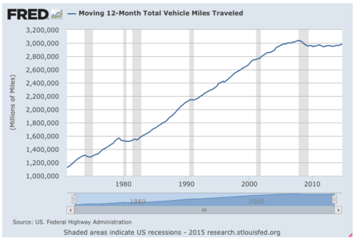
    But then in 2007, something happened. Total vehicle miles traveled peaked, declined, and then flat lined at just under 3 trillion miles. Here’s what that looked like (the ending time period is October 2014):

    image

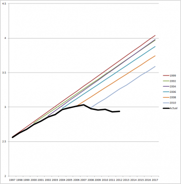
    However, since this was new for the FHWA, they continued to believe that this would ultimately correct itself and that total VMTs would eventually continue on their linear ascent. So here’s what their projections looked like (via State Smart Transportation Initiative):

    image

    Clearly things didn’t go as planned.

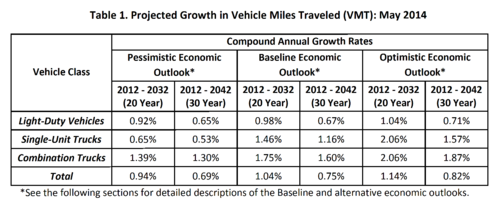
    But then in May of last year (2014), the FHWA finally changed its tune and released this forecast, which had the following projections:

    image

    It outlined 3 economic scenarios: a pessimistic one, a baseline one, and an optimistic one. In their baseline outlook, they believed that the annual growth rate for total vehicle miles traveled in the US would be 0.75% over a 30 year period running from 2012 to 2042.

    At the same time, they also stated that population growth would average about 0.7% per year through this same period. This means that the FHWA has more or less conceded that total vehicles traveled per person will likely remain flat, which is a significant change from previous forecasts.

    Now, given their track record, I don’t think any of us should put a lot of faith in the accuracy of these numbers. Per capita driving could flat line. But it might also go down, which is what it has been doing over the past few years.

    Either way, I do think it’s worth thinking about this shift. It’s a pretty big deal.

    Top Image: Flickr

  • Off to Chicago

    I’m flying out to Chicago this morning, and so I don’t have a lot of time to write. But I am taking my iPad with me and I plan to continue writing every day that I’m there. As some of you might remember, I’ve never been to Chicago before. This will be my first time. So I’m expecting lots of writing inspiration.

    That said, I’m going for a bachelor party and so I may not get the chance to geek out about the city as much as I normally would. There certainly won’t be any any Frank Lloyd Wright pilgrimages taking place. However, I have convinced the group that the architecture boat cruise will be a great way to see the city and a nice way to start off the day following a late night.

    If you’re from Chicago (or just know the city well) and have some must-see recommendations, I’d love to hear from you in the comment section below. I’m excited to visit Chicago because it’s another Great Lakes city and I’m told it’s somewhat similar to Toronto. It’ll be interesting to see how they compare and differ.

  • The story of a symbol of belonging

    image

    I’ve been following Airbnb pretty much since the beginning. The company has always fascinated me because I saw it as being less about technology and more about travel, hospitality, community and, in my view, real estate.

    An office building is just a set of spaces that get rented out on long term leases. A hotel building is just a set of spaces that get rented out on short term leases (one night at a time). And Airbnb spaces are simply extra or “found spaces” – such as an extra bedroom – that could never really be rented out at any sort of scale before. But then Airbnb came along, built a community around it, and empowered everybody to make money off that found, extra space. I think that’s pretty neat.

    Well today, Airbnb unveiled an entirely new logo, brand, and expression. It’s all about belonging, and their new logo is called the Bélo. Here’s a quick video that they call “the story of the symbol of belonging”. If you can’t see it below, click here.

    [youtube https://www.youtube.com/watch?v=7Hs0C2UvVBY?rel=0]

    What’s interesting about this new expression is that it’s a perfect example of Simon Sinek’s belief that people don’t buy what you do, they buy why you do it. And in this case, Airbnb’s why is community, trust, belonging, and a sense of place. Talk about emotive.

    In both the above video and in CEO Brian Chesky’s blog post today, reference is made to our cities and towns, and the fact that as they continue to get larger, we’re also becoming increasingly more disconnected. Things have gotten impersonal. But Airbnb is bringing back that sense of belonging.

    On a less emotive level, what it also does is set Airbnb up for expansion.

    Chesky has said before that the company wants to own the entire travel experience – from the moment you leave your home to the moment you return. So presumably a big impetus behind the rebrand was to develop something that could become ubiquitous across a number of different products and services. Which is why it makes perfect sense that they would encourage people to design their own versions of the logo.

    So while the rebrand has received a lot of criticism today – some people say it looks like a vagina – I wouldn’t discount it just yet. There are bigger plans in store.