Daily insights for city builders, delivered every morning at 6 AM ET. I’m Brandon Donnelly — a Toronto-based real estate developer and founder of Globizen. I’ve been writing here since 2013.

Tag: tower

  • The resilient story of Toronto’s tall towers

    The Urban Land Institute Toronto is hosting an event and panel discussion on April 8, 2021 about the future of high-rises in our cities. Here’s the blurb:

    Against the backdrop of the pandemic and its toll, what is the future of high-rises in our cities? What role do tall towers now play in shaping Toronto’s identity? While the pandemic has accelerated existing large trends, residential tall towers are proving the durability of a quality urban centre and hyper-urban lifestyles in Toronto and around the world.

    An introduction will be provided by James Parakh (author, Fellow of the Council on Tall Buildings and Urban Habitat, and Urban Design Manager for the Toronto & East York District) and then a discussion will be moderated by Robyn Player (Director, BTY).

    The discussion will be focused on what ULI is calling three of Toronto’s most exciting tower projects under development: Pinnacle One Yonge, One Delisle, and 11 Yorkville.

    I will be on the panel (talking One Delisle) alongside Lee Koutsaris (VP, Sales and Marketing, Metropia) and Anson Kwok (VP, Sales and Marketing, Pinnacle International).

    If you’d like to register, you can do that over here. It should be a great/timely conversation.

  • Penthouse lighting at the Massey Tower

    I am a big fan of lights on buildings. Here is a photo of the Massey Tower (by MOD Developments and Hariri Pontarini Architects) that I quickly took on my walk home from the office this evening:

    It’s not a very good photo and it’s not doing the project justice. So here’s another shot of the mechanical penthouse lighting from their Instagram.

    I’ve been noticing this lighting for a while now, and every time I see it I think to myself, “That’s really well done.” It’s simple, elegant, and it reinforces the overall architectural intent of the building.

    We are entering that time of the year, at least here in Toronto, where most of us will leave work and it will already be dark out. So the lighting on our buildings and in our public spaces can serve a particularly important function.

    Lighting can, of course, be done poorly. And we do need to be mindful of migratory birds during the spring and fall. Artificial light disorients them at night.

    But we all know how important lighting is to our interior spaces. The same is true for our urban spaces.

  • Non-load-bearing curtain wall

    image

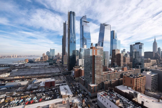
    Liz Diller of Diller Scofidio + Renfro was recently asked by designboom about how her firm approached the design of Fifteen Hudson Yards (the first residential tower in New York’s Hudson Yards).

    The firm had never designed a high-rise before. So while their typical approach would be to analyze program, here they were heavily informed by the views – both in and out from the site – as you move up the tower.

    The 88 storey tower transitions between two footprints. The base matches the street grid of the city, but as you move up the tower it transforms into a cloverleaf – allowing panoramic views of the city.

    It is a somewhat similar approach to what has been proposed by Studio Gang for One Delisle. Except for the transformation here is to a multifaceted cylindrical shape (a hexadecagon is what has been drawn).

    From the late 19th century when Chicago began to pioneer the modern skyscraper, architects and engineers have been thinking about how you treat a tall building as you move from top to bottom.

    Chicago architect Louis Sullivan responded to this challenge with his tripartite approach to design. He believed that tall buildings should be characterized by three main divisions: a base (bottom), a shaft (middle), and a cap (top).

    The technological innovation that allowed this thinking to flourish was the non-load-bearing curtain wall. Once the exterior walls of a tower no longer supported the actual building, architects then had the freedom to really experiment.

    This remains true to this day, but we no longer need to confine ourselves to only three parts. New technologies now allow for more.

    Today we have parametric modeling and other design tools that allow us to create new geometries and transitions; forms that would have been pretty complex to draw up in the past. 

    In the case of Fifteen Hudson Yards, every floor plate from 20 something and up is slightly different. I wonder what Louis would think of this.

    Image: Timothy Schenck via designboom

  • BIG’s IQON in Quito

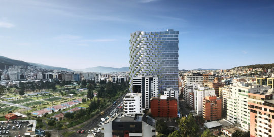
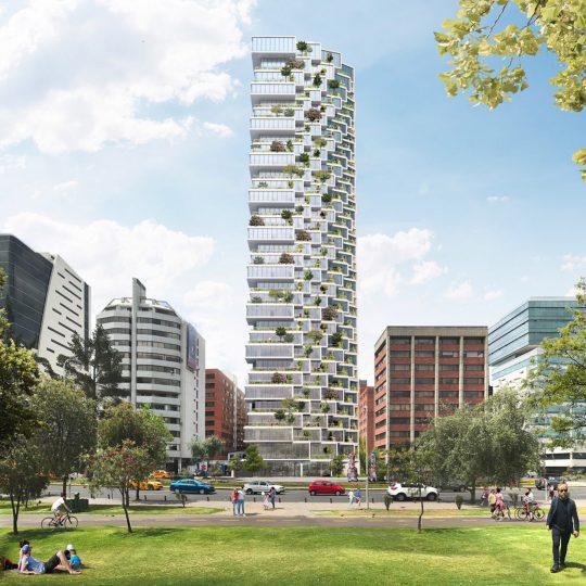
    BIG just announced its first project in South America. It is a 33 storey residential building in Quito, Ecuador. When completed, it will be the tallest building in the city. The developer is Uribe and Schwarzkopf

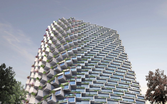
    Here are a couple of other images:

    The building is made up of “concrete boxes” that, when rotated, create terraces for the apartments. On one corner of the building the apartments are “through-units”, meaning they have two exposures. In this case, it is north and south.

    While different, we are starting to see some similarities across BIG’s projects, which isn’t meant as a criticism. I am thinking of Telus Sky, Vancouver House, and even KING Toronto. 

    They are, at least partially, about expressing the individual apartments and creating opportunities for outdoor spaces. This also serves to break down the overall scale of the building.

    What do you think of the project?

    Images: BIG

  • Building height fallacy

    Studio Gang has a project currently under construction in New York City called 40 Tenth Avenue. It is also known as the “solar carve tower.” Here are a couple of progress photos taken by Timothy Schenck. The glass is beautiful. (If you can’t see the embedded tweet below, click here.)

    https://platform.twitter.com/widgets.js

    This is one of my favorite buildings by Studio Gang and one that we all studied when we were kicking off One Delisle

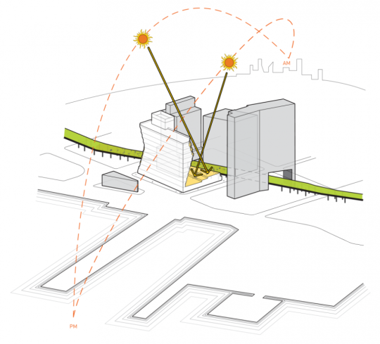
    The geometry of the building is a result of carve outs that maximize the amount of sunlight that is able to reach the adjacent High Line (public space). It is form driven by functional logic. Here is a diagram from Studio Gang showing the carve outs that result from the sun’s rays.

    image

    The other thing I like about this project is that it is a clear proof of something that I’m going to call the “building height fallacy.” There can be a tendency to overfocus on building height, which I have argued against before on this blog. 

    In this case, a shorter and squatter building without these solar carve outs, would have actually been worse for the High Line and the surrounding environment in terms of access to light and air.

    The building is responding to site-specific criteria – which is what great architecture should do.

  • Sinking tower solution

    Many of you are probably aware of the 58-storey Millennium Tower in San Francisco which is estimated to have sunk about 17 inches and to have tilted about 14 inches to the west since it was built.

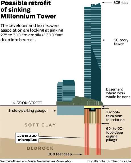
    Well today it was announced that they may have a fix. Here is what is apparently being proposed as a retrofit (image from SFGate):

    image

    The tower was originally built on top of a 10 foot thick raft or mat foundation, which was then supported by concrete piles that went down 60-90 feet into soft clay. Notably, the piles didn’t reach bedrock.

    The proposed solution involves drilling 275-300 new micropiles into the bedrock below. But here’s where things get really interesting: The plan is to stabilize the west side of the building first and allow the east side of the building to continue sinking. In theory, this will give the building an opportunity to level out before they fully stabilize it. 

    According to SFGate, the entire retrofit is expected to take anywhere from 2 to 5 years, and cost somewhere in the range of $200 to $500 million. The original tower cost $350 million to build. (I’m assuming that’s just the hard cost number.)

  • How elevation impacts risk taking

    image

    There’s an old saying that we shape our buildings and environments and then they in turn shape us. 

    Here is a fascinating research report about “the influence of physical elevation in buildings on risk preferences.” I discovered it through this MarketWatch article, which my friend John forwarded me this afternoon. 

    Here is a quote from the article:

    We then examined the correlation between hedge-fund volatility and office location in terms of number of stories above ground. We found that as the elevation of hedge-fund managers’ offices increased, they were more willing to take risks that resulted in more volatility. This was true even when statistically controlling for factors such as total assets, fund strategy and several other variables that could have led more resourceful hedge funds to occupy expensive offices that are often found on higher levels of buildings.

    Does this mean taller cities are also more volatile cities? Assuming this is all true, it once again proves that we are maybe not the rational decision makers that many us probably think we are.

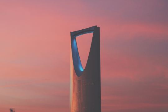
    Photo by Hala AlGhanim on Unsplash

  • 11 Hoyt, Brooklyn

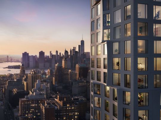
    Tishman Speyer just unveiled a new condo project in Brooklyn called 11 Hoyt. And it just so happens to be Studio Gang’s first residential project in New York City. Preview above. More renderings over here.

    It’s a 51 storey condominium with 480 residences and 55,000 square feet of indoor and outdoor amenities. The unit mix ranges from studios to four-bedroom residences, and prices range from $600,000 to over $4 million (USDs, of course).

    If you’re from Toronto, you’re probably looking at the renderings and thinking to yourself: “There are no balconies or outdoor spaces.” But that’s fairly typical in the NYC market, as I understand it.

  • Chipperfield to build tallest building in Hamburg

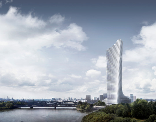
    David Chipperfield Architects has just won a design competition for the tallest building in Hamburg. It is set to rise 230 meters and look something like this:

    image

    There’s a real elegance to its simplicity. It also feels like an appropriate pairing with the nearby Elbphilharmonie designed by Herzog & de Meuron.

    But the first thing I thought to myself when I saw the design was: “Must be office. There are no outdoor spaces.”

    And sure enough, the plan is for 104,000 sm of primarily office. There are also plans for restaurants, shops, exhibition areas, and a hotel and bar.

    Some architects begrudge having to incorporate balconies into their tower designs because they can break up the elevations, muddy the concept, and create thermal bridging concerns.

    This tower – called the Elbtower – is a good example of why that is the case.

    Image via Dezeen

  • What’s with all these tower cutouts?

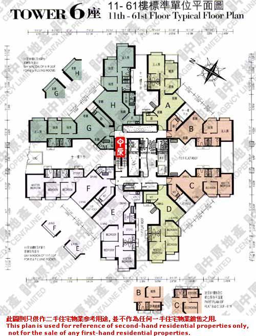
    One question that was nagging me after seeing Hong Kong’s “typical” tower typology was: what’s with the cruciform tower plan and all these notches and cutouts? Wouldn’t it be far more efficient to square off the floor plates? I figured that it had to be in response to building regulations. I was going to mention that in this post on the typical “8-units-per-floor” tower plan, but I wanted to first understand what was going on. Thankfully a reader of this blog who is from Hong Kong was kind enough to send me a wonderfully detailed email outlining some of Hong Kong’s building regulations and how they impact the design of tall buildings.

    It turns out that there are requirements for both “natural lighting and ventilation” and for “external air.” All rooms for habitation, as well as offices, bathrooms, and kitchens, are subject to these requirements. There are prescribed window areas for the “glass areas” and for the “openable areas”, both of which are a function of the room size. The glass area must equal the room area divided by 10. And the openable area must equal the room area divided by 16. I presume that these are minimum sizes because they don’t feel all that big.

    For the “external air requirement”, the room must face a street no less than 4.5m in width or it must face an unobstructed space as delineated by “rectangular horizontal planes” and by “inclined planes.” The incline planes are drawn in section from the sill of the window and the angle depends on the type of room. The rectangular horizontal planes are drawn in plan and have a minimum area of 21 square meters (or ~225 square feet). If you would like to deep dive into more of the technical details you can do that here. But suffice to say that it is these requirements which are driving all of the tower notches and cutouts.

    The result is tower floor plates that can look something like this:
    image

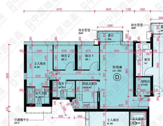
    And if we zoom into a unit (this one being a 3 bedroom apartment), you can see that both bathrooms have a window, as does the kitchen. From what I saw, there appears to be less interest in open concept floor plans. You may also finding it interesting to note some of the room dimensions (in mm) and the A/C platform sitting outside of the master bedroom. 
    image

    Finally, I should follow-up on my previous comment about tower separation distances and the ability for the above tower floor plates to be built directly adjacent to each other. Not surprisingly, this resulted in walls of towers being constructed. Ultimately this became known as the “wall effect.” So in 2011, the Sustainable Building Design (SBD) guidelines were put in place which stipulated that groups of buildings having a continuous facade length greater than 60m should comply with various separation and permeability guidelines.

    So there you have it. Every market has its local nuances. The above post is a good example of that. I also love when this blog becomes a platform for two-way discussion. I learned something new today and hopefully you did too. Thank you Hiu Yeung for your emails and for providing me with all of this information.

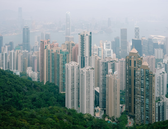
    Top image: Photo by me taken at Hong Kong’s Peak