Daily insights for city builders, delivered every morning at 6 AM ET. I’m Brandon Donnelly — a Toronto-based real estate developer and founder of Globizen. I’ve been writing here since 2013.

Tag: technology

  • How I moved over the last 3 weeks

    At the beginning of this year I wrote a post about a mobile tracking app called Moves that I had heard about through my friend Sachin Monga. He had just published a beautiful set maps showing where he physically spent his time in both Toronto and San Francisco.

    His post spurred me to download the app and at the end of my post I promised to share my own set of maps once I had collected enough data points. It’s only been about 3 weeks, but already my maps are starting to fill out, so I thought I would do a release.

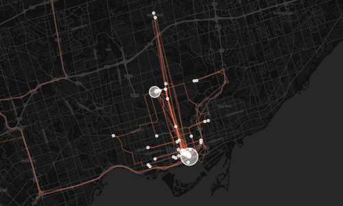
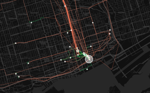
    The orange lines represent transport of some sort (car, subway, streetcar, and so on) and the green lines represent walking. I don’t cycle very often in the winter (I know, I’m a fair-weather cyclist), so you won’t see any of those lines just yet. However if I posted a map from the summer, I know it would look completely different.

    Here’s a first one showing a regional scale:

    image

    Here’s a second one showing the city of Toronto:
    image

    And here’s a third one showing mostly downtown:
    image

    What’s interesting about these maps is how much you can tell about me and the way I move around the city.

    For one, there’s a good chance I ski or snowboard given that I’m driving up to Collingwood, Ontario in the winter. You can also see how heavily dependent I am on the Yonge subway line, which is the thickest orange line in the middle of downtown. It’s also interesting to see how localized I am within my neighborhood (St. Lawrence Market). I walk to get groceries. I walk to the gym. I walk to coffee. And the list goes on.

    This is fairly typical for people living in urban neighborhoods, but it would be interesting to see where it applies in the city and where it begins to fall apart. I would also imagine that there’s a correlation to the area’s Walk Score, although this (Moves) might actually be a better measure since it’s usage data.

    Either way, imagine what cities could do if they had this sort of data for every resident. They would be able to see precise resident flows and then determine exactly where transit and infrastructure investments should be made instead of politicking to determine where they should be made.

    That time is coming.
  • Marginal cost = 0

    Earlier this week I wrote a post called: The pull from services to products. And in it I made mention of the fact that part of what’s driving this pull towards products is that the marginal cost of servicing additional users or customers is almost nothing in a world of internet services and products.

    Well the reality is that this phenomenon is driving a hell of a lot more. It could – and probably will – fundamentally change almost all aspects of the economy.

    I know that sounds like a pretty audacious statement, but if you watch the following 10 minute talk by Albert Wenger (Union Square Ventures) you might start to feel the same way. He outlines 5 changes being driven by the fact that in the digital world, marginal cost = 0. The impacts go well beyond tech, capturing sectors such as transportation and industrial real estate.

    [youtube https://www.youtube.com/watch?v=sVEtTzlqsoE?rel=0]

    If you can’t see the video, click here.

  • STEM + Art = STEAM

    image

    Most of you have probably heard of the STEM subjects. STEM stands for Science, Technology, Engineering, and Mathematics. These academic fields have been the focus of many federal governments around the world as they have been seen as the key to driving innovation.

    But what you may not have heard of is something called STEAM. I hadn’t heard about it until this morning. STEAM is an initiative being led by the Rhode Island School of Design to integrate art and design into national agendas pertaining to STEM. STEM + Art = STEAM.

    Here’s a snippet from RISD:

    The goal is to foster the true innovation that comes with combining the mind of a scientist or technologist with that of an artist or designer. RISD offers endless examples of how art and design education teaches the flexible thinking, risk-taking and creative problem solving needed to solve today’s most complex and pressing challenges – from healthcare to urban revitalization to global warming.

    I couldn’t agree more with this initiative. As somebody who thought a lot about how to combine design and technology in my own career, I believe that there are huge benefits to a multidisciplinary approach to problem solving and innovation. In fact, it’s one of the reasons I decided to go to Rotman for my MBA (see Business Design).

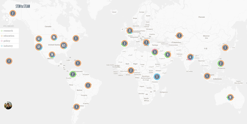
    So if you feel the same way, I would encourage you to add yourself and/or your company to the “STEM to STEAM map” that RISD has created. Click here to do that.

  • Do you know where you spend your time?

    Yesterday my friend Sachin Monga published a really great article on Medium called, 2014: My Year in Review. It was broken down into a few sections that included everything from his favorite blog posts of the year to all of the images he posted on Instagram. He called it “a stream of personal observations, data, and highlights for the year.”

    And it put my end of the year blog post to shame.

    One section that really stood out for me though was Places & Transit. Using a mobile app called Moves, Sachin extracted an incredible data set for where he physically spent his time and how he got around in 2014. I can’t believe I haven’t heard of this app yet – it’s totally in my wheelhouse. But I’m clearly late to the party. Facebook bought them in the first half of last year.

    The data set included how many hours he spent at home and at work. His top 3 most visited coffee shops. His top 5 most visited friends. How many nights he stayed in a hotel. His average daily commute time. And his total distance walked and cycled, among many other things. It was fascinating. I love data – especially when it was previously impossible or difficult to collect it.

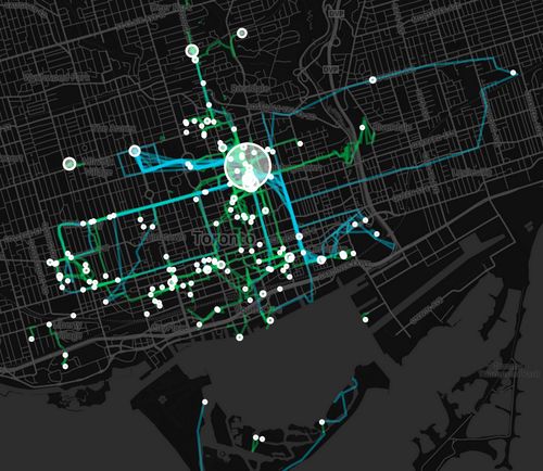
    He was also able to translate his data into a set of beautiful maps, showing where he spent his time and how he got around. Here is his personal map for Toronto. The larger the circle, the more often he was there. Blue lines are cycling. And green lines are walking.

    image

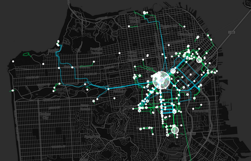
    And here’s San Francisco (where he now lives):

    image

    After reading his post, I immediately downloaded Moves. And I can’t wait to see how my personal map of Toronto will look like in a few weeks and months. Once I have enough data points, I’ll be sure to share it with you all here.

    In the interim, do you have any ideas for what this kind of data might be used for? I can certainly think of many. Let us know in the comment section below.

  • My identity crisis

    If you’re a regular reader of Architect This City, there are many things that you might know about me

    You might know that I was initially trained as an architect, but that I immediately transitioned into real estate development after grad school (where I studied both architecture and real estate).

    After becoming a real estate developer, you might know that I completed an MBA with a focus on innovation and entrepreneurship (which happened by default as a result of the electives I ended up being interested in).

    And finally, you might know, given the content of this blog and my startup history, that I have a significant interest in technology. More specifically though, you might know that my interest is in figuring out how technology will continue to infiltrate and impact “non-tech” industries such as real estate.

    But what you might not know is how I even ended up in architecture and real estate in the first place. Unlike a lot of people who seem to have grown up wanting to be an architect – perhaps because they had a relative who was one – I didn’t decide to study architecture until a bit later on.

    Growing up my primary interests were: art and computers.

    During high school, my art teachers used to tell my parents that I was going to be an artist. And my computer teachers used to tell my parents that I was going to be a computer geek – or maybe they said computer scientist.

    Maybe it had to do with timing and the emergence of the commercial internet in the 1990s, but computers sort of won out during that point in my life. I spent a lot of time building them from scratch, playing with software, and asking my mom not to pick up the phone because I was literally dialed-in to the internet.

    So when it came time to enrol in university, I fairly effortlessly decided on computer science. It just seemed to make sense. But after about a year I realized that it wasn’t for me. I didn’t love programming like my classmates did and the thought of doing it for a living scared me.

    At the same time, I felt like I needed to feed the artist in me. I wanted something both artistic and technical. So I decided to drop out of computer science and give architecture a try. It just seemed like the perfect marriage of my interests.

    I immediately fell in love with architecture. And I spent the next 7 years studying it across 2 degrees.

    But during that time, two things hit me. First, I came to the realization that real estate developers are the ones who really have the most say in terms of how our cities are built. And second, that technology was having a massive impact on business and life.

    This told me that design alone wasn’t going to be enough. I also needed to engross myself in real estate, finance, business, and technology. So that’s what I set out to do. And I really enjoyed it. On the technology side, it felt like I was coming full circle in a way.

    But today, I feel a bit like a 3 legged stool. There’s the design leg. The real estate/business leg. And the technology leg. And oftentimes I feel like life would be a lot simpler if I could just balance on one of those legs – instead of trying to stand on all three. But that’s simply not me.

    These are my passions and I need all of them to stand-up.

  • Pushing and pulling

    image

    Venture capitalist Chris Dixon recently published an interesting post called, Two eras of the internet: pull and push. In it, he describes two patterns that have emerged within the internet over the past decade and a half.

    Pull (2000s):

    Pull is when you are seeking information, usually an answer to a question. You want to know the closing time of a restaurant, the description of a hotel where you are thinking about staying, the details of an historical event you heard about, etc. You go to your computer and pull the information. The killer app for pulling information was Google.

    Push (2010s):

    Push is when you are using the internet in a more passive way and content comes to you. The killer app for push is social networks, the most popular being Facebook. Information is pushed from user to user via likes, shares, tweets, etc. People tend to push things they find funny, interesting, moving, outrageous, etc.

    Now let’s think about this for a second, because it’s a pretty significant change.

    Google’s mission is to organize the world’s information. And they have certainly made it easier for us to get the information we want. Instead of physically searching for something, you just type in a few keywords and it pops up. But, it still involves us deciding we want something and then pulling the information.

    What’s fascinating to me about push is the idea that content and information comes to you. And it’s one of the reasons that I’ve always found Foursquare more interesting than Yelp – even though Yelp is far more popular as a tool to help you find somewhere to eat, drink and so on.

    When I walk into a restaurant or bar now, oftentimes I’ll see a Foursquare notification popup on my phone showing me a tip that somebody has left: “Try the meatballs – they’re to die for”. I didn’t search for that. I didn’t ask for a recommendation. But Foursquare knew where I was and presented me with that information.

    Now, there are obviously potential downsides to constant interruption, but let’s focus here on the opportunities. How could these same principles to be applied to other industries such as, say, real estate?

    I think there’s a pull and push parallel.

    Today MLS operates in a way like a search engine for homes. You decide you might be interested in buying a home and so you go online and start pulling listings.

    Of course, the vast majority of people also work with a real estate agent. And in a way they’re kind of like your push. They get to know you, they figure out what you’re looking for, and then they push relevant listings and information to you.

    And maybe that’s why nobody has killed off real estate agents – despite the numerous attempts. Everybody has been focusing on new pull platforms (listing platforms) as opposed to a new push platform.

    Who knows.

    But I think it would be naive to think that these emerging push platforms won’t reach far beyond social media.

  • Barrels and ammunition

    A few weeks ago I watched a talk by Keith Rabois called, How to Operate. Keith is a venture capitalist with Khosla Ventures, the former COO of Square, and a member of the PayPal Mafia.

    The talk was primarily geared towards startups, but much of what he talked about could be applied to any organization where people are managed. So whether you’re an architect, real estate developer, or governmental organization, I bet you’ll find the lessons relevant.

    One in particular that stood out for me was the idea of barrels and ammunition.

    For a lot of organizations, the thought is often that by adding more people you’ll be able to increase output. More people = greater velocity. But Keith’s reasoning is that most people are actually ammunition. And just like in war, it doesn’t exclusively matter how much ammunition you have. You can only shoot through the number of barrels you have. Output depends on barrels.

    So who exactly are barrels?

    Barrels are the kind of people who can take something from idea all the way through to completion, while at the same time taking a group of people along with them. They are, in other words, your leaders.

    But, they are difficult to find.

    There are fewer barrels than ammunition. And, the culture of the organization itself will impact every person’s ability to be a barrel. Here’s how Keith puts it:

    Barrels are very difficult to find. But when you have them, give them lots of equity. Promote them, take them to dinner every week, because they are virtually irreplaceable because they are also very culturally specific. So a barrel at one company may not be a barrel at another company.

    That’s something for you to think about as you start your workweek.

    Image: Flickr

  • The MFA is the new MBA

    Harvard Business Review recently published a conversation between Roger Martin – who is the former dean of the Rotman School – and Tim Brown – who is CEO of the global design firm IDEO. The title of the talk is “Capitalism Needs Design Thinking.” But I decided to call this post something else after reading Roger say this:

    My friend Dan Pink argued in an HBR piece in 2004 that the MFA is the new MBA. I wrote to Dan to say that if that’s the case we have a problem because America pumps out a mere 1,500 MFAs a year versus 150,000 MBAs. Thirty MFAs per state per year is just a rounding error. This is one of the reasons I was so keen on transforming business education. It’s a huge infrastructure: 27% of all graduate students in America are in an MBA program. If they’re all being taught how to analyze things to death, that’s going to affect how they’ll shape the future of business.

    But what this conversation is really about is the future of democratic capitalism, which is why I think it’s a nice tie-in to yesterday’s Architect This City post about startups and inequality.

    I’m very worried about the fact that in America we’ve now gone 24 years without the median household income rising — it was the same in 2013 as it was in 1989. That’s unprecedented in American history. The longest that’s ever happened before is when it took just under 20 years to recover, after the Great Depression. This long period of stagnation has coincided with the top 1% of the economy doing spectacularly.

    And so while it’s easy to point fingers at the tech community and say that it’s to blame for rising income inequality, the reality, I think, is that there are other more fundamental issues that need addressing. Roger and Tim believe that design thinking can help. Here’s another great snippet from the former:

    I think the way that government generally works is to think, think, think, think, and then finally create legislation that brings about some change, and then they ignore their legislation and say okay, we’re finished with that. Then people go and figure out how to game that legislation, and the government doesn’t do anything about it. Whereas if they had a design view of it, they’d say when they passed a bill, that’s just the best idea we’ve got now, we have to go see how it works in practice, and then fix it. That’s just not the mentality.

    Technology is having a profound impact on the world. And it’s something that is very visible. But part of the challenge is that governments aren’t keeping up. They are almost never out in front.

    So when something new comes along, like Airbnb or Uber, the reaction is to just stop it. It doesn’t conform to the rules and regulations currently in place, and so it shouldn’t exist.

    But as Roger and Tim point out, maybe we need to look at our rules and regulations as simply part of an iterative process (like designers do). Because if we did that, maybe we’d be better equipped to transfer the benefits of innovation over to society as a whole.

    Image: HBR

  • Are startups causing inequality?

    Earlier this week Richard Florida published on article on CityLab talking about the relationship between tech innovation (in cities) and inequality. Specifically, the article deals with the correlation between venture capital investment and a variety of factors, such as monthly housing costs, wage and income inequality, and so on.

    The intent of the piece was to address the growing backlash against tech workers – in places like San Francisco – who have become the symbol for the growing gap between the rich and poor.

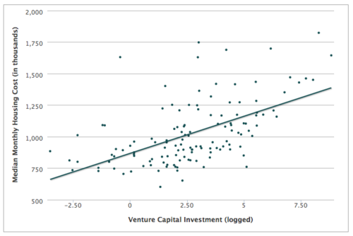
    The strongest correlation appears to exist between venture capital investment and housing costs. As the amount of venture capital goes up, so do housing costs – which probably shouldn’t surprise you. The rich start outbidding the poor for housing. Note: The two outlying dots at the top right, in the graph below, are Silicon Valley and San Francisco.

    image

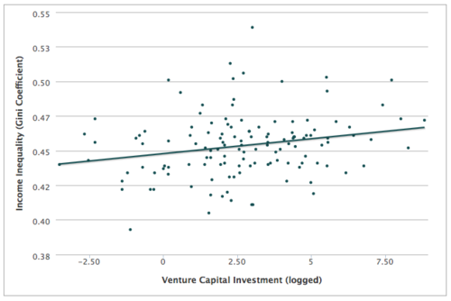
    But when it comes to inequality, the relationship isn’t so clear. For wage inequality, there seems to be a relationship. But for the broader income inequality measure, the relationship is fairly weak. Here’s the graph:

    image

    So this is not as black and white as it might seem. Regardless, Florida ends the piece with the following statement (that I think is spot on):

    It’s time to stop pointing fingers and get on with the far more important task of harnessing the urban tech revolution to create a new urban middle class and a more inclusive urbanism—one in which many more workers and residents can participate, and one from which many more can benefit.

    The answer is not to stop innovating. That would be counterproductive. We should be be encouraging innovation, but at the same time figuring out how best to harness it for society as a whole.

    Tomorrow, I’ll touch a bit more on how we might go about doing that. I have a post planned that I think will tie in really nicely to this discussion. So stay tuned.

  • Renovating Architect This City

    I’ve made a few changes around here. If you’re reading this post on the actual site (as opposed to via Tumblr, your email subscription, or some other feed) and you’re a regular reader, you might notice that I’ve completely redesigned the look and feel of Architect This City. If you can’t see it and want to take a look, click here.

    It’s something that I’ve been meaning to do for awhile now. And it’s because I haven’t been happy with how this blog showed up on mobile devices. It wasn’t responsive. That made ATC less enjoyable to read on your phone and it made it a bit of a pain to leave comments. And since almost 35% of readers are on mobile (and that number is only going to go up), it was time to make a change.

    This site now looks more or less the same whether you’re viewing it on your desktop or on your phone. I also made sure to make the font nice and big so it’s an easy read on mobile. I think it’s a big improvement. But I’d love to also get your feedback on the redesign. I hope you like it as well and I hope it leads to more frequent discussions in the comment section 🙂