Daily insights for city builders, delivered every morning at 6 AM ET. I’m Brandon Donnelly — a Toronto-based real estate developer and founder of Globizen. I’ve been writing here since 2013.

Tag: suburban

  • Net domestic migration is still pretty suburban

    For years, the data has been clear. Many Americans are moving from expensive cities, like Los Angeles, to less expensive metropolitan areas like Dallas-Fort Worth.

    But Wendell Cox’s recent article over at New Geography is a good reminder that these data sets can be limited. The US Census Bureau currently tracks domestic migration at the county level only. This can be a bit of a problem as counties vary dramatically in terms of geography and population.

    The New York metropolitan area, for example, is comprised of 25 different counties averaging about 750,000 residents. The Los Angeles metropolitan area, on the other hand, is compromised of two counties averaging about 6.6 million residents.

    These sorts of nuances become important when you’re trying to figure out things like whether people are moving to/from urban cores or the suburbs. Case in point: The San Diego metro area is compromised of a single county. When people move there, the data says nothing about how urban or suburban they might be.

    Dallas-Fort Worth is a lot easier to read. Since 2010, it has had the largest net domestic migration of any metro area in the US: +443,000 residents. But county data reveals that it is entirely suburban. The core (Dallas County) actually lost 57,000 people from 2010 to 2019. And this is not unique to the Dallas-Fort Worth area.

    Photo by Gabriel Tovar on Unsplash

  • Rightsizing in Kits Point

    Architect Michael Green’s new house in Kits Point, Vancouver was recently featured in the Globe and Mail. He and his family went from a 3,500 square foot home in the suburbs to a 1,500 square foot semi-detached home in the city, close to downtown. The house is simple, sparsely decorated, and about 13-feet wide.

    Here’s why he decided to do it: “I didn’t want to have to commute by car any more,” he says. “I wanted to be able to bike everywhere. I also wanted my kids to be able to bike everywhere. I wanted them to develop a sense of freedom, to have mobility, something too many kids don’t get these days.”

    As we all know, there is typically a very real trade-off in cities between space and location. The further you move out from the core (a generalization), the more affordable space usually comes. But at the same time, your transportation costs also increase — both directly and indirectly if you factor your time and your quality of life.

    Depending on how you value each of these items, you might be inclined to pursue more space or pursue more reasonable transportation costs. A 2,000 square foot reduction in space might seem like a lot. But if you’re heavily weighted toward freedom and mobility, as Green clearly is, it could be a perfectly rational decision.

    Photo: Ema Peter via the Globe and Mail

  • Driving distance between two adjacent homes

    I came across this tweet by Sean Galbraith last night. You will probably need to click through to see the full extent of the photos. It is a series of images showing two back-to-back houses. The lands touch one another. But if you were to drive from one house to the other, it would take you about 18 minutes because of the area’s road network. Approximately 7.1 miles.

    This, of course, is far from urban. It would take over two hours to walk this same distance (assuming an average walking speed of 1 mile every 18 minutes). If you’re an urbanist, this is surely galling to you. But I think it’s also important to remember that this is, at least partially, a result of a consumer preference for dead end streets that limit through traffic.

  • Shortage of cities

    Joe Cortright of City Observatory recently looked at “the myth of revealed preference for [the] suburbs.” In it, he cites the work of Jonathan Levine, who is the author of a 2006 book called, Zoned Out: Regulation, Markets, and Choices in Transportation and Metropolitan Land-Use.

    There’s an argument out there that, on average, people prefer the suburbs to urban neighborhoods because, well, more people in the US live in auto-oriented neighborhoods compared to urban ones. What Levine wanted to figure out was whether this was truly a result of consumer preference or simply a lack of urban neighborhoods – or a “shortage of cities” as Cortright calls it.

    To do this Levine examined two cities with very different urban fabrics: Boston and Atlanta. The idea was to take a city with lots of urban neighborhoods (Boston) and compare it to one with relatively few (Atlanta). 

    For his comparison, he classified all of the neighborhoods in both cities on a scale according to how urban they were. “A” meant very urban. And “E” meant sprawling/exurban. He then went out and interviewed residents, asking them about both the kind of housing they would ideally like to live in and how happy they were with their current housing. 

    What Levine discovered, among other things, was that in Boston – where about half of all housing fell into the top 3 most urban categories – about 83% of people with a strong preference for urban neighborhoods were also living in one. Whereas in Atlanta, just 48% of people with a strong for urban neighborhoods were living in one.

    Put differently, the study suggests that in cities with fewer urban neighborhoods, it is more difficult for people with a preference for that housing type to find and live in it, which makes intuitive sense. The spread between preference and reality widens, once again suggesting that this could be about supply rather than an issue of demand.

    Anecdotally, I have seen this phenomenon play out here in Toronto. I often hear people talk about the neighborhoods that they would ideally like to live in, if only they could find a reasonably priced home. (Low supply leads to upward pressure on pricing.) How aligned would you say you are with your ideal level of urban-ness? 

    For more on Levine’s work, head over to City Observatory.

  • The real reason we want entertaining spaces

    According to a recent study out of UCLA, which I discovered via this Curbed article, American families tend to spend most of their time at home in informal, rather than formal, spaces. That means more time in the kitchen and family room, as opposed to in the living room and formal dining room. 

    I’m sure this comes as no surprise to all of you. Was a study necessary? Maybe you even have plastic on the furniture in your formal rooms because, you know, they’re reserved for “entertaining.” The reason I mention this is because I thought it was funny how Kate Wagner describes this phenomenon in her Curbed article:

    The ironic inefficiency of hyper-exaggerated high-end entertaining spaces belies a truth: These spaces aren’t really designed for entertaining. They’re designed for impressing others. And not just impressing others: After all, it’s general politeness to compliment a host on their home no matter how impressive it is. The real goal, deeply embedded in these oversized, over-elaborate houses, is not for guests to say, “Oh wow, this is nice,” but to make them think, “Oh wow, this is nicer than what I have and now I feel jealous and insecure.” In true American irony, these giant “social” spaces (and McMansions in general) are birthed from a deeply antisocial sentiment: making others feel small. Considering that so often our guests are members of our own family adds another layer of darkness to the equation.

    For those of you who aren’t familiar with Kate Wagner, she is the founder of McMansion Hell, which is a hilarious website dedicated to blasting McMansions. A pejorative term for houses that privilege raw size and the appearance of wealth over quality. Now that you know that, I am sure the above blurb makes a lot of sense.

  • New York is the only US city with an urban core growing faster than the suburbs

    The latest data from the American Community Survey (2012 to 2016) has placed the suburban and exurban share of the US population (53 major metropolitan areas) at 85.5%. Back in 2000 this number was thought to be around 83.5%.

    Since 2010, automobile oriented suburbs and exurbs have also accounted for 90.5% of population growth. The US – and Canada would be no different – is by and large a suburban nation. And the data suggests this isn’t about to change.

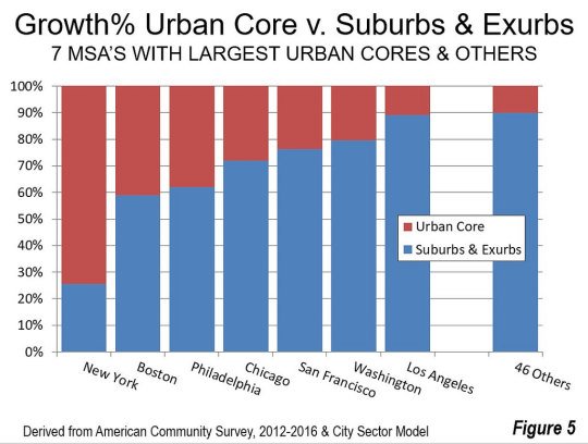
    The one exception is the New York metro area. From 2012 to 2016, 74% of its growth happened in the urban core. No other major metropolitan area in the US comes close to this sort of urbanity. Below is a chart from New Geography that shows you how NYC compares.

    All of the data for this post was also taken from New Geography.

  • The top 10 most suburban cities in America

    According to NewGeography, ~85% of the population in the 53 major metropolitan areas in the U.S. lives in the suburbs or the exurbs. (Data from 2011-2015.) And according to some definitions, a number of these cities could be classified as being 100% suburban.

    NewGeography recently looked at America’s most suburbanized cities using the “City Sector Model” of classification. Here’s generally how it works:

    1. Urban core-CBD: Employment density > 19,999 people per square mile
    2. Urban core-inner ring: Population density > 7,499 per square mile and > 19.9% transit/walk/bike modal split
    3. Earlier suburb: Not urban core or exurb, and median year house built before 1980
    4. Later suburb: Not urban core or exurb, and median year house built after 1979
    5. Exurb: Outside of 2010 principal urban area or under 250 people per square mile 

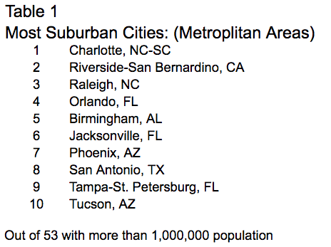
    Based on the above criteria, here are the top 10 most suburban cities in America:

    image

    All of these cities have virtually no urban core. To break the 10 way tie, they were simply sorted based on the size of their exurban population. To see all 53 metropolitan areas, click here.

  • Urban, suburban, and rural home prices in the U.S.

    Zillow.com recently published some research where they looked at U.S. home prices broken down according to location: urban, suburban, and rural.

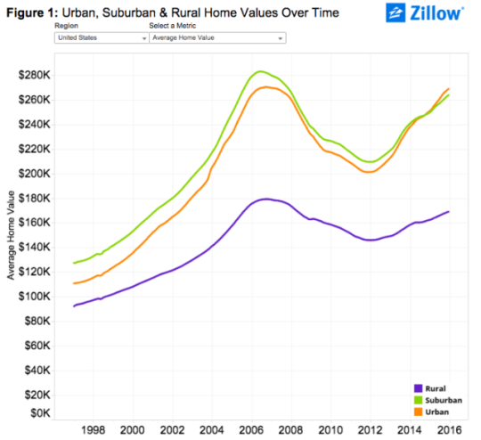
    Here’s what they found:

    image

    As you can see, urban homes across the U.S. largely trailed their suburban counterparts in terms of absolute value up until the end of 2014. At that point, urban homes then surpassed suburban homes for the first time in the last two decades. (I wonder if this is a first or there was another crossover point before the late 1990s.)

    But if you dig a little deeper and look at both the rate of appreciation and prices per square foot (as opposed to just absolute value), urban home prices appear even stronger. 

    Here’s a snippet from Zillow’s post:

    “Over the past five years (2010-2015), average urban home values have grown 28.4 percent, compared to 21.1 percent for suburban home values. In the past year alone, U.S. urban home values grew 7.5 percent, compared to 5.9 percent for suburban homes.

    On a per-square-foot-basis, homes in urban areas nationwide used to be worth roughly the same as suburban homes, before a gap started emerging in the late 1990s which has become progressively wider over the past roughly two decades. Currently the gap stands at 24.5 percent, with suburban homes valued at $156 per-square-foot and average U.S. urban homes worth $198 per-square-foot.”

    And here is that same chart showing per square foot prices:

    Everyone who reads this blog knows that there is a growing interest in urban centers. But if you look at the above charts for specific cities, there are still many cases where urban home prices are well below suburban ones. 

    To me, that serves as a reminder of the spikiness of this urban transformation, but also that it is likely still in its infancy. As recent as 20 years ago, Toronto largely didn’t believe that people would want to live downtown in modern apartments. Today we take that for granted.

    So even with all of the gushing about urban centers, I still think we are only just getting started when it comes to creating the great urban neighborhoods of the future.

  • Rethinking single family neighborhoods

    image

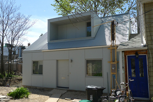
    Earlier this week a good friend of mine sent me a scanned article from this month’s issue of Urban Land Magazine called: Rethinking PADs–Private Accessory Dwellings. He said, I know you have a thing for PADs, so here you go. 

    PADs, or private accessory dwellings, is simply another term for nanny flat or laneway house. Whatever you want to call it, the concept is the same. It’s about taking a single family house and adding an additional dwelling onto that same lot. 

    In many cities around the world, this is not allowed. Each lot is to have only one dwelling unit. And that’s because the single family home – particularly in North America – has been considered sacrosanct.

    But as I’ve argued and demonstrated before, I think we’re on the cusp of this changing. Here’s a snippet from the Urban Land article (unfortunately, I don’t think the full article is available online):

    “If PADs can be added in appropriate scale and number, existing housing, zoned land, and current infrastructure could be efficiently used to increase housing supply and to stabilize and even reduce housing prices. Moreover, since PADs are by definition smaller than existing dwellings, they will attract both younger and older residents who will enrich the intergenerational composition of both urban and suburban communities.”

    I’m happy to see Urban Land (the magazine of the Urban Land Institute) giving this topic some air time. There are a number of social, economic, and environmental benefits to intensifying single family neighborhoods. And the most progressive cities in the world are already doing it.

    What is your city’s position on accessory dwellings? Toronto doesn’t support them. But there are instances where people have gotten them approved.

    Image: Kensington Market Laneway House, Toronto via Flickr

  • Pick one or the other

    Two days ago I posted a neat interactive map of carbon footprints across America. It was taken from an Atlantic Cities article. But in the same post, I questioned the (Atlantic Cities) article’s headline and main assertion that increasing population density won’t help to curb greenhouse gas emissions.

    This didn’t make sense to me.

    Well it turns out that the supporting research data was slightly misinterpreted. According to the Per Square Mile blog, the UC Berkeley study associated with the interactive map reveals a more nuanced relationship between population density and carbon emissions. It turns out that people who live in the middle of nowhere (rural residents) actually have fairly low carbon footprints. Even though they’re reliant on cars, they tend to drive and consume relatively little.

    And so initially, as population densities increase, so do carbon footprints. That is until it reaches about 3,000 people per square mile. At that point, carbon emissions start to drop off dramatically—roughly 35% on average from suburb to city.

    Below is a graph I found in the comment section of the original Atlantic Cities article that demonstrates this phenomenon. Population density is on the x-axis and carbon emissions are on the y-axis.

    image

    So here’s the big takeaway. If you’re looking to optimize around your carbon footprint, you need to pick a side: Either be urban or be rural. But don’t be somewhere in the middle. Don’t be suburban.