Daily insights for city builders, delivered every morning at 6 AM ET. I’m Brandon Donnelly — a Toronto-based real estate developer and founder of Globizen. I’ve been writing here since 2013.

Tag: streets

  • Red streetcar tracks

    A few months ago when I wrote about “Toronto’s great streets” I mentioned that Queens Quay West – while magnificent – has had its share of issues. Cyclists and pedestrians often find themselves battling for space. And drivers are consistently driving in the wrong places.

    Part of the problem, I think, is that the turning radii (among other things) are a bit atypical and unusual compared to the rest of the city. And so if you’re at all in mental autopilot, it can be fairly easy to make a wrong turn. You really have to be paying attention.

    Below is a screenshot from Google Street View showing the foot of Lower Spadina, looking east on Queens Quay West. If you’re making a left turn from the former onto the latter, you need to end up on the left (north) of the streetcar tracks (even though the tracks themselves might be directing you elsewhere).
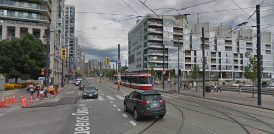
    There’s lots of signage telling you not to drive onto the tracks, but that hasn’t really been working. So the tracks were recently painted in bright red. You can see what that looks like here. Some people are still getting mixed up, but it’s certainly more noticeable.

    What I am wondering today is whether all of this signage and paint should be considered a symptom of poor design. In other words: Should good design require few instructions? Or, is this simply a normal part of iterative city building?

    What do you think?
  • Street-level intelligence and analytics

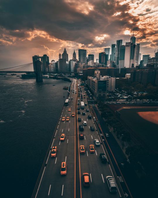
    I discovered a company yesterday called CARMERA, which just raised a $20 million Series B funding round. They call themselves a “real-time, street-level intelligence platform” and their flagship product, called Autonomous Map, provides HD maps and real-time navigation data to autonomous vehicles. That’s the way AVs work. They need maps like CARMERA’s to function. Here is an overview of what is supposedly the largest AV taxi service in the world. It is a partnership between CARMERA and Voyage.

    One of the interesting things about this product is that it is cleverly powered through another one of their products: a free fleet monitoring tool for commercial operators. So fleet managers use this service to keep track of their actual human drivers and, at the same time, CARMERA uses the vehicles to collect the data it needs for its Autonomous Map. They call it “pro-sourcing” the data (a play on crowdsourcing).

    It is perhaps a good example of “single user utility.” The product you’re making often has to be valuable to a single user before scale is reached. In this case, Autonomous Map would be a hard sell without a critical mass of pro-sourced data. It solves the perennial chicken-and-egg problem when creating new marketplaces.

    Finally, I think many of you will be interested to know that CARMERA has also announced a partnership with the New York City Department of Transportation. As part of this, the company will be handing over the data they have on pedestrian density analytics and real-time construction detection events. Part of their mission is to “automate cities” and better street analytics will certainly help to open up a new world of city building possibilities.

    Photo by Yeshi Kangrang on Unsplash

  • A tale of two cities

    image

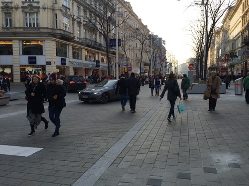
    Yesterday my friend Darren Davis out of Auckland introduced me to a 3-part blog series that he recently did with Andreas Lindinger out of Vienna, which looked at pedestrian zones and shared spaces across these two cities.

    The first post looks at the redesign of Vienna’s Mariahilferstraße (important shopping street that I’m somewhat glad I get to write and not try and pronounce). The second post looks at Auckland’s overall shared space program. And the third one offers a direct comparison between the two cities. The posts are all hosted on an interesting blog called Vienncouver (Vienna + Vancouver), which I am now following as of this morning.

    Compared to both Auckland and Vienna, Toronto is behind when it comes to pedestrian zones and shared spaces. So it’s interesting to see how other cities have managed to pull it off. It’s also further proof that you don’t have to be a warm climate city to have amazing public spaces.

    Image: Vienna via Vienncouver (notice the cars and pedestrians mixed in)

  • How does your city address its streets — literally?

    image

    Depending on where you live, street numbering may not be something you’ve given a lot of thought to. In Canada, and in many other places in the world, the convention is usually to start on one end of the street and count up – with even numbers on one side and odd numbers on the other.

    In many cities in the US, they’re even more rational. The streets themselves are numbered and the addresses indicate location. For example in Philadelphia, where I used to live, if you were going to let’s say 1750 Walnut Street, you would know that it’s between the cross streets of 17th Street and 18th Street. It’s a kind of hyper-rational approach, which lets you know precisely the number of blocks you need to go to get to your destination.

    But not all countries and cities are this rational.

    According to this Economist article – which a friend of mine forwarded me over the weekend – Costa Rica actually had no street numbering system until about 2012. Which means that directions were all based on landmarks: “100 metres south of the McDonald’s.” It seems almost hard to believe. But I guess that’s why ¼ of all mail was getting lost.

    Of course, there are also lots of variations in between these two extremes.

    Japan numbers its buildings, but they’re often clustered together in blocks and have no particular order or logic to them. Brasilia (Brazil) also assigns numbers based on sectors, quadrants, and blocks. And in Ireland, where I also used to live, they actually never adopted postal/zip codes. They’re one of the few developed countries in the world not to do that – though it’s coming next year.

    If your city or country has a unique numbering system or you’ve come across one in your travels, I would love to hear from you in the comment section below.

    There are obviously practical reasons to adopt an easy to understand numbering system. People need to be able to figure out where they’re going. But I would also imagine that there are spatial implications to the way you number and the way you organize your city.

    Image: Flickr

  • Dimensioning pedestrian happiness

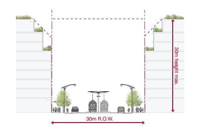
    The area that stretches between the property line on one side of a street and the property line on the other side of a street is called a public right-of-way here in Toronto. It may be called something different in other cities and countries.

    In the example below (taken from Toronto’s Avenues & Mid-Rise Buildings Study), it includes the sidewalks, the car lanes, and the streetcar lanes. But it could also include other public elements. In this instance, the buildings on either side of the street are assumed to be built right up against their property lines.

    ROWs obviously serve an important public function. But their size also has important urban design implications. As a pedestrian, it feels different to walk on a narrow street than it does on a broad street.

    The width of a ROW can also be used to inform what the preferred height of the buildings along it should be. In the example above, they’re talking about a 1:1 relationship between the width of the ROW and the preferred height of the buildings.

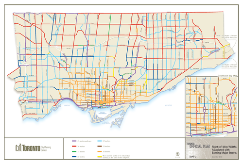
    Given their importance, I thought it would be interesting to share this map of Toronto (dated 2010) showing ROW sizing throughout the city. The mustard colored lines in the core of the city represent 20 metres, the red lines 36 metres, and the purple lines 45 metres or more. The rest of the colors fall somewhere in-between. For the most part, the purple lines represent highways, although there are a few other instances of purple.

    What’s interesting – but not surprising – to see is how we basically kept expanding the size of our ROWs as Toronto grew outwards. This was obviously to make more room for cars on the road.

    But the other, perhaps more interesting thing about this map, is that it could also serve as a guide to pedestrian happiness. The mustard/yellow lines are where it’s most enjoyable to walk. And the red and purple lines are where it’s least enjoyable to walk.

    If you’re from Toronto, give this framework a try and see if it holds true.

  • What to do when a car is blocking your bike lane

    I was out for a bike ride last night and, on my way home, I decided to try out the new dedicated bike lane on Adelaide Street. Usually I would take King Street, but it was completely full because of Caribana parties.

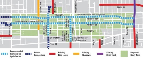
    For those of you who may not be aware, the city of Toronto is currently piloting two dedicated bike lanes on Adelaide Street and Richmond Street in the downtown core. Both streets are one-way and because the lanes were so big to begin with (highway-like spacing), I’m told that these new bike lanes didn’t even eat up a driving lane.

    Here’s a map of the pilot area:

    image

    Given that dedicated bike lanes are a scarce resource here in Toronto, I have to say that it was rather luxurious having my own piece of road. And because there’s no longer any fear of parked car doors swinging open, I was able to ride a lot faster than I normally would. 

    But as my friend Evgeny pointed out earlier this week, there’s a big difference between dedicated and grade separated bike lanes. Indeed, on my trip from Bathurst Street to Church Street last night, I encountered 3 cars parked in my lane.

    //platform.twitter.com/widgets.js

    So, I hope that these bike lanes become a permanent fixture downtown, but that the city makes them grade-separated. I’m sure people will use them. At the same time, I think they could also act as a catalyst for more pedestrian life along both of these streets.

    If you haven’t yet tried them out, I would encourage you to do so. The city is tracking usage and so you would be supporting the cause. And if there’s anybody parked in your lane, below is one way to handle it. It’s a video by Casey Neistat out of New York. If you can’t see it below, click here.

    [youtube https://www.youtube.com/watch?v=bzE-IMaegzQ?rel=0]