Daily insights for city builders, delivered every morning at 6 AM ET. I’m Brandon Donnelly — a Toronto-based real estate developer and founder of Globizen. I’ve been writing here since 2013.

Tag: street grid

  • Blocks and superblocks in Barcelona and Salt Lake City

    Let’s continue with our theme of city blocks and talk about another city with a noteworthy street grid: Barcelona. Up until the middle of the 19th century, Barcelona was a tiny medieval city hemmed in by 6 km of walls and totalling just over 2 square kilometers. If you look at a map of the city today, it’s pretty easy to see where this was:
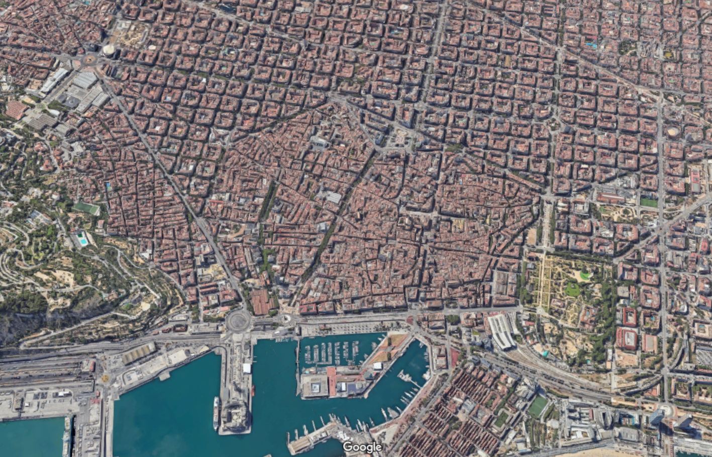
    This was of course done for military purposes. Barcelona’s medieval walls helped the city resist siege after siege. But the result was also overcrowding, unsanitary conditions, and a generally low life expectancy. So after much debate, it was eventually decided that the walls would need to come down and that the city would need to expand outward.

    This then raised the question: how should it be done?

    Enter a civil engineer named Ildefons Cerdà. Created in 1860, the Cerdá Plan for Barcelona was a continuous grid of blocks intended to guide the future growth of the city, similar to what the Commissioners’ Plan did for Manhattan. The blocks measured exactly 113.3 by 113.3 meters and each was to have a central open space of at least 800 square meters.

    In his original plan, the streets were to be 35 meters wide. But supposedly these were narrowed to no more than 20 to 30 meters due to criticism from the public. Wide streets and more lanes were, I guess, not seen as a benefit in the second half of the 19th century. Either this, or landowners simply wanted bigger buildings.

    The Cerdá Plan got approved in 1860 and, today, the city looks like this:

    One particularly unique feature of this plan was that the blocks all had/have chamfered corners. This improved visibility at the intersections, as well as created opportunities for public spaces and other uses. For better or for worse, today, you’ll find parking for cars and scooters, bike share stations, ramps leading to underground garages, patios, and more.

    The heights of the buildings on each block were also intended to be capped at a consistent height. But even with relatively few tall buildings, the Cerdà Plan led to one of the densest cities in Europe. Today, it is also viewed as a highly livable and desirable city. Hence why the city announced a total ban on short-term rentals. Too popular.

    Now for a comparison. Last week we spoke about Salt Lake City’s large city blocks (here and here). And so for fun, here’s what these blocks would look like on top of Barcelona:
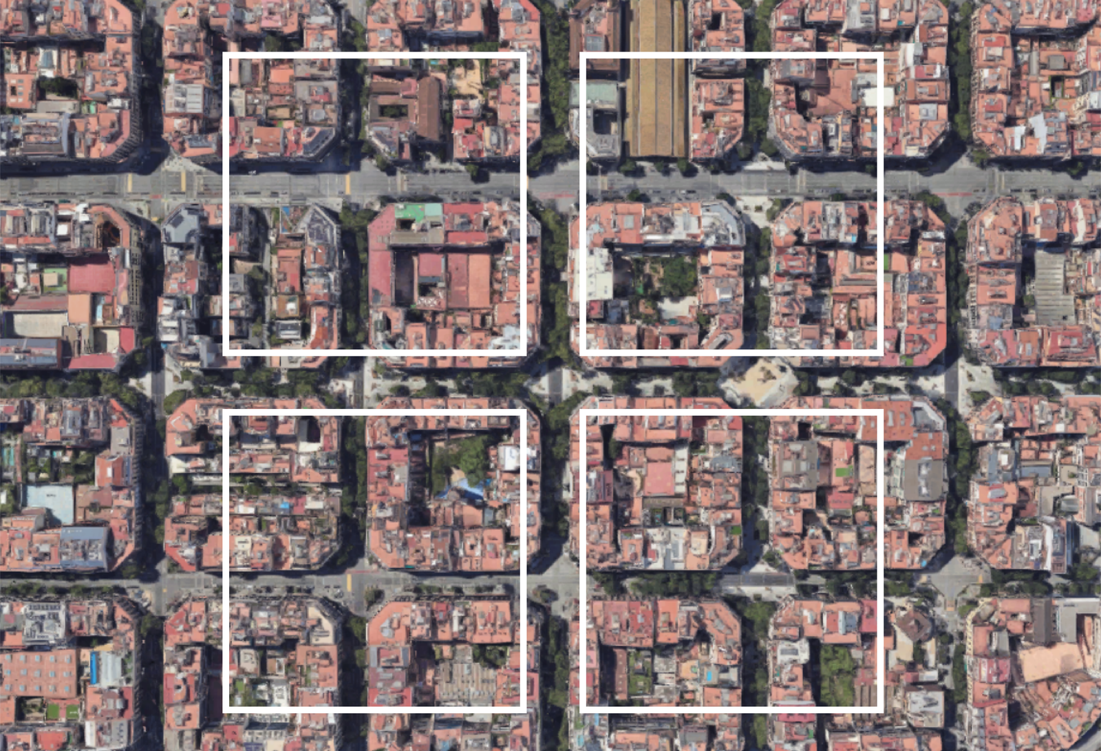
    The most obvious takeaway is that Salt Lake City has larger city blocks than Barcelona, and that’s one reason why, objectively, Barcelona is more walkable and urban than SLC. But I think you could also view this graphic as a tremendous opportunity.

    Barcelona is in the midst of rethinking its urban fabric around something called “superblocks.” The idea here is to cluster blocks together and then concentrate transit and vehicular traffic along its edges, creating a more pedestrian-focused center. For example, in its largest form, a superblock might be a 3 x 3 grid, creating a grouping of 9 city blocks.

    But it doesn’t necessarily need to be a 3 x 3 grid. Other permutations are possible and the city plans to eventually introduce over 500 of them.

    The first superblock was implemented in 2017 and, not surprisingly, it improved air quality, increased quietness, and led to a significant decrease in car usage (-92%). Interestingly enough, it only led to a moderate increase in car traffic on surrounding streets (+3%). Traffic can be a funny thing.

    Creating superblocks out of smaller blocks is naturally easier than the opposite. You have an existing grid to work with. But there’s no reason that the opposite can’t also be done. And I think that’s one way to look at Salt Lake City’s street grid. It already has its superblocks. Now it’s just a question of creating all of its smaller blocks.

  • Big blocks and walkability

    Conventional planning wisdom tells us that smaller city blocks are generally preferable to larger city blocks. They make for more interesting walks (which can change our perception of distance) and they improve overall connectivity. This is why you’ll often hear planners advocate for things like “mid-block connections.” It is a way of creating the feeling of smaller blocks.

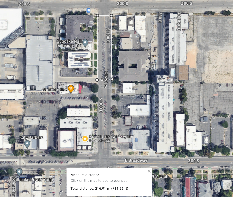
    Salt Lake City, as we have talked about, is the opposite of this. Its blocks measure 660 feet x 660 feet (call it 200m x 200m for those of us more accustomed to using the international standard for measuring things). This means that if you were to walk only 2 blocks (inclusive of 2 streets), your walk would be close to 500m, which is a commonly used walking/transit radius.

    Things get a bit tricker when you’re not walking in a straight line. For example, if you found yourself wanting to cross a street somewhere in the middle of a block — and you wanted to obey all traffic safety rules and not jaywalk — you would need to walk over 200m just to get to the opposite side. So basically a whole other block.

    There are also instances where even this street grid gets interrupted. This past weekend, I spent an evening walking to and from dinner on Main Street. And at one point, I got caught trying to cross the convention center (which occupies 3 blocks). I guess I could have tried to cut through, but I walked around, which added 2 additional blocks (~600m in total).

    Thankfully, SLC also has many instances of new mid-block streets/connections, road diets, internal laneways, and enhanced center medians, among many other things. I mean, here are some plans to turn Main Street into a pedestrian promenade. All of these interventions are an effort to soften the city’s underlying block structure, which we know tends to be indelible in cities.

  • How Gunter’s chain forever changed our cities


    In 1620, an Englishman by the name of Edmund Gunter invented a land surveying device known as Gunter’s chain. As the name suggests, it was an actual chain (see above). Each chain contained 100 links and, when fully extended, it measured 66 feet.

    This was a monumental innovation as it greatly simplified land surveying and made it a lot easier to measure out acres — especially if you maybe weren’t great with math. So it is perhaps no surprise that this simple device forever changed our cities.

    But first, here’s the only math you need to know:

    Number of chains x number of chains / 10 = number of acres

    For example:

    A lot measuring 66 feet by 66 feet would mean it has an area of 4,356 square feet, or 0.1 acres (1 acre = 43,560 square feet). It would also mean that this lot measures 1 chain by 1 chain, or 1 square chain. Take 1 square chain and divide it by 10, and you arrive at the same 0.1 acres.

    Similarly, a lot measuring 660 feet by 660 feet would mean it has an area of 435,600 square feet, or 10 acres. Using Gunter’s chain, this lot is 10 chains by 10 chains, which equals 100 square chains. Divide 100 square chains by 10 and you arrive at the same 10 acres.

    Put differently, 1 acre equals 10 square chains in Gunter’s system.

    Because of its simplicity and utility, the chain became a statutory unit of measurement in England by the 1670s. And as a result, it spread throughout the British Empire, meaning it started to influence how new cities were being planned and laid out.

    Let’s look at the example of Salt Lake City.

    We have spoken before about the city’s famously large blocks. They have the dubious distinction of being the largest in the US. But what you may not have noticed is that the typical SLC block measures exactly 660 feet x 660 feet. Its typical streets are also 132 feet wide.

    This is because of Gunter’s chain. These are 10-chain x 10-chain blocks and 2-chain streets.

    The same is true of other cities. Looking on the other end of the spectrum, Portland’s compact street grid is comprised of blocks that measure 198 feet x 198 feet. These are, in other words, 3-chain blocks. Its typical streets are also 33 feet wide. So half-chain streets.

    Units of measurement have a lasting way of influencing how we plan and design things. This is true at small scales and it’s also true of our cities. In tomorrow’s post, we’ll look more closely at Salt Lake City’s street grid and what it does to walkability.

    Image: National Museum of American History

  • Salt Lake City’s urban street grid

    Salt Lake City is not a walking city. The blocks are too big (660 feet x 660 feet) and the streets are too wide (132 feet) for that. This has translated into many of the streets have upwards of 6 lanes. To put this into further context, here is a block comparison chart from 99% Invisible:

    In the past, I have called this inheritance one of the greatest city building challenges. Because once you’ve designed a city around the car, it can be hard to move away from that. But as I have also said in the past, there are, of course, lots of things that can be done to make a place more hospitable to pedestrians.

    What is also interesting is that, according to 99% Invisible, the original intent for Salt Lake City’s urban grid was not for its large 660 x 660 blocks to serve as a rigid and immutable plan for the city. The intent was that its large blocks would be further subdivided into smaller blocks as the city grew and developed.

    Other than maybe a few examples, this never happened. Salt Lake City’s large blocks remain a defining characteristic of the city. But who is to say it’s too late for change?

  • The Hess triangle

    A friend of mine recently shared this Twitter thread with me. It is by Chaz Hutton. I didn’t know who Chaz was before I read the thread. But I now know that he draws things, sometimes for the New Yorker.

    Chaz’s Twitter thread covers the history behind what was once believed to be the smallest plot of land in New York City. He also positions the story as the “perfect embodiment of New York’s attitude.” Guess what the means.

    The story is about the isosceles triangle pictured above, measuring 25-1/2″ at its base and 27-1/2″ along its sides. It is known as the Hess triangle and it reads: “Property of the Hess Estate which has never been dedicated for public purposes.“

    Click here for the full story.

    Image: Chaz Hutton

  • What’s in an address?

    One of the small things that I liked about living in Philadelphia was the rational way in which street addresses tended to work.

    Here’s an example. 

    Let’s say you wanted to go to Brooks Brothers in Center City and you discovered that the address was 1513 Walnut Street (which it is). 

    By looking at the first two numbers, you would immediately know that the store sits between 15th Street and 16th Street on Walnut.

    If the address you were given was 1601 Walnut Street, you would know that your destination is now between 16th Street and 17th Street, but probably right at 16th.

    You would also know that the numbered streets run north-south and the streets named after trees run east-west. (Of course, not all of the east-west streets are named after trees.)

    No need to pull up the Google machine.

    All of this stems from William Penn’s incredibly rational 17th century grid plan for the city – one of the first examples in North America.

    If you’re interested in grids, you may also enjoy this post from last year: The spatiotemporal hierarchy of urban form.

    Photo by Jay Dantinne on Unsplash

  • U.S. street grids compared

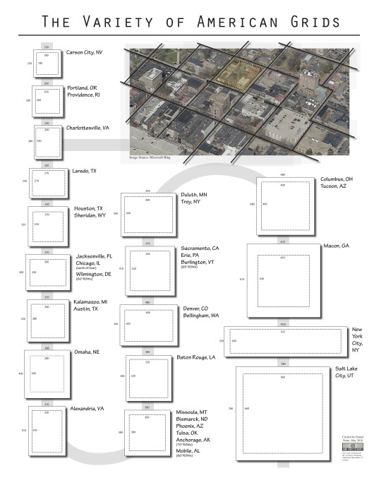
    I like this comparison of street grids that Daniel Nairn prepared back in 2010:

    There’s huge variation here. On the one end you have cities like Carson City, Portland, and Providence, which have small blocks (180′ x 180′ and 200′ x 200′). And on the other end you have cities like Salt Lake City, which have massive blocks (660′ x 660′). 

    This variation creates very different experiences for both pedestrians and drivers. It is widely understood that small blocks are better for walking, which is perhaps why Salt Lake City is known as a driving city. (I just learned that they have “crosswalk flags” to help pedestrians safely cross the street. What does that tell you?)

    In the case of New York – with its irregular rectangular blocks – it is arguably one of the reasons why the avenues (short side of the rectangle) have such a different feel than the streets (long side of the rectangle). Walking north-south is more enjoyable than walking east-west.

    All of this is even more interesting in the context of the point I made in this post: once these urban grids get laid out, they’re pretty sticky. That has far reaching implications.

  • The new Regent Park

    Yesterday morning I went for a swim at the new Regent Park Aquatic Centre. I used to swim regularly when I was in grad school in the US, but it fell off when I moved back to Toronto and there wasn’t a convenient place for me to walk to. Having to drive to a gym or to a pool can really cut hurt how often you’re able to go.

    In any case, the pool was fantastic. On the west side of it are glass sliding doors that face the park. And since yesterday was such a beautiful day, they were all open while everyone was swimming lanes. The wooden ceiling also gives the space a nice, warm feel.

    The biggest surprise for me though was the universal change rooms. I had never been in a co-ed change room before – or one that was completely open and visible to the pool (there are small private rooms so you can actually change). For families, it makes a lot of sense. Everyone can go in together and it’s easy to watch your kids in the pool from within the change room.

    After my swim, I rode my bike around Regent Park and tweeted this out:

    What’s happening in Regent Park is incredibly exciting. To me, it feels like a return to the fundamentals of city building. They’ve reconnected the old street grid – which had previously been removed to create the old “towers in a park” scheme – and they’re clearly working towards a proper urban neighborhood with retail at grade and buildings pushed right up against the street.

    A big measure of success, though, will be how animated the streets become and how well the retail does. Because all of that isn’t quite there yet. But we’re on our way. And already I feel like we’re about to forget what the old Regent Park used to be like. Toronto may have lived with that neighborhood for over 60 years, but future generations will barely know it existed.

    Image: Shaigil

    //platform.twitter.com/widgets.js

  • Understanding the radius of demand for transit

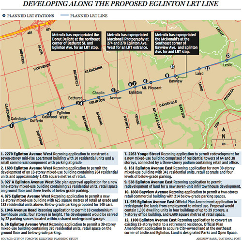
    Last week The National Post published an article talking about Toronto’s Crosstown LRT and how it’s spurring a wave of development all along Eglinton Avenue. Below is a map, taken from that article, showcasing some of the developments that are currently in the pipeline and awaiting the Crosstown’s opening date of 2020.

    image

    Not surprisingly, developers like transit investment. But more specifically, they like fixed track transit investment. Rarely do new bus routes elicit the same sort of response that you’re seeing above. And that’s because fixed track investment has permanence. If you’re going to go long on an area, you want certainty.

    As the Crosstown tunnel boring machines move across midtown Toronto, I thought it would be interesting to look at a transit concept that I first learned about through Jarrett Walker’s Human Transit blog. It’s called: the radius of demand

    One of things that transportation planners look at when designing and building a new line is the spacing of stops. Typically, as you move from buses all the way up to subways, the spacing between stops and stations increases. Spacing is always a bit of a trade off though, because more stops means easier access for riders, but it also means slower overall service. Somewhat famously, Paris designed its metro system so that you’re rarely more than 500 meters away from a station. 

    Once you have your station locations, it’s quite common to then draw a radius around each stop to simulate the catchment area. In other words: How much of the city can I service with this station and how far will people be willing to walk in order to get there? However, this distance, which is the radius of the circle, usually depends on the type of transit. Oftentimes people are willing to walk further in order to get to faster transit service.

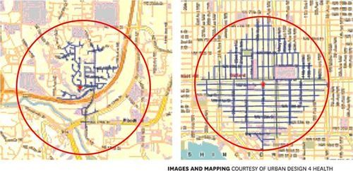
    But what’s most interesting about this radius of demand is that it’s entirely dependent on the fabric of the city. Take for example, the following two maps from Seattle, which I have taken from Walker’s blog. On the left is a suburban setting and on the right is a downtown setting. In both cases, the red circle represents a 1 km radius.

    image

    Now, if humans could fly over barriers, such as highways, and every Seattle resident was willing to fly exactly 1 km to a transit station, these two radiuses of demand would be perfectly accurate. But since that’s not the case, we instead need to look at what actually represents a 1 km walk – those are the blue lines in each image.

    Because once you do that, you realize that the cul-de-sacs and highways on the left make it impossible for most of that radius of demand to actually walk to the station in under 1 km. So the catchment area actually becomes much smaller. On the other hand, if you look at the image on the right, you’ll see that the tried and true city grid is actually remarkably efficient for walking. Almost all of the circle is serviced.

    So as the Eglinton Crosstown LRT makes its way through the center of Toronto, I think it’s important to keep in mind that it’ll be cutting through quite a few different kinds of street grids. Some of them will be highly conducive to transit usage and others not as much. And in many ways, this is one of the greatest challenges of transit investment. The track itself is only one part of the puzzle.

    That’s why the City of Toronto is also undertaking a planning exercise called Eglinton Connects. Its intent is to leverage the opportunities, as well as address the challenges, that will result from Metrolinx’s Crosstown LRT. If you’re interested in the future of Eglinton Avenue, you should consider getting involved. Oftentimes it’s only the critics that speak up. But that’s not the best way to build anything.

  • bijan:

    Bernal Heights, San Francisco