Daily insights for city builders, delivered every morning at 6 AM ET. I’m Brandon Donnelly — a Toronto-based real estate developer and founder of Globizen. I’ve been writing here since 2013.

Tag: statscan

  • Toward smaller condominium apartments

    Statistics Canada recently published some data (from 2022) looking at investors in the condominium apartment market. Here is what they believe to be the share of condominium apartments used as investment properties in Ontario’s 10 largest census metropolitan areas:

    It’s worth noting that this is after excluding condominium buildings where every single suite is owned by a single investor. This is/was most prevalent in London, and it’s the result of there being property tax benefits to registering a condominium (individual unit assessments), even though for all intents and purposes it’s a rental building (building in its entirety assessed).

    The article goes on to rightly suggest that the prevalence of investors, and the way that condominiums are financed, could be leading to the construction of more buildings with smaller suites. Here’s the proportion of new condominium apartments under 600 square feet by period of construction:

    The unsurprising takeaway is that condominium suites have gotten smaller. In the 1990s, the average condominium apartment built in the Toronto CMA was 947 square feet. This is compared to 640 square feet after 2016. And the same thing happened in Vancouver, which went from an average of 912 square feet to 790 square feet.

    Investor preferences certainly have something to do with this. But what the article doesn’t specifically mention is that this phenomenon is also a direct response to rising build costs: making suites smaller was how the market tried to maintain some level of affordability. Put differently, imagine how expensive new condominiums would be if the average size was still 947 square feet.

    But there are obviously limits to this. I was with one of our architects the other week and he made an interesting comment to me. He said, “Brandon, before when build costs used to go up and things got less affordable for consumers, we could just make the suites smaller to offset the impacts. But I don’t see how we can go any smaller now. We’ve reached the limit.”

    This is one of the reasons why I think this downturn is going to ultimately be a good thing for Canada’s housing markets. It’s a reset. It’s forcing everyone out of complacency and, hopefully, it means that when the next cycle begins we’ll be starting from a better foundation.

  • Comparing the weekly earnings of Canada’s visible minorities to white people

    We just finished up three days of snowboarding and skiing in Tremblant, Quebec and we’re now in Montreal closing out the long weekend. I am arguably Toronto’s greatest fan and supporter, but I continue to admit that Montreal is the coolest city in Canada.

    In other news, Theresa Qiu and Grant Schellenberg recently authored a Statistics Canada report looking at the weekly earnings of visible minorities and white people across the country. The study focuses on Canadian-born individuals aged 25 to 44 who were gainfully employed and making money in 2015.

    The reason why they isolated the study to Canadian-born visible minorities is that they wanted to eliminate the noise around new immigrants who may be struggling with the language(s), the recognition of their foreign credentials, or some other variable.

    In this case, every individual that factors into the study was born in Canada and, in theory, had access to similar sorts of opportunities. Of course, we know this isn’t always the case, but it’s an attempt an equal baseline.

    The findings are pretty interesting.

    Korean, Japanese, and South Asian men all tend to earn more than white males (which formed the baseline for the study). More than 60% of Chinese and Korean men also have a bachelor’s degree or higher, whereas only 24% of white males are in the same position.

    This is an important data point because we know that economic outcomes tend be positively correlated with educational attainment. The benefits of education also tend to compound later in life and this study only focuses on people aged 25 to 44. So the spreads could widen.

    One the factors that is surely influencing the above findings is that visible minorities are overwhelmingly urban. About 60% of visible minorities in Canada live in just three cities: Toronto, Montreal, and Vancouver. This compares to only 27% of white people.

    Again, an important data point given that people in big cities tend to earn more than those in smaller communities.

    For the full study, click here.

  • Canada’s national net worth spiked largely because of home prices

    Here are some interesting figures from a recent Statistics Canada article about Canada’s national net worth.

    In the first quarter of this year, Canada’s national net worth increased by over $1 trillion or 7.7% to reach nearly $15 trillion. This is, as I understand it, record-breaking. National net worth is defined as the sum of national wealth and Canada’s net foreign asset position, the latter of which is assets that Canada owns abroad, minus the value of any domestic assets owned by foreigners. Most of the increase this past quarter was in national wealth.

    Here is a chart that speaks to this (quarterly change in national net worth by component). Again, the light blue is national wealth. It is the biggest bar.

    On a per capita basis, which is much easier to contextualize, national net worth rose from $365,184 to $392,496.

    The other metric that is up is household savings. We’ve talked about this before on the blog, but check out this chart. In the first quarter of this year, it was 13.1%. And at the beginning of the pandemic, back in Q2-2020, it was 27.4%. I believe these figures represent the percentage of after-tax disposable income that is saved. Either way, a double digit savings rate is not typical for Canadians.

    So what is driving this increase in national wealth? A big part of it is the value of residential real estate, which increased 9.4% in the first quarter. StatsCan is calling this “unprecedented” but I don’t know how far back they are looking to make this claim.

    Because of this, increases in net worth have been, not surprisingly, unequally felt. For households that own their home, net worth increased by over $730 billion last quarter. For households that rent their home, net worth increased by approximately $43 billion. On a per household basis, this translates into net worth increases of approximately $73,000 and $8,000, respectively.

    This is a meaningful spread.

    For the full Statistics Canada article, click here.

  • How many households in Canada live in a condominium?

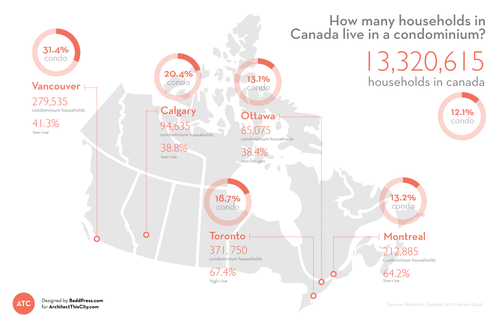
    Click here to zoom in / download a copy

    I’ve been meaning to introduce infographics and diagrams into my posts at ATC for quite some time now, so I’m excited to introduce the first one: How many households in Canada live in a condominium? I hope to make this a regular feature.

    While a lot of the new development happening in Canada is condominium – particularly in cities like Toronto and Vancouver – the vast majority of households in Canada still live in non-condominium dwellings. Only 12.1% of households are condominium households, which could be high-rise, low-rise, row-housing, or other, according to Statistics Canada.

    Perhaps not surprisingly, the Vancouver CMA has the highest percentage of condominium households at 31.4%. I would have expected Toronto to come second, but Calgary (20.4%) actually takes that position (probably) due to an abundance of low-rise condominiums (38.8% of all condos in the CMA). However, Toronto has, by far, the highest percentage of high-rise condominium households at 67.4%. This isn’t surprising to me.

    All of the data for this infographic was taken from Statistics Canada and the total number of households in each Census Metropolitan Area (CMA) was assumed to be “occupied by usual residents.” StatsCan defines this as households that are permanent as opposed to ones that could be second homes and so on.

    I hope you like the first ATC infographic.