Daily insights for city builders, delivered every morning at 6 AM ET. I’m Brandon Donnelly — a Toronto-based real estate developer and founder of Globizen. I’ve been writing here since 2013.

Tag: south korea

  • Blue lights on train platforms

    Sadly, Japan has one of the higher suicide rates in the world. According to the World Health Organization, the rate from 2000 to 2016 was about 18.5 deaths per 100,000. The only country in Asia with a higher rate is South Korea. They are at 26.9 deaths per 100,000 (an alarming figure). For comparison, Canada and the US are at 12.5 and 15.3, respectively, which also seem rather high to me.

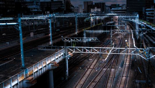
    I was intrigued to learn today that one of the ways that Japan has been trying to combat this high figure is by installing blue LED lamps on some of its railway platforms. Blue lights have been proven to have a calming effect (compared to white light). And since jumping in front of a train is unfortunately a common suicide method, blue lights were thought to maybe be a cost effective alternative to platform screen doors.

    The first blue station lights were installed on Tokyo’s Yamanote line in 2009. And according to this 2013 study – which looked at the possible impact across 71 train stations in Japan – the introduction of blue lights actually resulted in an 84% decrease in the number of suicides. Further studies also showed that there were no corresponding increases at other non-blue light stations. 

    It is an interesting example of “nudge theory”, but does it get at the root of the problem?

    Photo by Athena Lam on Unsplash
  • Firm Profile: APOLLO Architects & Associates

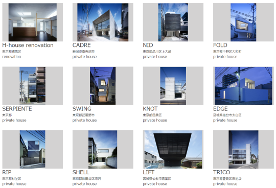
    This afternoon my friend Gabriel, of Gabriel Fain Architects, sent me the work of APOLLO Architects & Associates. They are based in Japan and South Korea. Here is a preview of some of their “private houses”:

    There is a lot that I love about these homes. 

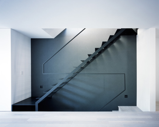
    I love their simplicity. Look at this handrail detail. Nothing more than what is absolutely necessary.

    I love their modesty. Many of the above homes hover around 150 square meters and many of them are much much smaller. 

    I love that each project’s description starts by talking about the owners and the site conditions, signaling that each home represents an individual response tailored to both the occupants and the context.

    And I love that many of these homes have been built on unthinkably small parcels of land in dense urban settings; parcels that would be dismissed as entirely useless in other parts of the world. 

    The site area for this home is 46.53 square meters and the building’s footprint is 36.93 square meters.

    Of course the Japanese housing market is a unique place. It’s worth pointing that out

    But as I browsed through what are effectively custom single family homes, I couldn’t help but be reminded that there’s a fine line between need and want.

    Small can be very beautiful. But small is also subjective.

  • The Korean Peninsula

    I just spent the last 7 minutes listening to this brief historical overview of Seoul by The Urbanist, while I bounced around the city on Google Street View, admiring the coverage of their transit network and the density of their low-rise neighborhoods. 

    I love Street View and I love using it to explore cities.

    One of the things I liked about The Urbanist episode –  beyond it being a good soundtrack while I explored – is that it talks, albeit briefly, about why Seoul is located where it is today. 

    I am always curious about this when it comes to cities. I mean, who was it that decided, yup, this is going to be the spot. Because it’s generally a pretty sticky decision once it is made.

    You may also find this 2014 NASA photograph of the Korean Peninsula interesting. The nighttime sky renders up a pretty stark contrast between North Korea and South Korea.

    According to NASA, per capita power consumption in North Korea and South Korea is 739 kilowatt hours and 10,161 kilowatt hours, respectively. That’s why the satellite photo looks the way it does.

  • What’s your favorite Olympic winter sport?

    The 2018 Winter Olympics start this Friday, February 9 in PyeongChang, South Korea. Unlike the past couple of winter games, which struggled with warm temperatures, this should be a cold one.

    The Winter Olympics tend to be less popular than the Summer Olympics, with fewer athletes and countries participating. 207 countries participated in the 2016 Summer Olympics in Rio de Janeiro, but only 88 countries participated in the 2014 Winter Olympics in Sochi. A big part of this has to do with the fact that winter sports generally require winter and snow and not every country has those things.

    I like the Winter Olympics. And perhaps not surprisingly, my favorite sport is snowboarding. This year I’m really rooting for Canadian snowboarder Mark McMorris. If you don’t know who Mark is, watch this short video. He has had a tough time over the years with a number of serious injuries, but he managed to bounce back and qualify for the Olympics. He won bronze in Sochi and is hungry for gold.

    The Olympics are always a good reminder that if you want to be the best, you’re going to have to be prepared to work beyond hard and make many many sacrifices in your life. And even then, there are absolutely no guarantees. 

    So what’s your favorite Olympic winter sport?

  • Notes from the retail apocalypse

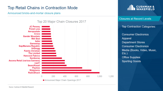
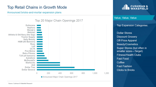
    A friend of mine was in Scottsdale last month for an ICSC conference where Garrick H. Brown (VP of Retail Research for the Americas at Cushman & Wakefield) delivered this retail presentation

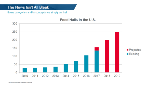
    My friend flipped it to me this week and below are a couple of slides that stood out as I scanned through it.

    image

    Apparently over the last five years, a new dollar store has opened every four hours in the US. That’s how quickly this category is growing. A race to the bottom.

    image

    Food halls are hot and not just in the US. Check out: “5 huge food halls opening soon in Toronto”.

    image

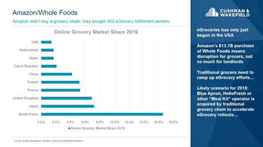
    This is similar to a chart I posted a few weeks ago that pegged online grocery shopping in South Korea at closer to 20%. I’m still fascinated by this market share number and want to better understand what’s driving it.

    image

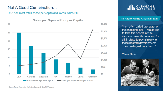
    This is an interesting chart that shows the relationship between retail square footage per capita and sales per square foot per capita. The US has lots of retail space per capita but low sales. Now look at Germany.

    image

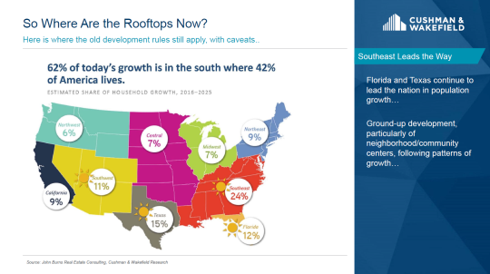
    Finally, this is a chart that shows where household growth is expected to happen from 2016 to 2025. It follows a very clear historical trend of Americans moving from cold places to warmer/hot places.

    image

    For the full presentation, click here.

  • South Korea buys 20% of its groceries online

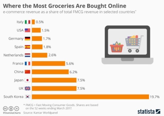
    The World Economic Forum recently posted the below chart showing that 1/5 of all grocery purchases in South Korea are done online. The calculation is e-commerce revenue as a percentage of total fast moving consumer goods revenue in the country.

    image

    The explanation they give for this high percentage is that South Korea has some of the fastest and most ubiquitous internet access in the world. 

    But as soon as I read this I thought to myself: This can’t be the only reason. When was the last time you really wanted to order groceries online but your internet connection was too slow? 

    Also, if you look at all online shopping (not just FMCG), South Korea no longer shows up as such an outlier. So what’s happening with grocery?

    Without actually knowing the market, I would imagine that there are companies in South Korea who have simply figured out how to offer a great online grocery shopping experience.

    South Korea is also one of the denser countries in the world at about 513 people per km2. That would help with distribution. 

    But then again, the Netherlands is also quite dense (414 people per km2). Why are they only at 2.6%? (For comparison, the US is about 33 people per km2.)

    If any of you are familiar with the South Korea market I would love to hear from you in the comments. If they really are at 20%, I am surprised more people aren’t talking about this.

  • Global home prices at the end of 2015

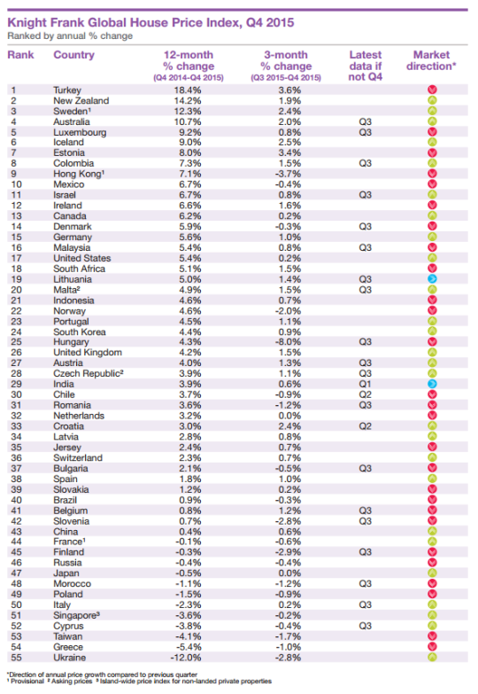
    Seeing how we’ve started looking at data from last year, I thought it would be interesting to look at global home prices as of Q4 2015. Here’s a chart from Knight Frank, which they refer to as their Global House Price Index:

    At the top of the list is Turkey, with an 18.4% increase from Q4 2014 to Q4 2015. (Supposedly this is because it has recently become easier for foreigners to buy property in the country.) Canada is 13th with a 6.2% increase (during this same time period) and the United States is 17th at 5.4%.

    This is obviously a high level analysis. There are lots of regional and local variations within each country. For instance in Canada right now, Calgary is a very different place than, say, Vancouver or Toronto.

    Nonetheless, it’s still valuable to see the relative performance of each country and see what their (Knight Frank’s) prediction is for 2016:

    “Our outlook for 2016 is muted. We expect the index’s overall rate of growth to be weaker in 2016 than 2015. The global economy is experiencing a potentially dangerous cocktail of low oil prices, a strong [US] dollar and a continued slowdown in China.”

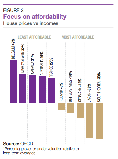
    It’s also interesting to see how the countries rank in terms of affordability:

    Once again, Canada ranks as being one of the least affordable countries in terms of home prices.