Daily insights for city builders, delivered every morning at 6 AM ET. I’m Brandon Donnelly — a Toronto-based real estate developer and founder of Globizen. I’ve been writing here since 2013.

Tag: sidewalks

  • No sidewalks — feature or bug?

    I tweeted the above photo on Saturday morning with the following text: “No sidewalks. Towers in the distance. Welcome to the inner suburbs of Toronto.” What I, of course, wanted to highlight is the contrast between the rural-like street with no sidewalks in the foreground, and the high-density towers built on top of Kipling subway station in the background. It is a perfect example of the kind of Toronto we are building, by design, all across the city. And it also exemplifies one of our great philosophical divides.

    If you look at the responses on Twitter, you’ll see that there are a few opinions. Generally speaking, though, there are probably two main ways to think about this scene. One way is to look at the transit-oriented housing and think of it as urban progress. We are adding new housing and we are doing it in a way that hopefully results in more walkable communities. With this in mind, you might now see the three humans on the street (one of which is in a stroller) and think it’s a shame that they have been forced to walk on the road.

    The other main way to look at this is that not having sidewalks is actually a feature and not a bug (indeed, a lack of sidewalks can be a pretty good indicator for rich people/wealthy households). From this lens, not having sidewalks means uninterrupted driveways (more parking), less through foot traffic, and a more quaint small-town feel. Also with this lens might be a view that the rural-like street was there first, before the transit-oriented towers. And it was doing just fine before people like me drove through their neighborhood and pointed out the lack of sidewalks.

    How do you see this scene?

  • Would wider sidewalks induce demand?

    One of the debates that is happening in cities all around the world right now is about whether or not it makes sense to redistribute public space in order to help with current social distancing measures. We are all being told to stay at home as much as possible, but as we venture out for food and/or sanity walks, many have started noticing that a lot of our sidewalks are in fact too small if you’re trying to stay 2m away from other humans. So with vehicular traffic way down, the question becomes: Should we start borrowing some of that space for pedestrians?

    Here in Toronto the official position is no. Closing down streets and lanes to car traffic is usually referred to as creating an “open street.” And the intent of these open streets is typically to bring people together for public life, which, of course, is the exact opposite of what we’re trying to do right now. What this implies, however, is that there’s a belief that additional space for pedestrians would induce demand, similar to what is believed to happen when you add additional lanes on a highway.

    Lewis Mumford probably had it best when he allegedly said, “Adding highway lanes to deal with traffic congestion is like loosening your belt to cure obesity.” So on the one hand, if you believe that more lanes doesn’t solve traffic congestion, you might also be inclined to believe that more and bigger sidewalks isn’t going to dampen the anxiety we currently feel when other humans get anywhere near us. The additional space would simply get filled with more bodies.

    But maybe you could argue that this is a little bit of a different situation. We’re in a global pandemic for God’s sake and most of us have the better sense to stay home unless it’s absolutely necessary. Perhaps in this case, demand would not increase and the greater supply would simply better serve the demand that is already there. Perhaps. I don’t have a strong stance on this, but I’m fairly certain that technology could help with this decision.

    What do you think?

    Photo by Jason Blackeye on Unsplash

  • Portuguese pavement

    One of the defining characteristics of Portuguese cities is the stone paving that is used in many or most pedestrian spaces. In European Portuguese, it is called calçada portuguesa. Above is a photo — that I didn’t take — of Rossio Square is Lisbon.

    This craft was also exported to Portugal’s former colonies, including Rio de Janeiro, Macau, and Luanda. Supposedly, the Portuguese used to load up their boats with limestone in order to weigh them down and make them stable before they set sail. And that’s, at least partially, the reason why this tradition ended up traveling.

    They’re dangerously slick when wet — particularly in a hilly city like Lisbon — but they sure are beautiful. Here’s a short video talking about the tradition in Macau. It’s an interesting example because the Chinese ended up adding their own touches.

    Click here if you can’t see it below.

    Photo by Alex Paganelli on Unsplash

  • Dimensioning pedestrian happiness

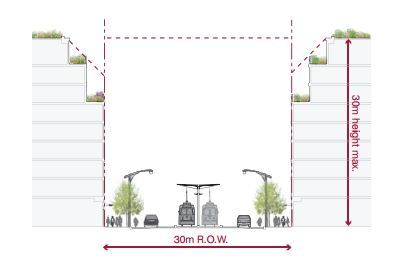
    The area that stretches between the property line on one side of a street and the property line on the other side of a street is called a public right-of-way here in Toronto. It may be called something different in other cities and countries.

    In the example below (taken from Toronto’s Avenues & Mid-Rise Buildings Study), it includes the sidewalks, the car lanes, and the streetcar lanes. But it could also include other public elements. In this instance, the buildings on either side of the street are assumed to be built right up against their property lines.

    ROWs obviously serve an important public function. But their size also has important urban design implications. As a pedestrian, it feels different to walk on a narrow street than it does on a broad street.

    The width of a ROW can also be used to inform what the preferred height of the buildings along it should be. In the example above, they’re talking about a 1:1 relationship between the width of the ROW and the preferred height of the buildings.

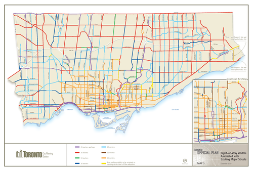
    Given their importance, I thought it would be interesting to share this map of Toronto (dated 2010) showing ROW sizing throughout the city. The mustard colored lines in the core of the city represent 20 metres, the red lines 36 metres, and the purple lines 45 metres or more. The rest of the colors fall somewhere in-between. For the most part, the purple lines represent highways, although there are a few other instances of purple.

    What’s interesting – but not surprising – to see is how we basically kept expanding the size of our ROWs as Toronto grew outwards. This was obviously to make more room for cars on the road.

    But the other, perhaps more interesting thing about this map, is that it could also serve as a guide to pedestrian happiness. The mustard/yellow lines are where it’s most enjoyable to walk. And the red and purple lines are where it’s least enjoyable to walk.

    If you’re from Toronto, give this framework a try and see if it holds true.