Daily insights for city builders, delivered every morning at 6 AM ET. I’m Brandon Donnelly — a Toronto-based real estate developer and founder of Globizen. I’ve been writing here since 2013.

Tag: real estate prices

  • Centralizing in cities

    This is not all that surprising:

    It is not surprising for at least two reasons:

    • We knew that central banks would tighten the money supply at some point and that it would have a negative impact on asset prices.
    • Many of us believed that a lot of people were making a somewhat long-term decision (flee the city) because of something that would ultimately prove to be short-term dislocation (a ~2 year health crisis).

    So one of the things I think you can glean from Daniel’s tweet is that our best urban centers are resilient. Notwithstanding the fact that we have things like Zoom and previous pandemic-suffering generations did not, the core value propositions associated with centralizing in cities hasn’t gone away.

  • Where are all the kids?

    This evening, when I was reading the internet, I came across this New York Times article from 2017 talking about how San Francisco has the lowest percentage of children of any of the largest cities in the U.S. It’s around 13% of the population. (Supposedly it was the second lowest in 2015. Pittsburgh was first.)

    The article goes on to claim that the city has approximately the same number of dogs as it does children. That number is somewhere around 120,000. Not surprisingly, many blame the city’s prohibitive housing costs as the main culprit for the lack of kids. Families simply cannot afford to live in the city.

    This got me searching for more information. Richard Florida looked at similar data back in 2015, but it’s important to note that he looked at metro areas and not the city propers. So the data doesn’t speak to whether families were forced to move out from the urban core to the suburbs in search of more affordable housing or for more space.

    Nevertheless, he finds no statistical association between the share of children in a city and things like urban density, economic output per capita, or median home prices. He instead finds that the share of children is positively correlated with two main factors: immigration and with ethnicity – specifically people of Latin origin.

    Click here if you’d like to read the rest of Florida’s analysis. And if any of you have additional data on this topic, please do share it below. I think I’m going to continue digging into this question of kids and cities.

    Image: Photo by William Bout on Unsplash

  • An even longer view on home prices — this time in Amsterdam

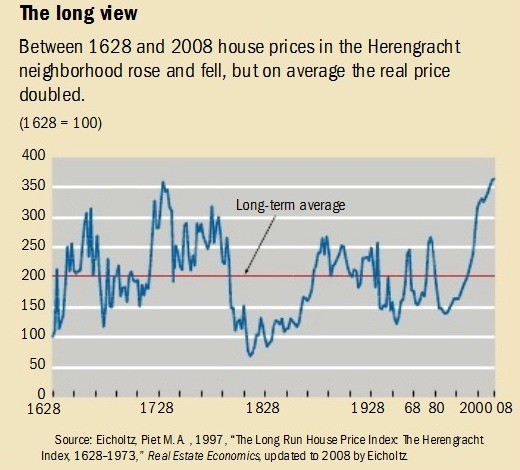
    In the comments of my recent post about Manhattan real estate prices during the Great Depression, a regular reader of this blog shared this terrific blog post (and corresponding research paper by Piet Eichholtz) about house prices along the Herengracht canal in Amsterdam from 1628 to 1973. Later it was updated to include up to 2008. It’s a long run house price index.

    Probably the first thing you’ll notice is that the index is highly volatile. Amsterdam enters its Golden Age, creates the world’s first stock exchange, and becomes the wealthiest city in the western world – house prices go way up. The tulip mania bubble pops – house prices go way down. It’s not until after World War II that prices sort of start to stabilize and increase, maybe, more consistently.

    In nominal dollars, the house price index increases 10x over the study period. But in real dollars most of that disappears. The biennial increase (that’s how the study was done) over the same period of time is just 0.5%. That translates into a doubling of house prices, which may seem quite good, except that remember it’s over a 380 year time period.

    image

    The Herengracht canal is a particularly good study because it was and has remained (or so I’m told) a desirable part of Amsterdam. This is an attempt to control for the variable that maybe some of the volatility could be explained by the area simply falling out of favor. (As a quick sidebar, the Herengracht was one of the first canals laid and dug out around the original city center of medieval Amsterdam during its Golden Age.)

    Generally, this finding is in line with one that economist Robert J. Shiller famously published a number of years ago where he argued that, when you correct for inflation, home prices actually look remarkably stable over long-run forecasts. In one study, he looked at 100 years of US home prices ending in 1990. Real home prices increased about 0.2% a year. What an outstanding hedge against inflation.

  • Manhattan real estate prices during the Great Depression

    image

    I was searching around trying to find data on long-term real estate prices and I came across a paper by Tom Nicholas and Anna Scherbina called, Real Estate Prices During the Roaring Twenties and the Great Depression.

    Here are some stats about Manhattan real estate (from the paper) that you all might find interesting:

    – In 1930, Manhattan housed 1.5% of the US population, but had approximately 4% of all US real estate wealth.

    – To construct their price indices the authors randomly collected 30 real estate transactions per month in Manhattan between 1920 and 1939. The mean price per square foot in 1929 was $6.91 (year of Black Tuesday). And the mean price per square foot in 1939 – 10 years later – was $2.29.

    – Buildings containing a store at grade tended to sell at higher prices. The authors speculate that this could be because a zoning change in 1916 made it difficult to open stores in “residential” areas.

    – Buildings with three, four and five storeys tended to sell at a discount. Six storeys or higher and the buildings generally had an elevator, which resulted in higher pricing.

    – Manhattan real estate prices reached their highest level in Q3-1929 before falling 67% by 1932. Prices remained more or less flat during the Great Depression.

    – If you bought a “typical property” in 1920, it would have retained only 56% of its value (in nominal dollars) by 1939. In fact, it took until 1960 for assessed property values in Manhattan to exceed their pre-Depression pricing.

    – An investment in the stock market index during this same time period, 1920-1939, would have outperformed real estate by a factor of 5.2x.

    Much of this probably seems hard to believe given the market today. Imagine waiting 40 years for the value of your property to come back.

    Photo by jesse orrico on Unsplash

  • Latest house-price indicators from The Economist

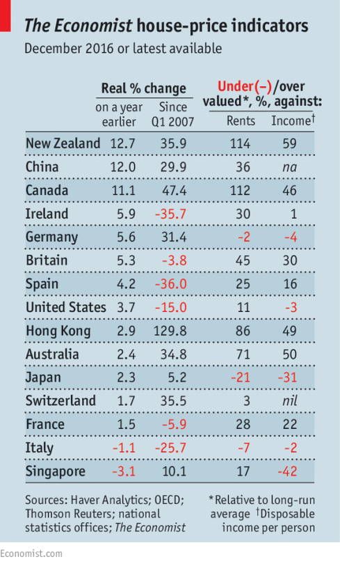
    The Economist recently published the following chart alongside this article talking about the impact of foreign buyers on global house prices.

    image

    They also have this set of interactive graphs that allows you to chart prices according to a number of different measures. The two metrics that The Economist focuses on (above) are house prices against rents and house prices against incomes. 

    The argument they make is that as (foreign) capital begins to think of property as merely a bolthole, it can start to detach itself from fundamentals such as rents and incomes. New Zealand, Canada, and Australia are specifically called out.

    This isn’t necessarily news. And one chart can only tell you so much. But I like staying on top of the various indices.

  • The rise of tech outposts

    What happens when wages and real estate prices become too high in a city? Companies start growing in lower cost locations. We’ve all seen this before. 

    Fred Wilson recently blogged about this “spillover effect”, citing a New York Times article talking about the growth of tech offices in Phoenix. As someone who sits on the board of many technology companies, he was noticing a thematic trend:

    “A big theme of board meetings I’ve been in over the past year is the crazy high cost of talent in the big tech centers (SF, NYC, LA, Boston, Seattle) and the need to grow headcount in lower cost locations.”

    We talk a lot about housing prices on this blog, and so I think it’s useful to see how this, along with high wages, also impacts companies. The two are interrelated.

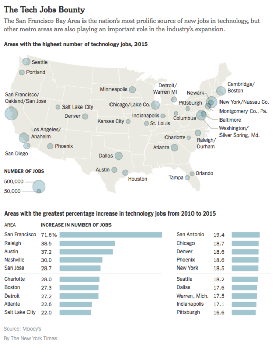
    Below is a chart from the NY Times article showing the US cities with the highest number of technology jobs and the most growth from 2010 to 2015. 

    San Francisco is in a league of its own. But overall, the growth is in tech and many cities are adding lots of technology jobs. Look at Detroit and Boston right beside each other (Detroit obviously has a smaller starting base). And look at how Miami is nowhere to be found.

    Of course, one interesting question is whether these new outposts – such as Phoenix – can truly come into their own and carve out a niche:

    “We don’t want to be San Francisco’s back office — we need more creators here,” said Scott Salkin, a founder and the chief executive of Allbound, which is based in Phoenix, makes sales software and has offices down the hall from Gainsight’s.

    Even with the high cost of living, it’s hard to supplant the coastal hegemony. That’s where people go to chase riches. As comedian Daniel Tosh likes to say, “the middle of the country is for people who gave up on their dreams.”

    Though for some, living in a place like Denver or Salt Lake City and snowboarding every weekend is a better outcome than living in a studio apartment and commuting an hour to work.

  • Prime property appreciation around the world

    Every year for the last decade, Knight Frank has published something called The Wealth Report. I’ve written about it before, but it’s basically a look at “prime property” and global wealth.

    As part of the report, they have something called the PIRI 100. It’s their “Prime International Residential Index”, which looks at luxury residential property prices around the world. They generally define “prime property” as being the top 5% of each market according to value.

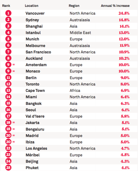
    This year, the top 25 locations in their PIRI 100 are as follows (for the most part, the data is up to December 2015):

    image

    Here in Canada, we like to talk about the insanity of the Vancouver and Toronto real estate markets. This list helps to put that into perspective. Even by global standards, Vancouver is at the top of the pack by quite a significant margin. 

    It’s worth noting that since this is a “prime property” index, it’s pretty safe to assume that the buyer profiles for these sorts of properties would have a significant international bias. So in a way, this list is really about global capital flows.

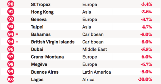
    Here are the bottom 10 locations on this year’s list:

    image

    If you’d like to see the full list, click here.

  • Urban, suburban, and rural home prices in the U.S.

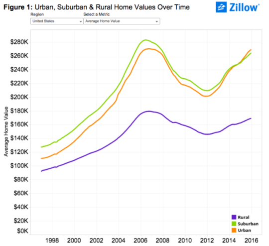
    Zillow.com recently published some research where they looked at U.S. home prices broken down according to location: urban, suburban, and rural.

    Here’s what they found:
    image

    As you can see, urban homes across the U.S. largely trailed their suburban counterparts in terms of absolute value up until the end of 2014. At that point, urban homes then surpassed suburban homes for the first time in the last two decades. (I wonder if this is a first or there was another crossover point before the late 1990s.)

    But if you dig a little deeper and look at both the rate of appreciation and prices per square foot (as opposed to just absolute value), urban home prices appear even stronger. 

    Here’s a snippet from Zillow’s post:

    “Over the past five years (2010-2015), average urban home values have grown 28.4 percent, compared to 21.1 percent for suburban home values. In the past year alone, U.S. urban home values grew 7.5 percent, compared to 5.9 percent for suburban homes.

    On a per-square-foot-basis, homes in urban areas nationwide used to be worth roughly the same as suburban homes, before a gap started emerging in the late 1990s which has become progressively wider over the past roughly two decades. Currently the gap stands at 24.5 percent, with suburban homes valued at $156 per-square-foot and average U.S. urban homes worth $198 per-square-foot.”

    And here is that same chart showing per square foot prices:

    Everyone who reads this blog knows that there is a growing interest in urban centers. But if you look at the above charts for specific cities, there are still many cases where urban home prices are well below suburban ones. 

    To me, that serves as a reminder of the spikiness of this urban transformation, but also that it is likely still in its infancy. As recent as 20 years ago, Toronto largely didn’t believe that people would want to live downtown in modern apartments. Today we take that for granted.

    So even with all of the gushing about urban centers, I still think we are only just getting started when it comes to creating the great urban neighborhoods of the future.

  • New York’s 8-figure apartments

    Whenever you’re starting to feel like real estate prices in your city are getting out of hand, just turn your attention to New York. It’ll make you feel better.

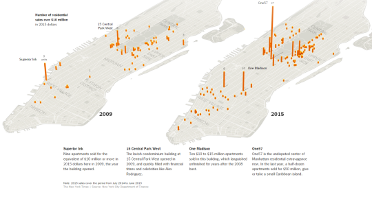
    The New York Times published an interactive overview of the Manhattan real estate market today. It was spurred on by the fact that the average residential sale price in Manhattan just hit $1.7 million (a new record) and that there’s a growing number of 8-figure apartments being bought up.

    Last year half a dozen apartments sold for more than $50 million in the One57 tower at 157 West 57th Street. (The New York Times calls this building the “undisputed center of Manhattan residential extravagance.”)

    Here’s one of their diagrams showing the number of residential sales over $10 million in 2009 and then in 2015:

    image

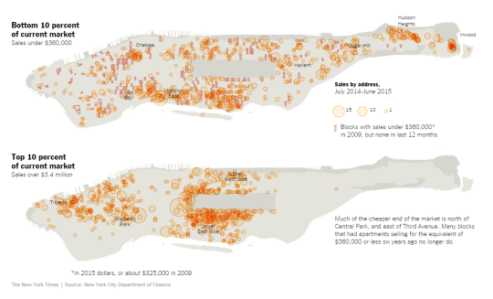
    And here’s another one of their diagrams showing the bottom and top 10% of the current market:

    image

    It’s interesting to see the clustering in certain areas and also the lack of clustering at the high end around the top of Central Park.