Daily insights for city builders, delivered every morning at 6 AM ET. I’m Brandon Donnelly — a Toronto-based real estate developer and founder of Globizen. I’ve been writing here since 2013.

Tag: portland

  • How Gunter’s chain forever changed our cities


    In 1620, an Englishman by the name of Edmund Gunter invented a land surveying device known as Gunter’s chain. As the name suggests, it was an actual chain (see above). Each chain contained 100 links and, when fully extended, it measured 66 feet.

    This was a monumental innovation as it greatly simplified land surveying and made it a lot easier to measure out acres — especially if you maybe weren’t great with math. So it is perhaps no surprise that this simple device forever changed our cities.

    But first, here’s the only math you need to know:

    Number of chains x number of chains / 10 = number of acres

    For example:

    A lot measuring 66 feet by 66 feet would mean it has an area of 4,356 square feet, or 0.1 acres (1 acre = 43,560 square feet). It would also mean that this lot measures 1 chain by 1 chain, or 1 square chain. Take 1 square chain and divide it by 10, and you arrive at the same 0.1 acres.

    Similarly, a lot measuring 660 feet by 660 feet would mean it has an area of 435,600 square feet, or 10 acres. Using Gunter’s chain, this lot is 10 chains by 10 chains, which equals 100 square chains. Divide 100 square chains by 10 and you arrive at the same 10 acres.

    Put differently, 1 acre equals 10 square chains in Gunter’s system.

    Because of its simplicity and utility, the chain became a statutory unit of measurement in England by the 1670s. And as a result, it spread throughout the British Empire, meaning it started to influence how new cities were being planned and laid out.

    Let’s look at the example of Salt Lake City.

    We have spoken before about the city’s famously large blocks. They have the dubious distinction of being the largest in the US. But what you may not have noticed is that the typical SLC block measures exactly 660 feet x 660 feet. Its typical streets are also 132 feet wide.

    This is because of Gunter’s chain. These are 10-chain x 10-chain blocks and 2-chain streets.

    The same is true of other cities. Looking on the other end of the spectrum, Portland’s compact street grid is comprised of blocks that measure 198 feet x 198 feet. These are, in other words, 3-chain blocks. Its typical streets are also 33 feet wide. So half-chain streets.

    Units of measurement have a lasting way of influencing how we plan and design things. This is true at small scales and it’s also true of our cities. In tomorrow’s post, we’ll look more closely at Salt Lake City’s street grid and what it does to walkability.

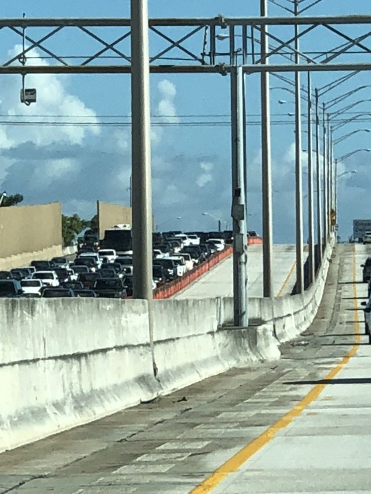
    Image: National Museum of American History

  • Case studies on inclusionary zoning

    Back in 2017, Portland, Oregon enacted new inclusionary zoning policies mandating that all new residential projects with 20 or more units must deliver a specified amount of affordable housing. Early accounts, by people like Joe Cortright of City Observatory, suggested that the market was reacting to this new requirement as you might expect. Developers rushed to get new applications onto the books and then there was a drop off in new housing supply.

    Now that it’s been a couple more years, it is perhaps worth checking in on Portland. Cortright did that in the fall of last year and the housing numbers are continuing to fall. From 2019 to 2020, new multi-unit housing permits in Portland fell by more than 60%. I really don’t know the Portland market and so it’s hard for me to comment on whether it is solely the fault of IZ, but there was a peak in 2017 and now housing permits are down significantly. However, they were also down significantly during the financial crisis. It’ll of course be interesting to see how this plays out over a longer time horizon.

    That said, a similar market response was recently reported in another Portland — Portland, Maine. In 2020, the city implemented a “Green New Deal” that stipulated, among other things, that all new residential developments with 10+ units would be subject to their new IZ policies. It has only been just over a year, but according to the city’s planning department, there were 756 new housing units on the books in 2020 prior to the new IZ policies. And since then, that figure has dropped to 139 new housing units. This is admittedly a small market and a relatively short time horizon, but it is still a data point.

    As many of you know, I struggle with inclusionary zoning. Maybe it’s confirmation bias, but I just haven’t been able to find much data suggesting that it can meaningfully increase overall housing supply and the supply of new affordable units. So if any of you are aware of some good case studies outlining successful examples, please share them in the comment section below.

  • Where developers won’t build even with $0 land

    Building on yesterday’s post about inclusionary zoning, below is a telling diagram from the Urban Land Institute showing which areas of Portland can support new development and which areas cannot. To create this map, ULI looked at achievable rents in each US census block to determine, quite simply, where rents will cover the cost of new development (all types of construction).

    However, in their models they are also assuming a land value of $0. And typically people want you to pay them money when you buy their land. So in all likelihood, this map is overstating the amount of blue — that being land where new development is feasible.

    But it does tell you something about developer margins. A lot of people seem to assume that the margins on new developments are so great that things like inclusionary zoning can simply be “absorbed” without impacting overall feasibility. The reality is that there are large swaths in most cities where development is never going to happen even if you were to start handing out free land.

    This map is also helpful at illustrating some of the impacts of IZ. If you assume that rents are the highest in the center of the city and that they fall off as you move outward, then the outer edge of the above blue area is going to be where development is only marginally feasible. And so any new cost imposed on development would naturally start to uniformly eat away at the blue feasible area — that is, until rents rise enough to offset it.

    Of course, this is a simplified mapping. Land usually costs money. Land values might also be highest in the center and fall off as you move outward, or there could be pockets of high-cost land. There may be more price elasticity in certain sub-markets compared to others. So the impacts of a new development cost may not play out as neatly as I outlined above.

    Regardless, there will be impacts, which is why I find this map telling even if it isn’t fully accurate or up to date. Maybe some of you will as well.

  • City stereotypes

    The New Yorker recently published a “daily shout” on Instagram called, How You Know You’ve Made It, by City. It is essentially a series on city stereotypes, and it’s pretty funny. Sorry Cleveland. If you can’t see the embed below, click here.

  • Eliminating single-family zoning

    There is something happening in many North American cities right now. We are starting to question the supremacy of zoning for only single-family homes.

    This past summer, the state of Oregon passed policy requiring cities of 25,000 people or more to allow duplexes, triplexes, and fourplexes within their single-family home neighborhoods. Minneapolis is poised to do something similar with its Minneapolis 2040 plan (though it has been contentious). And, of course, here in Toronto we recently rolled out laneway suites all across the city. Small scale multi-family dwellings are also already permissible in some areas (though few are being built).

    Some are calling this a YIMBY movement. But however you want to define it, it’s an acknowledgement that, if the goal is to built up instead of out, perhaps it’s time we look at the parts of our cities with the lowest population densities. I would also add that following my recent post on Paris vs. Vancouver, many seemed to gravitate (in the comments) toward the Parisian model — even if it did result in over 50,000 people per square kilometer. Density, it would appear, is okay.

    While positive, it remains to be seen whether these policy changes will result in a meaningful increase in housing supply. And a lot of that will come down to the details. As I have said before on the blog, the math can be challenging on these sorts of smaller projects, which is why you have smart people proposing things like an “inverse density” rule to help encourage more smaller scale development.

    But as the saying goes, sometimes you need to crawl before you can walk. And, if nothing else, there’s certainly symbolic value to what seems to be taking hold across North America right now.

  • These 3 things happened after Portland enacted inclusionary zoning

    On February 1, 2017, an inclusionary zoning ordinance came into effect in Portland, mandating that all new residential projects with 20 or more units dedicate a portion of the building to affordable housing.

    For the first year, the requirement was 8% of all units for households earning 60% of the Area Median Income or 16% of all units for households earning 80% of the AMI. I’m not sure if it was or is possible to do a blend of the two income levels.

    After the first year, the requirement was supposed to step up to 10% and 20% of all units, respectively. But that step up was never enacted, which had many industry analysts arguing that it was a clear signal the ordinance was not performing as intended.

    According to Joe Cortright of City Observatory (which is based in Portland), the new ordinance largely resulted in 3 things happening:

    (1) Developers rushed to get new applications in during the transition period so that they would not be subjected to the new IZ rules; (2) applications increased for projects with less than 20 units (avoid the rules by building smaller); and (3), following the initial transition surge, building permit applications, as a whole, dropped off.

    This last point is what usually comes up in debates around inclusionary zoning. Does the requirement to build affordable housing actually reduce overall housing supply?

    I’ve written about this before, but the math is pretty simple. Inclusionary zoning policies are a drag on revenue and a direct cost to the project. What that means is that something else will need to give in order for the numbers to balance.

    That could come in the form of lower costs (such as an impact fee abatement) or in higher rents on the balance of the units. But this latter approach is easier said than done. Sometimes you need to wait for the market to “catch up”, which could be what some developers in Portland are doing.

    They’re waiting for housing to get more expensive — overall — so they can then offset the pro forma drag from the affordable units.

  • A picture of dynamic road pricing

    Below is a photo of Interstate 95 near Miami, which, for the record, I myself did not take while driving.

    image

    The two empty lanes that you see are the “Express Lanes.” The price for using these lanes varies based on demand.

    During periods of low demand, the toll could be around $0.20 per mile. 

    During periods of high demand, such as during rush hour, it might be $1 per mile. 

    And during unusually heavy periods, like when there’s an accident, it could be more.

    We used these lanes while driving around the Miami area on this trip. The pricing always seemed reasonable and the lanes were never congested.

    I think the above picture is a good demonstration of how dynamic road pricing can be used alleviate traffic congestion.

    That’s why many cities, such as Portland, are exploring it as a solution. I wish Toronto would do the same.

  • Red tide, scooters, and civic security

    image

    I am reading up on a few different things this morning.

    Southwest Florida, which is where I am right now, is in the midst of a “red tide” that began last November. These happen fairly regularly along the Gulf Coast, but this one is high up on the severity scale. There doesn’t appear to be a clear explanation for what causes them, but sustained warmer temperatures and fertilizer and other pollutant runoff are thought to stoke it. Whatever the cause, they are devastating to the environment. We are switching coasts tomorrow morning.

    Portland now has electric scooters. (Why don’t we have these in Toronto?) But to combat possible concerns around urban clutter, the company, Bird, has committed to collecting all of its scooters each night and has agreed to remit $1 per scooter per day to the city. These scooters are pissing off some cities (or maybe it’s just San Francisco), but I still believe the problem will eventually get resolved. City Observatory also has this interesting piece where it compares the above scooter pricing to car pricing. Are we underpricing cars?

    Finally, here is a short film on civic security in Paris. In an effort to mitigate terrorism, the city has, of course, been implementing and erecting fencing, barricades and other reactive security measures. But sadly, now that this has become a new reality, the capital is spending more time considering how these measures could be more thoughtfully designed. The video showcases some of them. Certainly a more deliberate approach, but are they just as reactive?

    Maybe one of these topics will be of interest to you too.

    Photo by Andreas Selter on Unsplash

  • Portland is considering whether to solve traffic congestion

    image

    Chris Hagerbaumer is the deputy director of the Oregon Environmental Council. She recently delivered the below testimony on “variable traffic-based tolls”, a form of road pricing. This is something we have talked a lot about here on the blog. 

    Oregon is currently looking at implementing this on two freeways in Portland, which is why Chris delivered this testimony. And as many of you know, I am very much in support of this demand management approach. So here you are: why congestion pricing makes sense for Portland (taken from City Observatory).

    ——————————————————–

    The question in front of you is: how do we actually solve congestion, solve it in a way that is the least cost to the taxpayer, and in a way that doesn’t result in more pollution. When we add more supply (in other words, build more roads) we end up exactly where we started when it comes to congestion (due to induced demand), we spend billions of taxpayer dollars (much of which comes from drivers who aren’t the ones demanding more road space), we harm surrounding communities as highways encroach into neighborhoods, and we pollute the air and heat up the planet.

    Induced demand is the fact that when you add freeway capacity it induces longer trips, more sprawl and more driving. Traffic is like a gas, expanding to fit whatever space there is. In one infamous example, Texas spent nearly $2.8 billion expanding Katy Freeway to 26 lanes and congestion has actually worsened.

    Building new roads is a supply-side solution that simply doesn’t work.

    An effective, least-cost, environmentally sound way to address congestion is the proposal before you: congestion pricing to manage demand. Drivers pay an automated fee to enter highly congested roads at peak hours; in return, they travel smoothly and reliably, getting where they need to go on time. Prices are set at the lowest possible level to free up just enough road space to eliminate bottlenecks.

    When you eliminate bottlenecks and get traffic flowing freely, you have—in essence—added capacity. You no longer need to add new lanes, you save taxpayers a bundle, and you reduce dangerous auto and truck exhaust.

    Congestion pricing is a demand management solution that’s proven to work and does so in cities around the world. Drivers opposed congestion pricing at first: no one wants to pay more. But that opposition of 60% or more turned into support of 60% or more after congestion pricing was implemented. People’s opposition turned to support because they now get that it works—they experience the value.

    Equitable application of congestion pricing absolutely requires mitigating diversion to local streets. But note that congestion pricing actually pulls many drivers who were already cutting through local roads back to the highway because those drivers who were stuck in traffic now have an option to get where they need to go, on time, for a small price.

    Equitable application of congestion pricing also requires significantly increasing transit service and other travel options in the corridor and considering other means to make the system work for low-income commuters who must drive during peak hours, such as targeted discounts or exemptions.

    We think of highways as free and we think of driving as freedom, but by investing almost solely in infrastructure for cars over most of the 20th century and into the 21st century, we created a transportation system that is costly not only for our pocketbooks, but for our very health and wellbeing and our region’s economic prosperity, a transportation system that contributes to the existential risk of runaway climate change.

    You have an opportunity to make a decision that will lead to less time stuck in traffic, healthier air, and more economic prosperity for the region and state. We hope you embrace that opportunity.

    Photo by Zach Savinar on Unsplash

  • Car-dependent spatial structure

    Earlier this week a 58 year old woman named Dalia was struck and killed by a car near the University of Toronto’s downtown campus. This tragedy has everyone talking about and questioning how to make our roads safer, though the answers are not difficult to find. Here is an excerpt from a piece that Richard Florida penned following the incident called, Toronto’s Deadly Car Crisis:

    Today, more Torontonians die from being hit by cars than from being killed by guns. In 2016, nearly 2,000 pedestrians and 1,000 cyclists in the city were hit by cars. Of these, 43 resulted in fatalities. On average, a pedestrian in Toronto is hit every four or five hours, and a cyclist every eight or nine. This means that Toronto’s rate of pedestrian deaths was 1.6 per 100,000 people in 2016 — worse than in Chicago, Seattle, San Francisco, Boston, Washington, D.C., Portland, Pittsburgh, Cleveland, and Buffalo. It has risen to 1.7 deaths per 100,000 people in 2017 and is on track to rise still further to 1.8 deaths per 100,000 this year. And, children and the elderly face the greatest risk of being struck and killed by a car. The problem is only getting worse. Across Canada, pedestrian fatalities increased by more than 10 percent between 2010 and 2016; at time when they decreased by more than 25 percent in European countries like Norway, Switzerland, and the Netherlands.

    The broader issue is what he refers to as Toronto’s “car-dependent spatial structure.” And it is detrimental to not only our public safety, as we saw this week, but also to our ability to grow as a global city. The Greater Toronto Area is projected to reach 10 million people by 2041. I agree with Florida that, for a number of important reasons, we are going to need to commit ourselves to a new model for growth.