Daily insights for city builders, delivered every morning at 6 AM ET. I’m Brandon Donnelly — a Toronto-based real estate developer and founder of Globizen. I’ve been writing here since 2013.

Tag: population

  • New York City is back

    So here’s the headline: More people are moving to Manhattan than before the pandemic. This is true. But an even more accurate description might be that New York City was losing people before the pandemic and it is still losing people. But things have rebounded since the lows of the pandemic and it is now losing less people. Here are two charts from Bloomberg:

    This is generally good news since the increased exodus (to places like Miami) led some to believe that one of the most important global cities in the world was now dying. I never thought that was the case. But there’s no arguing against the fact that the fastest growing cities in the US are the ones with more affordable housing and fewer constraints on new development.

  • Have three, or more if you can afford it

    At the beginning of this year, Singapore expanded its preschool subsidies and improved its support for assisted reproduction and fertility treatments. The goal: more Singaporean children. According to the World Bank (via the Wall Street Journal), Singapore has one of the lowest fertility rates in the world at about 1.14 children per woman as of 2018. This is down from about 3 in 1970, when the government was actually worried about the opposite problem — too many children.

    Of course, this trend is not unique to Singapore. This is generally the way the winds are blowing in the developed world. Young people are spending more time on education, career, and travel. And they’re delaying marriage (or not getting married). On top of this, family-sized housing has become fairly expensive in most big cities. The fastest solution is to ramp up immigration, but many countries, including Singapore, have concerns about what this does to the “national identity.”

    So there seems to be a preference for throwing money at the problem and promotional material with slogans like this one: “Have three, or more if you can afford it.”

    Chart: WSJ

  • From urban to suburban

    The US Census Bureau just released its population estimates for 2018. As has been the case in previous years, the counties that added the most people (largest numeric growth) are all located in the south and west. Texas holds 4 out of the top 10 spots.

    Here is a Tweetstorm by Jed Kolko, the chief economist of Indeed, with a couple of graphs summarizing the findings (click through to see the full thread):

    Despite the narrative that people are returning to cities and urban centers, the data is pretty clear: the flow of domestic migration within the US is largely from dense urban counties to more suburban — and affordable — ones. Big cities are expensive.

  • Canada admitted 321,065 permanent residents last year

    Bloomberg recently reported that Canada admitted 321,065 permanent residents last year. This is up 12% from 2017, where the country admitted 286,479. Last year was also the largest cohort since 1913 (the year before World War I), where the country admitted just over 400,000 people.

    Here is a chart from Bloomberg (it is interactive if you click through):

    Of course, Canada was a much smaller country back in 1913 (about 7.6 million people), and so on a percentage basis we are much lower than where we were at the beginning of the 20th century. We’d have to admit close to 2 million permanent residents a year to get to a similar rate.

    And that is not what is in the books. Here are the projected admissions for 2019 to 2021. All of the below stats are from the 2018 Annual Report to Parliament on Immigration.

    I couldn’t find a geographic breakdown for last year, but in 2017, about 40% of admitted permanent residents (or 111,925 total) ended up in Ontario and about 72% ended up in Ontario, Quebec, and Alberta (the top 3 provinces for this year). If we add in BC, it brings this figure up to 86%.

    Here are also the top 10 countries of origin:

    If you’d like to download a PDF of the full report, you can do that here.

  • The disappearing urban advantage

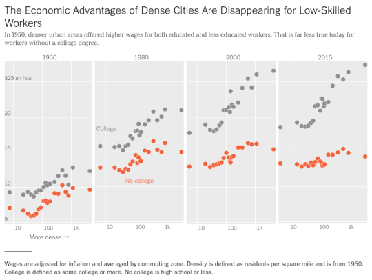
    The New York Times has a recent article up talking about the disappearing “urban advantage” for low-skilled workers. It is based on the work of MIT economist David Autor.

    Here is a chart from the article plotting wages against population density from 1950 to 2015:

    image

    The clear takeaway is that dense urban centers remain a place where wealth is created – but you probably need a college degree.

    The economic advantages of dense cities for those without one appears to be disappearing. The labor market has diverged.

    Interestingly enough, David’s research also suggests that college graduates may be starting to abstain from the suburbs – even when they have kids.

    And that’s because the returns to being in the city are so great.

    For the full NY Times article, click here

  • New York and Toronto population densities compared

    Today I came across this Reddit talking about how few census tracts there are in the United States with a population density greater than 150,000 people per square mile. 

    Basically, there’s a bunch in New York, one in San Francisco (Tenderloin), and one in Chicago that doesn’t really count because it’s an unusually small tract. Most other American cities don’t even come close.

    Looking at this New York Times mapping of the 2010 US census data, it turns out there are neighborhoods in NYC that go well beyond 150,000 people per square mile. Here’s one census tract (#154) at just over 200,000 ppsm:
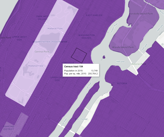
    If you convert 200,764 into the globally accepted standard for measuring distances and areas, you get approximately 77,515 people per square kilometer. Pretty dense.

    As a comparison, I thought I would see how this number stacks up against what is commonly referred to as the densest neighborhood in Canada: St. James Town

    If you pull up that geographic code in the 2011 Canadian census data (#5350065.00 in case you’re that nerdy), you’ll see a map boundary that looks like this:
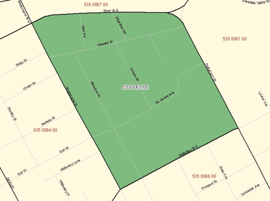
    And you’ll also find a 2011 population density of approximately 60,915 people per square kilometer. Also pretty dense – though the population did decline from 2006.

    Now obviously St. Jamestown is only one example. The rest of the city is, by and large, far less dense. But maybe when our 2016 census data gets released next year, we’ll find that we’ve become even denser. I suspect we will.

  • Population growth across North American cities

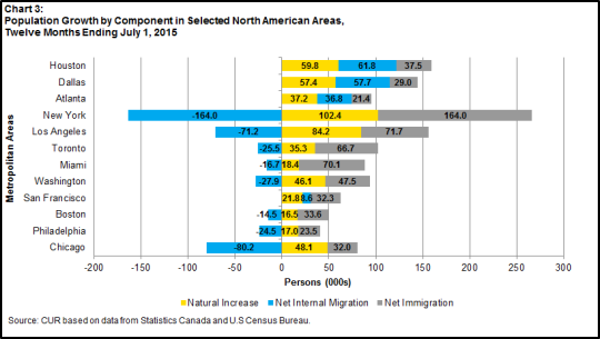
    The Centre for Urban Research and Land Development at Ryerson University recently published the following chart on their blog:

    It’s a look at population growth across a few North American cities, broken down according to natural increases, net internal migration from other parts of the respective country, and net immigration from outside of the respective country.

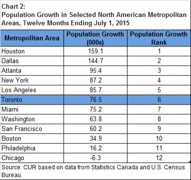
    When you sum up the pluses and minuses shown above, you get to population growth numbers that look like this:

    Houston, Dallas, and Atlanta are monsters in terms of population growth. They’re obviously smaller than New York and Los Angeles, and so on a percentage basis they are really adding a lot of people. Much of this has to do with the ease in which housing can be added in those cities and their relative affordability.

    Toronto is competitive with New York and Los Angeles in terms of an absolute number, but again our base is smaller so on a percentage basis we are growing faster. The big story with Toronto is our dependence on immigration to grow.

    The one city on this list that might surprise some of you is Chicago. Toronto and Chicago share many similarities and are often compared. But when you look at how the Chicago metropolitan area is shedding people, you see that, at least in this regard, it’s in structural decline.

  • Urban population densities, compared

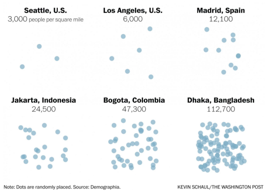
    Earlier this month The Washington Post published an article called, There’s no such thing as a city that has run out of room.

    And what it was really about was that when we say there’s no more room (I guess people are saying this), we are really saying that we just don’t want to allow anyone else to become our neighbor. Because the reality is that urban population densities vary widely around the world. So how can you really call a place full?

    I’m not sure I feel this pain point as much as the author, but I always find population densities to be a fascinating topic. And accompanying the article was a tool – using data from Demographia – that allowed you to compare the population densities of various cities.

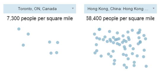
    Here are are two scenarios I ran:

    It’s important to keep in mind that these numbers are averages for the entire economically contiguous region. So it tells you nothing about the potential spikiness of certain areas. That’s why the population density of New York (which includes portions of New Jersey and Connecticut) probably seems low to you.

    Still, it’s fascinating to see how extreme some cities – including some first world cities like Hong Kong – can be. Clearly many cities have a lot of room to become a lot more dense. And I think that would be a good thing.