Daily insights for city builders, delivered every morning at 6 AM ET. I’m Brandon Donnelly — a Toronto-based real estate developer and founder of Globizen. I’ve been writing here since 2013.

Tag: pedestrians

  • Pedestrian plaza or parking lot?

    It is maybe comforting to know that even Europe wrestles with the decision of whether a grand urban space should be used for pedestrians, or turned into a parking lot. Take, for example, the Grand-Place in Brussels (pictured above).

    Today, it is a UNESCO World Heritage Site and one of the most important tourist destinations in the city. Perhaps its most famous. But during the 1960s, in what Wikipedia calls a “low period of appreciation,” it was a parking lot.

    This lasted until 1972, when a bunch of people from the community got together and lobbied for it to, you know, not be a parking lot. Not surprisingly, local shop owners were worried, at the time, that this would hurt their businesses. This is often the concern.

    Here in Toronto, where we continue to debate the pedestrianization of Kensington Market, we have surveys showing that 94% of visitors to the area support pedestrian-only zones, but that this number drops to 55% when you narrow to people who live/work/own stuff in the area.

    But if your goal is to sell more things to people, then there’s something to be said about listening to what your visitors want. In the case of Grand-Place, pedestrianizing the square made it far more popular as a tourist destination. And I think the same would be true of Kensington Market.

    For some photos of iconic public spaces in Europe being used as parking lots, check out this Politico article.

    Image: Wikipedia Creative Commons
  • Traffic signal inequality

    image

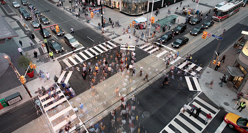
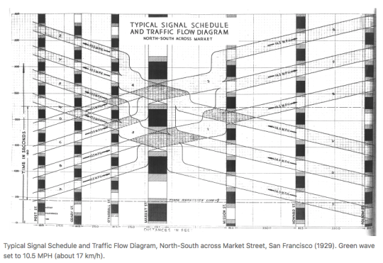
    David Levinson, who is based Sydney and authors the Transportist – a blog you should follow if you don’t – has a recent post up about signalling inequity and “how traffic signals distribute time to favour the car and delay the pedestrian.” In it he provides some background into traffic signal coordination (introduced in New York City in 1922), as well some some suggestions for how we could and should be prioritizing pedestrians.

    Here is an excerpt from the article:

    There is a reason that traffic engineers don’t automatically allocate pedestrian phases. Suppose the car only warrants a six second phase but a pedestrian requires 18 seconds to cross the street at a 1 meter/second walking speed. Giving an automatic pedestrian phase will delay cars, even if the pedestrian is not there. And there is no sin worse than delaying a car.  But it also guarantees a pedestrian who arrives just after the window to push the actuator passes will wait a full cycle.

    Sometimes pressing the walk button appears to do nothing. I suppose that’s why some cities call it the “placebo button.” And in other cases if you don’t press the walk button you’ll never get a walk sign. That’s usually a strong indicator that you are located in an environment not intended for pedestrians. David’s article also has me curious about the relationship between traffic signals/pedestrian phases and urban form. I bet you could tell a lot about the latter simply by understanding the former.

    Image: Transportist

  • People in big cities walk faster

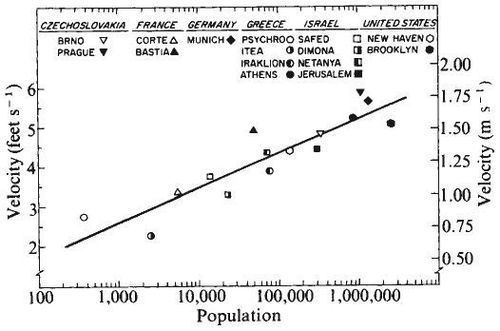
    One of the most interesting things about cities is that as they grow their “urban metabolism” also tends to increase. People become more productive. Economic output increases. It becomes easier to hail a cab (which is a test I like to use). And, according to this recent article by CityLab, people walk faster.

    Yes, research has shown that there’s a correlation between population size and the speed in which people walk. And some of the studies go as far back as the 1970s – like this one from psychologists Marc and Helen Bernstein:

    image

    In many ways, this makes intuitive sense. Life in the big city is a fast paced one. But why exactly do people start literally walking faster? The most probable answer seems to be, quite simply, that time is money. Subsequent research from the 1980s and 1990s has revealed that the best predictor of fast walking is economic output.

    When a city grows larger, they wrote, wage rate and cost of living increase, and with that the value of a resident’s time. As a result, “economizing on time becomes more urgent and life becomes more hurried and harried,” Walmsley and Lewis suggest. (Source: CityLab)

    The first thing that crossed my mind when reading all of this is that there must be some sort of upper limit. Humans don’t just keep walking faster and faster as the city in which they live in grows bigger. If that were the case, the mega cities of the world – such as Tokyo – would have people sprinting around all the time. But that’s obviously not the case.

    So this is a topic that could probably use some more data. And I would imagine it would be a lot easier to collect today given that we all now walk around with mobile sensors in our pockets (our smartphones). And pretty soon we may have mobile sensors on our wrists (smart watches).

    I would certainly like to see more data on this. The idea of an “urban metabolism” has always interested me.

    Image: Dundas Square, Toronto via Flickr

  • Show Yonge some love

    image

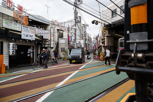
    Since last summer the Downtown Yonge Business Improvement Area in Toronto has been running a really creative community engagement program at yongelove.ca.

    The site includes a short history of Toronto’s most famous street, an Instagram contest (use #YongeLove to participate), and a survey where both locals and visitors can provide their feedback on what they think the future of Yonge Street should be.

    The reason this is being done is because, in 2016, Yonge Street from Davenport Road all the way south to the lake will be ripped up for infrastructure upgrades. And so it was rightly determined that now is the right time to rethink the future of Yonge. Let’s do this once.

    I’ve already talked about the Yonge-Redux proposal here on Architect This City and that seems to be where everyone’s head is at in terms of what they would like to see. I also think it’s the right thing to do for Yonge Street. If you’ve ever been on Lincoln Road in Miami or La Rambla in Barcelona, you’ll know how magical a great street can be.

    So I’d encourage you to complete the Yonge Love Survey and advocate for something awesome. It ends next month, after which time all the feedback will be forwarded to the city.

    I’d also love to hear what you think and how you responded in the comment section below. My response was more or less geared towards supporting the Yonge-Redux proposal.

  • Multi-modal cities are the new reality

    CityLab published an article last week on multi-modal cities that caught my attention (because it used a picture of Toronto with about 3 or 4 streetcars stacked up along Queen Street). The premise of the article is that all of this car vs. transit debate is actually missing the bigger picture: our cities are multi-modal and we need to be planning for that.

    That’s not to say that the shift away from cars isn’t a good thing. It is. But it’s not as simple as saying that, instead of driving, people should now only take transit. In today’s cities people walk, bike, take streetcars, take buses, take subways, take taxis, take private shuttles, use Uber, and, yes, they still drive.

    From my own experience, this is absolutely how I get around Toronto today. I walk to the gym. I ride my bike whenever I’m going somewhere downtown. I take the subway to my office in midtown because it’s far and I would be too sweaty if I biked there. I use Uber and Hailo when I’m going out at night. And I drive when I need to go to the suburbs or leave the city.

    But the key takeaway here is that we now have a much tougher challenge on our hands. When we were only optimizing for cars – however detrimental to our cities that was – we only had one mode to plan for. Now we have several. Some of which are public and some of which are private.

    However we also have access to technologies that we didn’t have before. We are networked in ways that weren’t possible before and we’re at the dawn of many profound mobility changes, such as driverless cars. (Have you read about Tesla’s new Autopilot feature yet?)

    So as I’ve said before, I really believe that we need to look at this, not as a war on the car, but as a war on inefficiency. The problem we are trying to solve relates to mobility: What’s the best way to move lots of people around dense urban regions? Stop focusing so much on the technologies and focus more on the people.

    Image: Flickr

  • Dimensioning pedestrian happiness

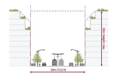
    The area that stretches between the property line on one side of a street and the property line on the other side of a street is called a public right-of-way here in Toronto. It may be called something different in other cities and countries.

    In the example below (taken from Toronto’s Avenues & Mid-Rise Buildings Study), it includes the sidewalks, the car lanes, and the streetcar lanes. But it could also include other public elements. In this instance, the buildings on either side of the street are assumed to be built right up against their property lines.

    ROWs obviously serve an important public function. But their size also has important urban design implications. As a pedestrian, it feels different to walk on a narrow street than it does on a broad street.

    The width of a ROW can also be used to inform what the preferred height of the buildings along it should be. In the example above, they’re talking about a 1:1 relationship between the width of the ROW and the preferred height of the buildings.

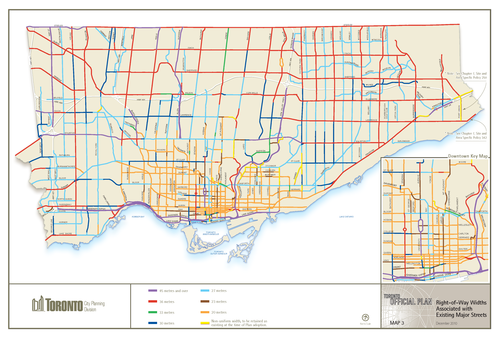
    Given their importance, I thought it would be interesting to share this map of Toronto (dated 2010) showing ROW sizing throughout the city. The mustard colored lines in the core of the city represent 20 metres, the red lines 36 metres, and the purple lines 45 metres or more. The rest of the colors fall somewhere in-between. For the most part, the purple lines represent highways, although there are a few other instances of purple.

    What’s interesting – but not surprising – to see is how we basically kept expanding the size of our ROWs as Toronto grew outwards. This was obviously to make more room for cars on the road.

    But the other, perhaps more interesting thing about this map, is that it could also serve as a guide to pedestrian happiness. The mustard/yellow lines are where it’s most enjoyable to walk. And the red and purple lines are where it’s least enjoyable to walk.

    If you’re from Toronto, give this framework a try and see if it holds true.