Daily insights for city builders, delivered every morning at 6 AM ET. I’m Brandon Donnelly — a Toronto-based real estate developer and founder of Globizen. I’ve been writing here since 2013.

Tag: oil

  • The world’s top oil producers

    Using data from MarineTraffic (which is definitely worth a click through), the New York Times has created this terrific animation showing the flow of oil tankers from the Persian Gulf to the rest of the world from May 15 to June 15, 2019.

    Here’s a screenshot:

    About 20% of the world’s supply of oil flows through the Strait of Hormuz, a tiny passage located between Iran (north) and the UAE (south). See above.

    The article also has a number of other charts that speak to changing supply and demand patterns. Note the US, China, and Iran.

    Here are the top oil producers (total petroleum liquids) and the top crude oil exporters in 2018 (both are measured in millions of barrels a day):

    And here are the top oil consumers ranked by 2016 data (total consumption of petroleum and other liquids):

    Images/Charts: New York Times

  • Data is the new oil

    “A NEW commodity spawns a lucrative, fast-growing industry, prompting antitrust regulators to step in to restrain those who control its flow. A century ago, the resource in question was oil. Now similar concerns are being raised by the giants that deal in data, the oil of the digital era.“

    The Economist just penned an interesting piece arguing that the world’s most valuable resource is no longer oil, but data. That’s why the five most valuable publicly traded companies in the world are all tech/data companies.

    But the point they are really making is that current antitrust remedies are poorly suited to this new precious commodity. For example, in today’s world authorities need to be thinking not just about firm size, but about the extent of their data collection.

    There’s a reason firms with no (meaningful) revenue get acquired for huge numbers. Yes, sometimes it’s just for the talent. But it’s also because of the data they control and the potential threat they pose.

    So much of what we do today leaves a digital trace. And those traces are hugely valuable. I suspect we will be hearing more about this as the data economy continues to spawn tech giants.

  • What technological deflation could be doing to the economy

    Earlier in the week, I came across this post (via Fred Wilson), arguing that rapid technological progress is causing systemic deflation in the broader economy.

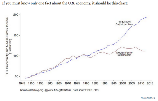
    Here’s a chart that illustrates the author’s point:

    What is happening here is that despite advances in technology and increases in productivity, real wages have been stagnant for decades. (This chart is for the US, but it likely applies to many other countries.)

    This is an interesting paradox. For a long time, increases in productivity were met with corresponding increases in income. So why the divergence?

    The author believes that it’s because the gains brought about by “extreme technological progress” are being unequally applied to the economy. In other words, they do not benefit the majority of people. He then goes on to argue that we could be entering an entirely new macroeconomic era: 

    “Economic growth may be over soon, at least in absolute terms. On the other hand that will be at least partially offset by the technological deflation. So instead of the decline of the innovation it will be just the opposite, the explosion of the innovation that will turn the economy to the decline. And moreover, it will not be a tragedy since we will be able to produce higher standard of living with fraction of the GDP today. Few adjustments needs to be done into our economic system to cope with the change for sure.”

    When you read things like this it makes the idea of a “basic income guarantee” seem far more palatable.

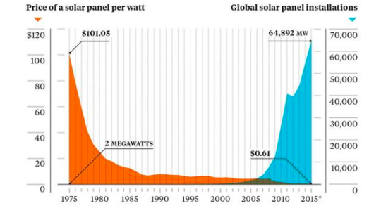
    The other chart that stood out to me was this one below, which shows the declining cost of solar panels and the rise of global solar panel installations. 

    It’s a great reminder that it’s only a matter of time before we wean ourselves off of oil. And, that we could be headed towards some sort of third industrial revolution where the marginal cost of energy is almost zero. Already about 25% of Germany’s electricity comes from renewables.

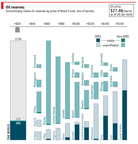
    On that note, I am going to end with a fantastic interactive chart from The Economist (screenshot below) that outlines oil reserves around the world by country. If you click through to their website, you can then toggle the price of oil (per barrel) to see how much of those reserves are actually viable.

    With the price of oil where it is today ($27.88 per barrel as of January 20, 2016), there are only a handful of countries with profitable oil. I am sure you could have guessed which ones.

    What will happen if, or should I say when, that oil is no longer needed? 

  • Balancing oil and ideas

    Colorado Sunset by Travis Bredehoft on 500px.com

    https://500px.com/embed.js

    Canada is a resource rich country. And one of the things that commonly happens to countries with a lot of resources is that they begin to myopically focus on the immediate gains from resources at the expense of long term innovation and economic development. 

    This is known as the “resource curse.”

    The Martin Prosperity Institute here in Toronto recently published a report that looks at this exact topic: Canada’s urban competitiveness through the lenses of its resource economy and its knowledge economy. In the end, Richard Florida and Greg Spencer conclude that two can and should work together, but that we need to stop neglecting our cities:

    “The oil and gas industry is not necessarily a constraint on the creative economy, but in the past decade or so it has come to dominate thinking around economic development policy-making. It is time to use the resources from the energy economy to build a more secure future as an urban knowledge economy. We can also use
    talent and technology to deepen and expand the resource economy.”

    And one of their key recommendation is something I have argued for many times here on Architect This City:

    “A New Federalism for Cities: It is time to give cities the taxing and spending powers they require. Cities must be given more control over their own destinies if they are to prosper
    in the 21st century.”

    Now, here are a few interesting charts from the report.

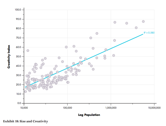
    This first one looks at the relationship between a city’s population and its creativity levels. The two are positively correlated, which means that, in this context, bigger is better.
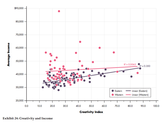
    This second one splits Canada in half – east and west – and then looks at how average income levels are affected by creativity levels (the knowledge economy). Here we see that in eastern cities, income levels are positively correlated with creativity levels. But in western cities, changing creativity levels have almost no impact on income levels. 
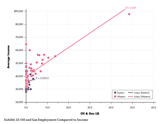
    Finally, this third chart compares the relationship between oil and gas employment (LQ = location quotient) and average income levels. What it finds is that income levels and oil and gas employment are positively correlated in the west, but there’s almost no relationship in eastern cities. 

    The way to read this chart is to think of the LQ as the employment multiple relative to the national average. So for example, a LQ = 10 means that the oil and gas employment levels are 10 times the national average. As you probably guessed, the pink dot way out on the right is Fort McMurray.
    If you’d like to read the entire report, you can do that here. I hope that our new Prime Minister, Justin Trudeau, will read reports like this and spend more of his efforts investing in our knowledge economy – which means investing in our cities.

  • A history of energy and cars (and how Tesla is changing the world)

    image

    I spent this morning reading a long – but incredibly worthwhile – article by Tim Urban on Wait But Why called, How Tesla Will Change The World. (Are they all this long? It was my first time reading WBW.)

    The article, of course, talks a lot about Tesla, but it’s so much more than that. It talks about (1) the history of energy, (2) the history of cars, and then about (3) Elon Musk and Tesla. If you have the time, I highly recommend you give it a read.

    But since it is long and many of you probably won’t do that, here’s an extract from the third section on Tesla (EV = electric vehicle/car):

    EVs aren’t there yet. Right now, there are legit cons. But as the next few years pass, EVs will get cheaper, battery ranges will get longer and longer, Superchargers will pop up more and more until they’re everywhere, and charging times will just decrease as technology advances. Maybe I’m missing something, and I’m sure a bunch of seething commenters will try to make that very clear to me, but it seems like a given to me: the gas era is over and EVs are the obvious, obvious future.

    The car companies, as I mentioned, aren’t happy about all of this—they’re acting like a kid with a cupcake whose parents are forcing them to eat their vegetables.

    But how about the oil industry?

    Unlike car companies, the oil industry can’t suck it up, get on the EV train, and after an unpleasant hump, continue to thrive. If EVs catch on in a serious way and end up being the ubiquitous type of car, oil companies are ruined. 45% of all the world’s extracted oil is used for transportation, but in the developed world, it’s much higher—in the US, 71% of extracted oil is used for transportation, and most of that is for cars.

    As Tim states at the end of his article, this piece is all really about change and progress. Progress is not inevitable. It doesn’t just happen as time marches on. It happens because of strong willed people who believe in something that many others probably don’t. 

    Because with many changes – regardless of how critical or beneficial they may be to society as a whole – there will almost always be entrenched interests that would rather see things stay exactly the same. But in my view, that shouldn’t get in the way of doing the right thing.

    Image: Wait But Why

  • Did we hit peak car?

    image

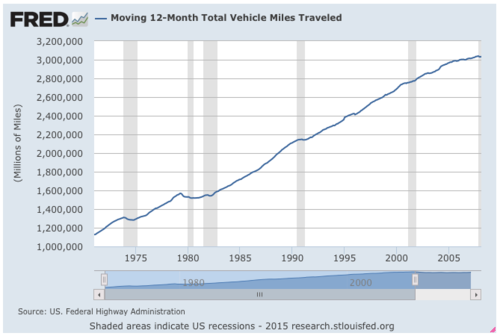
    The total number of vehicle miles traveled in the US used to largely do only one thing: go up. This is made it fairly easy for the Federal Highway Administration (FWHA) to forecast how much more Americans were going to drive in the coming years – they just extended the trend line.

    Below is what that looked like since the early 1970s (via FRED Economic Data). You’ll see that the total vehicle miles traveled went from somewhere around 1.1 trillion miles to around 3 trillion miles in and around the late 2000s. The shaded areas represent recessionary periods.

    image

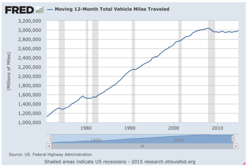
    But then in 2007, something happened. Total vehicle miles traveled peaked, declined, and then flat lined at just under 3 trillion miles. Here’s what that looked like (the ending time period is October 2014):

    image

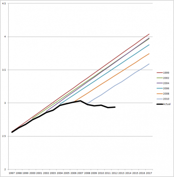
    However, since this was new for the FHWA, they continued to believe that this would ultimately correct itself and that total VMTs would eventually continue on their linear ascent. So here’s what their projections looked like (via State Smart Transportation Initiative):

    image

    Clearly things didn’t go as planned.

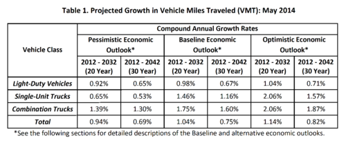
    But then in May of last year (2014), the FHWA finally changed its tune and released this forecast, which had the following projections:

    image

    It outlined 3 economic scenarios: a pessimistic one, a baseline one, and an optimistic one. In their baseline outlook, they believed that the annual growth rate for total vehicle miles traveled in the US would be 0.75% over a 30 year period running from 2012 to 2042.

    At the same time, they also stated that population growth would average about 0.7% per year through this same period. This means that the FHWA has more or less conceded that total vehicles traveled per person will likely remain flat, which is a significant change from previous forecasts.

    Now, given their track record, I don’t think any of us should put a lot of faith in the accuracy of these numbers. Per capita driving could flat line. But it might also go down, which is what it has been doing over the past few years.

    Either way, I do think it’s worth thinking about this shift. It’s a pretty big deal.

    Top Image: Flickr

  • Natural resources drive employment growth in Canadian cities

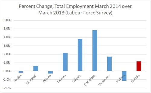
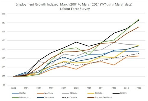
    I was reading Wendy Waters’ All About Cities blog this morning and I came across the following charts showing employment growth across Canadian cities. The first chart shows total employment growth over the last year and the second chart shows employment growth over the past 10 years.

    What is immediately obvious from these charts is that Calgary and Edmonton–both resource driven economies–have and are leading Canada in terms of employment growth.

    Toronto isn’t that far behind though, particularly if you exclude manufacturing from the equation (see second chart). The decline of manufacturing in the Greater Toronto Area really represents a structural change in the economy.

    I wanted to post these charts because, for all the talk about the rise of the information and digital age, Canada’s economy is still very much based on natural resources. We extract and sell. And we have one of the largest proven oil reserves in the world.

    Now, I’m not opposed to this business model, but there’s lots of evidence out there to suggest that resource dependency ultimately hurts innovation and productivity–which makes sense. If we didn’t have resources, we’d be forced to figure out other ways to make money.

    So while it’s great to see our cities growing, let’s not take it for granted.