Daily insights for city builders, delivered every morning at 6 AM ET. I’m Brandon Donnelly — a Toronto-based real estate developer and founder of Globizen. I’ve been writing here since 2013.

Tag: official plan

  • Thoughts on Dupont Street in Toronto

    This morning I spoke to the Globe and Mail about the evolving nature of Dupont Street here in Toronto. The impetus for the discussion was this: Dupont Street is now seeing a lot of residential intensification, but the street itself remains a bit of a crosstown highway. It’s not yet a “complete street.” And since Junction House is effectively on the west end of this midtown artery, John Lorinc asked to get my thoughts.

    The point I tried to make is that, in my opinion, this is first and foremost a zoning issue. Dupont Street is seeing intensification, but it is largely happening on the north side of the street, abutting the rail corridor (purple and red in the above Official Plan map). The south side of the street is, for the most part, a low-rise neighborhood (yellow in the above map).

    This kind of edge condition is somewhat unique in the city: low-rise on one side of the street; higher density housing, retail, and office on the other. But it is particularly problematic if you’re trying to create a great main street, because single-sided retail streets generally don’t work very well.

    We could certainly have a discussion about sidewalk widths, bike lanes, and other streetscape improvements; but in my mind, there is nothing inherently bad about the cross section of this street. The right-of-way width is 20 meters, meaning there are generally two lanes going in each direction. This is a dimension you’ll find all over the city, including on beloved streets like Queen Street.

    The problem here is what is abutting the street, and it is something that is systemic across the city: we have too many arterial roads that only allow for low-rise housing. So if you were to ask me what to do next, and I was asked this morning, the first thing I would do is up-zone the south side of Dupont and allow for non-residential uses at grade.

    And once this is done, I am certain it will snowball many other positive improvements.

  • What should Toronto do with its major streets?

    The City of Toronto’s Official Plan directs growth to areas of the city that it refers to as Centres, Avenues, Employment Areas, and the Downtown. In other words, these are the areas where most new development is intended to take place. So if you own land in one of these areas, it is probably worth more than if it were outside of them, all other things being equal.

    Avenues are what you might expect. They are major streets that run throughout the city (pink ones in the above map). But not all major streets are “Avenues.” There are lots of major streets that provide connectivity across the city but still feel like residential streets (tired ones I might add) and that have land use policies that only allow low-rise housing. I have always viewed this as a mismatch and I have long been critical of it on the blog.

    But as part of the City’s Expanding Housing Options in Neighourhoods (EHON) initiative, this exact problem is being looked at. And I think it is one of the most important land use studies currently underway in the city. Because if we are truly serious about housing affordability and our low-carbon goals, we are going to need to blanket our city with a lot more transit-supportive density. And our major streets are great place to start.

    I just hope that everyone involved will be as bold and visionary as possible. If you have any thoughts, please leave them in the comment selection below. And for the latest on this study, click here. It is an agenda item at next month’s Planning and Housing Committee meeting.

  • Our Plan Toronto

    The City of Toronto is currently reviewing its Official Plan, which is a city planning document that acts as a kind of master guide for land user matters. It is a pretty important document in that it dictates, among other things, what kind of development should go where. One way that it is often explained is that our OP is the “vision”, whereas our zoning by-laws are the “precision.”

    This update will be completed by next summer. Why? Because the Province of Ontario said so. (That’s how things work around here. I think cities should have more power.)

    Toronto is expected to grow by more than 700,000 people and add some 450,000 jobs by 2051. Where these people and jobs will be accommodated is a big part of the exercise here.

    As part of this review, the City of Toronto published this Story Map. It is pretty neat. It looks at how the city has grown over the years (the above image is Toronto’s 1943 Master Plan). It explains a little bit about how planning works. And it has a bunch of stats on how people live and work in the city. I just used it to confirm my hunch that there are exactly zero single-family homes in my neighborhood.

    Looking at the above map from 1943, it is, of course, interesting to see how much the city has grown. But it also interesting to note that many of the neighborhoods that now form part of the city were just “New Residential Areas with Prospective Populations.” They were colors and numbers on a map in areas that had yet to be built out by developers.

    When I see this, I can’t help but wonder what the narrative was like at the time with respect to these new developments. Were people upset? Were people happy? Did people even notice what was happening on the edges of their city? Because sprawl, and that’s what this was, is quite different from intensification.

    Our focus today is on the latter. It is about building up as opposed to out. There’s no more room for yellow shaded areas with numbers. This means that we will end up using our land and other resources more efficiently, but it also presents a whole host of issues. Change is hard. Intensification is hard. Part of the job of this document is to navigate some of these challenges.

    If you’d like to get engaged with the city’s Official Plan review, head over here.

  • Toronto approves city-wide expansion of laneway suites

    This a big month for laneway (housing) advocates in Toronto. Last week, City Council voted in favor of expanding the policy provisions for laneway suites to all Neighbourhoods within the city. (Neighbourhood is a defined term in the city’s Official Plan.)

    Previously, the policies — which allow laneway suites to be built as-of-right — only applied to the Toronto & East York Districts. Here’s a copy of the recent staff report in case you would like more information.

    On Monday, my friend Alex Sharpe (of Lanescape) was on BNN Bloomberg talking about why this is a good thing for the city. Alex and the rest of the team at Lanescape have been instrumental in these policy changes.

    If you’re a Toronto homeowner with a property that fronts onto a laneway, I would encourage you to consider this opportunity. It’s a way to increase the value of your home and it’s a way to create more rental housing in this city.

  • A mapping of development potential in Toronto

    I first met Monika Jaroszonek in 2017, right before she started RATIO.CITY. Since then she has developed some pretty incredible tools for the city building space.

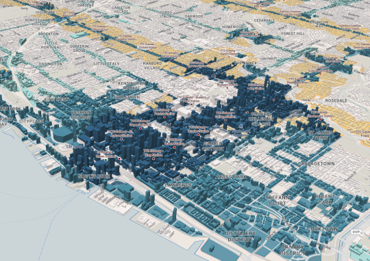
    Yesterday the company published this interactive visualization looking at development potential across the City of Toronto. The mapping looks for the following:

    The tool then ranks each development site – AAA, AA, A – according to how many of the above criteria it meets.

    It also flags land that it refers to as “Missed Opportunity.” These are lands located within 500m of a Major Transit Station, but that are designated as Neighbourhoods (considered stable) or Employment (whole other discussion).

    Based on this filter, about 5.6% of the City’s land is a “Missed Opportunity” and about 1.2% is AAA.

    When you look at the visualization, that is one of the first things you will probably notice; a lot of our transit infrastructure is currently underutilized as a result of land use policies.

    Image: RATIO.CITY

  • Anachronistic employment areas

    Today I was at the Land & Development Conference here in Toronto. I started live tweeting during the breakfast, but my vintage iPhone 6 couldn’t keep up, so I had to stop. Some insights throughout the day. But a lot of what you would expect. I suppose it’s more about the networking.

    I would, however, like to reiterate something that Ken Greenberg mentioned about Employment Areas/Lands in Toronto. For those of you who aren’t familiar, these lands are essentially intended to serve one, and only one, purpose: employment. And the process for introducing a mix of uses, including residential, is an onerous one to say the least.

    I appreciate why this is the case. But I agree with Greenberg in that this kind of single use zoning is antiquated. It does not reflect the realities of the market today. There are other mechanisms we can use to maintain and provide for employment, and ensure that we don’t end up with a city of all residential.

  • Neighborhood depopulation

    Recently we’ve been talking about California’s Proposition 13 and how it may be creating a disincentive for longtime homeowners to move. They’re enjoying below market property taxes, and so they stay put, even if they may have too much house.

    But this concept of “overhousing” isn’t unique to California. The Globe and Mail just ran a piece talking about how Toronto’s designated “Neighborhoods” are losing people as the nests empty out, seniors remain put, and the broader city booms.

    The rate of depopulation that created the spare bedrooms in Toronto’s low-rise neighbourhoods is stark: “Since 2001, about 52 per cent of the land mass of Toronto has reduced in density of population by about 201,000 people,” Mr. Smetanin says. “Other parts of Toronto have grown by 492,000.”

    The irony of this phenomenon is that the city’s Official Plan considers these Neighborhoods to be “physically stable”, as well as “one of the keys to Toronto’s success.” However, things are clearly changing behind that physical stability.

    Photo by Verne Ho on Unsplash

  • The missing middle will come, eventually

    Yesterday Lloyd Alter of Treehugger wrote a great rebuttal to my post about homes for families. His argument was that I missed a whole world of building typologies between single family homes and apartments. (Something that architect and urban planner Daniel Parolek calls “The Missing Middle”.)

    Now he’s absolutely right. I didn’t mention it – other than provide an option in the survey for townhomes. And he’s right that it’s a tremendous opportunity for cities looking to increase housing supply and improve affordability.

    But the reason I didn’t mention it in my survey is because, here in Toronto, we’re not very good at that middle scale.

    I previously wrote a post talking about Toronto’s 3 stages of intensification. It went from high-rise to mid-rise, and then to low-rise intensification. And my argument was that we’re still in and figuring out the mid-rise scale. (There are challenges at this scale, but that deserves a separate post.)

    Eventually though, I think we will get to low-rise intensification. And that will cover off many of the building typologies that Lloyd is talking about: duplexes, triplexes, fourplexes, and, my personal favorite, laneway houses.

    This, of course, isn’t the case in every city. Many cities, such as Montreal, have a strong history of neighborhood-scaled apartments. Lloyd points that out in his article. But that’s not the case here in Toronto.

    In fact, Toronto’s Official Plan explicitly designates these low-rise “Neighborhoods” as areas that are stable and should not see much intensification. And it was a great selling point for the Places to Grow Act: intensification here, but not there.

    But I think this will change. Not because I’m a real estate developer and I think it should change, but because our current arrangement is causing a dramatic erosion of affordability at the low-rise/ground-related housing scale.

    If it were up to me, and it most certainly is not, I would start with laneway housing. It’s a great way to intensify low-rise neighbourhoods without altering the character of the streets.

    If you live in a single family neighborhood, I would especially love to hear your thoughts in the comment section below. It will be interesting to see how this all plays out. 

  • Dimensioning pedestrian happiness

    The area that stretches between the property line on one side of a street and the property line on the other side of a street is called a public right-of-way here in Toronto. It may be called something different in other cities and countries.

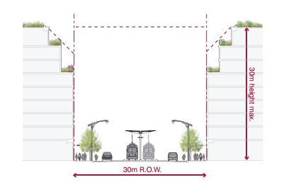
    In the example below (taken from Toronto’s Avenues & Mid-Rise Buildings Study), it includes the sidewalks, the car lanes, and the streetcar lanes. But it could also include other public elements. In this instance, the buildings on either side of the street are assumed to be built right up against their property lines.

    ROWs obviously serve an important public function. But their size also has important urban design implications. As a pedestrian, it feels different to walk on a narrow street than it does on a broad street.

    The width of a ROW can also be used to inform what the preferred height of the buildings along it should be. In the example above, they’re talking about a 1:1 relationship between the width of the ROW and the preferred height of the buildings.

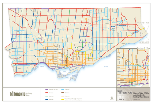
    Given their importance, I thought it would be interesting to share this map of Toronto (dated 2010) showing ROW sizing throughout the city. The mustard colored lines in the core of the city represent 20 metres, the red lines 36 metres, and the purple lines 45 metres or more. The rest of the colors fall somewhere in-between. For the most part, the purple lines represent highways, although there are a few other instances of purple.

    What’s interesting – but not surprising – to see is how we basically kept expanding the size of our ROWs as Toronto grew outwards. This was obviously to make more room for cars on the road.

    But the other, perhaps more interesting thing about this map, is that it could also serve as a guide to pedestrian happiness. The mustard/yellow lines are where it’s most enjoyable to walk. And the red and purple lines are where it’s least enjoyable to walk.

    If you’re from Toronto, give this framework a try and see if it holds true.

  • How Toronto is growing

    If there are two things we like to talk about here in Toronto it’s that there are a lot of condos going up and that it’s becoming increasingly difficult–some would say impossible–to get around. Just this past weekend, I had 2 or 3 people tell me that biking is the only practical way to get around downtown and that it’s fairly easy to outwalk a streetcar on either Queen Street or King Street.

    Usually these statements are followed by a question, asking what the city is doing to address these issues. The unfortunate reality is that I think urban mobility is going to get worse before it gets better (although I am thrilled about the Eglinton Crosstown line now under construction). If you’re a regular reader, you’ll know that I’m a supporter of a Downtown Relief Subway line and that I was disappointed by John Tory’s recent transit proposal.

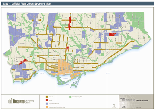
    The best way to explain why I feel this way is to talk about how and where Toronto is growing. In my post on John Tory’s transit proposal, I talked about how Toronto is developing in the shape of an upside down letter T. And the reason for that is because in the city’s Official Plan, the “Downtown and Central Waterfront” area is identified as a growth node and is shaped more or less like an upside T. It’s the light orange in the following map.

    image

    In addition to the downtown core, the areas shown in red are earmarked as “Centres” for growth. There’s one in each borough (Etobicoke, North York and Scarborough) and one at Yonge & Eglinton, which most people would consider to be the heart of midtown. Finally, you have the “Avenues” which are the greenish brown lines on the above map. Those are areas that city also hopes will accommodate future growth.

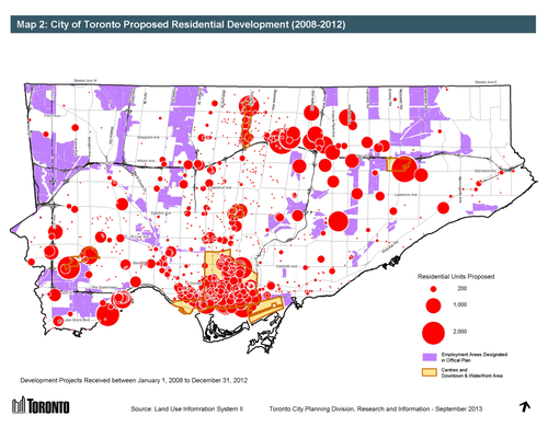
    Now, let’s look at where development is happening in the city. Here’s residential development from 2008 to 2012. The biggest circle represents 2,000 proposed residential units.

    image

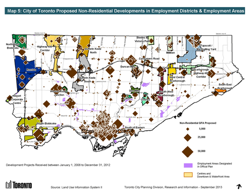
    And here’s non-residential development. The largest diamond represents projects with a non-residential floor area greater than 50,000 square meters (~540,000 square feet).

    image

    What should become immediately apparent is that growth–particularly on the residential side–is happening more or less according to plan. The biggest “outliers” are really the development happening along Mimico’s waterfront and all the development happening along Sheppard Avenue East. But those are because of the water and the Sheppard subway line.

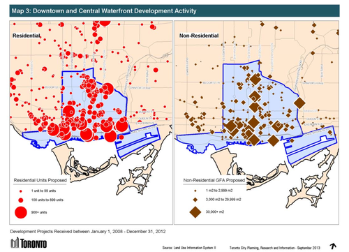
    In both the residential and non-residential cases though, the downtown and central waterfront area is quite clearly receiving a significant share of the development happening in the city.

    image

    Which always makes me wonder: Why are we so reluctant to build proper transit in the core?

    The city’s Official Plan is clearly funneling growth to downtown and yet we continue to propose, fund, and build subway lines in areas where the population densities are lower and ridership levels will inevitably be less. Which ultimately means that the required government subsidies to keep those lines operating will be higher.

    I’m not suggesting that the inner boroughs don’t also need top notch transit and infrastructure. They absolutely do. But I get frustrated when politics trumps rational city building. And so does everybody else who’s stuck with inadequate mobility options.

    Images: City of Toronto