Daily insights for city builders, delivered every morning at 6 AM ET. I’m Brandon Donnelly — a Toronto-based real estate developer and founder of Globizen. I’ve been writing here since 2013.

Tag: new geography

  • A place for everything

    Housing is expensive in California:

    In 2021, San Jose had the least affordable housing among the 92 major US housing markets, with a median multiple of 12.6. San Francisco had a median multiple of 11.8, Los Angeles was at 10.7, followed by San Diego, at 10.1).7 Housing was severely unaffordable even in the interior markets, with Riverside-San Bernardino at 7.4 and Sacramento at 6.7.

    And there are some explanations for why that is the case:

    Dartmouth economist William Fischel published an early seminal review 9 of housing affordability in California (1970 to the 1990s). Fischel suggested that regulatory research should look for major changes that “are adopted in some places but not in others.”

    Fischel examined the higher house price increases that occurred in California compared to the rest of the nation between the late 1960s and late 1980s. Fischel cites various possible causal factors. He found that the higher prices could not be explained by higher construction cost increases, demand, higher personal income growth, the quality of life, amenities, Proposition 13, land supply or water issues.

    Instead Fischel cites stronger land use restrictions — There were two principal issues, the California Environmental Quality Act (CEQA) and local growth management restrictions.10

    We have discussed this issue many times before on the blog, but Wendell Cox’s article is helpful in pointing out that zoning in and of itself wasn’t the problem. The problem arose, at least according to Fischel’s research, when these policies went from “ordinary zoning” to something that became a tool to restrict growth.

    The illustrate what “ordinary zoning” means, Cox uses the idiom, “a place for everything, but everything in its place.” And I think this is an interesting way of putting it. Part of the reason why we have zoning is that it is a way to organize uses. It is a way of saying that sex shops and cannabis shops can’t go here, but they can go over there.

    But the key part of this idiom is its first part: a place for everything. What this implies is that the answer should never just be, “no, sorry, you can’t build this.” At most, it should be, “no, sorry, you can’t build this here, but you can over there.” There is a place for everything.

    Of course, this is much harder to do when you flip from sprawl development to infill development. Because now there are fewer places “over there.” You really have to figure out “here.”

  • Toronto is the densest urban area in North America

    Some of you are probably shocked by this headline. But it is true. Here’s the chart to prove it:

    Toronto is number one. Los Angeles is number two. And New York sits just behind Winnipeg and Calgary. Huh?

    The reason this is likely surprising to you is that when most people think of urban density they think of the urban core. And you are correct in thinking that the urban core of New York City is denser than the urban core of Winnipeg.

    The difference here is that we are talking about “urban area” (or “population centre” in Canada). This is the continuously built up area around each major city. Think of it as the lit up area that you might see on a nighttime aerial photo.

    Urban areas don’t care about municipal or other jurisdictional boundaries. And they don’t factor rural areas. Urban areas are a measure of continuous urbanization.

    So even if you have the densest downtown on the planet, if you have a sprawling low-density urban area surrounding it, you can still end up with a relatively low overall population density. And this is precisely what is happening here with New York.

    This is also why there’s only so much that you can glean from a blended average like this. Because you can have very different urban forms and very different mobility splits (think New York City vs. Winnipeg), and still end up with somewhat comparable averages.

    Chart: New Geography

  • Super-entrepreneurs by region

    A super-entrepreneur, according to the common definition, is a rich person who has amassed a net worth of at least US$1 billion dollars by either starting a company or taking a small company and growing it into a big one. A super-entrepreneur is, by definition, not someone who inherited their wealth. Though I’m not sure what the cut off is. If you inherited $1 million and then started a massive company, does that still make you a super-entrepreneur? What about if you inherited $100 million?

    In any event, here is a chart from New Geography showing super-entrepreneurs by region:

    The USA is in the lead in this chart at about 3.1 super-entrepreneurs per one million inhabitants. But the highest rate in the world, at least according to this data set, actually belongs to Singapore at 4.7 per million. Europe, as a whole, doesn’t look all that great here. But again, if you get more specific, some European countries are actually doing quite well. Sweden, for instance, is sitting at around 2 per million, which is higher than Canada’s figure.

    Why this data is potentially interesting is that it tells you a bit about these countries. It tells you whether they have strong property rights, whether it’s easy to conduct business, and whether it’s supportive of new ideas, among, of course, many other things. There also appears to be a clear link between the presence of super-entrepreneurs and unemployment. Turns out that the more people you have starting wildly successful businesses, the lower unemployment tends to be.

    For the full New Geography article, click here. In addition to what I just wrote about, it talks about Europe’s “entrepreneurial paradox” and issues of gender equality.

  • The car versus transit job access multiple

    I haven’t seen this sort of data before and it’s an interesting way of looking at job access, transit connectivity, and overall built form:

    The above is a table from New Geography (using data from the University of Minnesota). And what it shows is how many more jobs, across the US, can be accessed within a 30-minute commute by car versus by transit. For example, what this data tells us is that, on average across the US, there are about 56x more jobs that can be quickly accessed by car versus by transit.

    But there is also huge variation across the 50 largest cities in the US. On the top end is Detroit, where there about 130x more jobs that can be accessed by car (again within 30 minutes). This isn’t at all surprising. Also not surprising is the fact that New York is on the lowest end with only 5.6x as many car-versus-transit jobs. This is one of the reasons why I spoke yesterday about NYC being such an ideal candidate for something like NYC 25×25.

    What a lower number tells us is that the city is far less reliant on personal vehicles and almost certainly has a higher urban density. That’s why you see cities like New York, San Francisco, Boston, and Chicago near the top of this list. And in my opinion, this is where you want to be. The goal should be to minimize this multiple.

    I haven’t seen a dataset like this before, but I’m now curious to see how it varies globally. It feels like something that more of us should be monitoring. Because we know that there are strong links between jobs access and the overall economic performance of a city.

  • Where Americans moved over the last decade

    Today’s post is perhaps a good follow-up to yesterday’s post about housing supply in Ontario. Below are a few charts taken from a recent article by Wendell Cox looking at net domestic migration across the US. The takeaway here is that the shift from larger cities to smaller cities seems to be accelerating, following a trend that started before COVID.

    The data in these charts is organized according to population and by Core Based Statistical Areas (CBSAs). At the bottom are America’s two megacities: New York and Los Angeles. Both have metro areas that exceed 10 million people. As you can, these two city regions have been losing the most people, both in terms of total humans and on a percentage basis. The goldilocks sweet spot seems to be cities in the 500k to 1 million range.

    But the most telling figure is probably this one here:

    This chart adds up all major metropolitan areas with a population greater than 1 million, and then shows net migration over the last decade. Here you can see when this trend started (around 2016) and how it has been accelerating. In this case, it does appear that COVID added some fuel to the fire. But the question remains: Why is this longer-term trend even happening?

    Is it a short-term phenomenon? Is it because once a city reaches a certain size it simply becomes more annoying to live in it and people would prefer to live elsewhere? Or is it more about overall affordability? That is, if we could figure out how to deliver more affordable housing in our cities, could we stymie the bleeding toward smaller and more affordable ones?

    I don’t know the answers to the questions. But they have been widely debated and I still think they’re interesting ones. If all things were equal (or closer to equal), how and where would most people choose to live? Put differently, how much of this is some sort of natural market outcome and how much of it is a direct result of our actions (or inactions)?

  • Canada is a suburban nation

    Statistics Canada has started releasing some of the results from its 2021 survey and there is a new classification that is now being used in its analysis of Census Metropolitan Areas (CMAs). Instead of organizing city regions jurisdictionally, it is now using a new functional classification that is based on travel times to downtown.

    This has resulted in five new geographic categories: Downtown, Urban Fringe (<10 min to downtown), Near Suburb (10-20 min to downtown), Intermediate Suburb (20-30 min to downtown), and Distant Suburb (over 30 min to downtown). Below is chart from a recent Globe and Mail article that summarizes these classifications, but keep in mind that percentage growth is different than total population growth (the next chart from New Geography covers this one).

    This is more granular than their previous approach, which used to be fairly binary: city core vs. the suburbs. But at the same time, it reflects a very suburban and monocentric view of cities. Downtown is in the middle. People generally need to drive to said downtown for things like work and entertainment. And so how long does it take to do that?

    Though in all fairness, this lens is our reality. When you apply the above classification and look at Canada’s 41 largest metropolitan areas, only 4.7% of us live in a downtown and only about 28.5% of us live in what is presumably an urban setting (downtown + urban fringe). And the numbers are actually less urban in a CMA like Toronto, where 11.5% live in the urban core (downtown + urban fringe) and 88.5% live in the suburbs, whether near or distant.

    However, one could argue that we are at least becoming slightly more urban. Only 11.5% of Torontonians might currently live in the urban core (2021), but 16% of our growth from 2016 to 2021 went to it (see above chart). Of course, this is an incremental kind of shift. About 84% of our population gain also went to the suburbs, with the vast majority of it going to distant suburbs (a 30 minute commute in Toronto is nothing after all).

    As Wendell Cox points out in this recent New Geography article, Canada remains a suburban nation.

  • Net domestic migration is still pretty suburban

    For years, the data has been clear. Many Americans are moving from expensive cities, like Los Angeles, to less expensive metropolitan areas like Dallas-Fort Worth.

    But Wendell Cox’s recent article over at New Geography is a good reminder that these data sets can be limited. The US Census Bureau currently tracks domestic migration at the county level only. This can be a bit of a problem as counties vary dramatically in terms of geography and population.

    The New York metropolitan area, for example, is comprised of 25 different counties averaging about 750,000 residents. The Los Angeles metropolitan area, on the other hand, is compromised of two counties averaging about 6.6 million residents.

    These sorts of nuances become important when you’re trying to figure out things like whether people are moving to/from urban cores or the suburbs. Case in point: The San Diego metro area is compromised of a single county. When people move there, the data says nothing about how urban or suburban they might be.

    Dallas-Fort Worth is a lot easier to read. Since 2010, it has had the largest net domestic migration of any metro area in the US: +443,000 residents. But county data reveals that it is entirely suburban. The core (Dallas County) actually lost 57,000 people from 2010 to 2019. And this is not unique to the Dallas-Fort Worth area.

    Photo by Gabriel Tovar on Unsplash

  • Are you happy with where you live?

    This past weekend I saw a few people reacting on Twitter to this article by Wendell Cox talking about how Canadian families are being denied their preferred housing choice: the detached single family home.

    The fact that the article is by Wendell Cox should tell you everything you need to know. But essentially the argument is that misguided planning policies are driving up the cost of housing and that we should, instead, be encouraging unfettered sprawl.

    There’s lots to discuss here, but the first thought that actually came to mind was: “How would this article sound if we replaced all of the references to housing with references to cars?” In case you too are wondering that, this is how the first paragraph would read:

    A new poll by Sotheby’s International Realty suggests substantial disappointment among Canada’s young urban families, unable to afford to purchase the types of [cars] that they prefer. The poll determined that young urban households in Canada strongly prefer [Aston Martins], but they are often “motivated by (financial) necessity to purchases [sic] [cars], especially [BMWs], they do not prefer.“

    The article is clearly one-sided. I don’t disagree that there are people who – all things being equal – would prefer to raise a family in a ground-related single family home. Backyards serve a purpose, as do large basements equipped with beer fridges.

    But all things are not equal. And there also people who value walkability, a reasonable commute, and the kind of urban amenities that come along with being in a dense city. I am one of those people.

    Photo by Adrien Olichon on Unsplash

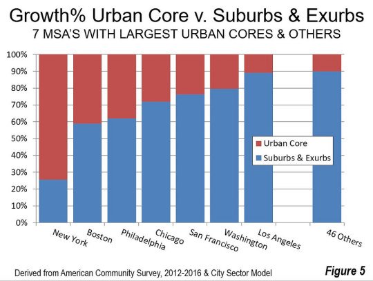
  • New York is the only US city with an urban core growing faster than the suburbs

    The latest data from the American Community Survey (2012 to 2016) has placed the suburban and exurban share of the US population (53 major metropolitan areas) at 85.5%. Back in 2000 this number was thought to be around 83.5%.

    Since 2010, automobile oriented suburbs and exurbs have also accounted for 90.5% of population growth. The US – and Canada would be no different – is by and large a suburban nation. And the data suggests this isn’t about to change.

    The one exception is the New York metro area. From 2012 to 2016, 74% of its growth happened in the urban core. No other major metropolitan area in the US comes close to this sort of urbanity. Below is a chart from New Geography that shows you how NYC compares.

    All of the data for this post was also taken from New Geography.