Daily insights for city builders, delivered every morning at 6 AM ET. I’m Brandon Donnelly — a Toronto-based real estate developer and founder of Globizen. I’ve been writing here since 2013.

Tag: net migration

  • New York City is back

    So here’s the headline: More people are moving to Manhattan than before the pandemic. This is true. But an even more accurate description might be that New York City was losing people before the pandemic and it is still losing people. But things have rebounded since the lows of the pandemic and it is now losing less people. Here are two charts from Bloomberg:

    This is generally good news since the increased exodus (to places like Miami) led some to believe that one of the most important global cities in the world was now dying. I never thought that was the case. But there’s no arguing against the fact that the fastest growing cities in the US are the ones with more affordable housing and fewer constraints on new development.

  • Net flow of households across US regions

    These are a set of diagrams taken from a recent WSJ article talking about how, “the pandemic changed where Americans live.” I know that this is a topic that gets a lot of air time (both here on the blog and elsewhere), but these diagrams do a good job of showing the flow of people, as well as how things may have changed/accelerated since 2018.

    These diagrams also remind me of the work of Charles Joseph Minard. A French civil engineer, Minard is best known for his contributions to the field of information graphics, and in particular his flow maps. His most famous piece of work — which I happen to have hanging at home — is his depiction of Napoleon’s losses during the Russian campaign of 1812.

    The map itself is from 1869 and is packed full of information. It shows the number of Napoleonic troops as they left for Moscow, the distance they traveled, the outside temperature (the French weren’t properly prepared for the cold), latitude and longitude, the direction of travel, and the location of the troops relative to specific dates.

    The point of the diagram was really to show how disastrous this campaign was for Napoleon. The thick beige band on the left is showing over 400,000 troops setting out. But by the time they reached Moscow — which, by the way, had been abandoned before their arrival — only about 100,000 troops were left.

    The thin black bar on the bottom is showing how many troops ultimately remained and returned at the end of the campaign — the number was only about 10,000. So the vast majority of Napoleon’s troops perished. Supposedly over half either starved or froze to death.

    Some 150 years later, and we are still using flow charts to clearly depict the movement of people and things.

  • Crossing the chasm in Austin

    I can’t open Twitter these days without seeing someone in the tech industry talking about moving or talking about someone who just moved to either Austin or Miami. “What’s the best neighborhood in Miami for startups? My friend just moved to Edgewater. Where did so-and-so move?”

    Here’s a recent article from the WSJ talking about how accelerated tech-fueled growth is straining Austin. And below is a set of charts (from the article) comparing home prices in Austin and San Francisco. (Reminder, the California-to-Texas migratory pattern recorded the highest number of “net movers” last year.)

    But in reading through the article, I am reminded that the challenges facing Austin are not entirely unique. Growing cities all around the world are being put in a position where they need to decide whether they want to remain car-oriented and relatively low-density, or if they want to make the shift toward more transit-oriented urbanism.

    It’s admittedly not easy, both politically and practically speaking. It’s hard to rewrite deeply entrenched built form. But Austin is naturally looking at what happened in San Francisco, where restrictions on new development are thought to be partially (largely?) responsible for the city’s unaffordable housing.

    According to the same WSJ article, voters in Austin turned down two previous transit proposals. One was in 2000 and the other was in 2014. There was concern over too much urbanization. There was concern it would induce more people to move to the city. And there was concern that it would threaten the city’s low-rise single-family homes.

    But this year a transit plan was approved that includes three new rail lines, one of which will tunnel through downtown. Provided that Austin can effectively pair this with more housing, more uses, and more density — which is generally what you need to make transit work — then it may be well on its way to crossing, if you will, the chasm of urbanity.

    Charts: WSJ

  • Urban migration, household type, and housing supply

    Here is an interesting discussion paper on the Toronto region’s economy, demographic outlook, and its land use. It was recently published by IBI Group and Hemson Consulting to support the 10-year review of our regional transportation plan.

    I wanted to share a couple of charts from the report that I thought were interesting. If you’re not in the Toronto region, I would be very curious to hear how your city might compare in terms of the way it is trending.

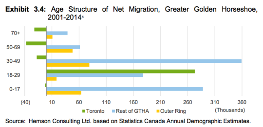
    The first chart is net migration by age group. Like Vancouver – similar chart posted here – people have been moving into the city/Toronto when they’re young and then moving out to the suburbs once they start having families. 

    Will that continue? The oldest Millennials are now hitting their mid-30′s and I am very interested to see if there will be any reversal in this.
    image

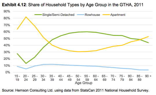
    Given the above trend, people in this region are not surprisingly also swapping apartments for ground-related housing as they get older. The crossover point seems to be (or at least has been) when people hit their mid-30′s. Again, I am curious how this may evolve as the city matures.
    image

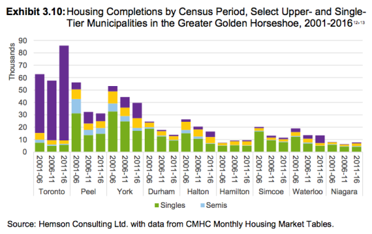
    Because if you look at housing completions from 2001 to 2016 (chart below), the only municipality that was able to meaningfully increase its housing supply was Toronto. 

    Every other municipality – except for Hamilton, which posted modest gains – experienced significant declines in the number of new homes delivered to the market over the last census periods. 

    Of course, the only reason Toronto was able to increase its housing supply was by building up – in other words by building condos and apartments. (Shown in the purple below. For some reason the legend is incomplete in the report.) 
    image

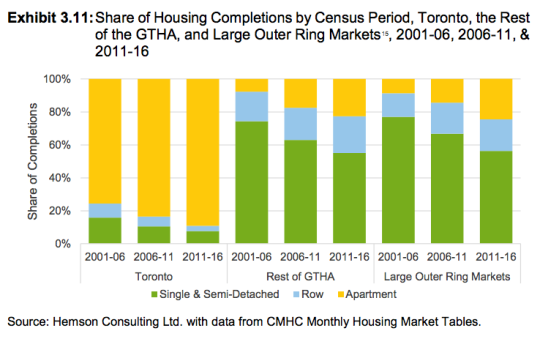
    If you look at the share of housing completions, over 80% of new homes in Toronto are now in apartment form. 
    image

    Intensification is a deliberate policy choice. And we can certainly debate whether it’s a good or bad thing (I believe it’s a good thing). 

    But putting that aside, the above charts are a great answer to the perennial question: “How is it that Toronto is building so many condos?” This is why.

  • A look at net migration by age group in Vancouver

    I’ve written quite a few posts about family formation and, more specifically, about where Millennials will move once they start having kids

    Many seem to believe that – despite the current Millennial love affair with urban centers – much of this cohort is destined to repeat the pattern of the previous generation. Meaning, once the kids come along, they’re headed to the suburbs in search of bigger and more affordable housing.

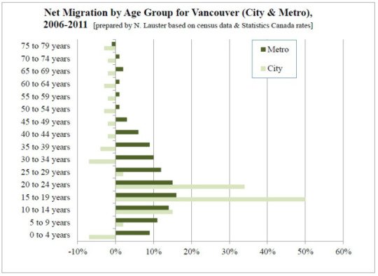
    If you look at the data, there’s a lot to support this prediction. Below is an interesting chart from Nathanael Lauster (Professor in Sociology at the University of British Columbia) that looks at net migration by age group for the City of Vancouver and the metro area.

    image

    What this chart shows is a flood of people in their late teens and early 20s migrating into the city (many of which are likely students), but then a fairly dramatic net loss of people leaving the city as they enter their 30s. The metro area, however, continues to grow – almost certainly because of people looking for more suitable family housing.

    But this data is from 2006-2011. We don’t yet have the 2016 census data. And I suspect that we will start to see an increase in the number of people opting to remain in the city across many different urban centers. 

    There are some very real economic pressures that successful cities today have to contend with. But I believe that the desire to remain in the city is there for a lot of young people.