
Max Galka has created an incredible visualization of country-to-country net migration (from 2010 to 2015) on his blog, Metrocosm.
Here’s a screenshot:
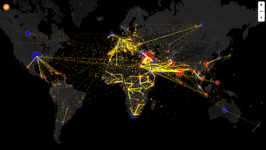
But you really need to view the full screen interactive version.
In that version, you can hover over a country to see the total net migration number (+/-) and you can click on a country to see where people are moving to and from. A blue circle indicates positive net migration (greater inflows) and a red circle indicates negative net migration (greater outflows).
All of the data is from the United Nations Population Division. And though the numbers are estimates, it’s a fascinating look at global migration. For instance, look at the outflow from Syria.
It would also be interesting to see these numbers on a per capita basis because some countries certainly punch above or below their weight in terms of migration. Off the top of my head, I’m thinking of Canada and Australia vis-à-vis the US.