Daily insights for city builders, delivered every morning at 6 AM ET. I’m Brandon Donnelly — a Toronto-based real estate developer and founder of Globizen. I’ve been writing here since 2013.

Tag: moscow

  • Yes, the most surveilled cities in the world are in China

    Toronto has a lot more CCTV cameras than I would have thought.

    According to this (2022?) data from Comparitech, there is estimated to be about 19,236 cameras installed around the Greater Toronto Area. With a population of around 6.31 million people, this translates into a per capita rate of 3.05 (CCTV cameras per 1,000 people). What this means is that there is almost surely footage of me enjoying a late-night shawarma sandwich after the bar somewhere on the streets of Toronto.

    In some ways, this is a high number of cameras. Tokyo, which is usually considered to be the largest metro area in the world with nearly 40 million people, only has 1.06 cameras per 1,000 people. Dhaka is 0.71. Sao Paulo is 1.04. Osaka is 1.57. And Montreal is 1.03. Though to be totally fair here, Rio de Janeiro is up at 3.34 (and it may be the most dangerous city mentioned in this post). Paris is 4.04. New York is 6.87. Los Angeles is 8.77. And London is 13.35.

    But where things get really exciting is in authoritarian places. Moscow is estimated to have 16.85 CCTV cameras per 1,000 people. And in China as a whole, there is estimated to be roughly 540 million cameras scattered around its cities, which works out to an average of 372.8 cameras for every 1,000 people. For a city like Shanghai, this crudely equals something like 10.6 million cameras.

    It turns out that surveillance is pretty important for things other than shawarma-eating videos:

    Vyborov wasn’t arrested that day, but the police informed him that he was under surveillance through Sfera, one of Moscow’s face recognition systems, for participating in unsanctioned rallies. Considered one of the most efficient surveillance systems, Sfera led to the detention of 141 people last year. “Facial recognition, and video cameras in general in a totalitarian state, are an absolute evil,” Vyborov says.

    Here’s the other thing. Safety is usually touted as the reason to have lots of cameras. But Comparitech’s data suggests that there’s an almost non-existent correlation between lots of cameras and lower crime. I mean, just look at Tokyo. It is basically the model megacity, and its per capita camera rate is only 1.06. The real utility, it would seem, is using cameras and face recognition software to restrict personal freedoms.

  • Coupe d’une maison parisienne

    This is an interesting article by ArchDaily, looking at the “evolution of the house plan in Europe” between 1760 and 1939. The article focuses on London, Paris, Amsterdam, and Moscow and includes floor plans, photographs, as well as well-known illustrations like the one shown above. Created by Bertall in 1845, the drawing shows a section through a Parisian house and is called The Five Floors of the Parisian World.

    What it shows is the declining opulence that used to exist in Paris’ apartment blocks as you moved upward. If you were rich, you lived on the second floor, right above the ground floor lobby. The ceilings were higher on this floor and maybe had a balcony overlooking the street. If you lived on the third floor it meant that you were a less rich. And if you lived in the top floor attic, you were poor. That is what this comic is showing.

    Now, all of this changed over time as new technologies, namely the elevator, were brought to multi-family buildings. All of a sudden it became convenient to live higher up and all of a sudden people wanted better views and to get further away from the chaos of the street. What I’m curious about, though, is how posterity dealt with the lower ceiling heights on these upper floors.

  • The world’s best cities

    Whenever you see a best-of-anything ranking, you should probably ask yourself what the hell “best” even means. In this case, Resonance Consultancy is ranking the world’s cities based on six alliterative categories: place, people, programming, product, prosperity, and promotion.

    Some of these metrics are qualitative, but many are, in fact, quantitative. Number of COVID-19 infections in 2020; number of direct destinations served by the city’s airports; number of foreign-born residents; number of top-rated restaurants (TripAdvisor); most Instagram check-ins, and so on.

    The result is this list of the world’s best cities:

    1. London
    2. New York
    3. Paris
    4. Moscow
    5. Tokyo
    6. Dubai
    7. Singapore
    8. Barcelona
    9. Los Angeles
    10. Madrid
    11. Rome
    12. Chicago
    13. Toronto
    14. San Francisco
    15. Abu Dhabi

    I arbitrarily chose the top 15 cities in order to make sure that Toronto was included in this ranking. If you’d like to download a full copy of the 2021 World’s Best Cities report, you can do that over here. I recommend you check out their performance criteria.

    Toronto, for example, performs very well when it comes to “people.” That’s fairly consistent across most of these rankings. But it didn’t fare so well when it comes to “place.” That category includes things like the average number of sunny days and the number of high quality sights & landmarks.

  • The world’s cities by 2030

    This UN report (2018) on urbanization trends is a fascinating way to understand how our world is growing and changing. So today’s post is about some of my takeaways. If you have others, feel free to add them to the comment section below.

    But first, some definitions.

    The UN report considers 3 ways to measure the size of a city, all of which we have used before on this blog. The first is the “city proper.” That is the current administrative boundary of a city. The second is the “urban agglomeration” area, which is a city’s contiguous built-up area. And the third is the “metropolitan area,” which is the approximate area of economic and social interconnectedness.

    Above is what these 3 boundaries might look like for Toronto (which is the example they use in their report). About the only one that isn’t debatable is the “city proper” boundary; but it really doesn’t capture the full extent of a city. Wherever possible, the UN report relies on the city’s urban agglomeration area. They also define a “megacity” as a city of over 10 million people.

    The largest city in the world is currently Tokyo. However, from 2018 to 2030 it is expected to decline by almost 900,000 people. Whereas, the city in 2nd position — Delhi — is expected to add more than 10 million inhabitants during this same time period. By 2030, these are expected to be the largest cities in the world:

    Most current megacities are located in what the UN refers to as the “Global South.” And 9 out of the 10 cities projected to become megacities by 2030 are located in developing countries. The one exception is London. Though all regions in the world are becoming more urban, the real population growth is happening in Asia and Africa.

    Most cities — 59% of cities with 500,000 or more people — are at risk of at least one natural disaster. And 3 megacities — namely Manila, Osaka, and Tokyo — are high risk for 3 or more types of natural disaster.

    Going through the report’s data charts, it’s also interesting to note that Toronto is not projected to become a megacity by 2030. However, the Toronto area already represents over 20% of Canada’s entire urban population.

    In the United States, Chicago’s urban agglomeration is projected to continuing growing and does come close to megacity status by 2030. The Miami region is similarly expected to grow and is actually right on top of Toronto in terms of population. But the fastest growing regions are, of course, expected to be the city’s that can more easily sprawl (Las Vegas, Phoenix, and so on).

    Bogotá, Colombia is already a megacity and is expected to add almost 2 million people by 2030. It currently represents about 26.5% of the country’s entire urban population. São Paulo remains one of the top 10 largest cities in the world and is similarly projected to add over 2 million people in the same time period, but to a much larger base.

    In Europe, it’s London, Paris, and Moscow, with the latter two already in possession of megacity status.

    Now quantity isn’t everything. Despite not ranking in the top 10 in terms of population, both New York and London are widely considered to be the world’s preeminent global cities. At the same time, we do know that the size of a city does create certain socioeconomic benefits. Urban agglomerations create agglomeration economies.

    If you’d like to download a copy of the World’s Cities in 2018 (United Nations), click here.

    Charts/Maps: United Nations

  • A 17.6 square meter apartment in Taipei

    Dezeen recently announced its 2019 interior award winners and this 17.6 square meter (~190 square foot) flat in Taipei was selected for “small interior of the year.” Designed by the Taiwanese studio A Little Design, the space features a 3.4m ceiling height and a queen-size sleeping loft. The design is very well done.

    But as I was looking through the photos, I couldn’t help but think, “This is about the size of a parking spot in Toronto.” Typically, the minimum dimensions for a parking space are 2.6m wide by 5.6m long. If either side is obstructed or the drive aisle is substandard, these dimensions need to be increased.

    So we’re not far off.

    Some of you will interpret this to mean that the apartment is too small; whereas some of you will interpret this to mean that the spaces we dedicate to cars are too big. It’s a matter of perspective. But what is clear is that there is a market for small urban spaces. Here are some other examples from São Paulo, Beirut, and Moscow.

    Photo: Hey! Cheese

  • The Knight Frank Global Affordability Monitor 2019

    Here’s a chart from Knight Frank’s 2019 Global Affordability Monitor that I think you’ll find interesting:

    It compares real home price growth and real household income growth (after tax) over the last 5 years for 32 world cities. The bolded percentages represent the former and the non-bolded percentages represent the latter.

    Consider the variations here.

    Amsterdam saw a real home price change of 63.6%, but a household income change of only 4.4% (although the circle looks to be in the wrong spot if this number is correct).

    Moscow, on the other hand, saw flat home prices (0.1%) and a 22.7% increase in household income.

    Though San Francisco is the star in terms of income growth.

    Sao Paulo, unfortunately, saw a dramatic decline in both home prices and incomes. It’s in the bottom left corner.

    When I look at this chart, I don’t see a strong correlation between household incomes and home prices. And the proportions of the chart tell you that the y-axis is moving more than the x-axis.

    But if the top number exceeds the bottom number, then you could come to the conclusion that housing affordability has gotten worse over the last 5 years.

  • The Russian James Bond

    This is last year’s news and some of you may have already seen it, but here is a video of Zaha Hadid’s only completed private residence:

    It was built in the Barvikha Forest near Moscow. The client, Vladislav Doronin, is a real estate developer. He owns/runs Capital Group, OKO Group, and Aman. Zaha used to call him the Russian James Bond.

    The central idea behind the house is the raised master bedroom suite. Vladislav wanted to wake up and only see trees and sky. And so Zaha raised the bedroom 22m above grade.

    Look at it in section (those stairs!):

    It wouldn’t be my first choice, but I can appreciate its boldness. What are your thoughts on this house?

    Image: Dezeen

  • Spaces for the Instagram age

    In 2017, the New York Times Style Magazine ran a piece on Harry Nuriev – and his design firm Crosby Studios – titled: The man designing spaces for the Instagram age

    Since then, Harry and his firm have been in Time Magazine, have had a solo show at Design Miami, and have been named to the Architectural Digest 100, among many other things.

    There has obviously been a lot of talk over the last few years about the impact that Instagram is having on physical spaces and design #IRL (in real life). 

    Some, or perhaps many, worry that it is having a “homogenizing effect on design.” Everyone is following a kind of global minimalism that looks good on social, but is maybe getting a bit monotonous. 

    There’s no question that online is having an impact on how we design offline. But I am far less fussed about it than most. 

    Architecture, design, and art have always reflected the cultural milieu at the time, and it just so happens that we are living through a period where the internet is transforming so much of what we know.

    It is always important to question what is going on. But I think Crosby Studios is doing some really great work.

  • Planning for the unplanned

    I was listening to The Urbanist (Monocle Radio) last night while I was making dinner and there was a segment on Moscow’s “illegal retail kiosks.” These are small scale retail structures that were built without formal planning permissions and so the city decided to demolish them. 

    There was lots of backlash. Photos here.

    Now, I’ve never been to Moscow. So I can’t really comment on the attractiveness and usefulness of these kiosks. But I suspect that these illegal retail kiosks, many of which seem to have been located around metro stations, contributed quite a bit to the city’s urban vibrancy. Retail is hard to get right. It doesn’t work everywhere.

    All of this got me thinking about our tendency to sterilize and overplan cities. I’m not saying that planning is bad. It’s not. But I do think we should acknowledge that we don’t know everything about the future and that human ingenuity will undoubtedly unlock new things we never thought would be beneficial.

    So how do we plan for the unplanned? Perhaps it starts with accepting the off-center. Here’s a quote from Anthony Bourdain (it’s all over the internet, but I can’t seem to find the original blog source):

    I think that troubled cities often tragically misinterpret what’s coolest about themselves. They scramble for cure-alls, something that will ‘attract business,’ always one convention center, one pedestrian mall or restaurant district away from revival. They miss their biggest, best, and probably most marketable asset: their unique and slightly off-center character. Few people go to New Orleans because it’s a ‘normal’ city — or a ‘perfect’ or ‘safe’ one. They go because it’s crazy, borderline dysfunctional, permissive, shabby, alcoholic, and bat shit crazy — and because it looks like nowhere else. Cleveland is one of my favorite cities. I don’t arrive there with a smile on my face every time because of the Cleveland Philharmonic.

    There’s value at the margins.

  • Where the world’s billionaires live

    The Martin Prosperity Institute here in Toronto recently published an interesting report called The Geography of the Global Super-Rich.

    What they did was use the Forbes 2015 Billionaire List to chart billionaires and billionaire wealth by location and by industry. They also looked at the wealth gap in each location and whether the wealth was self-made or inherited.

    A correlation analysis was also done to see what key variables – such as population, density, economic output, global city standing, VC investment, and so on – were positively correlated with a greater concentration of super rich people.

    There are 1,826 billionaires across the world according to Forbes. The researchers were able to match 99% of them to a specific metro area / primary residence.

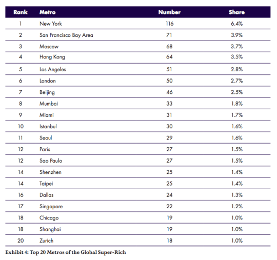
    Here are the top 20 metro areas in terms of the number of billionaires:

    image

    Look at Miami at #9. 

    I suspect that this may surprise some of you. But Miami has grown into a significant global city. As one of my friends from Miami likes to tell me: “The best thing about Miami is that it’s a Latin American city that’s so close to the United States.”

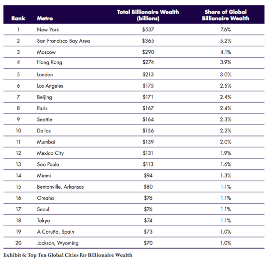
    Here are the top 20 metro areas in terms of total billionaire wealth: 

    image

    A bunch of changes on this list because of extremely wealthly people and families in places like Bentonville (Arkansas) and Omaha.

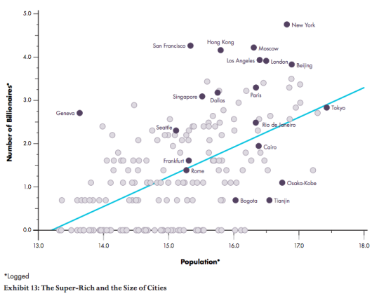
    One of the conclusions of the report is that the size of the city generally matters:

    “The geography of the super-rich is a function of larger cities. Both the number of billionaires and their net worth are positively associated with the population of global cities, with correlations of 0.56 for the number of billionaires and 0.44 to their net worth.”

    Here is a chart comparing population to the number of billionaires:

    image

    Cities such as New York, Moscow, and Hong kong, which sit far above the blue line, have more billionaires than their population size would predict.

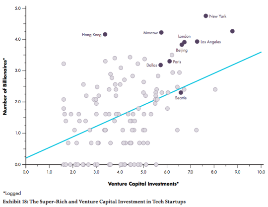
    Here is a similar chart comparing venture capital investment to the number of billionaires:

    image

    Once again, there is a positive association.

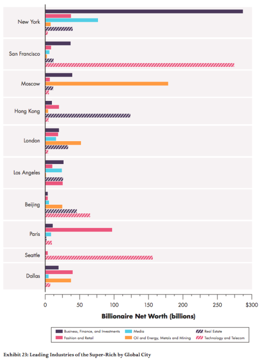
    Finally, here are a two charts that show which industries have produced the most billionaires:

    imageimage

    If you’re interested in this study, you can download the full report here. All of the charts were sourced from the report.