
Daily insights for city builders, delivered every morning at 6 AM ET. I’m Brandon Donnelly — a Toronto-based real estate developer and founder of Globizen. I’ve been writing here since 2013.

Tag: mid-rise buildings

  • Enhancement Zones: The mid-rise performance standard that didn’t make the cut

    I’ve written a lot about mid-rise development on this blog and elsewhere. 

    I recently wrote this post responding to a tweet by the Chief Planner of Toronto. And towards the end of last year, I wrote a longer piece for developer Urban Capital’s annual magazine. If you missed it, you should definitely download a copy. Not so much for my article, but because, overall, the UC magazines are excellent. (Credit to David Wex.)

    Today, I’d like to focus on one specific “performance standard” from Toronto’s mid-rise guidelines that I’ve been thinking about lately. But more specifically, I’d like to focus on a performance standard that was initially contemplated but never actually got adopted. 

    (I apologize in advance if this post gets a bit too geeky for some of you. It refers to a specific land use policy in Toronto, but it has much broader relevance.)

    If you take a look at the final Avenue & Mid-Rise Buildings Study and turn to page 56, you’ll see that Performance Standard #5B (Rear Transition to Neighbourhoods: Shallow Properties) was stricken from the report. It was never adopted as a standard.

    So what is this all about?

    This performance standard had to do with something called “Enhancement Zones”, which was proposed as a way to deal with shallow parcels of land on Toronto’s main avenues. You see, because of the other performance standards – namely the angular plane (see images below) – the depth of an avenue site is hugely important for determining what can ultimately be built on it.

    From the city’s perspective, this is a double edged sword. In the case of exceptionally deep lots, you can actually meet all of the performance standards while at the same time exceeding the recommended densities. But in the case of shallow lots, the performance standards sometimes/often make it so that you can’t even achieve the recommended densities. In fact, a lot of sites simply become un-developable.

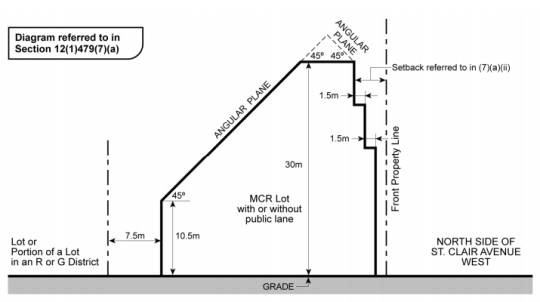
    To give you a visual for what I’m talking about, here’s a section drawing from a zoning by-law that was adopted by City Council for St. Clair Avenue West in midtown:
    image

    Here you can quickly see that if you were dealing with a shallow lot of, say, 25m in depth, you wouldn’t have much left over after taking into account the rear property line setback (7.5m above), the front property line setback, and the 45 degree angular plane. Now you’re beginning to see why I said that it is easier said than done to play creatively within the guidelines envelope (thick black line above). When you look at the feasibility of these projects, you quickly end up getting pushed right up against the glass.

    But this is where Enhancement Zones comes in. 

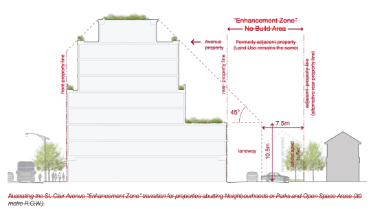
    The idea here is that an adjacent low-rise residential property (or pair of properties in the case of attached houses) could be included in mid-rise development proposals to create a deeper site that then meets the requisite separation distances between the mid-rise scale and the low-rise scale. To be clear, nothing would be built in the Enhancement Zones. They would just help to relieve some of the setback pressures from the original shallow lot and maybe even create a rear laneway system where one did not exist before.

    Below is a drawing from the Mid-Rise Buildings Study showing that new condition. The same 7.5m setback applies at the rear, but now it sits within an Enhancement Zone – formerly an adjacent and separate property. All the text is crossed out because, again, this standard was not adopted.
    image

    From a mid-rise development and feasibility standpoint, this makes a lot of sense. Sites that may have been un-developable before, now become developable. This makes it easier for us to achieve the European-scaled mid-rise vision that Toronto has for its avenues.

    But for reasons that I am sure you can guess, there are concerns with this performance standard. Probably the most obvious is that, to a certain extent, it destabilizes “neighbourhoods.” And they are intended to be completely stable entities that see little to no intensification. As soon as you allow this to happen, properties sitting in Enhancement Zones would become the prey of developers.

    However, there are counter arguments you could make. The owners of these properties would likely receive offers above market value. So maybe they end up better off. At the same time, you could also argue that the more development we unlock outside of “neighbourhoods”, the more stable they can actually remain.

    In any event, I’ve been thinking about this lately and I thought it would be interesting to debate the pros and cons of these magical-sounding Enhancement Zones. For those of you inclined to engage in geeky planning discussions, I’d love to hear from you in the comments.
  • Why multi-family developers are shifting their customer focus

    One aspect of the Toronto housing market that I’ve been paying close attention to is the adoption of multi-family dwellings by both long-term end-users and families. 

    I’ve written about this before (here and here, over a year ago) and have argued that here in Toronto we are at an inflection point. Multi-family dwellings – both rental and condo – are evolving to now target these new customer segments. Whereas previously, the new construction multi-family housing market was heavily geared towards investors and first-buyers. And often it was simply a stepping stone towards a single family home.

    Now, every city and real estate market is different. And I have heard many people in U.S. cities say that Millennials are simply deferring what we saw with previous generations. At the end of the day they (or we, I’m a Millennial) are going to move to the suburbs and buy that car. The current trends we are seeing around city living and reduced driving are just that – short-term current trends.

    But I think it’s worth reiterating: I do not believe that the status quo is what’s happening right now in Toronto. And I’m sure it’s also happening elsewhere. Time and time again I speak to developers in this city who are starting to shift at least some, and in some cases all, of their focus towards end-users, families, and larger units – particularly for new mid-rise product in the “neighborhoods.”

    And if you think about it, this makes perfect sense. 

    The average price of a detached single family house in Toronto is well north of a million dollars. So when a developer brings to market a 1,200 sf family sized apartment at $600 psf ($720,000) or even at $700 psf ($840,000), that home now becomes a relatively “affordable” option in many desirable areas of the city. Particularly if you value location amenities and your time (i.e. shorter commutes) over raw quantity of space. I know I certainly do.

    I know this isn’t going to appeal to everyone. But there is a big market here. Get ready.

    What are you seeing in your city? Let us know in the comment section below.

  • Ontario allows wood frame buildings up to 6 storeys

    Yesterday it was announced that, starting January 1, 2015, the Ontario Building Code would be changed to allow wood frame buildings up to six storeys. Previous to this, the highest you could go was 4 storeys. 

    This change has been in the works for a number of years. And it’s already allowed in most of Europe and in other places in Canada, such as British Columbia. So it’s nice to see this finally happen here in Toronto.

    The reason this is a big deal, and worthy of a blog post, is that it changes the cost structure for mid-rise buildings. Simply put, wood frame buildings are cheaper to construct compared to reinforced concrete and other buildings materials.

    Some people think this just means developers will make greater returns. But I don’t think that’s the case (see microeconomics). The real opportunity here is to spur mid-rise development on sites that – before this change – would have been previously un-developable. That is, you just couldn’t make the numbers work.

    As much as mid-rise buildings make a lot of sense from an urban design standpoint, it’s not always easy to find good mid-rise development sites. Mid-rise buildings are generally less efficient to build compared to towers and you have a lot of fixed costs that don’t scale down just because you’re doing a smaller project.

    So what this change in cost structure will, hopefully, do is allow more product to enter the market. And since many big urban centers operate with perpetual supply deficits – precisely because it’s often so hard to build – this should actually help with affordability.

  • Dimensioning pedestrian happiness

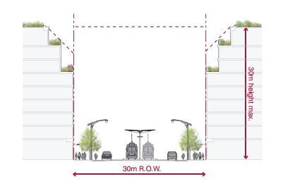
    The area that stretches between the property line on one side of a street and the property line on the other side of a street is called a public right-of-way here in Toronto. It may be called something different in other cities and countries.

    In the example below (taken from Toronto’s Avenues & Mid-Rise Buildings Study), it includes the sidewalks, the car lanes, and the streetcar lanes. But it could also include other public elements. In this instance, the buildings on either side of the street are assumed to be built right up against their property lines.

    ROWs obviously serve an important public function. But their size also has important urban design implications. As a pedestrian, it feels different to walk on a narrow street than it does on a broad street.

    The width of a ROW can also be used to inform what the preferred height of the buildings along it should be. In the example above, they’re talking about a 1:1 relationship between the width of the ROW and the preferred height of the buildings.

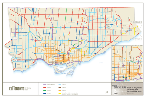
    Given their importance, I thought it would be interesting to share this map of Toronto (dated 2010) showing ROW sizing throughout the city. The mustard colored lines in the core of the city represent 20 metres, the red lines 36 metres, and the purple lines 45 metres or more. The rest of the colors fall somewhere in-between. For the most part, the purple lines represent highways, although there are a few other instances of purple.

    What’s interesting – but not surprising – to see is how we basically kept expanding the size of our ROWs as Toronto grew outwards. This was obviously to make more room for cars on the road.

    But the other, perhaps more interesting thing about this map, is that it could also serve as a guide to pedestrian happiness. The mustard/yellow lines are where it’s most enjoyable to walk. And the red and purple lines are where it’s least enjoyable to walk.

    If you’re from Toronto, give this framework a try and see if it holds true.