Daily insights for city builders, delivered every morning at 6 AM ET. I’m Brandon Donnelly — a Toronto-based real estate developer and founder of Globizen. I’ve been writing here since 2013.

Tag: metrolinx

  • Urbanizing the suburbs

    Commuter rail has typically functioned as a way to bring people from the suburbs into downtown for employment, and sometimes recreation. That has typically translated into good inbound service in the mornings, good outbound service in the evenings, and mediocre service the rest of the time. It has also historically meant lots of subsidized surface parking. Free parking was (and still is) often thought of as the key to putting bums in seats and increasing ridership.

    Here in the Toronto region, this service is provided by GO Transit, which, since 2009, has been owned by Metrolinx. But as one of the fastest growing regions in North America, this kind of service and thinking has become increasingly antiquated. That’s why Metrolinx and the Government of Ontario are working to profoundly change the economic geography of this region by both electrifying the lines and implementing 15 min, all-day two-way service. 

    This may seem like an incremental improvement, but it is not. It is a significant change that will transform the service from commuter rail to regional express rail. Of course, this now means that it is time to rethink the land use policies and built form that surround these key transit nodes. One of the places where this is happening today is at the Clarkson GO Station. The City of Mississauga is in the midst of a planning study that will ultimately guide future development around the station. 

    I think this one of the most important shifts taking place right now in this region and elsewhere. It is the maturation of our suburbs and it is going to result in more walkable and vibrant urban places across our cities. So if you have a few minutes, I would encourage you to complete this survey that the City of Mississauga recently put out. The results will help to guide their Clarkson Transit Station Area Study. 

    I also think think it is worth completing the survey even if you aren’t local to the area. How to urbanize the suburbs is a universal problem.
  • Urban migration, household type, and housing supply

    Here is an interesting discussion paper on the Toronto region’s economy, demographic outlook, and its land use. It was recently published by IBI Group and Hemson Consulting to support the 10-year review of our regional transportation plan.

    I wanted to share a couple of charts from the report that I thought were interesting. If you’re not in the Toronto region, I would be very curious to hear how your city might compare in terms of the way it is trending.

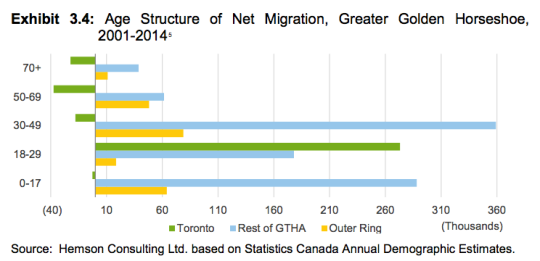
    The first chart is net migration by age group. Like Vancouver – similar chart posted here – people have been moving into the city/Toronto when they’re young and then moving out to the suburbs once they start having families. 

    Will that continue? The oldest Millennials are now hitting their mid-30′s and I am very interested to see if there will be any reversal in this.

    image

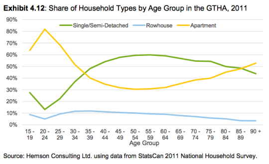
    Given the above trend, people in this region are not surprisingly also swapping apartments for ground-related housing as they get older. The crossover point seems to be (or at least has been) when people hit their mid-30′s. Again, I am curious how this may evolve as the city matures.

    image

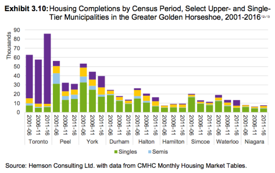
    Because if you look at housing completions from 2001 to 2016 (chart below), the only municipality that was able to meaningfully increase its housing supply was Toronto. 

    Every other municipality – except for Hamilton, which posted modest gains – experienced significant declines in the number of new homes delivered to the market over the last census periods. 

    Of course, the only reason Toronto was able to increase its housing supply was by building up – in other words by building condos and apartments. (Shown in the purple below. For some reason the legend is incomplete in the report.) 

    image

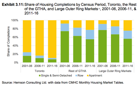
    If you look at the share of housing completions, over 80% of new homes in Toronto are now in apartment form. 

    image

    Intensification is a deliberate policy choice. And we can certainly debate whether it’s a good or bad thing (I believe it’s a good thing). 

    But putting that aside, the above charts are a great answer to the perennial question: “How is it that Toronto is building so many condos?” This is why.

  • Toronto’s rapid transit network by 2031

    Starting today and running until the end of March, the City of Toronto, the Toronto Transit Commission, and Metrolinx will be hosting several public meetings as they work towards planning out this city and region’s rapid transit network.

    Below are a few of the key maps from their presentation.

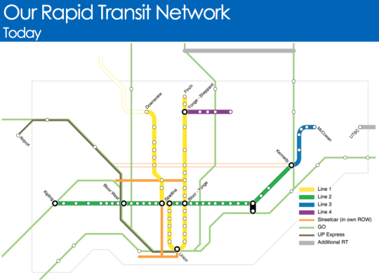
    Here is what Toronto’s rapid transit network looks like today (the hollow lines represent projects in construction):

    image

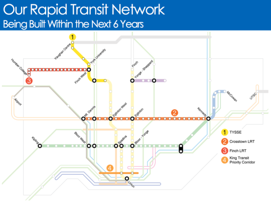
    Here is what will be built within the next 6 years:

    image

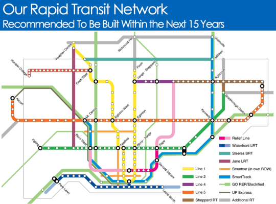
    And here is what they are recommending should be built within the next 15 years:

    image

    It’s hard not to get excited when you see maps like this. Of course, it’s a lot easier to draw lines on a map then it is to fund and execute on projects like this.

    But I think it all starts with us acknowledging that these initiatives are critical to both our economic competitiveness as a city region and our quality of life as citizens of it. Because if this is something we really want, then we can absolutely make it happen.

    Click here if you’d like to see the full presentation and also the public meeting dates/times.

  • Let’s fix the UPX train, together

    I am a big fan of the UP Express train that runs from downtown Toronto to Pearson Airport. 

    I love the station architecture, the branding and identity, the trains themselves (with wifi), and the local retailers they house at Union. I also happen to live a stone’s throw away from the downtown station. So I can go from door to bum in seat within 10 minutes.

    But despite all this, it has become clear that something needs to be done to fix the UPX train. Just last weekend a friend of mine and fellow urbanist, who was visiting Toronto from Vancouver, sent me a text message saying: “This UPX train is really nice, but why is it so expensive?”

    Indeed, that seems to be the general consensus. Here is the opening paragraph from a recent Globe Editorial article:

    Toronto’s high-end airport express train is a failure. A city that urgently needs better transit has been saddled with a deluxe boutique rail service that cost $456-million to build and runs nearly empty, 19 ½ hours a day.

    So today I thought we could collectively brainstorm some ideas for how Metrolinx – the public agency that operates the train – should address this issue.

    I’ll start by sharing my thoughts as a rider and then, hopefully, you all will share yours in the comment section below. I know that there are people from Metrolinx who subscribe to this blog, so I am sure your feedback will get through to them.

    My thoughts are twofold. Like many others, I think the pricing is off. But at the same time, I think there should be a focus on enhancing the value proposition of the service.

    Bur first, let’s talk about price.

    At the time of writing this, a one-way trip from Union Station to Pearson Airport on the UPX is $27.50. If you happen to have a PRESTO card, it’s $19.

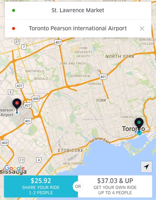
    The alternative for many is probably a taxi. So let’s also look at some Uber fare estimates. For someone like me leaving the St. Lawrence Market area, I’m looking at $25.92 with UberPOOL (meaning I’m sharing the car with 1-2 other people) or $37.03 if I insist on riding solo.

    image

    Against the non-PRESTO fare, UberPOOL is a cheaper option and it’s door-to-door service. Against the PRESTO fare, UPX is potentially $6.92 cheaper. But if you’re someone who has to take the subway to the UPX station, then it’s only $3.67 cheaper (add $3.25 for the subway) and it’s not door-to-door service. So for the vast majority of people, I suspect that UberPOOL would win out in this particular scenario.

    If you happen to be traveling with someone, then UberPOOL and UberX are probably going to be cheaper no matter how you slice it. And again, you’re getting door-to-door service. So I think the consensus is right: fares need to come down.

    But I don’t think Metrolinx should be solely focused on price. They should also be thinking about ways to create additional values for riders. 

    One of my favorite travel experiences is that of Hong Kong’s airport train. There, they have airline check-in counters in the city so you can collect your boarding pass and check your baggage up to a day before your actual flight. This is a huge value add because it means you can check out of your hotel, liberate yourself of your luggage, and spend the day in the city before leaving on the train to catch your flight. You can’t do that with an Uber. And lugging bags around a busy city, sucks.

    My point with all of this is simply that you can’t expect people to pay more or roughly the same, if they are not getting additional value. And right now, the train isn’t door-to-door and taxis are. (Though, the train has a travel time advantage during peak times.) So you either make it cheaper or you create additional value. Or, you do some combination of the two, which is where my head is at.

    What are your thoughts? Please respond in the comments below so all the feedback is public. Thanks.

  • But what about employment?

    The Neptis Foundation here in Toronto just recently published a fantastic report looking at the regional economic structure of the Greater Golden Horseshoe area. It’s called Planning for Prosperity.

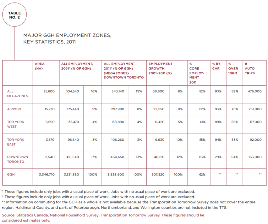
    In it they identity the polycentric nature of employment in the Toronto region by way of downtown Toronto and three suburban “megazones.” Here’s one of their maps showing overall employment density and the megazones (light blue circles):

    Here’s a snippet to give you an idea of the scale of these megazones:

    “The Airport megazone, one of the three employment megazones outside Downtown Toronto, is the second largest concentration of employment in Canada, after Downtown Toronto. It represents almost 300,000 jobs, more than the central business districts of Montreal, Vancouver, or Calgary individually.”

    And here’s a chart showing the hard numbers:

    Downtown Toronto dominates in terms of employment. But it’s also fascinating to see how much more efficiently it provides that employment. It has the smallest physical area of all the employment zones (2,540 hectares or 6,276 acres) and the lowest percentage of car trips (29%).

    But the big takeaway from their report is that we have not been focused enough on employment in our planning. Instead, we seem to be thinking residentially. Here’s a final snippet:


    “This study shows that the Growth Plan and The Big Move, which are currently under review, do not address the challenges and opportunities of a globalizing regional economy or the reality of a transforming economic landscape.

    The Growth Plan’s focus has largely been on managing residential growth rather than non-residential and employment-related development. Indeed, the Growth Plan is based on shockingly little hard evidence on the evolving economy of the region. Plans for city-regions a fraction of the size of the GGH typically involve more economic research, analysis, and evidence.”

    Clearly we need to be looking at both the residential and non-residential sides of the equation as we grow the region. To read the full report, click here.

  • The London Crossrail

    On Thursday afternoon the mayor of Toronto, John Tory, was in London meeting with their mayor, Boris Johnston, and talking about Toronto-London business relations, the economy, and transit.

    Here is the tweet:

    //platform.twitter.com/widgets.js

    On the topic of transit, the big item to see and discuss was The Crossrail. For those of you who might not be familiar with it, here are a few bullet points from their website:

    Crossrail is Europe’s largest construction project – work started in May 2009 and there are currently over 10,000 people working across over 40 construction sites.

    The Crossrail route will run over 100km from Reading and Heathrow in the west, through new tunnels under central London to Shenfield and Abbey Wood in the east.

    Crossrail will transform rail transport in London and the south east, increasing central London rail capacity by 10%, supporting regeneration and cutting journey times across the city.

    Crossrail will bring an extra 1.5 million people to within 45 minutes of central London and will link London’s key employment, leisure and business districts – Heathrow, West End, the City, Docklands – enabling further economic development.

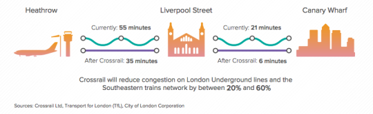
    And below is a neat diagram that I found in this City of London report. I think it does a good job summarizing some of the spatial impacts of The Crossrail.

    image

    In the past I’ve been negative about John Tory’s SmartTrack proposal, which is clearly inspired by The London Crossrail. I had my reasons for that. But I want to be clear that I am not in any way negative on Regional Express Rail as a mobility solution.

    Toronto would benefit greatly from RER and Metrolinx is working diligently to deliver it to the region. I can’t wait for that to happen so I can drive even less than I already do.

  • Metrolinx takes first step towards rail + property in Toronto

    image

    I’ve written quite a bit about the advantages of a “rail + property” model when it comes to building public transit. It’s a model that works quite successfully in other parts of the world, such as in Hong Kong.

    However, in North America the notion of land value recapture or of transit authorities acting as real estate developers is still very much in its infancy. We’re myopically focused on rail. 

    Which is why I said about 3 months ago that if the stations along the new Eglinton Crosstown LRT line in midtown Toronto became single storey and single purpose buildings, that we will have missed an enormous city building opportunity.

    Since that post I had a number of conversations with the folks over at Metrolinx and I was delighted to learn that there were in fact plans to build additional density on top of the stations. And as of today they’ve gone completely public with that intention.

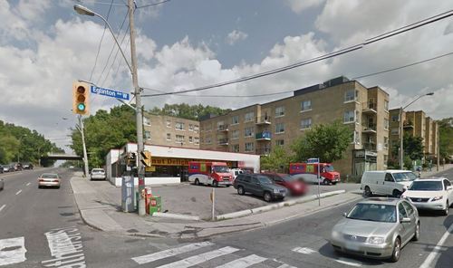
    Metrolinx, with the help of Avison Young, has just issued a request for proposal (RFP) for 4 sites along Eglinton Avenue in the city. Two of them are at Keele Street, one of them is at Weston Road, and the last one is at Bathurst Street. The 4 sites could generate between $14M – $22M.

    The objective is to find suitable developer partners to help them build on top of their planned LRT stations. And it’s a step in exactly the right direction for Metrolinx and this city.

    Image Source: Google Streetview

  • Understanding the radius of demand for transit

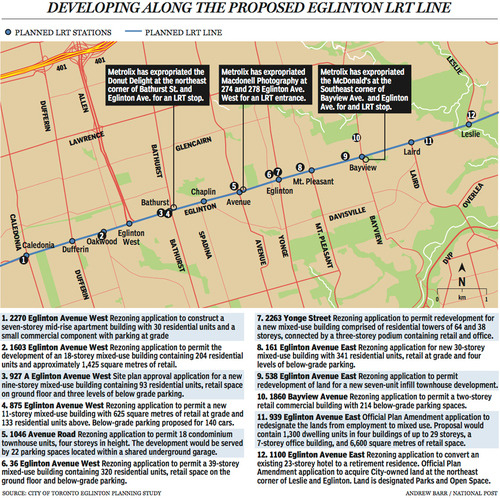
    Last week The National Post published an article talking about Toronto’s Crosstown LRT and how it’s spurring a wave of development all along Eglinton Avenue. Below is a map, taken from that article, showcasing some of the developments that are currently in the pipeline and awaiting the Crosstown’s opening date of 2020.

    image

    Not surprisingly, developers like transit investment. But more specifically, they like fixed track transit investment. Rarely do new bus routes elicit the same sort of response that you’re seeing above. And that’s because fixed track investment has permanence. If you’re going to go long on an area, you want certainty.

    As the Crosstown tunnel boring machines move across midtown Toronto, I thought it would be interesting to look at a transit concept that I first learned about through Jarrett Walker’s Human Transit blog. It’s called: the radius of demand

    One of things that transportation planners look at when designing and building a new line is the spacing of stops. Typically, as you move from buses all the way up to subways, the spacing between stops and stations increases. Spacing is always a bit of a trade off though, because more stops means easier access for riders, but it also means slower overall service. Somewhat famously, Paris designed its metro system so that you’re rarely more than 500 meters away from a station. 

    Once you have your station locations, it’s quite common to then draw a radius around each stop to simulate the catchment area. In other words: How much of the city can I service with this station and how far will people be willing to walk in order to get there? However, this distance, which is the radius of the circle, usually depends on the type of transit. Oftentimes people are willing to walk further in order to get to faster transit service.

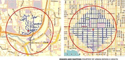
    But what’s most interesting about this radius of demand is that it’s entirely dependent on the fabric of the city. Take for example, the following two maps from Seattle, which I have taken from Walker’s blog. On the left is a suburban setting and on the right is a downtown setting. In both cases, the red circle represents a 1 km radius.

    image

    Now, if humans could fly over barriers, such as highways, and every Seattle resident was willing to fly exactly 1 km to a transit station, these two radiuses of demand would be perfectly accurate. But since that’s not the case, we instead need to look at what actually represents a 1 km walk – those are the blue lines in each image.

    Because once you do that, you realize that the cul-de-sacs and highways on the left make it impossible for most of that radius of demand to actually walk to the station in under 1 km. So the catchment area actually becomes much smaller. On the other hand, if you look at the image on the right, you’ll see that the tried and true city grid is actually remarkably efficient for walking. Almost all of the circle is serviced.

    So as the Eglinton Crosstown LRT makes its way through the center of Toronto, I think it’s important to keep in mind that it’ll be cutting through quite a few different kinds of street grids. Some of them will be highly conducive to transit usage and others not as much. And in many ways, this is one of the greatest challenges of transit investment. The track itself is only one part of the puzzle.

    That’s why the City of Toronto is also undertaking a planning exercise called Eglinton Connects. Its intent is to leverage the opportunities, as well as address the challenges, that will result from Metrolinx’s Crosstown LRT. If you’re interested in the future of Eglinton Avenue, you should consider getting involved. Oftentimes it’s only the critics that speak up. But that’s not the best way to build anything.

  • Transit panel responds to Metrolinx

    On September 18th, 2013, the Premier of Ontario, Kathleen Wynne, established a “transit investment strategy advisory panel.” Their mandate was to advise the Province on how to respond to the revenue tools proposed by Metrolinx (also an Ontario agency) to fund transit expansion in the region. Well that panel has just released their final report and you can read it here.

    I’d like to highlight 3 things from the report.

    1.

    The first is their assessment of how Canada’s transit policy framework stacks up against our competitors. Here’s a snippet:

    “Canada remains the only G8 country without a coordinated national framework of policies and programs for funding expansion and renewal of transit systems. As shown in the chart opposite, a review of national transit policy frameworks done by the Canadian Urban Transit Association indicates that Canada ranks at the bottom in terms of its engagement in urban public transit.”

    And here’s the chart they’re talking about. I hope it’s legible.

    2.

    The second is their conclusion on highway tolls:

    “Although highway tolls can raise a significant amount of revenue and influence travel behaviour, they are expensive, complicated, and require a lot of lead time to implement. Once transit alternatives are in place, road tolls meet our criteria and are a valid option. Following the opening of the new Highway 407 East, the Province has the option of designating the new toll revenue to the Next Wave. For now, however, the Panel has not recommended Highway Tolls as a revenue source.”

    If you’ve read any of my posts on electronic road pricing, you’ll know that I support the pricing of roads and congestion.

    3.

    The third is their list of what they call “next wave projects”, which are essentially priority projects. Here’s their list for phase one of it:

    • Relief Line
    • GO Two-Way All Day (excluding Lakeshore)
    • Hurontario LRT
    • Electrification of Union-Pearson Express
    • Yonge North Subway (partial extension, delivered after Relief Line is in service)
    • Priority portions of other rapid transit – Hamilton, Durham, Dundas, Brampton

    I’m happy to see the relief subway line on the top of that list.

    If you have any thoughts on transit planning in the Greater Toronto Area, I would love to hear from you in the comment section below.

  • More on electronic road pricing

    We recently started a Lunch & Learn program at TAS. I did the first one on electronic road pricing and followed-up with the blog post below. Let me know what you think. It’s also cross-posted here on TAS’s website.

    —————————————————-

    image

    Last week at TAS I kicked started our new Lunch & Learn program with a talk on electronic road pricing. It was based on an HBS case that I had prepared for a pricing class I took at the Rotman School.

    The case is essentially about traffic congestion in Hong Kong and a decision to either build more road (a bypass road running adjacent to the harbour: The Central-Wan Chai Bypass) or implement an Electronic Road Pricing (ERP) system, similar to what was implemented in Singapore in the 70s and in London in 2003.

    My own view is that road pricing makes a lot of sense. And I’ve written extensively about it on my own personal blog. But to quickly summarize the economics behind it all, take a look at this graph:

    image


    What this graph plots is the marginal cost of products and services with a fixed capacity.  An example of a product or service with a fixed capacity would be a road. Roads can only handle a certain amount of drivers before it becomes unusable (gridlock). What this graph tells us is that once you reach that capacity—variable k in the graph—the marginal cost goes from zero to basically infinity.

    In laymen terms, it’s telling us that at 4am when nobody is on the road, the cost—to society, to productivity levels, and so on—of adding each one additional driver is basically zero. But, as soon as you hit capacity, at say 830am, and traffic is at a standstill, the cost shoots way, way up!

    So how do you solve this problem? Well, you price congestion. This invariably removes or forces drivers to other times of day and makes it so that demand for the road drops below the available supply. Then the road is able to function as it’s intended to. I don’t know about you, but this makes a ton of sense to me. What good are roads if they’re clogged with traffic?

    What I’d like to do now is bring the discussion back to Toronto. For those of you with an interest in transit, you’re probably aware that Metrolinx has a “Big Move” transit and infrastructure plan that’s going to cost the region $2 billion a year to implement. I view this as investment in our region and so I think it’s absolutely the right move.

    However, the billion dollar question is, where is the money going to come from? Earlier this year Metrolinx proposed 4 main revenue tools. They are:

    – A 1% sales tax (estimated to raise $1.3 billion annually)
    – A business parking levy (estimated to raise $350 million annually)
    – A $0.05 fuel and gasoline tax (estimated to raise $330 million annually)
    – And a 15% increase in development charges (estimated to raise $100 million annually)

    What I would suggest is that there should be a road pricing plan in this list in addition to—or instead of—some of the items listed above. Taxes are just taxes. And they discourage consumption depending on the elasticity of the demand for those items.

    However, I would argue that a well executed road pricing model should be considered not as a tax, but instead as an incredibly accurate way to price roads according to actual usage patterns and costs incurred. Think of it like time-of-use utility billing. Do you think of high-peak utility billing as a tax or as simply the price to use the service when demand is the highest?

    The benefits of a road pricing system would be numerous:

    – We’d get a consistent revenue stream for transit investment in the region (instead of having to rely on government hand outs)
    – We’d be helping to decouple transit building from the political process (because Metrolinx would now make its own money)
    – We’d eliminate traffic congestion (yes, it can be done)
    – We’d increase productivity levels across the region (people will actually be able to get around)
    And we’d be reducing our impact on the environment by encouraging alternate forms of transportation

    This is an incredible list of benefits. However, I think one of the challenges with implementing electronic road pricing is that it’s often misunderstood. People just view it as a tax. Hopefully by looking at the economics behind it all, it has become clearer that it’s actually a bit more nuanced than that.