Daily insights for city builders, delivered every morning at 6 AM ET. I’m Brandon Donnelly — a Toronto-based real estate developer and founder of Globizen. I’ve been writing here since 2013.

Tag: maps

  • Map of every development project in Paris

    It is surprisingly difficult to find good real estate and development information about a market that you’re not familiar with. So I was pretty excited when I came across this map of every development project in Grand Paris (Greater Paris) created by Arthur Weidmann.

    It’s in Google My Maps and what he has done is pin every project according to status: under construction, under renovation, approved, proposed, and recently delivered. For each pin, you’ll also find information like the expected completion date, the use(s), the area, the architect(s), and photos. It is unbelievably detailed and, according to Google, it was last updated 8 hours ago.

    Here’s the full map with all statuses shown:

    And here’s what it looks like if you filter by only projects under construction:

    It’s interesting, but not surprising, to note that the majority of construction projects seem to be taking place outside the boundaries of Paris proper. However, if you alternate to projects under renovation, it more or less flips, with most of the projects being within Paris:

    This tells you something about the city.

    Sometimes when I’m looking at or for information like this, I think to myself that I must be in the minority of people who are interested in tracking development projects with this level of detail. So I find it interesting that this map has been viewed nearly 300,000 times. Clearly, I’m not actually alone.

  • New land development across the US between 2001-2019

    The Washington Post just published this interactive feature showing new developed land (i.e. urban sprawl) across the US between 2001 and 2019.

    It is based on these land cover maps which were published by the US Geological Survey earlier in the summer. Their findings show that between 2001 and 2019, more than 10% of the land cover in the lower 48 states changed during this time period. Mostly in forested areas.

    The WP feature allows you to search by city/address and I would encourage all of you to try it out. As an example, here is Salt Lake City. The gray areas represent land that was already developed in 2001. The purple areas represent land that was developed sometime between 2001 and 2019.

    Images: Washington Post

  • Amazon opens up its maps platform

    More than half of Amazon’s US deliveries are now completed using its own fleet. So at some point, the company will no longer need to rely on FedEx and/or UPS. It’s also on track to quickly surpass them in terms of packages delivered per year, if it hasn’t already.

    But this also means that Amazon has had (and has been developing) its own maps platform to help support its delivery vehicles. Up until recently it was an entirely internal and proprietary tool. But this month, the company started to open it up in preview form (via an API).

    What this mean is that if you have a web or mobile application that needs a map or some other kind of location-based feature, you now have the option of using Amazon instead of Google or Apple or some other company.

    What’s interesting about this move is that it’s exactly what Amazon did with AWS (its dominant cloud infrastructure business). AWS is a meaningful part of Amazon’s overall business — in fact, it’s responsible for over 10% of the company’s total revenue, and an even bigger part of its operating income.

    So this quiet little announcement could be something.

  • Spiky population density maps

    I rediscovered the maps and work of Alasdair Rae this morning. (He has appeared on this blog before in posts like this one here.) Alasdair works in the Department of Urban Studies and Planning at the University of Sheffield and is author of the blog, Stats, Maps n Pix. Recently, he’s been publishing maps showing population densities around the world. He also gets into the details of how they’re made. They are pretty cool to see.

    Here are the Great Lakes.

    And here is Brazil, as well as a map of the world (without any land shown). Canada and the United States barely register on this second one.

  • Man behind the map

    For those of you who are regular readers of this blog, you’ll know that I love to snowboard and that I leave Ontario every winter in search of fresh lines. It is an annual tradition that has been going on for over a decade.

    One of the things I wish I had been more diligent about is collecting all of the trail maps. I am sure I have a number of old ratty ones in some of my snowboard bags and snow pants, but none of them are probably worth keeping.

    That’s why I think this is a terrific Kickstarter campaign by James Niehues. Over the last 30 years, James has researched, photographed, and painted almost every ski map in use across North America. Yes, these maps are all painted by hand. 

    If you would like to back James’ project – a hardcover coffee table book of his work – you can do that here.

    https://www.kickstarter.com/projects/orsc/james-niehues-the-man-behind-the-map/widget/video.html

  • Kickstarter: Modern map art

    image

    It has been a while since I shared a Kickstarter campaign on the blog and this one caught my attention:

    https://www.kickstarter.com/projects/1505932940/map-art-prints/widget/card.html?v=2

    If you can’t see the project embedded above, click here.

    The project is colorful abstract art maps of anywhere in the world. You can also choose whatever color theme you want.

    I think these are beautiful. The print at the top of this post is Rome.

  • The functional economic geography of the US

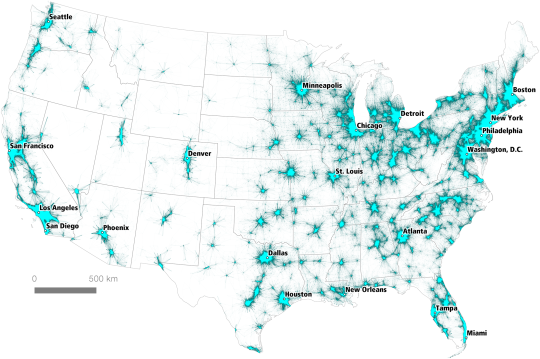
    PLOS One recently published a paper and a set of maps that looks at commuter flows across the United States (over 4 million data points). The objective was to identify all of the country’s “megaregions.”

    Here is one of those maps. I think it says a lot.

    We often think of cities as having discrete boundaries and population counts, but the reality is that studies and maps such as these provide a much better sense of the overall economic geography of a place.

    It’s worth noting that the commuter dataset used for this study is from 2006-2010. So things may look a bit different today. The full report can be found here.

  • Toronto’s rapid transit network by 2031

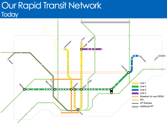
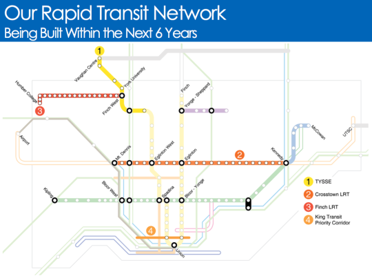
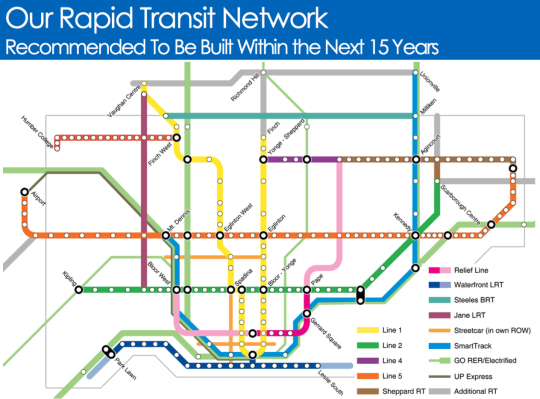
    Starting today and running until the end of March, the City of Toronto, the Toronto Transit Commission, and Metrolinx will be hosting several public meetings as they work towards planning out this city and region’s rapid transit network.

    Below are a few of the key maps from their presentation.

    Here is what Toronto’s rapid transit network looks like today (the hollow lines represent projects in construction):

    image

    Here is what will be built within the next 6 years:

    image

    And here is what they are recommending should be built within the next 15 years:

    image

    It’s hard not to get excited when you see maps like this. Of course, it’s a lot easier to draw lines on a map then it is to fund and execute on projects like this.

    But I think it all starts with us acknowledging that these initiatives are critical to both our economic competitiveness as a city region and our quality of life as citizens of it. Because if this is something we really want, then we can absolutely make it happen.

    Click here if you’d like to see the full presentation and also the public meeting dates/times.

  • Fun Friday: ATC subscriber map

    When I was very young I went a Montessori school here in
    Toronto. If you’re not familiar with Montessori education, it’s basically a
    very open ended and independent form of learning. Students choose
    what they want to do.

    Because of this, many have argued that a Montessori
    education is actually great training to be an entrepreneur
    . Instead of being
    told what to do, you as a student need to figure it out on your own. See the
    parallel? Both Google founders went to Montessori school.

    When I was there (< grade 4), my absolute favorite thing
    to do was draw maps. I remember them having these large scale maps of the world where you could
    physically remove each country so that you could then trace it and create your
    own maps. I spent a lot of time doing exactly that.

    To this day, I still really love maps. And I remember many
    of my friends in architecture school being the same way. So perhaps it comes
    with the territory.

    In any case, I recently started playing around with a product
    called cartoDB. And one of the things you can easily do with it is connect it
    to Mailchimp (the service that manages the ATC email newsletter) and anonymously
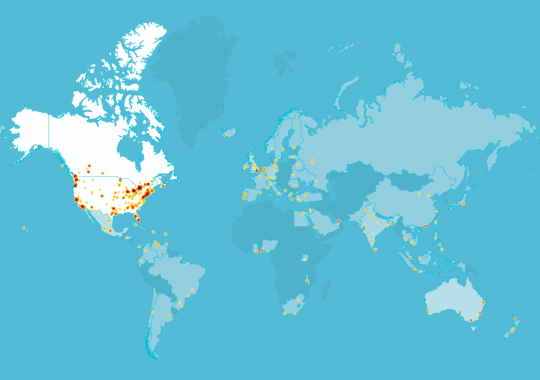
    map the location of each subscriber. I couldn’t resist giving it a try.

    Below is what that looks like. Not surprisingly, the highest
    concentrations of subscribers to this blog are in Canada and the US.

    image

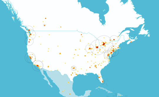
    So here’s a zoomed in version:

    image

    I’ve been trying to branch out from talking about Toronto
    all the time. And that seems to be working somewhat. But I could still do a better
    job of creating more global content. I’ll try harder.