Daily insights for city builders, delivered every morning at 6 AM ET. I’m Brandon Donnelly — a Toronto-based real estate developer and founder of Globizen. I’ve been writing here since 2013.

Tag: map

  • Every major hurricane in the North Atlantic and Eastern North Pacific

    I came across this map while reading up on Hurricane Dorian:

    It is a map showing the tracks of every known hurricane in the North Atlantic (1851-2013) and in the Eastern North Pacific (1949-2013). Major hurricanes (category 3 or higher) are shown in yellow and tropical cyclones (intensity less than category 3) are shown in red.

    The map is from the National Hurricane Center. Some of their other maps include the points of origin for tropical cyclones (here is August 21-31 from 1851-2015) and the total number of hurricane strikes by U.S. county (here is Florida from 1900-2010).

    What has happened is a catastrophe. UBS is already estimating the insured damages in the Bahamas to be between $500 million and $1 billion. But as is usually the case, the total economic losses will likely exceed the insured losses.

  • Cities are labor markets

    Eduardo Porter recently published this piece in the New York Times on the “relentless economic decline” of small-town rural America. We often talk about rising income inequality, but the greater concern is the alarming rate of joblessness in many of these communities. Earning less than others is not as bad as earning nothing.

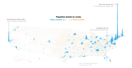
    I think the below map from the article, depicting population density by county, starts to show how uneven the economic landscape is across the US. Porter puts it this way: “This is the inescapable reality of agglomeration, one of the most powerful forces shaping the American economy over the last three decades.”

    image

    But, of course, we don’t really have a solution to this problem. Some are suggesting employment subsidies, such as the earned-income tax credit. While others are suggesting that we need to make it easier to build in the large blue spikes shown above. That way we’ll be able to more affordably accommodate the people who will ultimately need to move from rural to urban.

    While this latter suggestion may seem grim for small-town America, it is perhaps a reminder of what cities really are at their core: Cities are labor markets. They are the places where people come to get a job and make money.

  • Last lake swim of the year

    I’m in Muskoka right now, with very little time to write. 

    I had about an hour before dinner, but I decided that a far more responsible thing to do would be to jump in the lake for what will likely be the last lake swim of the year. It might be the end of September, but it still feels like summer.

    Here’s what that looked like:

    If you’re searching for something more city related, check out these high resolution maps of Canada according to our trails, roads, streets, and highways. My good friend Peter just sent them over to me. Thanks Peter.

    Regular scheduled programming will resume tomorrow.

  • A short history of redlining

    In 1933, the United States Congress created the Home Owners’ Loan Corporation (HOLC). With foreclosures rising as a result of The Great Depression, the task of the agency was to provide new low-interest mortgages to both homeowners and private mortgage lenders. Between 1993 and 1936, the agency served about one million households.

    By 1935, the parent company of the agency (the Federal Home Loan Bank Board) decided to initiate something called the “City Survey Program.” The idea was to look at local real estate trends – including the racial and ethnic composition of the country’s largest cities – in order to get a better understanding of how to manage all of these outstanding loans.

    One outcome of this program was the creation of the HOLC’s infamous “residential security maps.” (Philadelphia’s is shown at the top of this post.)

    These were maps that categorized city neighborhoods according to 4 grades. Grade A neighborhoods (green) were the best ones. They were ethnically homogenous and had room to be further developed. Grade B neighborhoods (blue) were the second-best ones. They were already completely developed, but were still considered desirable. Grade C neighborhoods (yellow) were starting to decline and showed an “infiltration of a lower grade population.” And finally, grade D neighborhoods were considered “hazardous” and colored in red. These neighborhoods had low homeownership rates, old crappy housing, and an “undesirable population”, which, at the time, largely referred to Jews and African Americans.

    Some have argued that the HOLC and their “residential security maps” are what kicked off systematic mortgage discrimination in America’s inner city neighborhoods – later referred to as “redlining.” This was the practice of denying credit to people who lived in these undesirable neighborhoods (and even to real estate developers who wanted to build in these undesirable neighborhoods).

    But University of Pennsylvania professor Amy Hillier has argued that these maps simply reflected the ethos of the time period. Using a sampling of HOLC mortgages, she found that 62% of them were issued to grade D (red) neighborhoods. The agency, itself, was not actually redlining in practice.

    Furthermore, she also looked at private mortgages issued in Philadelphia between 1937 and 1950 and found that security grade rating actually had no impact on the total number of loans issued. She did, however, discover slightly higher interest rates for properties located near and in the bottom security grades.

    All of this is to say that “redlining” is likely not the only culprit for inner city decay. There are other factors at play.

    To that end, the National Bureau of Economic Research recently published a working paper, which I discovered through CityLab, called, “Racial Sorting and the Emergence of Segregation in American Cities.” The key finding here is as follows:

    “Our preferred estimates suggest that white flight was responsible for 34 percent of the increase in segregation over the 1910s and 50 percent over the 1920s. Our analysis suggests that segregation would likely have arisen in American cities even without the presence of discriminatory institutions as a direct consequence of the widespread and decentralized relocation decisions of white urban residents.”

    In other words, it wasn’t just mortgage discrimination; it was also just general discrimination. That actually makes a lot of sense, because, if you think about it, the former couldn’t have occurred without the latter being present.

    Here’s how the research paper puts it (via CityLab):

    “Policies that reduce barriers faced by blacks in the housing market may thus not prevent or reverse segregation as long as white households have the ability and desire to avoid black neighbors.”

    (Note: Most of the information and data used in this post was sourced from the work and research of Amy Hillier.)

  • 3 changes to John Tory’s SmartTrack transit plan

    Last week Oliver Moore of the Globe and Mail announced that Toronto mayor John Tory’s SmartTrack transit plan is evolving to feel less like SmartTrack and more like what Metrolinx had been planning all along.

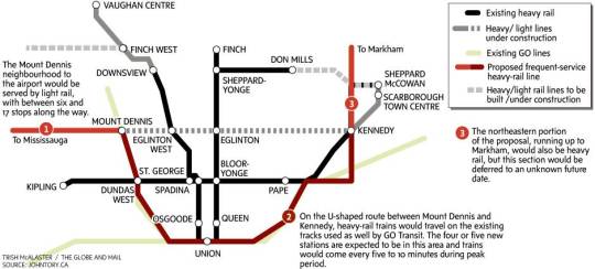
    Here’s the map from the Globe and Mail:

    The 3 big changes are as follows (and numbered accordingly on the above map):

    1. 

    The western end of the line will be replaced by an extension of the Eglinton-Crosstown LRT (currently under construction) running from Mount Dennis to Pearson Airport. This is what was originally proposed.

    2. 

    The “U” running from Mount Dennis in the west, down through downtown, and up to Kennedy in the east is what remains of the original SmartTrack line and will operate as some sort of “heavy rail” service on existing GO Transit lines. The original election campaign plan was to run trains every 15 minutes, but that was deemed too infrequent to attract riders, so now Metrolinx and everyone is trying to figure out how to get it down to every 5-10 minutes and feel more like subway.

    3. 

    The extension north of Eglinton Avenue to suburban Markham (in the northeast) is being pushed out and will be dealt with sometime in the future. Keeping the first phase of SmartTrack south of Eglinton on both ends is beneficial in avoiding the issue of SmartTrack and the Scarborough subway extension cannibalizing each other. (In my opinion, this issue is a perfect example of what happens when transit planning becomes too political.)

    The net result is a plan that is looking less and less like the original SmartTrack. I’m not complaining though because I have never been a big supporter of SmartTrack. I have always thought we should be focusing on the downtown relief subway line and on allowing Metrolinx to just execute on its regional express rail (RER) strategy.

    For more on this topic, check out Steve Munro’s post, SmartTrack: Now You See It, Now You Don’t! He’s far more of an expert than I am on these sorts of issues.

  • The rise of the East

    I love the work that LSE Cities (London School of Economics) is doing with Urban Age. If you haven’t yet checked out their site, you should do that now. If you’re a city geek, it’s the kind of site you can get lost in for hours. Especially if you’re a sucker for great diagrams like I am.

    Here’s one I found today that shows where cities are growing in the world:

    Each circle represents a city (well, metropolitan area). The dark green dot is the city’s population in 1950. The lighter green dot is the city’s population in 1990. And the yellow dot is the city’s projected population by 2025. Click here for a larger version of the map.

    What’s fascinating about this diagram is that you can so clearly see how the most significant population growth has shifted away from the West to the rest of the world and in particular Asia. That is, those dots have more yellow than green.

    We, of course, already knew this was happening. And population is just one dimension. But it’s still interesting to see this in diagram form. We are living through the rise of the East. And this diagram is a reminder of that.

  • The ultimate Toronto transit map

    image

    If you live in Toronto and only give serious thought to one thing today, it should be to this interactive transit map created by Metro.

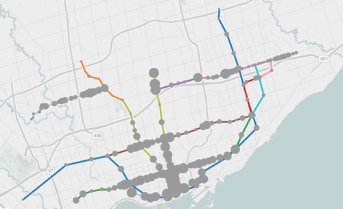
    The map shows all existing, planned, and proposed transit lines in the city, and then overlays population densities, commuting patterns, household income, and so on. It’s a super valuable map that I think reveals a lot about how we should be focusing our energies to get Toronto moving.

    So what sorts of things does it tell us? I’ll give 2 examples.

    If you look at commuting patterns across the Bloor-Danforth subway line, you’ll see that Runnymede station in the west is where people switch over from taking transit to driving. People west of that station tend to drive. Naturally, it also happens to coincide with where population densities start to fall off.

    By contrast, if you look at the east side of the city along the Danforth and beyond, the entire stretch more or less relies on transit to get around. Part of this likely has to do with income levels, but it’s also because of the availability of the Gardiner Expressway. There’s no equivalent in the east end. Dylan Reid of Spacing Magazine believes this makes a case for some sort of road pricing along the Gardiner, and I would agree.

    As a second example, look at the population densities along the proposed Downtown Relief Line, Finch LRT, and John Tory’s SmartTrack line. Outside of the core, the population densities are relatively low along the proposed SmartTrack line – which is never a good thing for rapid transit.

    There’s also no Sherbourne station on the SmartTrack line, which happens to have the highest population density across the entire Relief Line – 22,131 people per square kilometre! That’s more than any other stop along the Yonge-University subway line except for Wellesley station.

    I’ve written about this a lot before, but I think we need to do a better job of matching up transit investment with expected customer demand. Too often we let politics get in the way of rationale decision making. Maybe it’s time we did something like set minimum population densities. If you want a subway line in your area, you have to first bring the people.

    What else does this map tell you?

  • Dimensioning pedestrian happiness

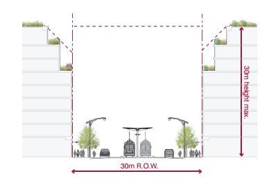
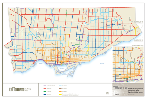
    The area that stretches between the property line on one side of a street and the property line on the other side of a street is called a public right-of-way here in Toronto. It may be called something different in other cities and countries.

    In the example below (taken from Toronto’s Avenues & Mid-Rise Buildings Study), it includes the sidewalks, the car lanes, and the streetcar lanes. But it could also include other public elements. In this instance, the buildings on either side of the street are assumed to be built right up against their property lines.

    ROWs obviously serve an important public function. But their size also has important urban design implications. As a pedestrian, it feels different to walk on a narrow street than it does on a broad street.

    The width of a ROW can also be used to inform what the preferred height of the buildings along it should be. In the example above, they’re talking about a 1:1 relationship between the width of the ROW and the preferred height of the buildings.

    Given their importance, I thought it would be interesting to share this map of Toronto (dated 2010) showing ROW sizing throughout the city. The mustard colored lines in the core of the city represent 20 metres, the red lines 36 metres, and the purple lines 45 metres or more. The rest of the colors fall somewhere in-between. For the most part, the purple lines represent highways, although there are a few other instances of purple.

    What’s interesting – but not surprising – to see is how we basically kept expanding the size of our ROWs as Toronto grew outwards. This was obviously to make more room for cars on the road.

    But the other, perhaps more interesting thing about this map, is that it could also serve as a guide to pedestrian happiness. The mustard/yellow lines are where it’s most enjoyable to walk. And the red and purple lines are where it’s least enjoyable to walk.

    If you’re from Toronto, give this framework a try and see if it holds true.

  • Big time Barcelona

    image

    Barcelona is one my favorite cities in the world. I love the intimate laneways in the old part of town. I love how La Rambla functions as a spine for public life in the city–even if it is pretty touristy. I love the weather and beaches. And I love that there’s a strong culture of art and design that seems to permeate all aspects of the city. 

    Over the weekend I found an impressive website called BIG TIME BCN, that beautifully maps out the city’s more than 2,000 years of building. It covers over 70,000 plots of land and, if you hover of them, it’ll tell you the age of the buildings. It’s similar to what was done here for the Netherlands. But the colors on this one seem very Barcelona to me.

  • Florence vs. Atlanta [Mapping]

    As I was browsing Tumblr this morning, I came across this image (linked from Quora):

    image

    On the left is portion of Florence. And on the right is a single highway interchange in Atlanta. Both maps are at exactly the same scale.

    It’s a stark reminder of how varying land use patterns can be. On the left you have a dense and walkable city, and on the right you have an area that would be entirely inhospitable to pedestrians.