
Since the beginning of this year, the London School of Economics has been running a debate series called, Cities in the 2020s: How are cities responding to profound global change? The next event is about localizing transport and it’s scheduled for May 20, 2021. If you’d like to attend, click here. It’s free and open to all. The one thing I would add is that I am getting the strong sense right now — as cities, other than Toronto, begin to reopen — that people are starting to remember just how much more fruitful in-person interactions are compared to being on screen. There’s no comparison. In fact, earlier today I had in-person work interaction that resulted in a positive outcome that I am certain would not have happened otherwise. And as an ENTJ (business school made me take these personality tests), I find that I derive a lot of my energy from being around other people. As long as these sorts of things remain true, I believe that we will stay tethered to our cities and reliant on things like mass transit.
Tag: london school of economics
-
Anxious urbanism
One of the first things that I noticed when I visited Rio de Janeiro a few years ago was the clear fixation on safety and security. There are gates and cameras everywhere. And the guidance you tend to receive from the locals usually resolves around how to stay safe. Don’t wander around at night. Be careful when you take out your phone. Be mindful of certain areas. You know, those sorts of things.
Of course, you never really know how dangerous a city is because it’s one of those things that’s impractical to test. You’re not going to wander around dark places just to see what the probability of being robbed is. The more sensible thing to do is simply believe what people are telling you and you observe the cues scattered around the built environment.
The result is a general sense of anxiety. You’re not quite sure if all the gates and cameras are truly necessary, but their mere presence makes you believe that they might be. I mean, why else would they be so pervasive? Or, could it be that people are overshooting with their investments in safety and security because, well, fear and paranoia are strong motivators?
I was reminded of all of this as I read through Ed Chartlon’s recent book review of, Panic City: Crime and Fear Industries in Johannesburg. The title of his review is Anxious Urbanisms, and I think that’s a good way of describing some of these phenomenons. It’s an urbanism of uncertainty. I haven’t read the book (yet), but it’s an interesting topic.
So I will leave you all with this excerpt from the review:
Ultimately, what we might take from Panic City, then, is less a comprehensive sociology of crime in the city and more a method of affective analysis. What the book provides is a sense of the ways in which the emotional sphere organises space, how feelings like anxiety or fear or panic, currently widely distributed across the world, materialise themselves, architecturally and politically. If immunity is anything like security, Murray offers us a cautionary tale. For wherever uncertainty thrives, so does the tendency towards paranoid thinking—which is to say, a contagion of a different sort, one that licences regimes of suspicion, self-protection and individual security, and all at the eventual cost of collective wellbeing and interdependence.
-
Living in a denser London

LSE Cities has just published a new report called, Living in a denser London: How residents see their homes. The goal of the research project was to better understand how modern housing projects are working (or not working) for Londoners. And so they connected with over 500 residents from 14 completed housing projects and got their feedback on everything from built form to community engagement. Most of the housing projects were completed in the last ten years, but they also surveyed projects from 1980, 1947, and 1902. If you don’t feel like going through the full report, there is also this website and this short film.
Image: LSE Cities
-
A comparative analysis of global cities
Since 2005, LSE Cities (London School of Economics) has been collecting comparative data on how global cities perform in terms of key spatial, socioeconomic, and environmental indicators.
This is their latest data matrix:

To be clear, it is not a ranking of cities. It is intended to help us better understand how different cities around the world are performing.
Depending on how you’re consuming this post, the text may be difficult to read. So here’s what each column represents, moving from left to right:
- Current population in the administrative city (millions)
- Current population in the urban agglomeration (millions)
- Average hourly population growth of urban agglomeration 2015 to 2030 (people per hour)
- Administrative city area (km2)
- Average density of built-up administrative area (people/km2)
- GDP per capita in urban area ($, PPP)
- Percentage of country’s GDP produced by the metro region
- Population under 20 (%)
- Murder rate (homicides per 100,000 inhabitants)
- Percentage of daily trips made by public transport
- Percentage of daily trips made by walking & cycling
- Car ownership rate (per 1,000 inhabitants)
- CO2 emissions (tonnes per capita)
If you’d prefer to download a full PDF of the chart, click here.
-
Shaping Cities in an Urban Age

Shaping Cities in an Urban Age is the third book to come out of the London School of Economic’s Urban Age project. It was published last fall. The first two titles were, Living in the Endless City (2011) and The Endless City (2007).
If you’re familiar with the first two publications, you’ll know that these books are heavily illustrated. Lots of maps, charts, and diagrams. So they make great coffee table books. But they’re also filled with insightful essays — this one has 37 of them.
In this particular book the focus is on the following:
“It identifies current trends that are making cities more fragmented, less equitable and environmentally more damaging, and argues powerfully for a more integrated social, environmental and spatial approach that can inform and inspire city-makers that are shaping an increasingly urban world.”
I am sharing this with all of you today because I have always really enjoyed these books. They have a way of quickly putting things into perspective globally.
Around 2.5 billion more people are expected to live in an urban agglomeration by 2050. And 90% of this growth is expected to happen in just two places: Asia and Africa. This is an unprecedented shift that will obviously create many challenges and many opportunities.
This book is about that.
Image: Phaidon
-
Operating at the margins

I’ve been thinking about land markets as of late and so today I thought I would share a post by Toby Lloyd that I recently discovered called: Understanding and adapting the land market is key to solving our housing crisis (2014). It’s from the London School of Economics’ British Politics and Policy blog.
His argument, as the title suggests, is that we need to dig deeper and look at how our land markets are functioning if we want to address some of the challenges facing our cities today.
The post is obviously written from a UK perspective, but many of his points will probably ring true for a lot of you in the industry. One remark that stood out for me was his point about developers always operating at the margins:
“The result of the land auction process is that the worst scheme, the one that offers the least to the community, the poorest quality homes, and charges the most for them, is generally the one that will happen, because this is the one that offers the most cash up front to the landowner. As a result, development is always already at the margins of viability. Even a relatively small shock can see construction grind to a halt rapidly, because there is simply not enough margin left after the landowner’s cut has come out for the developer to want to build.”
When it comes to building, most people tend to think about the developer, the architect, and so on. But what I think many people overlook is that this entire process starts with a land input and a landowner. And the cost, availability and usability of that land input has a significant impact on everything that happens downstream.
-
Residential population densities compared
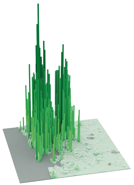
The following diagrams were taken from LSE’s Urban Age website. I’ve sorted them from lowest to highest peak residential population density. In each case I’ve also included the year of the dataset.
It’s amazing how much these simple extrusion diagrams can tell you about the city. It also shows you that high population densities don’t necessarily need to equate to tall buildings. Barcelona, in particular, stands out for me.
Berlin (Peak residential density: 21,700 people/km2, 2009)
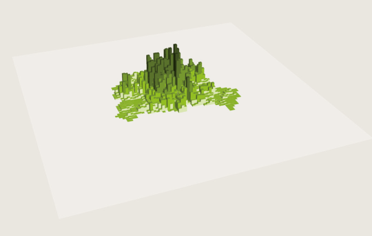
Stockholm (Peak residential density: 24,900 people/km2, 2012)
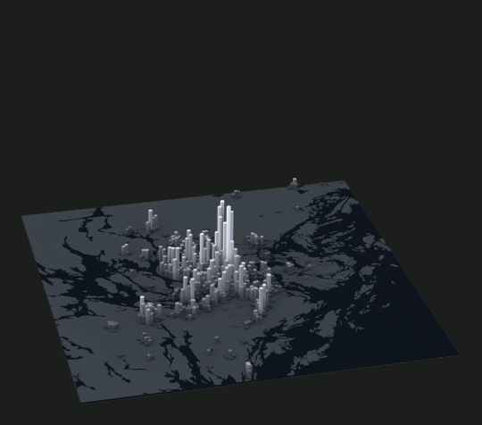
London (Peak residential density: 27,100 people/km2, 2013)
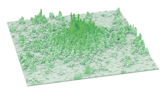
São Paulo (Peak residential density: 29,380 people/km2, 2009)
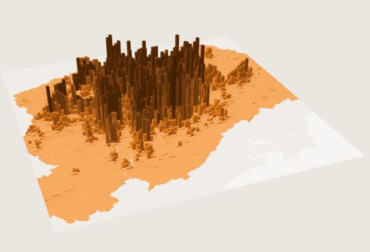
Mexico City (Peak residential density: 48,300 people/km2, 2009)
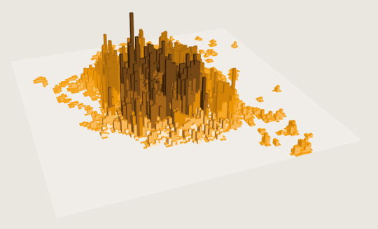
Barcelona (Peak residential density: 56,800 people/km2, 2013)
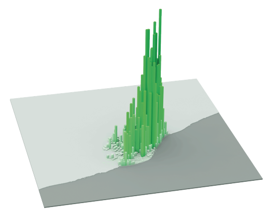
New York (Peak residential density: 59,150 people/km2, 2012)
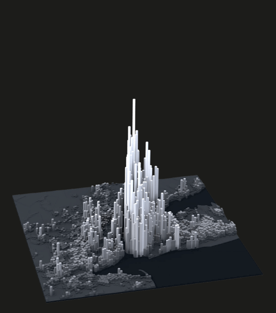
Shanghai (Peak residential density: 74,370 people/km2, 2011)
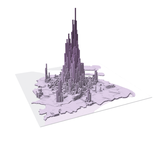
Istanbul (Peak residential density: 77,300 people/km2, 2013)
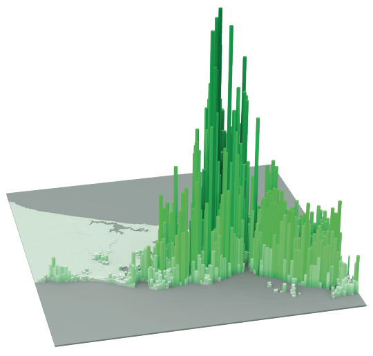
Hong Kong (Peak residential density: 111,100 people/km2, 2013)
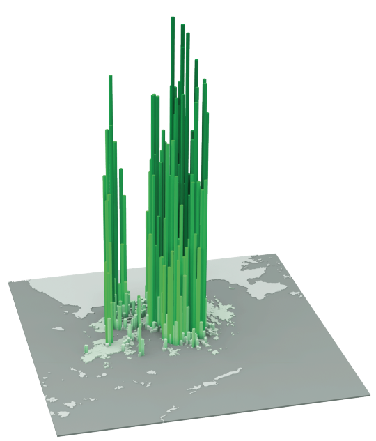
Mumbai (Peak residential density: 121,300 people/km2, 2013)
-
The rise of the East
I love the work that LSE Cities (London School of Economics) is doing with Urban Age. If you haven’t yet checked out their site, you should do that now. If you’re a city geek, it’s the kind of site you can get lost in for hours. Especially if you’re a sucker for great diagrams like I am.
Here’s one I found today that shows where cities are growing in the world:

Each circle represents a city (well, metropolitan area). The dark green dot is the city’s population in 1950. The lighter green dot is the city’s population in 1990. And the yellow dot is the city’s projected population by 2025. Click here for a larger version of the map.
What’s fascinating about this diagram is that you can so clearly see how the most significant population growth has shifted away from the West to the rest of the world and in particular Asia. That is, those dots have more yellow than green.
We, of course, already knew this was happening. And population is just one dimension. But it’s still interesting to see this in diagram form. We are living through the rise of the East. And this diagram is a reminder of that.