
Daily insights for city builders, delivered every morning at 6 AM ET. I’m Brandon Donnelly — a Toronto-based real estate developer and founder of Globizen. I’ve been writing here since 2013.

Tag: interior design

  • Field Guide to Indoor Urbanism

    A few months ago, one of my old professors from architecture school — Phu Hoang — reached out to me through this blog. That’s one of the benefits of writing publicly — it becomes your calling card. In this case, it had been at least 16 years since I was in his design studio.

    We connected over a call. He told me about his and Rachely’s firm, MODU Architecture. And he let me know that he’s no longer teaching at Penn. He is now the Head of Architecture of the Knowlton School at Ohio State University.

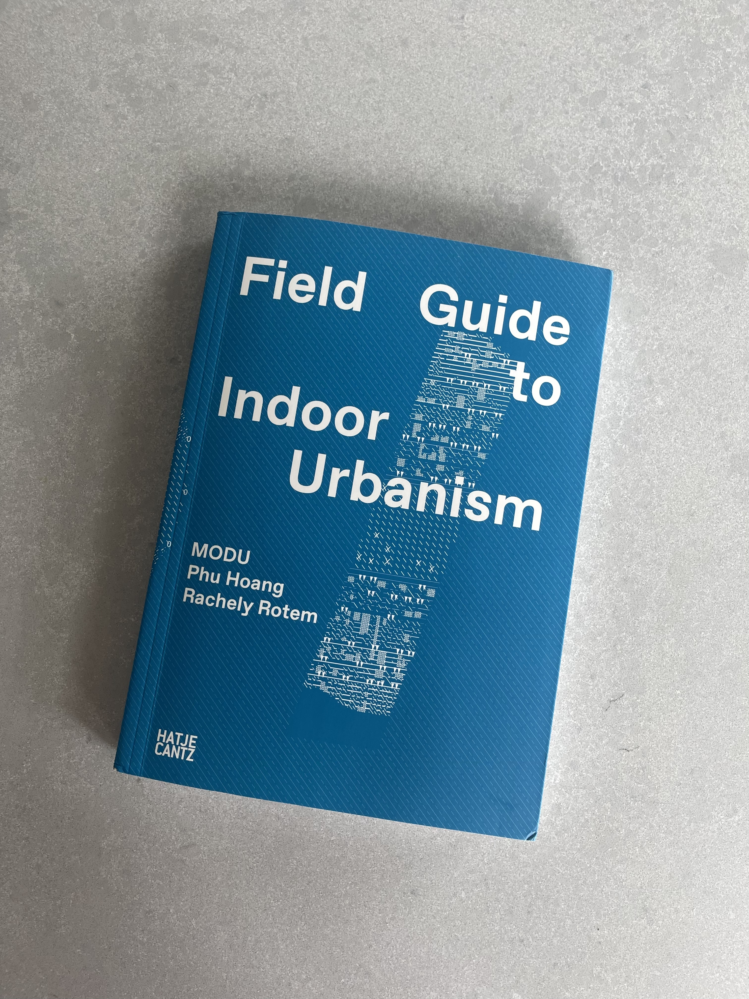
    Then, following the call, he was kind enough to send me a copy of his new book, Field Guide to Indoor Urbanism:
    The typical approach to modern building design is to have clearly defined boundaries between interior and exterior spaces. The outside is the outside. And the inside is a climate-controlled space that is, for the most part, sealed to the outside.

    Most of us spend the vast majority of our lives in these latter spaces. In fact, since the advent of modernism and the International Style over a century ago, the general idea has been that these spaces can and should be mostly the same.

    HVAC systems make it so that you don’t really need to worry about context or the environment. What works in Toronto can work in Phoenix. You just need to dial up your cooling loads.

    This is so much the case that whenever I’m in a city with a fairly benign climate, such as somewhere in California, I always find myself fascinated by the fluidity between interior and exterior spaces. It’s such a foreign concept to me that it stands out: “Wait, how is this not sealed?

    Indoor urbanism, on the other hand, makes the argument that this binary approach is the wrong way to think about spaces. Here’s an excerpt from a recent Metropolis article about MODU:

    They call this approach “indoor urbanism,” which privileges the blurred boundary between what has traditionally been considered interior space and exterior space. This in-between space–straddling open and closed, artificial and natural–deserves architects’ keen attention, especially as the planet warms. “Indoor urbanism recognizes that architecture and cities are situated on an environmental continuum, as a matter of degrees rather than absolutes,” write Hoang and Rotem in Field Guide.

    Examples of this thinking can be found throughout their work. This project in Jackson, Wyoming is one of my favorites both because I love Jackson and because it’s a cold and snowy place. And yet, even in this climate zone, their design includes for several “semi-exterior areas” that serve to connect you to nature.

    This is a decidedly different way to think about architecture and urbanism. But as our climate crisis intensifies, it’s only going to become more relevant.

  • When do iconic chairs actually become iconic?

    Search for the most iconic chair designs in the world and you’ll likely come across a list that includes:

    • Wassily Chair by Marcel Breuer (1928)
    • Barcelona Chair by Mies van der Rohe (1929)
    • Grand Consort by Charlotte Perriand, Le Corbusier, and Pierre Jeanneret (1928)
    • The various Eames Chairs (starting in 1945)
    • Wishbone Chair by Hans Wegner (1949)
    • Wiggles Side Chair by Frank Gehry (1972)
    • And the list goes on.

    Most of these chairs also look as if they were just designed yesterday. Meaning, they’re timeless and have stood the test of time. But they are mostly older designs. Which raises an interesting question: How much does the passage of time play in a role in determining whether or not something is “iconic”?

    There are some more recent designs that you could call iconic. The Roly-Poly Chair by Faye Toogood (2014) and the Louis Ghost Chair by Philippe Stark (2002) come to mind. This suggests that really great designs can become immediate classics. (Though, this latter example is a reinterpretation of a classic French chair that in and of itself is an icon.)

    What I think is the mostly right answer is that, yeah, sometimes you can catch lighting in a bottle. The Louis Ghost Chair, for instance, is one of the top selling chairs of the 21st century. It’s a clever and modern take that used new technologies (as is often the case) to revisit an old classic. Starck nailed it.

    But more often than not, you probably need time. Time is what allows the object to form cultural associations in our mind and to prove that it is, in fact, timeless. However, if this is truly the case, then it makes it difficult to determine if we’re still producing as many design icons today as we did in the past. We won’t really know until they become old.

    Image: Louis Ghost Chair via Knoll

  • Cream-colored walls and light-oak tables

    I don’t normally write about food on this blog. But hear me out. Yesterday was Bianca’s birthday and we had an incredible experience at Osteria Giulia. We sat at the bar, as we like to do, and everything was perfect: the food, the service, and the interiors.

    First, let’s talk about the food.

    Anchovies, grilled sourdough, and a lot of delicious butter:

    Endive, pear, burnt honey vinaigrette, toasted almonds, and ricotta:

    Ricotta filled pasta, mushrooms, and artichokes:

    Sea bass, leeks, artichokes, fava beans, and charred tomatoes:

    Now, let’s talk about the interiors. They were designed by Guido Costantino Projects. And to get a good feel for their approach, I suggest you first check out their Instagram and then move onto their website. They do really beautiful and calming work.

    Design always matters.

    And I’m pretty sure that the cream-colored stones and light-oak details made everything taste that much better last night. If you haven’t been and you get a chance, I would highly recommend you try Osteria Giulia. It’s now one of our favorites in the city.

    Happy birthday, Bianca!

  • Modern luxury

    “Luxury” is an overused term in the world of real estate. If you call everything luxury, then ultimately nothing is luxury, right? But let’s ignore this particular debate for right now. I was recently in a meeting where our interior design team — Mason Studio — made what I think is an important distinction between “classic luxury” and “modern luxury.”

    Classic luxury is old school luxury. It is the kind of luxury that says, “you can’t come in here unless you look like this.” And I’m sure that all of you can think of brands that might speak to you in this way.

    But I think this idea of luxury is quickly changing. Perhaps a good example of “modern luxury” is the recent collaboration between RTFKT — the web3 digital fashion company that Nike bought last year — and high-end luggage company RIMOWA.

    This, to me, is a brilliant collaboration. It is a sign of what’s to come — an ongoing blurring of our physical and digital worlds — and it is a less fussy kind of luxury; maybe I’ll mint an exceptionally expensive piece of luggage, maybe I’ll mint a digital collectible, or maybe I’ll just hang out on Discord.

    Now, one could argue that nothing has really changed and we’re just talking about different kinds of trappings. But that doesn’t feel exactly right. There is something about modern luxury that feels more inclusive to me. And I think that is why it is quickly becoming the dominant form of “luxury” — whatever that means.

  • Lobby / co-working space at Junction House

    It has been cold and snowy in Toronto lately, which is great if you’re looking to shred pow on a snowboard, but suboptimal if you’re trying to construct buildings. It pains me deep inside my bone marrow when we lose productive days to weather. But what can you do?

    I was, however, thrilled to see this first glimpse (pictured above) of the lobby / co-working space at Junction House this morning. The slightly elevated section (which is the point of view of the above rendering) is the co-working area.

    The reason it’s elevated is that we needed the clearance below for our parking ramp. We thought about trying to make it retail, but a place for residents to hang out and work seemed like a pretty good idea.

    A lot of us on the team are big fans of a great hotel lobby bar, but that’s kind of challenging to do in a residential condominium. This is maybe the next best thing. It’s been very popular with purchasers so far, but I’m looking forward to seeing how it performs in real life.

  • Never too small — beautifully designed small spaces

    This is my new favorite YouTube channel. I discovered it last night and it’s called “Never Too Small.” The focus is on beautifully designed small spaces. And all of the videos are meticulously crafted — they have a calming feel to them.

    The first video that I watched was the one above (click here if you can’t see the embed) about Desmond Wong’s 31st floor apartment in Hong Kong. At 52 square meters, it’s actually one of the larger spaces on the channel. But it is perhaps important to keep in mind that this was a 2-bedroom flat before Desmond renovated it.

    Floor plans are an interesting thing (and something I enjoy working through for work) because there are lots of nuances to consider, some of which are entirely local. For example, in this flat you’ll see that the kitchen is off in its own little room and furnished with a window.

    That is common in many of the HK apartments that I have seen, but it is not how we would typically lay things out in a new build of this scale here in Toronto. The kitchen would likely be a galley kitchen adjacent to the living/dining room to create more of an open concept plan.

    I’m looking forward to watching their other episodes. For more about NTS, you can also check out their website. They recently published a book which, from what I can tell, looks equally beautiful.

  • The new Miami

    The last year has been challenging for the hospitality industry. But at the same time, it was a good year to renovate. The W South Beach recently unveiled a $30 million renovation project that includes all 357 rooms. Designed by local studio Urban Robot Associates, the project directive was an interesting one. The team was asked to reimagine the hotel for the “new Miami.” A Miami that is more grown up and cultured, but that, of course, still has a bit of an edge. With all of the attention that Miami and Florida are getting right now, this project feels timely and indicative of something broader underway. Indeed, it’s hard not to acknowledge that Miami is having a moment right now. This also happens to be one of the last hotels that I stayed at prior to last March’s lockdown. So I have a clear “before” in my mind. It’s fun to see how much it has changed over the last year while I was mostly sitting at home. (Shameless plug: I also love the pale wood herringbone floors, which, coincidentally, will also be on offer at One Delisle.)

    Images: Urban Robot Associates

  • Introducing Crosby Studios’ virtual shoppable showroom

    One of my favorite interior design firms — Crosby Studios — has just launched a new home goods and accessories concept called Crosby Studios Home. The offerings are unmistakingly Harry Nuriev (the founder of Crosby Studios). It’s all about design, art, and fashion coming together. But what is also noteworthy is how the concept was launched using a virtual shoppable showroom. And the experience, which is pictured above, is shockingly good. You simply wander around this blue-floored apartment and click on whatever stuff you would like to add to your shopping cart. This isn’t the first virtual showroom experience, but as I was using it, I couldn’t help but think that we’ll be seeing a lot more of this in the future. This and things like shoppable augmented reality.

    Images: Crosby Studios Home

  • A 17.6 square meter apartment in Taipei

    Dezeen recently announced its 2019 interior award winners and this 17.6 square meter (~190 square foot) flat in Taipei was selected for “small interior of the year.” Designed by the Taiwanese studio A Little Design, the space features a 3.4m ceiling height and a queen-size sleeping loft. The design is very well done.

    But as I was looking through the photos, I couldn’t help but think, “This is about the size of a parking spot in Toronto.” Typically, the minimum dimensions for a parking space are 2.6m wide by 5.6m long. If either side is obstructed or the drive aisle is substandard, these dimensions need to be increased.

    So we’re not far off.

    Some of you will interpret this to mean that the apartment is too small; whereas some of you will interpret this to mean that the spaces we dedicate to cars are too big. It’s a matter of perspective. But what is clear is that there is a market for small urban spaces. Here are some other examples from São Paulo, Beirut, and Moscow.

    Photo: Hey! Cheese

  • Value of Design Awards

    Interior Designers of Canada (IDC) is launching a new awards program this September called the Value of Design Awards (VODA). And for some reason they asked me to be one of their inaugural judges. I think the talented folks at figure3 had something to do with that. Link here.

    What’s interesting about VODA is that many or most ID awards focus on design that simply looks cool. The ambition of this awards program is to recognize and celebrate the positive impact that Canadian design thinking has on people and businesses. In other words: How does it actually perform?

    To submit your project to IDC’s Value of Design Awards, go here. The final entry deadline is June 8, 2018. So you don’t have much time left.