Daily insights for city builders, delivered every morning at 6 AM ET. I’m Brandon Donnelly — a Toronto-based real estate developer and founder of Globizen. I’ve been writing here since 2013.

Tag: income

  • US counties with the highest per-capita income

    Below are the US counties with the highest per-capita income (as of 2018), according to this recent Bloomberg article:

    Teton, WY is home to the Jackson Hole valley (which has some of the best skiing in the world). And Pitkin, CO is home to Aspen. Turns out, rich people like ski towns.

    Interestingly enough, 2018 saw per capita income grow in the greatest number of US counties since 1981. According to the Bureau of Economic Analysis, it was 97% of all counties:

    For the full Bloomberg article, click here.

    Charts: Bloomberg

  • Median household income vs. health insurance costs

    I just came across this chart from Axios, which relies on data from the Federal Reserve Bank of St. Louis and the Kaiser Family Foundation. It compares median household income against the average cost of employer health insurance (in the United States).

    What it is saying is that, after adjusting for inflation, the median household income has only increased by 2% from 1999 to 2017, whereas employer health insurance costs have increased by some 121% over this same time period.

    The takeaway: Rising healthcare costs are believed to be eating away at take-home pay in the US. As of 2017, health insurance costs were estimated to represent about 30% of the average household income. That feels like a big number to me.

  • The new donut

    Years ago Aaron Renn coined an urban paradigm that he labeled “the new donut.” The old donut, of course, is one that many of you will know well: poor downtown (hole in the donut) and wealthy suburbs (ring around the hole in the donut). This is a well documented phenomenon in many American cities.

    The new donut reflects today’s return to city centers. It is the filling in – albeit only partially – of the middle of the donut. The reason I say only partially is because the data clearly suggests that, in many cases, there’s now a trough between the immediate core and the outer suburbs. 

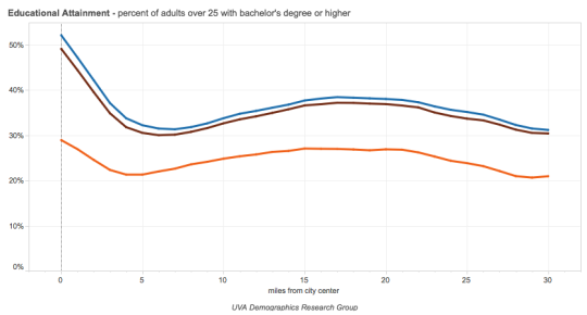
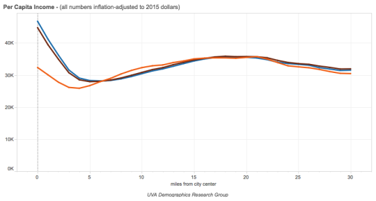
    In 2015, the University of Virginia published a study called The Changing Shape of American Cities. It looked at things like educational attainment and per capita income in 1990 and then compared it to more recent 2012-2015 data. But most significantly, it plotted this data against “miles from city center.” (I discovered this study via City Observatory.)

    Here are educational attainment and per capita income for the 50 largest metro areas in the US. The orange line is 1990 data. The brown line is 2012 data. And the blue line is 2015 data. The x-axis is “miles from city center.”

    imageimage

    Compared to 1990, it is clear that there has been noticeable spike in education and income in city centers. For the above composite index, more than 50% of adults over 25 now have a bachelor’s degree. But it has also accentuated the trough that appears to sit, on average, about 5 miles out from the center. 

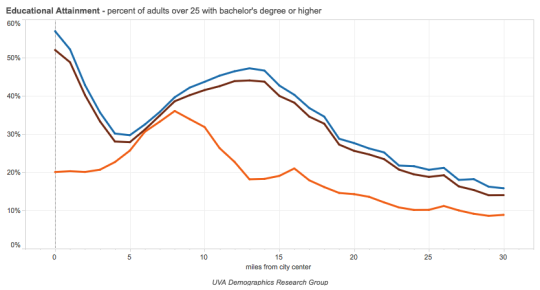
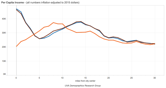
    In some metro areas, such as Charlotte (shown below), there has almost been a complete inversion. Education and income were highest 5 to 10 miles out from the center, but that has since flipped, along with a dramatic spike right in the center.

    imageimage

    This is the new donut. If you’d like to see the graphs for all 66 American cities that form part of the study, you can do that here

  • Doing stuff vs. owning stuff

    “People get income for doing stuff, and they get income for owning stuff. Increasingly the latter. And the ownership share of income goes to a small slice of households that own almost all the stuff.”

    This is a quote from a recent article by Steve Roth over at Evonomics, where he breaks down the share of US household income that is derived from “labor” vs. “capital.” In other words, how much money do households make from working (trading their time for money) and how much do they make from their existing wealth (that is, owning stuff)?

    If I were to oversimplify how he calculates this (you can read all of the details, here), it is: (Income – Labor Compensation) / Income. Take all of the household income. Subtract the money made from doing stuff. And then divide it by total income to get the percentage made from “unearned property income.” There are gray areas and others things to consider, but that’s the gist of it.

    What he discovers and argues is that basically 50% of household income comes from simply being wealthy and owning stuff. He also reminds us that approximately 60% of US wealth is… “earned the old-fashioned away: it’s inherited.”

  • Canada’s 1%

    The Globe and Mail recently published an article about Canada’s highest paid workers. It uses census data spanning 2005 to 2015.

    There’s a feature that allows you to enter your before tax income, your location, and your gender to see how you compare to “the 1 percent.”

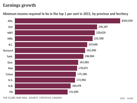
    But in case you don’t feel like doing that, here’s the minimum income required to be in the top 1 percent as of 2015 for each province/territory:

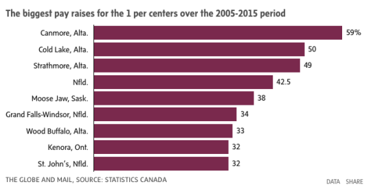
    And here are the communities where the 1% saw the biggest pay increases:

    The data certainly underscores how important commodities have been for growing individual incomes. Alberta, Newfoundland, and Saskatchewan are resource-rich provinces.

    However, the above data doesn’t capture the collapse of oil prices in 2014. So it would be important to also consider what this data looks like outside of a commodities boom.

    Charts: The Globe and Mail

  • The war on work

    Air Canada bumped me from my flight this morning and so I am spending the day hanging out at Toronto Pearson Airport. I can think of more enjoyable ways to spend Canada Day, but at least there’s a nice seating area in Terminal 1 with free wifi and lots of plugs.

    I just finished watching the below talk by Harvard economist Ed Glaeser at the Manhattan Institute. His overall thesis is that unemployment is a far worse problem than income stagnation and that the US needs to stop creating incentives for people not to work. He refers to it as a war on work.

    He addresses a few topics that we’ve talked about here on this blog, such as guaranteed basic incomes, as well as others that we haven’t talked about, such as raising the minimum wage. To give you one spoiler: He argues that a higher minimum wage has been shown to cause an overall drop in employment, which he, again, believes is a deeper problem.

    Glaeser delivers a passionate performance. So if you have 30 minutes to spare – perhaps you’re stuck in an airport somewhere – I recommend you give it a watch. If you can’t see the video below, click here.

    [youtube https://www.youtube.com/watch?v=8xaNV_6wgak?rel=0&w=560&h=315]

  • The urban wealth pendulum

    Jeffrey Lin, who is an economist at the Federal Reserve Bank of Philadelphia, recently published the following chart:

    image

    I found it in this Washington Post article. And it’s packed full of fascinating information.

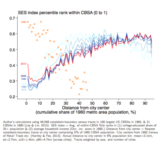
    The chart compares the socioeconomic status in US cities (y-axis) against “distance from city center” (x-axis) in 1880 and then in recent years (1960 to 2010 census data). The orange circles represent the 1880 data and the red and blue lines represent the recent census data.

    What this chart and research tells us is that in 1880, rich people overwhelmingly lived in the center of cities. And as you moved further away from the city center, socioeconomic status fell off pretty precipitously. This makes sense given that, at the time, it was hard to get around and travel long distances.

    However, in the post-war years, the exact opposite became true. We began driving and wealth decentralized. This should surprise no one. 

    But what’s interesting is how this appears to be reversing. In 2010 (the red line), there’s a sharp increase in socioeconomic status for people living basically right in the center of cities. And for the 30 – 60 km range, there has been a decrease in socioeconomic status essentially from the 1960s onwards. 

    The important takeaway here – which is spelled out in the Washington Post article – is that the neighborhoods which appear to be in high demand today are also in very short supply:

    “We have 80 years of essentially zero production of neighborhoods with these qualities,” Grant says. “We’ve spent the last 80 years building car-oriented suburbs. Then when the elites decide they want to go back into the city, there’s not enough city to go around.”

    This is one reason why supply matters.

  • Architecture as a tool of capital

    I just stumbled upon an interesting Architectural Review article from last year called: Architecture is now a tool of capital, complicit in a purpose antithetical to its social mission. The author is Reinier de Graaf, who is an architect and partner at the firm OMA.

    The focus of the article is on inequality; capitalism vs. socialism; Thomas Piketty’s book, Capital in the Twenty-First Century (which is now on my reading list); and on how Modernism lost its social mission and got repurposed as a tool that just serves capitalist interests. It went from an ideology to simply an architectural style.

    Here is an excerpt:

    “Once discovered as a form of capital, there is no choice for buildings but to operate according to the logic of capital. In that sense there may ultimately be no such thing as Modern or Postmodern architecture, but simply architecture before and after its annexation by capital.”

    Given that I am initially trained as an architect, but that I work as a real estate developer, this article hits home for me. But unlike the author, I am not as fussed by this intertwining of capital and architecture. In fact, I have always believed that the more architecture can understand its economic milieu, the more likely it can affect positive change.

    Of course, there’s the question of whether that economic milieu is even the right one in the first place. I’ll echo this blog post (on the limits of capitalism), by saying that I consider myself a capitalist, but not an absolute capitalist. Capitalism isn’t perfect.

    I like Reinier’s description of income vs. wealth (borrowed from Piketty):

    He identifies two basic economic categories: income and wealth. He then proceeds to define social (in)equality as a function of the relation between the two over time, concluding that as soon as the return on wealth exceeds the return on labour, social inequality inevitably increases. Those who acquire wealth through work fall ever further behind those who accumulate wealth simply by owning it.

    What are your thoughts?

  • 2 new ways to think about economic inequality

    We talk a lot about economic
    inequality these days. We worry, among other things, that our successful cities
    are becoming playgrounds for the rich and that housing is becoming increasingly
    unaffordable for the middle class.

    Without negating the
    importance of things such as attainable housing, I’d like to offer up two,
    potentially new, perspectives on economic inequality.

    The first is an
    essay by venture capitalist Paul Graham
    . In it, he rationally unpacks, as he always does, the phenomenon of economic inequality. One of his key points is the distinction between rent seeking degenerate economic inequality and the economic inequality caused by rapid value creation (i.e. Two Stanford students decide to create a new search engine called Google).

    “If the rich people in a society got that way by taking wealth from the poor, then you have the degenerate case of economic inequality where the cause of poverty is the same as the cause of wealth. But instances of inequality don’t have to be instances of the degenerate case. If one woodworker makes 5 chairs and another makes none, the second woodworker will have less money, but not because anyone took anything from him.”

    Of course, Paul Graham is thinking about this from the perspective of a venture capitalist that funds startups and helps entrepreneurs get rich. But what about the impacts to people who live in a city where the rich are far richer than the poor?

    That brings me to the second perspective.

    A recent study, published in The Journal of the American Medical Association and written about in the New York Times, has discovered a surprising relationship between income and life expectancy across the United States from 2001 to 2014.

    What they found was that cities with high economic inequality – such as New York and San Francisco – actually have lower inequality when it comes to life expectancy. 

    Here is a chart from the New York Times:
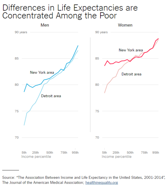
    And here is a chart from healthinequality.org:
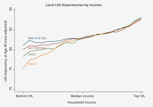
    If you’re rich, it doesn’t matter where you live. The life expectancy of a rich person in New York is roughly the same as a rich person in Detroit. (Though, as to be expected, women generally live longer than men.)

    However, as income levels fall, so does life expectancy. But it falls more in a city like Detroit than it does in New York. In fact, rich cities such as New York and San Francisco are almost model cities in this regard. Why is that?

    The biggest predictor appears to be health behaviors, such as smoking and obesity:

    “The research seems to suggest that living in proximity to the preferences — and tax base — of wealthy neighbors may help improve well-being. New York is not just a city of rich and poor, but also one of walkable sidewalks, a trans-fat ban and one of the most aggressive anti-tobacco agendas of any place in the United States.”

    So there you have it. Two, potentially new, ways to think about economic inequality.

  • Technology is eating the world

    Large Gantry Crane on Sunset by Sasin Tipchai on 500px.com

    https://500px.com/embed.js

    Earlier today the comment section of an old post I wrote about UberX was revived with a discussion around technology and what it means for human capital.

    The concern expressed was that technology and machines are going to put us all out of a job. And it stemmed from a discussion around driverless cars. Clearly we are headed in that direction and so eventually we will no longer need to drive or have people drive us around. This means that something that was once a job will no longer exist.

    But I am not yet convinced that it will be as dire as some believe it will be – though it could very well necessitate some significant structural changes in the economy.

    Here are two things to consider:

    Marc Andreessen has written and tweeted a lot about the topic of “robots eat all jobs” and his argument is that this line of thinking often revolves around something called a lump-of-labor fallacy. This is the idea that there is a fixed amount of work to be done. And so when technology replaces humans, we are just making the labor pie smaller.

    But the reality appears much different. Human wants and desires increase and we find new ways to put people to work. One of the examples I’ve heard Marc give, that I really like, has to do with buildings. In the past, there used to be a guy whose only job was to shovel coal into a furnace. He physically heated the building. But eventually technology did away with that requirement and that job. Is that not progress? Or should we go back to that in order to put people to work?

    All this said, unemployment and job displacement are still serious issues for cities and countries. Which is why some people – including many capitalists – believe that minimum wages will not be enough going forward. We will also need to look at things like a “basic income guarantee” to redistribute wealth and ensure that, no matter what, everyone has a certain amount of money to live.

    At first blush, this doesn’t feel right. But I think it’s important to remain open minded and engage in discussion. Hopefully we can do a bit of that today in the comments below.