Daily insights for city builders, delivered every morning at 6 AM ET. I’m Brandon Donnelly — a Toronto-based real estate developer and founder of Globizen. I’ve been writing here since 2013.

Tag: gta

  • Land prices and transaction volumes are, as you’d expect, down

    Bullpen Consulting just released its Q3-2024 high-rise land report for the Greater Toronto Area. Here’s a figure showing average high-density land prices (on a per buildable square foot) by quarter since 2018:

    Here’s their summary data broken out by Toronto versus the Greater Toronto Area:

    And here’s a list of all the land transactions last quarter:
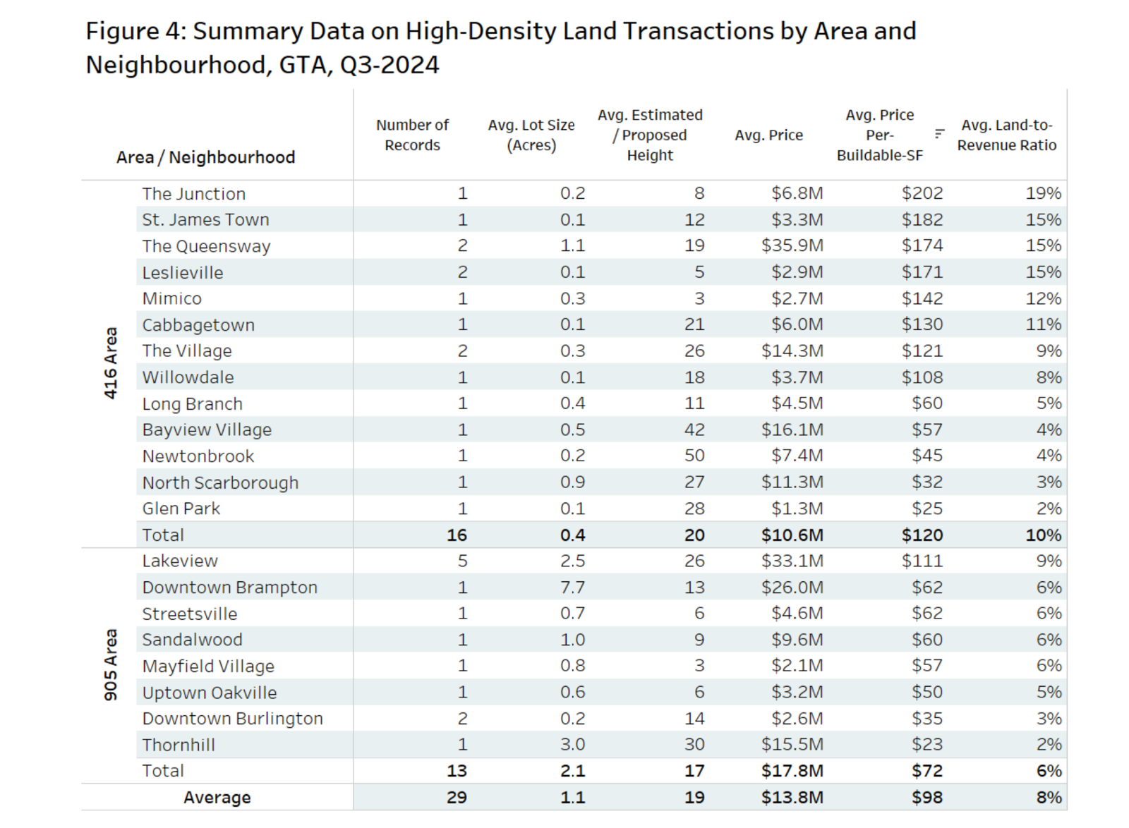
    At the highest level, the average high-density land trade last quarter across the GTA was at around $98 per buildable square foot. This is down 13% from $112 pbsf in Q3-2023. And going back to the first chart in this post, there also seems to be a longer-term decline in high-density land prices.

    But as Bullpen rightly points out in their report, there are limits to what can be gleaned from data like this. And that’s because land transactions can be structured in countless ways. Did the vendor provide cheap financing? Was there a delayed close? Are there any unique site conditions that could be impacting value? The list goes on.

    So even though prices and transaction volumes are down (which is what one would totally expect right now), it still doesn’t feel like this data accurately reflects what’s going on in the market today. I think the reality is worse.

    If you’d like to join Bullpen’s mailing list, here’s their website.

    Figures: Bullpen Research & Consulting

  • Toronto condos on the rise again

    CIBC Deputy Chief Economist Benjamin Tal was recently interviewed by Larysa Harapyn of the Financial Post about the state of the housing market in the Greater Toronto Area. The message he delivers is pretty clear: “If you think that Toronto is unaffordable now, you wait.” The long-term fundamentals in this market remain strong. Demand is outstripping supply and will likely continue to do so, which is why Tal also stresses the importance of delivering more purpose-built rental housing. If you can’t see the video above, click here. (And with that, I think it’s time to switch topics for tomorrow’s post. That’s enough Toronto housing for one week.)

  • Suburban household debt in Canada

    Rachelle Younglai and Chen Wang’s recent piece in the Globe and Mail on suburban household debt (in Canada) has a number of interesting stats. Here are some of them:

    • Looking at debt service ratios across the country, the most financially stressed neighborhoods in Canada are almost exclusively in the suburbs. (Map of the Greater Toronto Area shown at the top of this post. Data from Environics Analytics.)
    • 34 of the top 100 most financially strained neighborhoods in Canada are located in Brampton, Ontario.
    • Brampton has grown at 2x the rate of Toronto over the last decade.
    • 43% of Brampton’s housing was built between 2001 and 2016.
    • 80% of homeowners in Brampton have a mortgage compared to 63% across the Toronto region as a whole.
    • 80% of Brampton’s property tax revenue comes from residential property (not surprising). In comparison, 47% of Toronto’s property tax revenue comes from commercial properties.
    • About 2/3 of Brampton’s work force leaves the city for their job. This makes sense given the above point.

    The other thing the article talks about is the increase in the average household size in many suburban communities as a result of people renting out parts of their house.

    One Brampton gentleman is quoted as saying that he rents his basement out to 3 or 4 students and his upstairs bedrooms to two truckers. This translates into typically 6 vehicles parked in his driveway.

    Assuming this is the trend, I wonder how much of this additional income is being reported to CRA. Because if it’s not, then it could be throwing of these debt ratios and making the financial situation look more dire than it is.

    In any event, I think this speaks to, among other things, the role that many suburban communities now serve for new immigrants coming to Canada. They are doing what they can to try and get ahead.

    It’s also worth noting that if you look at the above map of the Greater Toronto Area, the lowest “debt spots” are in fact where homes tend to be the most expensive — the core.

    Map: The Globe and Mail

  • Half of Toronto condos completed last year became new rental housing

    image

    Shaun Hildebrand (Urbanation) and Benjamin Tal (CIBC) published a report today called, “A Window Into the World of Condo Investors.” In it they revealed that last year (2017 data) no less than 48% of the Greater Toronto Area’s newly completed condo units were closed on by “rental investors.” In other words, almost half of the units became new rental supply.

    This stat was not surprisingly turned into clickbait-y type headlines like, “Half of Toronto condos bought last year were by investors”; whereas an alternate headline might read: “Half of Toronto condos completed last year became new rental housing.” Not as jarring, I know.

    In any event, there are a bunch of other interesting stats in the reports. Here are a few of them:

    – 80% of all new home sales in the GTA last year were condo.

    – Average resale condo prices (per square foot) increased by 26% last year and rents grew by 9%.

    – Over 20% of condo investors purchased their property with no mortgage.

    – Average down payment made by investors was 20%; non-investors were closer to 15%, likely because of mortgage insurance and other factors.

    – Out of the condo investors who took possession in 2017 with a mortgage, no less than 44% are in a negative cash flow position – meaning their rental income isn’t covering their carrying costs. 

    – The returns, which the report calls exceptional, have been coming in the form of price appreciation.

    – As a stress test for the market – what if all these negative cash flow investors suddenly sold their condos? – the report also estimates that if you took all of the rental investors who closed in 2017 with a mortgage and who are in a negative cash flow position greater than $500 per month, it would represent only 3.4% of the total annual supply of condos (both new and resale product).

    If you would like to check out the full report, you can do that over here.

    Photo by Scott Webb on Unsplash

  • Only 9% of new homes sold last month were low-rise single-family

    BILD (the Building Industry and Land Development Association) just released its June 2017 data for the Greater Toronto Area’s new housing market. You can read the full release here. But I would like to point out a couple of things:

    About 91 percent of the 6,046 new homes sold last month were multi-family condo apartments in high-rise and mid-rise buildings and stacked townhomes, while only nine percent were low-rise single-family homes.

    The average price of available new condo apartments continued to rise with an increase of more than $22,000 from May. June’s $627,000 average price marked a 34 percent increase from a year ago. The average available unit was 845 square feet with an average price per square foot of $742. A year ago, the average price per square foot was $587.

    From this, it’s once again clear that Toronto is in the midst of an incredible transformation from a low-rise city to a more vertical city. New supply on the low-rise side of the market is heavily constrained.

    I get the sense sometimes that many people in this city, and others, believe that access to a low-rise detached house should be a right. Go to school. Get a good job. And then buy that house with a backyard. 

    The data speaks to a very different reality.

    Photo by Victoria Heath on Unsplash

  • February housing numbers

    The Building Industry and Land Development Association (BILD) announced its February (2017) numbers today for the Greater Toronto Area. Here are some of the highlights:

    – At the end of February, there were 324 detached homes available in developer inventories. Ten years ago, this number was was 12,064 (detached only). 

    – If you consider all low-rise homes (detached, semi-detached, and towns) the above numbers are 1,001 (2017) and 17,304 (2007), respectively.

    – Average price of a new detached house is now $1,469,449. For all ground-related housing – again, including semis and towns – it’s $1,081,013.

    – There were more than twice as many condo apartments sold than low-rise homes in February.

    – Condo inventory is also dropping and reached a low of 10,342 units.

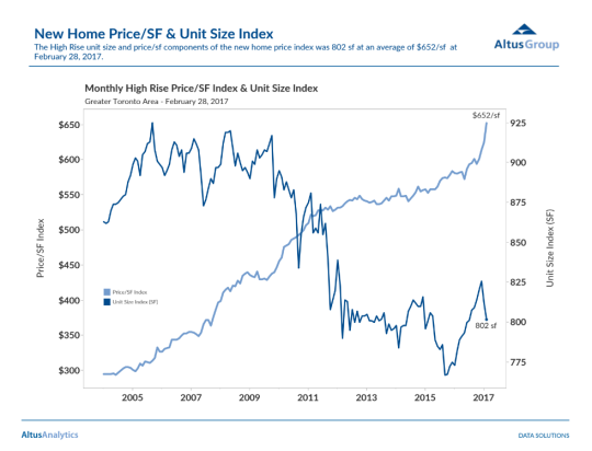
    – Average price of a new condo increased to $652 per square foot and the average unit size decreased to 802 square feet.

    Here’s that information in a chart from Altus Group:

    image

    The overall story here continues to be about decreasing inventory and increasing prices. There’s also the ongoing shift from low-rise to higher density housing, which I don’t view as a bad thing.

  • Supply down. Prices up. Unit sizes up.

    This morning BILD released its November new home data for the Greater Toronto Area. 

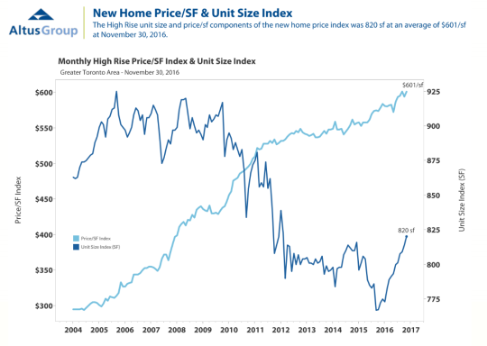
    The story is one we’ve been hearing for a while. Supply is trending downward. It’s becoming harder to build. And prices are up. The average new detached house in this region is now C$1,230,961 and the average new condo is now C$493,137 (~$601 psf). Overall, average pricing is up 20% for low-rise houses and up 10% for condos, compared to this time last year.

    One of the things that I find interesting about the data is how unit sizes have recently started trending upward on the high-rise (condo) side. Below is a chart from Altus Group that shows what I’m talking about. Look at the increase from the middle of 2015 to today. The average is now 820 sf, compared to what looks to be around 770 sf at its lowest point.

    image

    Now, there are a number of possible explanations for this. One is that boomers are starting to sell their houses and move into condos in larger numbers, and 500 sf just don’t do. The market is starting to cater to them. Another possible explanation is that low-rise pricing has become so out of reach for many people and families, that they are now looking to condos to fill that need.

    I see both scenarios playing out in new projects today. But this second scenario, in particular, is one that I’ve been thinking about for a few years now. It’s less obvious than the boomer play. But I think of it as the market maturing. I like seeing families living right in the city and I am sure we will see more of that in the future.

  • Home prices and negative interest rates

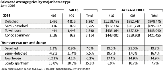
    This morning, I am looking at the following chart of average home prices in the Greater Toronto Area:

    It’s from this Globe and Mail article.

    These are staggering numbers. The average price of a detached home in the suburbs (905 area code) increased 21% year-over-year. In the city (416 area code), the increase was 19.6% YOY. These numbers are almost unbelievable.

    The article focuses on low supply (decrease in listings) and high demand. And that is certainly a big part of what’s going on here in this city, as well as in many others.

    But of course, the backdrop to all of this is our low / zero / negative interest rate environment.

    Larry Summers has a great post on his blog (which I discovered this morning via Fred Wilson) that talks about this “remarkable financial moment.” In some instances, real interest rates are actually negative! (You should read his post.)

    There are always people threatening that interests rates just have to go up. But Larry, as well as others, continue to argue that natural real interest rates are likely to remain close to zero going forward.

    Fred mentions Albert Wenger on his blog this morning and I have written about him before as well, here. In his book World After Capital, Albert argues that capital is no longer the scarce resource of our time. Instead, it has become attention.

    If you believe all of this to be true, then perhaps the numbers at the top of this post aren’t so unbelievable after all.

  • The war on the car

    image

    In today’s post I’d like to focus on the second tweet I embedded in yesterday’s piece about downtown Toronto. Specifically, the fact that almost 75% of downtown residents walk, cycle, or take transit to work, leaving drivers firmly in the minority.

    For me, this then makes me question whether or not we’re optimizing well enough for the majority. However, it’s often not that simple. And that’s because the downtown core is clearly regional in its draw, and the further you move out from the downtown core, the more the modal split flips. In the suburbs, driving is obviously the majority.

    And herein lies the tension and the reason for all this “war on the car” rhetoric: We have a downtown core with completely different mobility preferences than the rest of the region.

    But as Toronto continues to intensify and grow (the population of the Greater Toronto Area is projected to reach almost 9 million by 2036), I truthfully don’t know how we could reasonably expect to (efficiently) move that number of people in private cars. I’ve just never seen it done before.

    Some people think that if we simply got rid of all those damn streetcars on our city streets, that we’d be doing a lot to eliminate traffic congestion. But it’s not that simple. The Highway 401 here in the city is already 18-lanes and one of the widest in the world. And yet it’s perpetually clogged. No streetcars there.

    So I look at this tension as a growing pain. Sooner or later I think we’re going to realize that this war should really be a war on inefficiency. How do we move lots of people around big cities while minimizing waste, maximizing economic output, and enhancing quality of life?

    Now that’s a war worth fighting.

    Image: Helibacon

  • Toronto’s concession roads

    I’m late in writing this blog post because I was up in Collingwood for the day snowboarding. I’m exhausted, but I do have something to say.

    One of the things I always find interesting when I’m driving north of the city is how far Toronto’s major north-south streets extend. Go out to Aurora or Newmarket and you’ll still come across many familiar faces such as Jane, Keele, Dufferin, Bathurst and Yonge Street. And the distance between each of them is exactly the same as it is in the city: 2 kilometres.

    This may not seem like much of a big deal, but have you ever wondered how this street grid was established?

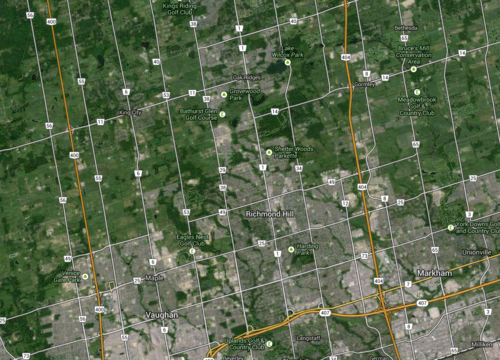
    These streets are actually concession roads. And they were used to subdivide undeveloped land in Upper and Lower Canada into a grid that could then be further subdivided into farming lots. Each square of the grid is 2 km x 2 km, or 1,000 acres.

    Look at a map of the Greater Toronto Area and you’ll see it:

    image

    But what I find most intriguing about this grid system is that it was designed around farming—not our current use case. The intent was to further subdivide each 1,000 acre lot into smaller 100 acre farming lots. And these concession roads were for access—they weren’t city blocks.

    By comparison, there’s another city that’s famously run off a regular street grid. You may have heard of it. It’s called New York. And its street grid was established in the Commissioner’s Plan of 1811. Some even go so far as to say that it’s “the single most important document in New York’s development.” 

    But New York’s grid is much different than the one I’m talking about. Because of its smaller scale (20 blocks a mile going north-south), New York’s was decidedly urban. It was meant for city building.

    Now, in the case of Toronto, concession roads obviously never stopped us from developing a thriving city. We filled in each square to make them as urban as we needed them to be. But as planning ideals changed, so did the infilling of those squares. Our grid was flexible enough to accommodate everything from farm land to suburban subdivisions.

    But I can’t help but wonder how the Greater Toronto Area would have turned out had we, quite simply, chosen a different size of square. What if instead of 2 km x 2 km, we had made them 1 km x 1 km? Or what if we made them even smaller? What would the Toronto region look like today?

    Sometimes it may seem like a simple decision, but in reality the implications are huge.