Daily insights for city builders, delivered every morning at 6 AM ET. I’m Brandon Donnelly — a Toronto-based real estate developer and founder of Globizen. I’ve been writing here since 2013.
I have started using Apple Maps when I cycle. I’ve been using Apple instead Google because it automatically pairs with my watch and tells me (through vibrations) when I need to turn somewhere, but I’m not here to argue that one is better at navigating than the other.
What’s great about using either Apple or Google Maps is that it will take you on routes that have bike lanes or, at the very least, routes that have less vehicular traffic.
Toronto’s cycling network is far from complete. But I have been impressed by how far I can go on dedicated lanes and by how many lanes/trails exist that I didn’t know about. Here is the city’s 2024 map showing only dedicated bikeways:
It is not fun riding a bike when you have to fight with city traffic. And so this is a great way to try and avoid that, and not think too much about which routes you should be taking. It’s also a great way to test the completeness of your city’s biking network.
I’m glad that Toronto is becoming a much better place to ride a bike.
I had a dinner in the suburbs this evening. And so in the afternoon today, I opened up Google Maps to figure out how I was going to get there.
I didn’t have my car with me — because I hate driving into the office — so in my mind, I was either going to take transit or take an Uber.
These are the time estimates that Google gave me:
It was going to take me over 4 hours to walk there. Over an hour to drive there. And 47 minutes to take the train there. Interestingly enough, cycling was also going to be faster than driving.
As soon as I saw this, I shut down the app and decided I would take the train. All I was interested in was the absolute fastest option. And for me at that moment, it was the train.
I recognize that this isn’t always the case. Sometimes driving is much faster than taking transit. It depends on a number of factors.
But as a general rule, when it comes to big and dense cities, you really can’t beat trains and bikes for moving the greatest number of people, as quickly as possible.
The first time I went to Italy was, I think, when I was about 18 or 19 years old. My friend and I took the train down to Milan from Zug, Switzerland (where his father lives), and we got out of the train station without any idea as to where we were going or where we were going to stay. We were young and brazen and clearly not very prepared. I was probably also wearing Diesel jeans and holding a Sony Ericsson T68 in my hand. Sadly, neither of these things were all that helpful as travel aids.
Today it’s impossible to imagine traveling without our smartphones and apps like Google Maps, Google Translate, Airbnb, Uber, and many others. I know that Uber has received its share of criticism over the years, but if you want to fully appreciate what Uber brought to the world, go to a place that you don’t know, that is generally unsafe, and where you don’t speak the language. It becomes invaluable. (This was Rio de Janeiro for me.) But even without all three of these things, it’s an incredibly powerful tool.
In situations where there is zero overlap in languages, I have also used Google Translate to have entire conversations. When push comes to shove, I prefer this approach over trying to impose English (or French) on someone. After all, I am the visitor. I should be the one bending as much as possible. You can also use the app to photograph a restaurant menu and have the entire thing translated in realtime. This to me — realtime reading — feels like a powerful use case for when augmented reality arrives.
I also like to use to Google Maps to fastidiously track where I want to go and where I have been. I love logging my travels, and that is much easier to do today compared to the Diesel jean days. I also try and remember to pre-download whatever maps I need so that I’m less reliant on roaming. Here is what Marseille and Sicily look like right now following our trip:
(If any of you are looking for recommendations, CRABE-TORO was our absolute favorite restaurant in Marseille and Càssaro was our favorite place for a drink in Noto, Sicily. We, unfortunately, never tried the food at the latter, but I’m sure it’s terrific.)
Technological change has always elicited criticism, negative externalities, and some people wishing that things would just remain as they are. And there is, of course, something liberating about getting off a train in a foreign city and figuring out things as you go. In Milan, we simply walked into various hotels, asked them what their rates were, and then probably got taken advantage of as two young Canadians.
At the end of the day, though, I am a firm believer that the world is a better place because of technological progress. From the Gutenberg printing press to Google Maps, technology empowers us as humans. And I have little doubt that 10 years from now we’ll all be traveling with some sort of augmented reality device and romanticizing the good old days of pins on a Google Map.
For the Canadian readers out there, I wish you all a happy Thanksgiving weekend. I am back in Toronto and regularly scheduled programming will now resume on the blog. I hope you enjoyed some of the post diversions over the last 10 days.
Okay, this is neat. Stanford has created what is effectively Google Maps for the Roman Empire.
What it shows you is the principal routes of the Roman World: the road network, the main navigable rivers, and the hundreds of sea routes that crossed the Mediterranean, the Black Sea, and the coastal Atlantic.
The tool then attaches both time and expense to these routes (which would have been used for the transportation of goods and people, but also for general communication across the Roman Empire).
So if, for example, you are curious about how many days and how many denarii it would have cost you to deliver an important dinner invitation from Roma to Alexandria during the summer months of antiquity, you now have an online tool. It’s about 14 days.
I was searching for a location this morning on Google Maps and I came across the “popular times” chart that many of you are probably familiar with. It shows you how busy the location you’re looking at tends to be throughout the day. But this time around, I noticed a pulsing “live” dot and it got me wondering: How live is live?
Google collects this data from of our phones.
It is aggregated and anonymized Location History data from anyone who has opted in on their Google Account. If you’re using Google Maps and have your location services set to “always”, you can actually see a timeline of the places you’ve visited — even if you haven’t explicitly navigated to them (see above).
So the short answer is that the live data is really live. If there’s a spike in the busyness of a particular venue — one that doesn’t match historical busyness patterns — the Google network can pick it up.
I’m fascinated by this kind of city data because I see it as part of the future of city building. Why not use more data to inform the way in which we plan and build our cities. Retail data, traffic data, migratory patterns, population densities — all of this and more is now available to us.
Google Maps recently introduced a new feature that allows you to search for electric vehicle charging stations by plug type. Here’s what it looks like when I tried it here in Toronto:
While helpful, it demonstrates two things. One, there are too many plug types and that’s a problem for EV adoption. Nissans and Mitsubishis use CHAdeMO, BMWs use CCS, and Tesla has its own proprietary plug, for example.
Two, this is one the main reasons why Tesla is so far ahead when it comes to EVs. They’ve been very purposeful in building out an expansive network of charging stations so as to avoid what is very clearly a chicken-and-egg problem. You need great EVs and then places to charge said vehicles.
As of January 2021, Tesla operates over 2,105 Supercharger stations worldwide with over 1,094 stations in North America, 589 in Europe, and 423 in Asia/Pacific. This is how you start to compete when there are over 160,000 gas stations in the US alone.
I noticed this week that Google has started to overlay augmented reality-type place markers onto Street View. The markers are designed to help surface the kind of local business information that you might otherwise find in search — phone number, hours of operation, and so on. Apparently not everyone is seeing them, but the feature is starting to roll out in certain cities. Above is a photo of Dundas Street West in the Junction.
This transforms Street View into even more of a wayfinding tool, but it also offers up a glimpse of how the world might look with augmented reality. But to make this ultimately happen, you really do need to figure out how to get people to start wearing smart glasses. Lots of companies, including Google and Snap, have been trying. None of their products have really stuck — though Snap’s Spectacles are easily the best looking ones.
However, last month Google did announce that it had acquired Canadian smart glasses company, North. I was invited to try out a pair of North Focals 1.0 glasses, which I wrote about over here. They were exceedingly cool, but definitely not ready for mainstream and daily usage. The sides were thick and you had to wear a ring joystick in order to navigate through its menus. Too much work. Too nerdy.
But that’s okay because Google didn’t buy North for the Focals product. They bought them for talent, patents, and for probably a bunch of other things. They bought them to help Google invest in its “hardware efforts and ambient computing future.” The little markers you might now be seeing on Google Street View are likely part of that.
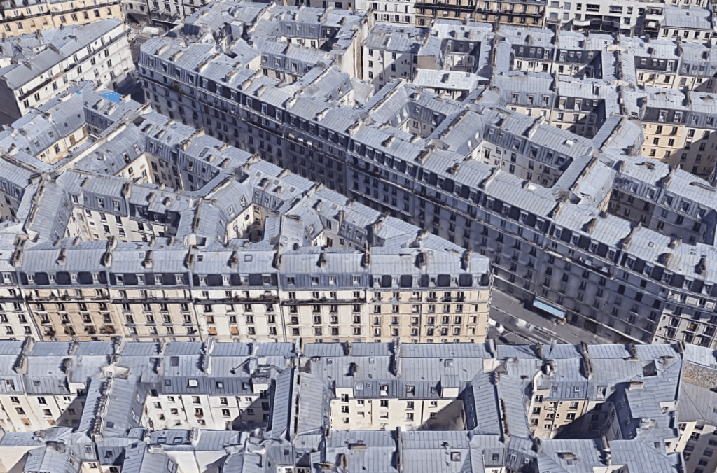
At the intersection of rue Eugene Sue and rue Simart in Paris is a collection of mid-rise buildings that were constructed during Haussmann’s renovation of Paris in the second half of the 19th century. They were intended to house some 10,000 workers.
Here’s an aerial image of that intersection from Google Maps:
Some people, namely the folks over at The Funambulist, have compared this area to the Kowloon Walled City in Hong Kong as a result of its extreme population density. But unlike the Walled City, this area of Paris still exists today.
The way these blocks are able to achieve such a high population density is by employing compact internal courtyards. In some cases they would be more accurately referred to as light wells.
Here’s a fascinating diagram from The Funambulist showing the approximate areas of each courtyard/light well:
I have become very interested in these sorts of European courtyard buildings. They do have their benefits. For one, they offer respite from the rest of the city. But you can also understand why the modernists were so fixated on access to light and air.
In this January 2018 report from the Fraser Institute, they pegged the average population density of Paris to be about 21,067 inhabitants per square kilometer (2014 population year). It is the second densest city in their report after Hong Kong, but the densest in Europe. By comparison, Vancouver sits at around 5,493 inhabitants per square kilometer (2016 population year).
Now, these are of course city averages. Some neighborhoods will be higher and some will be lower. According to a January 2018 study by Alasdair Rae — who is a works in the Department of Urban Studies and Planning at the University of Sheffield — these are the most densely populated square kilometers across Europe (or at least within the 39 countries that he looked at).
Paris, once again, comes in near the top with a peak density somewhere around 52,218 inhabitants per 1km square. The square in question is in the neighborhood of Goutte D’Or. And the only square within the study to come in denser is one from the L’Hospitalet de Llobegrat in Greater Barcelona (53,119 inhabitants per square kilometer).
Now let’s take a look at how these sorts of densities actually manifest themselves. Below is an aerial capture from Google Maps showing a section of Goutte D’Or in Paris. The buildings are all pretty much 7 storeys (mid-rise), but the blocks are mostly filled in. Lots of interior courtyard apartments. This is one way to get to over 50,000 people per square kilometer.
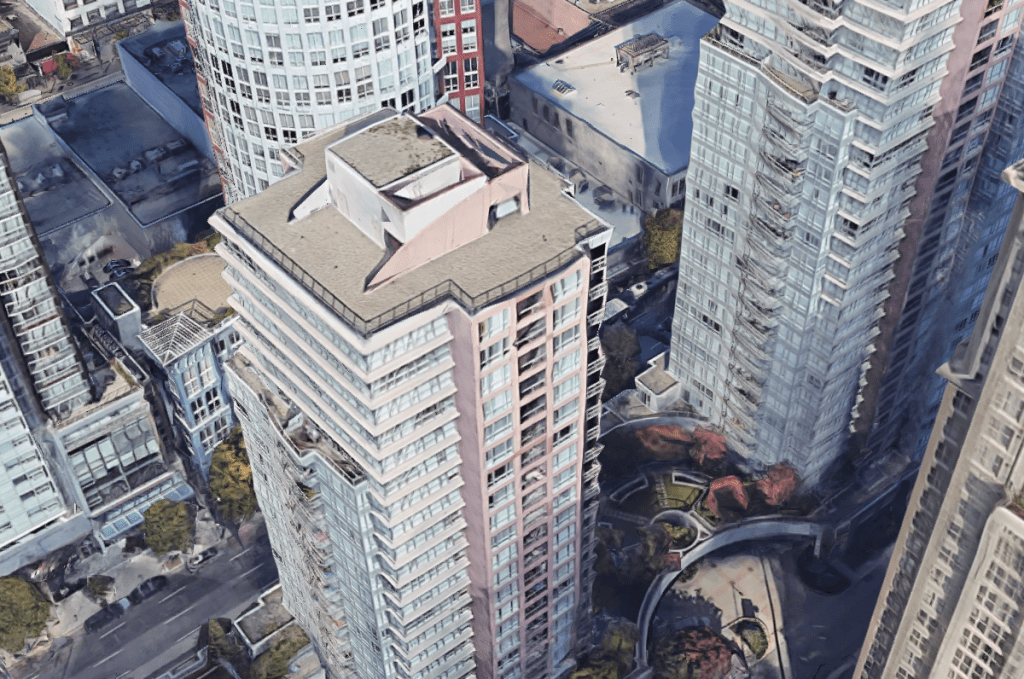
Returning to Vancouver as a point of comparison, below is an aerial capture from downtown Vancouver at exactly the same scale as the Paris capture. I couldn’t find a density map of downtown, but it’s probably safe to assume that it’s greater than 5,493 and a lot less than 52,218 residents per square kilometer.
What you see here is typical Vancouverism. Lots of slender point towers, careful tower positioning and spacing, and generally low podiums. It is a perfect demonstration that height and density do not necessarily correlate. It is possible to have low buildings and high density, which is something that Europe obviously does very well.
But here’s the important question: In which of these two examples would you rather live? Please leave a comment below.
While we were doing our West Palm Beach to Toronto road trip last weekend, I started wondering how much longer the trip would be taking had we been driving a Tesla. The drive, according to Google Maps, is normally about 20 hours and 46 minutes. It’s a long one. About 2,288 km. The mountains in Virginia are nice, though.
The route I threw in is West Palm Beach to Junction House (2720 Dundas St W, Toronto):
According to Tesla, this same route using a Standard Range (400km) Model X SUV is now estimated to take 34 hours.
The additional travel time is a result of charging time (anywhere from 20 – 70min per charge depending on the device) and the fact that you need to go where the chargers are. In this scenario, you end up driving an additional 155 km. However, you will end up saving money on gas.
This reminds me of something that Bill Gates argued in the talk I recently posted. Electric vehicles are the future of personal transport, but they’re not great for commercial applications: planes, boats, and so on. The battery capacity simply isn’t there, and it’s unlikely to be there anytime soon. But perhaps the charging times can be brought down. That would help.
I’m not planning on doing this drive again anytime soon. But if any of you are, you may want to leave the Tesla at home if you’re in a rush. However, using an EV would, of course, be the right thing to do for our planet.