Daily insights for city builders, delivered every morning at 6 AM ET. I’m Brandon Donnelly — a Toronto-based real estate developer and founder of Globizen. I’ve been writing here since 2013.

Tag: economic growth

  • Boom babies (of China)

    A few years ago I wrote a post talking about “depression babies.” In it, I cited a research paper that looked at the impact of macroeconomic shocks on people’s willingness to take on financial risk in the future. The term “depression babies” stems from the Great Depression and how it is believed to have impacted risk taking, savings rates, and probably many other things.

    I was reminded of this when I read this recent article in the WSJ talking about how the Chinese have started spending — and taking on the debt — like Americans, particularly among Chinese under 30. It is the inverse of the depression baby phenomenon. In this case, it is arguably years of economic expansion leading to greater comfort around financial risk.

    Here are a couple of figures from the article:

    JPMorgan estimates China’s ratio of household debt to gross domestic product will climb to 61% by 2020. That’s up from 26% in 2010 and higher than current levels in Italy and Greece.

    The level in the U.S. is about 76%, after falling from 98% in 2006, according to the International Monetary Fund.

    By another measure—the ratio of household debt to disposable income—China appears to have already surpassed the U.S. Its ratio reached 117.2% in 2018, up from 42.7% in 2008, according to calculations by Lei Ning, a researcher at the Institute for Advanced Research at Shanghai University of Finance and Economics. The U.S. peaked at 135% in 2007 and dropped to 101% in 2018.

    Not surprisingly, the article goes on to talk about how this dramatic increase in household debt might be something to worry about. Maybe. I’m not an economist. But I do think this is designed to boost the Chinese growth machine and I do think it makes them less reliant on other countries — such as, maybe, the United States.
  • Five great surges of capital and technology, 1771-2017

    Carlota Perez is a professor that specializes in the social and economic impact of technological change. In 2002, she published an influential book called Technological Revolutions and Financial Capital: The Dynamics of Bubbles and Golden Ages.

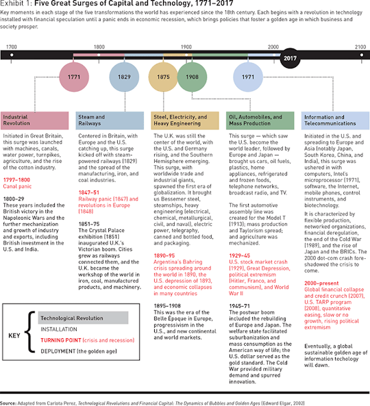
    One of her arguments is that economic growth since the Industrial Revolution has occurred through a series of cycles and surges, ultimately culminating in a fifth great surge centered around information and telecommunications. This is our current economic environment.

    Perez was recently interviewed by strategy + business and they published this diagram (if it’s too small, click through to the article):

    The five surges of capital and technology since 1771 are:

    1. Industrial Revolution
    2. Steam and Railways
    3. Steel, Electricity, and Heavy Engineering
    4. Oil, Automobiles, and Mass Production 
    5. Information and Telecommunications

    Number 4 – oil, automobiles, and mass production – is what produced widespread suburbanization, a middle class filled with homeowners, and new forms of retail employment. And I am sure that most of you would agree that it’s not quite over yet.

    According to Perez, each cycle has two phases: an installation phase and a deployment phase. This latter phase is a “golden age.” But in between these two phases is a turning point that is typically characterized by some sort of crisis and recession. 

    Her belief is that we are in this turning point right now. You see it with Brexit. The demagogues being elected. And more. If you buy this, the key question naturally becomes: How do we cross this chasm and enter our next golden age?

    What’s also important to keep in mind about this theory is that it means that what we are seeing today, socio-economically, is not in fact new. We’ve been through this before. I’ll end with this quote from the interview with Perez:

    In the 1920s, wealth distribution looked the same as it does today. The top 1 percent received 25 percent of society’s total income. By the 1950s it was down to 10 percent. Every installation period brings inequality until the state comes back actively to reverse it and relieve social unrest.

    So what’s happening today may be temporary and it may be history repeating itself. If you’re interested in this topic, you can read the full interview here.

  • The Elephant Graph

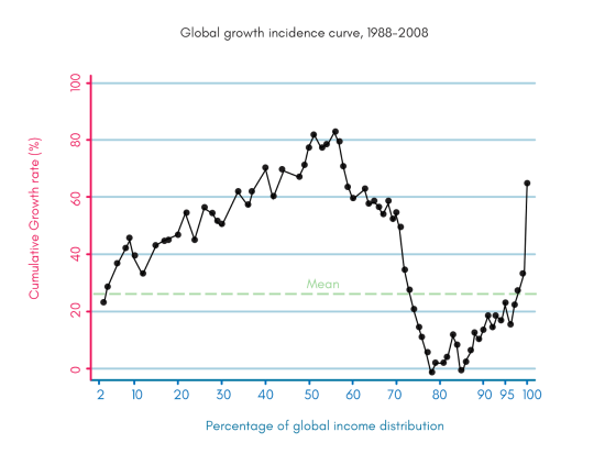
    The following chart was created by Branko Milanovic (Visiting Presidential Professor, Graduate Center, City University of New York and Senior Scholar, Luxumberg Income Centre) and by Christoph Lakner (Economist in the Development Research Group at the World Bank.

    image

    It is known as the “elephant graph” because, well, it kind of looks like an elephant. The trunk is on the right.

    What it shows is global cumulative real income growth from 1988 to 2008 for every percentile around the world.

    The trunk on the right is the world’s 1%. Their income is up.

    The 50-60th percentile range is also up. These are people in the developing world who started making a bit of money as a result of industrialization. In percentage terms things look good, but in absolute terms they’re not making a lot of money. Still, they are becoming better off.

    Where things fall apart is in the 75-90th percentile range. These are essentially the lowest income folks in the developed world. Their incomes haven’t been growing at the same rate and, in some cases, their incomes decreased in real terms. They are falling behind.

    Kaila Colbin wrote a Medium post about this graph and asks whether the exponential growth in technology that we are seeing today, will end up creating more jobs than it eliminates – as it did before in the past. 

    She also wonders whether the dip we are seeing in the 75-90th percentile range could spread left as automation eliminates jobs for those folks in the developing world.

    These are important questions.

  • What technological deflation could be doing to the economy

    Earlier in the week, I came across this post (via Fred Wilson), arguing that rapid technological progress is causing systemic deflation in the broader economy.

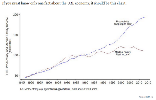
    Here’s a chart that illustrates the author’s point:

    What is happening here is that despite advances in technology and increases in productivity, real wages have been stagnant for decades. (This chart is for the US, but it likely applies to many other countries.)

    This is an interesting paradox. For a long time, increases in productivity were met with corresponding increases in income. So why the divergence?

    The author believes that it’s because the gains brought about by “extreme technological progress” are being unequally applied to the economy. In other words, they do not benefit the majority of people. He then goes on to argue that we could be entering an entirely new macroeconomic era: 

    “Economic growth may be over soon, at least in absolute terms. On the other hand that will be at least partially offset by the technological deflation. So instead of the decline of the innovation it will be just the opposite, the explosion of the innovation that will turn the economy to the decline. And moreover, it will not be a tragedy since we will be able to produce higher standard of living with fraction of the GDP today. Few adjustments needs to be done into our economic system to cope with the change for sure.”

    When you read things like this it makes the idea of a “basic income guarantee” seem far more palatable.

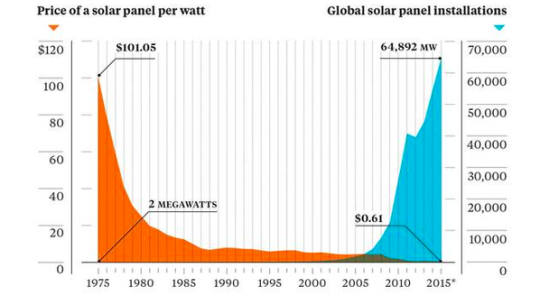
    The other chart that stood out to me was this one below, which shows the declining cost of solar panels and the rise of global solar panel installations. 

    It’s a great reminder that it’s only a matter of time before we wean ourselves off of oil. And, that we could be headed towards some sort of third industrial revolution where the marginal cost of energy is almost zero. Already about 25% of Germany’s electricity comes from renewables.

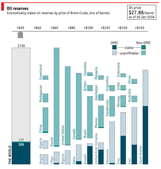
    On that note, I am going to end with a fantastic interactive chart from The Economist (screenshot below) that outlines oil reserves around the world by country. If you click through to their website, you can then toggle the price of oil (per barrel) to see how much of those reserves are actually viable.

    With the price of oil where it is today ($27.88 per barrel as of January 20, 2016), there are only a handful of countries with profitable oil. I am sure you could have guessed which ones.

    What will happen if, or should I say when, that oil is no longer needed? 

  • How immigration shaped Toronto and New York

    One of the things that Joe Berridge reminded me of in his talk yesterday, is that the story of Toronto is really the story of immigration. 

    In his words, Toronto has become the success story that it is precisely because we are good at taking in lots of immigrants and making them economically productive. 

    Sure, there are many things that we could be doing better, but you don’t get to be the most multicultural city on the planet without doing a lot of things right. More than half of this city is now foreign born. The term “visible minority” is quickly expiring.

    image

    And more than anything else, this accomplishment is arguably what has allowed us to become the global city that we are. Click here for a fascinating chart from the Toronto Star that allows you to see the number and source of immigrants that have come to this city over the last half century.

    But of course, Toronto is not alone in this accomplishment.

    Urban economist Edward Glaeser wrote a great essay back in 2005 called Urban Colossus: Why is New York America’s Largest City? It’s an incredibly interesting read for those of you interested in cities and so I definitely recommend it.

    But the crux of his argument is that New York is the largest and most dominant city in America because of geography – specifically its deep harbor – and because of its success in manufacturing.

    What this meant is that New York became the center of shipping in the country and the point of entry for the majority of immigrants coming into the United States. But since transportation costs were still relatively high at the time, most immigrants arrived in New York and stayed in New York.

    Luckily, New York had a robust manufacturing economy – notably because of sugar refining, publishing and printing, and the garment industry. This allowed the waves of immigrants flooding into New York to become economically productive.

    From 1850 to 1920, the population of the New York grew about 800% from roughly 700,000 people to over 5.6 million people.

    So the moral of the story is simply that immigration has and will continue to play a pivotal role in the shaping of our cities. Canada has a sub-replacement fertility rate somewhere around 1.61 births per woman (2012). This is lower than that of United States, which is around 1.88 births per woman.

    That means that without immigration, we do not grow. We shrink. And that’s usually not a great thing for economies.