
Daily insights for city builders, delivered every morning at 6 AM ET. I’m Brandon Donnelly — a Toronto-based real estate developer and founder of Globizen. I’ve been writing here since 2013.

Tag: dimensions

  • Physical space is a funny thing

    It is often difficult to grasp. This is why when you look at an empty piece of land, it can sometimes be difficult to visualize actually fitting a building on it. And why when you look at an empty room, it’s common to think, “there’s no way that furniture will fit in here.” But in the end, it does fit.

    It also tends to be relative. Here in North America, it is common to argue over things like parking space dimensions and drive aisle widths. We’ll say things like, “well, people like their big cars.” But then you travel to Europe and you find streets like this:

    And this:

    The first is only marginally bigger than the width of a parking space in Toronto (2.6 meters). And the latter is only marginally bigger than the width of a typical two-way drive aisle (6 meters). So are these too small? Well, it depends on your perspective.

    If your basis of measurement is the size of cars, then these streets will seem too small. Cars also keep getting bigger, so you have this inflation factor to deal with. But if your basis of measurement is something else, such as walkability, then maybe they’re just right.
  • Dimensioning pedestrian happiness

    The area that stretches between the property line on one side of a street and the property line on the other side of a street is called a public right-of-way here in Toronto. It may be called something different in other cities and countries.

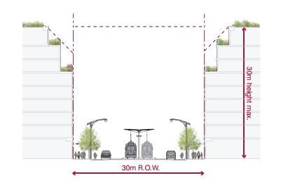
    In the example below (taken from Toronto’s Avenues & Mid-Rise Buildings Study), it includes the sidewalks, the car lanes, and the streetcar lanes. But it could also include other public elements. In this instance, the buildings on either side of the street are assumed to be built right up against their property lines.

    ROWs obviously serve an important public function. But their size also has important urban design implications. As a pedestrian, it feels different to walk on a narrow street than it does on a broad street.

    The width of a ROW can also be used to inform what the preferred height of the buildings along it should be. In the example above, they’re talking about a 1:1 relationship between the width of the ROW and the preferred height of the buildings.

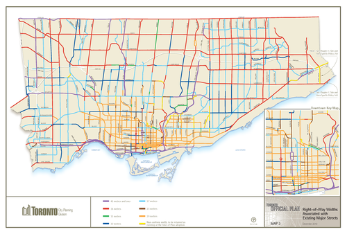
    Given their importance, I thought it would be interesting to share this map of Toronto (dated 2010) showing ROW sizing throughout the city. The mustard colored lines in the core of the city represent 20 metres, the red lines 36 metres, and the purple lines 45 metres or more. The rest of the colors fall somewhere in-between. For the most part, the purple lines represent highways, although there are a few other instances of purple.

    What’s interesting – but not surprising – to see is how we basically kept expanding the size of our ROWs as Toronto grew outwards. This was obviously to make more room for cars on the road.

    But the other, perhaps more interesting thing about this map, is that it could also serve as a guide to pedestrian happiness. The mustard/yellow lines are where it’s most enjoyable to walk. And the red and purple lines are where it’s least enjoyable to walk.

    If you’re from Toronto, give this framework a try and see if it holds true.