Daily insights for city builders, delivered every morning at 6 AM ET. I’m Brandon Donnelly — a Toronto-based real estate developer and founder of Globizen. I’ve been writing here since 2013.

Tag: developing world

  • COVID-19 in the developing world

    One of the things that Bill Gates mentions in his recent TED talk about the coronavirus is that we need to be aware of what might be coming in developing countries, particularly in the southern hemisphere with winter about to arrive. (There’s some evidence of a relationship with temperature.)

    So far, countries like Brazil have been criticized for taking a laid-back approach to fighting the coronavirus. But the same could be said for many, or perhaps most, countries around the world at the outset.

    However, in the case of densely populated slums — like Brazil’s favelas — the problem is expected to be more severe. Without the ability to socially isolate and without proper services, it is questionable whether they will be able to “flatten the curve” in the same way that some developed countries have. There’s also a lack of government oversight in these communities.

    Incidentally, the Financial Times is reporting that organized crime has started to step in to fill this void — and it is happening over WhatsApp. Here is an excerpt from the above article: “Whoever is caught on the street will learn how to respect the measure. We want the best for the population. If the government is unable to manage, organised crime resolves,” read one message sent to residents of a Rio de Janeiro slum.

    One hope is that rich countries will be largely through their outbreaks by the summer and that a vaccine will be well on its way.

    (On a related note, here is an excellent slide deck from the London Business School on the economics of this pandemic. It’s very comprehensive and worth a read.)

  • Relationship between female literacy and total fertility rate

    This recent post by Sam Karam at NewGeography illustrates the relationship between female literacy and total fertility rates in Sub-Saharan Africa, India, and China. The overarching argument, which won’t surprise any of you, is that, “higher female literacy is a reliable predictor of lower fertility and improved prosperity.”

    The following graph uses data from populyst, the UN Population Division and UNESCO. The time period for the dataset varies by country but approximately corresponds to the latest 2000′s. All Sub-Saharan countries are represented, except for the Congo, Somolia, and South Sudan.

    image

    Noteworthy about this dataset is that the biggest decline in the total fertility rate happens precipitously after female literacy reaches and exceeds 80%. What is also interesting, but not surprising, if that the countries with the lowest gender equality rankings tend to also have high fertility rates. And that’s because low gender equality tends to translate into lower female literacy rates. 

    According to populyst, the above phenomenon – precipitous decline in TFR with rising female literacy – has already proved itself out in China. 

    Based on data from the World Bank, China’s total fertility rate dropped from 6.38 in 1966 to 2.75 in 1979. And since the one-child policy was only enacted in 1979, it doesn’t appear to be driven by that. (I would have initially expected some sort of surge in births prior to that policy.) From 1982 to 2000, the female literacy rate in China rose from 51% to 87%. Today it is 99.6%, which is basically the same as it is for males.

    For a more detailed look at the above data, check out this populyst post.

  • First 3D printed home in America

    The video below is a good follow-up to my recent post about the 100 million city and the rapid population growth that we are seeing in some parts of the developing world.

    If you can’t see the embedded video below, click here.

    [youtube https://www.youtube.com/watch?v=SvM7jFZGAec?rel=0&w=560&h=315]

    It’s a video about what is allegedly the “first permitted, 3D-printed home in America” – an 800 square foot home that was built/printed in Austin during SXSW in about 24 hours.

    The project is a partnership between New Story (a non-profit) and ICON (a construction technologies company), and the goal is to pioneer a fast and cheap housing model for the developing world.

    The cost for the above home is said to be about $4,000.

  • High resolution population maps

    image

    Facebook, as part of their internet.org initiative, is working on bringing internet access to people in rural areas all across the world. For obvious socioeconomic reasons, this is an important initiative. From a business standpoint, it also grows the base of potential Facebook users at a time where that top line number is starting to plateau.

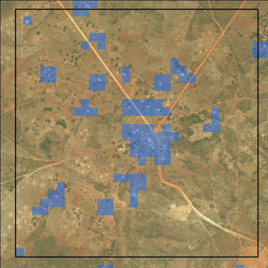
    In order to understand how people are settling and aggregating throughout the world, Facebook has been using high-resolution population maps and then creating models to drill down and analyze individual buildings. 

    This is interesting because: how else could you track informal settlements? So far this seems to be the most effective method. In fact, in architecture school I worked on a project in Dhaka, Bangladesh and I remember relying heavily on aerial photography because I simply couldn’t find the data I was looking for.

    Here’s an excerpt from a recent World Bank post. They, along with Columbia University, are collaborating with Facebook.

    Facebook’s computer vision approach is a very fast method to produce spatially-explicit country-wide population estimates. Using their method, Facebook successfully generated at-scale, high-resolution insights on the distribution of buildings, unmatched by any other remote sensing effort to date. These maps demonstrate the value of artificial intelligence for filling data gaps and creating new datasets, and they could provide a promising complement to household surveys and censuses.

    And here’s an excerpt from a recent Facebook post on the same topic:

    From this preliminary analysis, we’ve determined that slightly less than 50% of the population lives in cities. However, 99% of the population lives within 63 km of the nearest city. Hence, if we are able to develop communication technologies that can bridge 63 km with sufficiently high data rates, we should be able to connect 99% of the population in these 23 countries. [”These 23 countries” represents about 1/3 of the world’s population.]

    I would imagine that this type of model works better in sparsely populated / low-rise areas. Still, I am very interested in thinking about ways in which our current survey and census methods could be improved. Here in Canada we conduct our national census every 5 years. In today’s world that feels like eons. One day, I am sure, it will be real-time.

    Image: World Bank

  • The Elephant Graph

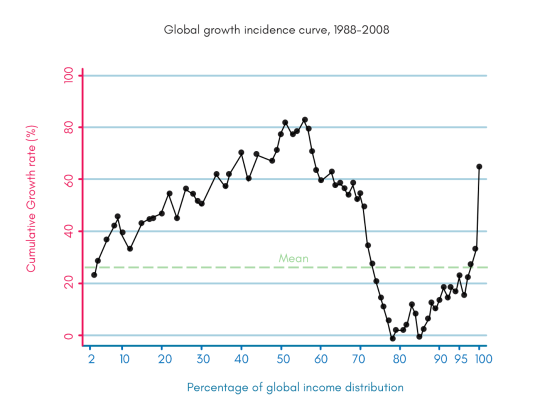
    The following chart was created by Branko Milanovic (Visiting Presidential Professor, Graduate Center, City University of New York and Senior Scholar, Luxumberg Income Centre) and by Christoph Lakner (Economist in the Development Research Group at the World Bank.

    image

    It is known as the “elephant graph” because, well, it kind of looks like an elephant. The trunk is on the right.

    What it shows is global cumulative real income growth from 1988 to 2008 for every percentile around the world.

    The trunk on the right is the world’s 1%. Their income is up.

    The 50-60th percentile range is also up. These are people in the developing world who started making a bit of money as a result of industrialization. In percentage terms things look good, but in absolute terms they’re not making a lot of money. Still, they are becoming better off.

    Where things fall apart is in the 75-90th percentile range. These are essentially the lowest income folks in the developed world. Their incomes haven’t been growing at the same rate and, in some cases, their incomes decreased in real terms. They are falling behind.

    Kaila Colbin wrote a Medium post about this graph and asks whether the exponential growth in technology that we are seeing today, will end up creating more jobs than it eliminates – as it did before in the past. 

    She also wonders whether the dip we are seeing in the 75-90th percentile range could spread left as automation eliminates jobs for those folks in the developing world.

    These are important questions.

  • How Premise is crowdsourcing economic data in developing countries

    I have to tell you all about a company that I just discovered called Premise. I think it’s incredible what they’re doing and a perfect example of mobile (smartphones) eating the world.

    The problem that Premise is solving is that of developing-world economic data being both not timely enough and not all that accurate/granular. This is important, because lots of big organizations – ranging from governments to private companies – are making funding and investment decisions based on this inadequate information.

    So here’s what Premise did:

    They put smartphones into the hands of the people who are on the ground in these places. They paid them meaningful amounts of money (relative to local wages). And they developed a technology platform that could index and analyze the millions of local observations being sent in. So far they have paid out over $3 million to their contributors located across 34 countries.

    As an example: Premise has developed food price indices. And the data comes directly from locals physically going to the market on a regular basis (which most would do anyways) and snapping photos of the food + prices. This allows Premise to provide basically realtime pricing data. (There are checks and balances to ensure data integrity.)

    Why does this matter? 

    Because it allows Premise, for instance, to figure out exactly what happens to food staple pricing when something like an Ebola epidemic hits:

    “Premise started tracking food prices in Monrovia on September 8, and throughout the month we observed upward pressure on prices (our Liberia indices and data are freely available at data.premise.com). The price of rice, Liberia’s primary food staple, increased 12% during September. Moreover, we saw significant price differences across the city. Prices in neighborhoods with the most exposure to Ebola were 8-12% higher on average than relatively unaffected neighborhoods. As the disease tore through the city, market sellers avoided the worst-hit areas and trade declined.”

    This is powerful information and just one example of what Premise is doing. Obviously this data is also of use to for-profit companies, which is how the company has managed to raise over $66 million in VC funding. But I think there will also be big benefits for these developing countries. As the saying goes, you make what you measure.