
Daily insights for city builders, delivered every morning at 6 AM ET. I’m Brandon Donnelly — a Toronto-based real estate developer and founder of Globizen. I’ve been writing here since 2013.

Tag: design

  • Culture in our society and economy

    Last week I was reading the blog of James S. Russell, who used to be the architecture critic for Bloomberg News. He’s no longer the architecture critic, because Bloomberg got rid of his column:

    My column, along with almost all cultural coverage, was eliminated at Bloomberg late last year in favor of a yet-to-be completed revamping that focuses on luxury and lifestyle. 

    Obviously, the decision saddens me personally, but it’s also a regrettably powerful signal that culture doesn’t matter in our society and economy.

    As someone who spent a great deal of time studying art, architecture and design, his post really resonated with me. This is a depressing thought. It may be hard to measure the ROI of the arts, but that doesn’t mean there isn’t a return.

    Ironically, Bloomberg–the former mayor of New York–understood this:

    As Mayor of New York, Michael Bloomberg, the company’s founder, championed arts as valuable to the vibrancy of the city and as a powerful force for economic development. The city has seen unprecedented growth in arts facilities, thanks both to his administration’s efforts and his personal philanthropy. His post-mayoral activities are intended to nurture cities as fields of wealth creation by helping them become cauldrons of innovation, which he recognizes is entwined with vibrant cultural and lifestyle trends.

    That sounds about right.
  • Those evil bikes

    image

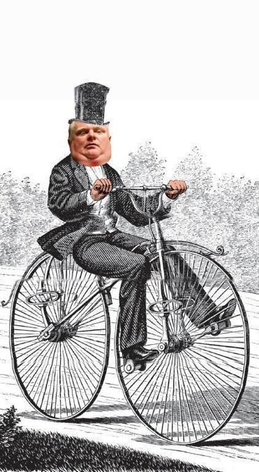
    I just stumbled upon an interesting piece in the Boston Globe (from last December) talking about how the bicycle is “emerging as a new conservative front in the culture wars.

    It starts by talking about Toronto mayor Rob Ford and asks: Who elected this guy? Their response comes down to mode of transport.

    The answer, in large part, comes down to transit. Ford is famously pro-car, and his strongest support came from suburbs outside downtown Toronto, where voters drive into the city during the day and return by car in the evening. One political scientist found that the strongest predictor of whether someone voted for Ford in the 2010 mayoral election was the person’s method of commuting: Car commuters were Ford voters; everyone else wasn’t. Ford repaid their loyalty by declaring on his first day as mayor that the “war on cars” was over; he abolished the vehicle registration tax and announced a plan to kill light rail in the city simply because, he said, streetcars “are just a pain in the rear end.”

    The article then goes on to argue that Ford is at the forefront of a growing conservative movement using bikes as a new political lightning rod. Conservative politicians view cyclists as urbanites (statistically this is true) and therefore not part of their core voter base (statistically this is also true). And so hating on bikes has become a convenient way for them to galvanize their support base.

    But beyond bikes, we’re really talking about a bigger city building issue: How do you unify a city with such divergent priorities? How do we stop this downtown versus the suburbs mentality? These are important questions and I don’t think the answer is to de-amalgamate Toronto. That’s the easy way out.

    Whether we like it or not, the Toronto region functions as one contiguous economic unit and, if we want to be able to effectively compete on the global stage, we’re going to need cohesion. We need to get our house in order. It’s still early days for Toronto’s 2014 mayoral election, but I really hope the next 4 years turn out to be better than the last. I think they will.

  • The story behind the name “Architect This City”

    I was having drinks with an old friend a couple of weeks ago and I told her about my blog. She immediately asked me what it was called. At the time, it was just called “Cities.” And truthfully, I hadn’t given the title much thought. I just knew that I wanted to take a multi-disciplinary approach to examining cities.

    After that night I started thinking more about the idea of a proper title for my blog and I came to the conclusion that I did need something more creative. I should have a stronger brand and identity. So I experimented with a few names and, as you’ve probably noticed, I settled on “Architect This City.”

    Now that I’ve been using the name for a few weeks, I thought I would share my thinking behind it.

    I wanted the name to convey 3 things. (1) I wanted it to be clear that this blog was about cities. (2) I wanted it to be something personal to me. (3) And I wanted to somehow demonstrate that this blog isn’t a siloed look at any one particular discipline, such as architecture, planning or real estate. It’s more than that.

    Given my background in architecture and the fact that “city” is in the name, I think that objectives 1 and 2 made it through. But what I hope is also clear from the name is that the term “architect” is supposed to refer to something much broader than just building design. It’s about the underlying systems, processes and structures of our cities—which could tie into the real estate market, our governance structures or some new technological innovation. Cities are complex and there are many “architects.”

    Finally, I wanted the name to be a directive—a call to action. I wanted it to be a reminder that cities don’t just build themselves. They require careful thought, planning and deliberation. And that’s fundamentally what this blog is all about: city building.

    What do you think about the new name? I’d love to hear your thoughts in the comment section below.

  • Mirvish+Gehry and the story of 4 heritage buildings

    I am a real estate developer and I believe in progress. But I also fundamentally believe in balancing progress and preservation. I’ve said this before.

    This morning, Alex Bozikovic of the Globe and Mail, published a piece on the epic Mirvish + Gehry proposal for Toronto’s Entertainment District. It’s called, “Frank Gehry and David Mirvish’s tall order in Toronto.

    Now, I’ve said before that I like this project. I don’t mind the height and I don’t buy the argument that there aren’t enough public spaces in the area. There’s David Pecaut Square directly to the south that could use a few more warm bodies in it.

    But as I also said before, I think the key concern here is one of heritage. There are 4 heritage designated buildings on the site dating back to as early as 1901. Here’s where they sit:

    image

    The Anderson Building (1915) is particularly unique. Here’s a larger photo (via blogTO):

    image

    So while I’m excited by the prospect of a real Gehry project in Toronto, I think we need to figure out a way to find a balance. Preserve the facades, build on top, or relocate them. Do something besides wipe the slate clean.

    As Bozikovic rightly points out in his article, “Toronto has a sophisticated culture of working with heritage buildings.” There are lots of great examples of how we managed to move forward as a city, without erasing our past.

    And in many ways, I see this ability to work with and build upon heritage buildings as an emerging Toronto vernacular. I mean, what could be more appropriate for the most diverse city on the planet than an architectural style—of our own—that blends and layers history with disparate design ideologies.

    I sense an opportunity.

    We could have Gehry’s white sinuous curves drape over the heritage buildings. Make them become a literal unveiling of Toronto’s past and a metaphor for the sophisticated way in which we build upon legacy.

    It’s too easy to just demolish everything. We’re better than that.

  • The Toronto font

    Susan Kare was the screen graphics and font designer for the original Apple Macintosh computer in the 1980s. Being from Philadelphia’s affluent Main Line, she initially proposed that the various fonts be named after the railroad stops along it.

    However, when Steve Jobs asked where the names had came from, he contested that, if the fonts were to be named after cities, they should be named after “world-class cities”, rather than small ones that nobody had ever heard of.

    image

    And since that’s what Jobs wanted, that’s what Jobs got. The fonts were renamed: Venice, London, Athens, Toronto, Chicago, New York and Geneva. Some of these font names you’ll probably still recognize but some, including Toronto, were eventually abandoned. 

    The Toronto font was removed from System 6 onwards. So from 1988 onwards.

  • [youtube http://www.youtube.com/watch?v=FlApbxLz6pA?wmode=transparent&autohide=1&egm=0&hd=1&iv_load_policy=3&modestbranding=1&rel=0&showinfo=0&showsearch=0&w=500&h=281]

    Want to know how the Dutch design their intersections so that they’re friendly for cyclists? Then check out this video. It’s amazing what you can achieve when you actually care about something and you put thought and intent into it.

  • The essence of the stock market is speculation

    Dutch architecture firm OMA (Office for Metropolitan Architecture) has a subtle way of being incredibly subversive in their architecture.

    The recently completed 1.9 million square foot Shenzhen Stock Exchange (SZSE) building is presently making the rounds online and I personally find it incredibly striking. It has the same timelessness about it that makes me love Mies’ Toronto Dominion Centre.

    But it wasn’t until I read the description on OMA’s website that I decided to blog about it. Here’s the first paragraph:

    “For millennia, the solid building stands on a solid base; it is an image that has survived modernity. Typically, the base anchors a structure and connects it emphatically to the ground. The essence of the stock market is speculation: it is based on capital, not gravity.

    All of these factors suggest an architectural invention: our project is a building with a floating base. As if it is lifted by the same speculative euphoria that drives the market, the former base has crept up the tower to become a raised podium.”

    It’s a powerful, yet potentially controversial, symbol, as one could argue that efficient markets should, at least in theory, operate not on ramped speculation but upon fundamental values. However, if markets are an expectations game, perhaps you could simply argue that the building symbolizes a perceived bright future.

    Either way, very interesting.

  • Mjölk

    I first heard about Mjölk a few years ago. Located in the Junction, it’s a gorgeous gallery & store dedicated to Scandinavian and Japanese craftsmanship. It has everything from furniture to hand crafts. It’s well worth a visit if you’re into clean lines and the “pure aesthetic of the north.”

    Started by a husband and wife duo, the couple also own the building and live above the store. They recently renovated their home and it was just awarded a 2013 Toronto Urban Design Award. You can see all the photos here. I particularly like the third floor inner courtyard:

    If you’re curious as to what brought them to the Junction, check out this response from a Dwell interview dated 2011:

    “Downtown became so expensive, and that pushed people either east or west. In the past five years, this area has really become a destination. A lot of young, independent businesses have popped up, starting with reclamation stores Smash and Post and Beam. There’s also Crema Coffee Co., Pandemonium Books & Discs, Junction Fromagerie (a Quebecois cheese shop), and Bunner’s gluten-free vegan bakery, to name a few.”

    I like to think of residential properties as a leading indicator for gentrification. Sometimes it’s easy to miss the change taking place behind closed doors though.


  • enochliew:

    House W by 01Arq

    Elegant detail where the sliding doors extend to the roof line beyond the ceiling, resulting in a minimal box without the appearance of a bulky top.