Daily insights for city builders, delivered every morning at 6 AM ET. I’m Brandon Donnelly — a Toronto-based real estate developer and founder of Globizen. I’ve been writing here since 2013.

Tag: design

  • Make no little plans

    “Make no little plans. They have no magic to stir men’s blood and probably themselves will not be realized. Make big plans; aim high in hope and work, remembering that a noble, logical diagram once recorded will never die, but long after we are gone will be a living thing, asserting itself with ever-growing insistency. Remember that our sons and grandsons are going to do things that would stagger us. Let your watchword be order and your beacon beauty. Think big.”

    -Daniel Burnham, Chicago architect. (1846-1912)

    I’m a big fan of Chicago. Having now visited the city, I can say that everyone was right when they told me that I was going to love it. It has great art and architecture, great food (with some of the largest portions I’ve ever seen), great nightlife, and great people. 

    But I don’t want to talk about any of these things today. Instead, I want to talk about something much more specific that stood out to me last weekend: Chicago’s relationship to both the water and the street.

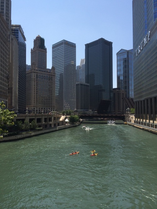
    While Chicago and my hometown of Toronto share many similarities– including being situated on a Great Lake and having rivers flow through the middle of them–the relationship to these bodies of water is remarkably different. Here is a photo of people kayaking in the Chicago River on a Friday afternoon:
    image

    What impressed me about Chicago is how intimate and urban the relationship is with the lake and its rivers. If you look at the photo above, you’ll see that many of the buildings are built right up against the river, but that there’s space allocated for riverwalks, patios, and so on. It’s all about engaging and connecting with the water.

    Toronto on the other hand, is only recently starting to reacquaint itself with its bodies of water. We spent much of the second half of the 20th century with our back turned to the lake and without a strong urban connection to the Don River. And if I had to guess why it’s because we built highways along them.

    We built the Gardiner Expressway adjacent to Lake Ontario and we built the Don Valley Parkway adjacent to the Don River. This fundamentally changed our orientation and largely precluded us, I think, from creating the same kind of waterside urbanity offered in Chicago.

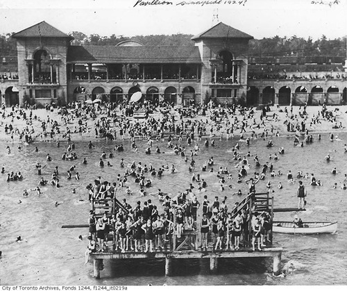
    As an example, consider that in the first half of the 20th century, Toronto’s Parkdale neighborhood – which today still has a questionable reputation – was actually an affluent and desirable waterfront community filled with beautiful Victorian mansions. It was well connected to the waterfront, and so the area flourished. Here’s what Sunnyside Pavilion used to look like:
    image

    But then in the 1950s we built the Gardiner Expressway, disconnecting Parkdale from the lakefront and destroying many of its amenities, such as the Sunnyside Amusement Park. In turn, the rich people left and their large Victorian mansions got chopped up into rooming houses and other rental housing stock. And in my view, Parkdale still hasn’t fully recovered from this. 

    Highways are divisive. There’s no question.

    So unless you can afford to bury them, it comes down to trade offs: Do you want to make it easier for people to drive in from the suburbs or do you want a truly spectacular water or riverfront? In the 1950s we chose the former. But even still today, the thought of tearing down–even a portion of the Gardiner Expressway–is fraught with opposition. I guess not much has changed.
    image

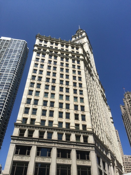
    The second way that Chicago impressed me is through the relationship that many of its buildings hold to the street. They come down to ground level with authority and with great retail presence, and often make no amends about their mass and impressiveness. This frames the street and creates a level of urbanity that isn’t always found in Toronto – particularly outside of the downtown core.

    In Toronto, the trend today is towards street level podiums, significant setbacks, and delicate point towers that minimize the impact of their height and allow for natural light to reach street level. It’s well-intentioned and perfectly appropriate in many urban settings. But sometimes you need a little urban assertiveness. Sometimes you want to impress and impose. And Chicago does that.

    What I’m getting at is that Chicago architect Daniel Burnham was on to something. He famously advocated for man (that was the era) to think big. Make no little plans, he said. And it’s admirable advice. Toronto is going through a tremendous transformation right now. We’re North America’s boomtown, which is a title that Chicago would have held at one point.

    But as we build for the future, let’s remember that, long after we’re gone, we’re going to be judged based on the plans we are making today. So why not make them big ones.
  • What’s a bean worth?

    Yesterday I tweeted this picture out from Chicago:

    //platform.twitter.com/widgets.js

    Many of you, I’m sure, have seen this public sculpture before, either in person or somewhere online. It’s called Cloud Gate and it’s by Anish Kapoor – though its nickname has become, quite simply, the bean.

    Given that it’s been a hugely successful piece of public art, I asked what people thought the ROI of it might be. Obviously I wasn’t expecting any sort of number, but I wanted to draw attention to the fact that the right kind of investment in public art can pay huge dividends. Oftentimes we, developers and others, don’t think of it in this context though.

    And it’s probably because it’s so hard to figure out what those dividends might be. What’s the value of a big recognizable bean that everyone around the world associates with your city? But if you think about it, it’s not that different than a corporate logo that everyone knows is yours, which is why I’m interested in the branding of places.

    However, as Gil Meslin rightly pointed out in his tweet storm response to my tweet, it’s hard to consider the bean investment in isolation. I mean, the whole point of the bean is to reflect the surrounding urban landscape. So if it wasn’t for the larger Millennium Park investment and the beautiful historic buildings along Michigan Avenue, maybe that bean wouldn’t be the bean that it is today.

    Ultimately, that just makes coming up with any sort of defensible ROI even more difficult. But that shouldn’t deter us. Because as I’ve said before, just because you can’t measure or prove it (right now), doesn’t mean it isn’t a good idea. In this case, I think it’s pretty clear that this bean has been a hugely successful investment.

  • Learning from Melbourne

    Earlier this week my good friend Gabriel Fain emailed me a bunch of photos from his recent trip to Melbourne. Gabriel and I went to architecture school together here in Toronto and we often go back and forth on city building issues.

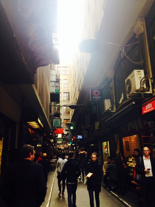
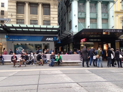
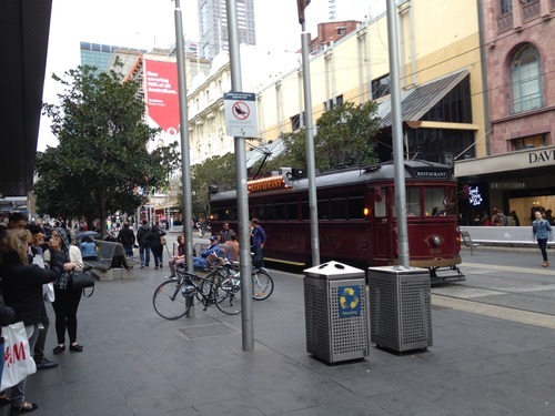
    Here are the photos he sent me of Bourke Street in Melbourne:

    image

    image

    The comparison he drew in his email was to that of Bloor Street in Toronto, except with a few major differences: Bourke Street is pedestrian only (except for a tram running down the middle of it). It has no curbs. There’s lots of inviting seating. And the connecting cross street laneways are fully activated. He then ended by saying that "Toronto is light years behind Melbourne and Sydney in the terms of the quality of the public space.“ 

    I replied and asked if I could turn his email into an ATC post. He responded by saying that he was hoping I would, and then sent me another photo – this time of one of the laneways:

    image

    Melbourne’s laneways and arcades are celebrated around the world. What was once just residual space, became a catalyst for the revitalization of the city’s central business district in the 1990s and a major tourist destination. But all it really took was a change in thinking. It took somebody to believe that the space used for garbage collection, could also be used for a thriving culture of intimate al fresco dining.

    In Toronto, I think we’re headed in the right direction in terms of our thinking, but that we’re not yet being bold enough. The recent revitalization of Market Street in my neighborhood (St. Lawrence) is a wonderful example of putting pedestrians first and a wonderful street overall. Like Bourke Street, it also doesn’t have curbs (this is how you know pedestrians matter). But it was also a prime candidate for a pedestrian-only street. Especially given that Market Lane to the north is already one (though in desperate need of renewal). 

    For a number of reasons though, pedestrian-only streets are difficult to accept here in Toronto. I’ve been shot down many times in real estate meetings for arguing that we should have them in our city. Oftentimes people say it’s because of our harsh climate. But in my view, that’s all the more reason to have them. When the weather is nice, we should be enjoying our public spaces to the fullest. Why only build to the worst case scenario? Plus, they work in Scandinavia.

    We’ve also done it before. In the early 1970s (when I wasn’t around), a portion of Yonge Street was piloted as a pedestrian-only mall – a remarkably forward-thinking achievement for that era of city building. So I’m confident that it can be done and that we’ll one day do it again.

  • What use could driverless cars serve beyond just transport?

    image

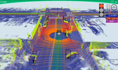
    Here’s further evidence that technology is starting to infiltrate into many other industries, including architecture. London-based architect and designer Pernilla Ohrstedt is currently working on an exhibition for Dezeen and MINI Frontiers that will architecturally visualize the 3D data that driverless cars collect in order to navigate around.

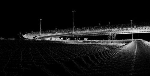
    I had never thought of this before, but as a byproduct of driverless cars, we’re about to start collecting detailed replicas of all of our cities – well beyond the static images we currently have with Google Streetview. In order to navigate by themselves, driverless cars are constantly scanning their surroundings to create a “point cloud” replica of the built environment. This point cloud basically tells the car where they are, where they should drive, and what obstacles might be around.

    It could look something like this:

    image

    Already there are firms like ScanLAB emerging to provide 3D scanning, publishing, and visualization services. But this is obviously just the tip of the iceberg. I can only imagine what innovation will emerge from the passive collection of all this data once driverless cars become commonplace in our cities.

    As one example, it could be a way for us to systematically measure the correlation between the qualities of a street and the vibrancy of its street life. Is there a perfect width? An ideal traffic volume? A right scale? All of this data could make city building more of a science (and perhaps less political).

    My hope though is that this data would be open and accessible to all, so that clever entrepreneurs could build on top of it.

    What are some of your ideas?

    Images: Dezeen

  • Introducing: ATC city tees

    image

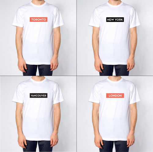
    I’ve just launched a set of city tees over at shopATC. To start, there are 4 cities (Toronto, New York, Vancouver, and London) and each one is available in either black or (ATC) orange. They’re printed on a super soft American Apparel tee and cost only $30 each. I picked the cities based on readership levels. I hope you like them.

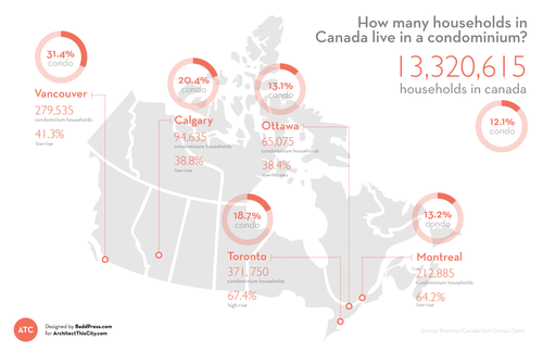
  • How many households in Canada live in a condominium?

    Click here to zoom in / download a copy

    I’ve been meaning to introduce infographics and diagrams into my posts at ATC for quite some time now, so I’m excited to introduce the first one: How many households in Canada live in a condominium? I hope to make this a regular feature.

    While a lot of the new development happening in Canada is condominium – particularly in cities like Toronto and Vancouver – the vast majority of households in Canada still live in non-condominium dwellings. Only 12.1% of households are condominium households, which could be high-rise, low-rise, row-housing, or other, according to Statistics Canada.

    Perhaps not surprisingly, the Vancouver CMA has the highest percentage of condominium households at 31.4%. I would have expected Toronto to come second, but Calgary (20.4%) actually takes that position (probably) due to an abundance of low-rise condominiums (38.8% of all condos in the CMA). However, Toronto has, by far, the highest percentage of high-rise condominium households at 67.4%. This isn’t surprising to me.

    All of the data for this infographic was taken from Statistics Canada and the total number of households in each Census Metropolitan Area (CMA) was assumed to be “occupied by usual residents.” StatsCan defines this as households that are permanent as opposed to ones that could be second homes and so on.

    I hope you like the first ATC infographic.

  • The branding of places

    image

    Most people would agree that branding is a powerful and important exercise in the world of business. We recognize that brand equity is something that pays dividends in the future.

    When you walk around a city with a Starbucks, Tim Hortons, or some other coffee cup in hand, you are sending signals about who you are as a person and consumer. So, you could argue that you’re consuming the cup, as much as you are consuming the coffee.

    But one area that still feels like it’s in its infancy is place branding. That is, the branding of nations, regions, cities, and places. I’ve talked a lot about the business of cities and how impressions are created around cities, but I’ve never explicitly talked about place branding.

    However, it is an area on the rise. Monocle has written extensively about the importance of nation branding and there are firms, such as Vancouver-based Resonance, that now specialize in the strategy and branding of places.

    Here’s a short 5 minute video that they prepared talking about place branding and their approach to it. If you can’t see the video below, click here.

    //player.vimeo.com/video/66920801

    But at the same time, there are more grassroot ways in which a place brand can emerge. Think about the number of times Jay-Z has referred to himself as the Brooklyn boy or Drake has promoted Toronto in one of his videos. It’s hard to measure the impact of these sorts of things, but I am sure there is one.

    Here’s another example – a 4 minute video of Drake talking about why he loves Toronto. Click here if you can’t see it below.

    [youtube https://www.youtube.com/watch?v=M3TrbGEJbio?rel=0]

    Recently, you may have heard that Drake is about to give Toronto a new moniker: The 6. Some think it is in honor of our two main area codes 416 and 647, and I think that’s probably a good guess.

    But whatever the reason, I thought it was an interesting exercise in place branding. So I decided to partner with Toronto-based design firm Badd Press and make a “The 6” t-shirt (shown at the top of this post). You can get yours for $30 by visiting shopATC.

  • The story of a symbol of belonging

    image

    I’ve been following Airbnb pretty much since the beginning. The company has always fascinated me because I saw it as being less about technology and more about travel, hospitality, community and, in my view, real estate.

    An office building is just a set of spaces that get rented out on long term leases. A hotel building is just a set of spaces that get rented out on short term leases (one night at a time). And Airbnb spaces are simply extra or “found spaces” – such as an extra bedroom – that could never really be rented out at any sort of scale before. But then Airbnb came along, built a community around it, and empowered everybody to make money off that found, extra space. I think that’s pretty neat.

    Well today, Airbnb unveiled an entirely new logo, brand, and expression. It’s all about belonging, and their new logo is called the Bélo. Here’s a quick video that they call “the story of the symbol of belonging”. If you can’t see it below, click here.

    [youtube https://www.youtube.com/watch?v=7Hs0C2UvVBY?rel=0]

    What’s interesting about this new expression is that it’s a perfect example of Simon Sinek’s belief that people don’t buy what you do, they buy why you do it. And in this case, Airbnb’s why is community, trust, belonging, and a sense of place. Talk about emotive.

    In both the above video and in CEO Brian Chesky’s blog post today, reference is made to our cities and towns, and the fact that as they continue to get larger, we’re also becoming increasingly more disconnected. Things have gotten impersonal. But Airbnb is bringing back that sense of belonging.

    On a less emotive level, what it also does is set Airbnb up for expansion.

    Chesky has said before that the company wants to own the entire travel experience – from the moment you leave your home to the moment you return. So presumably a big impetus behind the rebrand was to develop something that could become ubiquitous across a number of different products and services. Which is why it makes perfect sense that they would encourage people to design their own versions of the logo.

    So while the rebrand has received a lot of criticism today – some people say it looks like a vagina – I wouldn’t discount it just yet. There are bigger plans in store.

  • Mirvish + Gehry gets nod from City Council

    image

    Last week Toronto City Council voted to support planning staff’s recommendation to approve the landmark Mirvish + Gehry development on King Street West in the Theatre District. 

    The revised design now includes 2 towers (as opposed to 3) at 82 and 92 storeys tall. As a result of this change, 3 of the 5 existing buildings on the site will now be retained. I think this represents a good balance between (historic) preservation and progress.

    If you’re interested in a bit more of the backstory, Toronto Life published an article today called David Mirvish on the Edge. It talks about his father (Ed Mirvish), his upbringing, and how he got into the real estate development business.

    I thought you all might enjoy it.

    Image: Projectcore

  • Why constraints can be a good thing for design

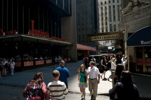
    image

    I was reading the New York Times this morning and I stumbled upon an interesting article about Shubert Alley. I wasn’t aware of Shubert Alley, but I’m sure many of you probably are. It’s a 300-foot long pedestrian-only alley in the theater district of New York. It connects 44th Street and 45th Street and runs west of Broadway.

    And apparently it’s a big deal in the theater world – or at least according to Richard Hornby in 1991: “In New York, the desirability of a theatre is inversely proportional to its distance from Shubert Alley.”

    But what you may not be aware of is how the alley–which today serves as a public gathering space–was actually created. In 1913 when the Shubert and Booth theaters were built, the fire code dictated that theaters had to have separate fire exits on the sides of their buildings that connected directly to a main street. 

    Most of the time this led to blank sidewalls, but in this instance, the Shuberts and their architect Henry Beaumont Herts, decided to run an alley all the way through the block to serve as their emergency exit. 

    But what seemingly started as a pragmatic response to a code requirement, ended up creating what some people would consider the heart of the theater district. Sometimes constraints can be a good thing for design.

    Image: New York Times