Daily insights for city builders, delivered every morning at 6 AM ET. I’m Brandon Donnelly — a Toronto-based real estate developer and founder of Globizen. I’ve been writing here since 2013.

Tag: design

  • A Love Letter to the Great Lakes

    This week, the first ever international street art festival will be taking place in Toronto. It’s called A Love Letter to the Great Lakes and it is running from June 20 to June 25, 2016.

    The goal of the festival is to use public works of art to get people thinking about our water resources and, more specifically, about the Great Lakes. Together, these Lakes represent 20% of the world’s fresh surface water.

    So this week, 21 local and international artists will be painting giant murals in 3 different areas of the city: Queen & Ossington, Queen & Spadina, and at the mouth of the Don River.

    The collaborators for the event include Tre Packard (Pangeaseed Foundation), Jason Botkin (A Love Letter to the Great Lakes, En Masse), Jaqueline West (Herman & Audrey), developer Jeff Hull (Hullmark) and Devon Ostrum (Friends of the Pan Am).

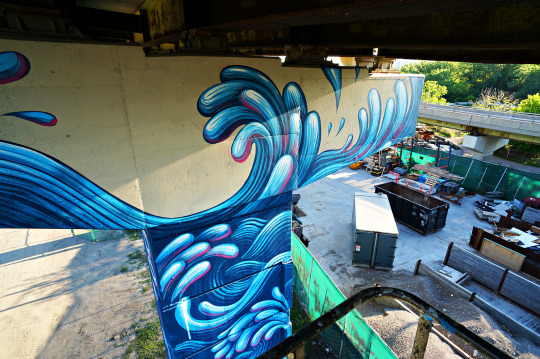
    Below is one of the works already in progress. It’s by Jason Botkin and it’s located on one of the bents of the Gardiner Expressway East at the mouth of the Don River.
    image

    This event caught my attention for 3 reasons.

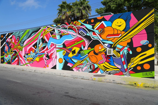
    First, I think the city is going to be left with some rad looking murals. Here is one from a similar event in Cozumel, Mexico called Sea Walls: Murals for Oceans in Cozumel:
    image

    Second, like many others, I care deeply about the environment. But until we put in place the right economic incentives / disincentives, we need all the awareness building that we can get.

    Third, seeing Jeff Hull on the list of collaborators reminded me that there’s a new breed of real estate developers emerging in our cities. The big bad developer is sometimes (often?) thought to be greedy and insensitive to local communities. But I think the next generation sees itself quite differently. They see themselves more as city and community builders.

    So if you’re in Toronto this week, get on your bike and head over to one or more of the mural sites. Tweet me if you decide to go and maybe we can connect.
  • Architecture as a tool of capital

    I just stumbled upon an interesting Architectural Review article from last year called: Architecture is now a tool of capital, complicit in a purpose antithetical to its social mission. The author is Reinier de Graaf, who is an architect and partner at the firm OMA.

    The focus of the article is on inequality; capitalism vs. socialism; Thomas Piketty’s book, Capital in the Twenty-First Century (which is now on my reading list); and on how Modernism lost its social mission and got repurposed as a tool that just serves capitalist interests. It went from an ideology to simply an architectural style.

    Here is an excerpt:

    “Once discovered as a form of capital, there is no choice for buildings but to operate according to the logic of capital. In that sense there may ultimately be no such thing as Modern or Postmodern architecture, but simply architecture before and after its annexation by capital.”

    Given that I am initially trained as an architect, but that I work as a real estate developer, this article hits home for me. But unlike the author, I am not as fussed by this intertwining of capital and architecture. In fact, I have always believed that the more architecture can understand its economic milieu, the more likely it can affect positive change.

    Of course, there’s the question of whether that economic milieu is even the right one in the first place. I’ll echo this blog post (on the limits of capitalism), by saying that I consider myself a capitalist, but not an absolute capitalist. Capitalism isn’t perfect.

    I like Reinier’s description of income vs. wealth (borrowed from Piketty):

    He identifies two basic economic categories: income and wealth. He then proceeds to define social (in)equality as a function of the relation between the two over time, concluding that as soon as the return on wealth exceeds the return on labour, social inequality inevitably increases. Those who acquire wealth through work fall ever further behind those who accumulate wealth simply by owning it.

    What are your thoughts?

  • Conversational investing

    I’ve been spending my mornings this weekend, listening, watching, and reading things. I’m always reading to find content for this blog, but I’ve allocating more time to consumption this weekend. So you might be noticing a slightly different varietal of posts over the past few days.

    This morning it’s a podcast called Dorm Room Tycoon. It’s an interview with Andy Weissman, who is a partner with the New York venture capital firm, Union Square Ventures. The topic is “how we invest” and I’m enjoying the discussion.

    Andy describes their firm as being boutique and thesis-driven. Meaning they have theses and they look for companies that dovetail with them. But in addition, he also labels their approach as “conversational investing.”

    What does that mean?

    It means they listen, watch, and read. They blog (all the partners write their own personal blog). They engage and discuss. They put themselves and the firm “out there”. And they don’t pretend to have all the answers or to be able to predict the future. Instead they let their conversations – both internal and with the broader market – help them make their investing decisions.

    So why do I bring this up?

    Because in my own small way, I am trying to do the same with real estate development, architecture, and city building. I write every day to learn and because I am infinitely curious. If you want to know what I’m thinking about, read this blog.

    It’s for this reason that my favorite blog posts are the ones in which there’s lots of discussion in the comment section. It’s the market talking back, telling me whether I’m out to lunch or not. Ultimately, this idea of “conversational investing” is really about iterative decision making.

    Here’s the podcast embed in case you would also like to listen:

    [soundcloud url=”https://api.soundcloud.com/tracks/266734055″ params=”auto_play=false&hide_related=false&show_comments=true&show_user=true&show_reposts=false&visual=true” width=”100%” height=”450″ iframe=”true” /]

    Regardless, the Dorm Room Tycoon is worth checking out. They have other interviews with people like Malcolm Gladwell and Simon Sinek.

  • Fluted glass curtain wall

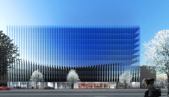
    New York architecture firm REX is working on a new office building in Washington DC that will incorporate a beautiful fluted glass facade. Here’s a rendering of what it is intended to look like:

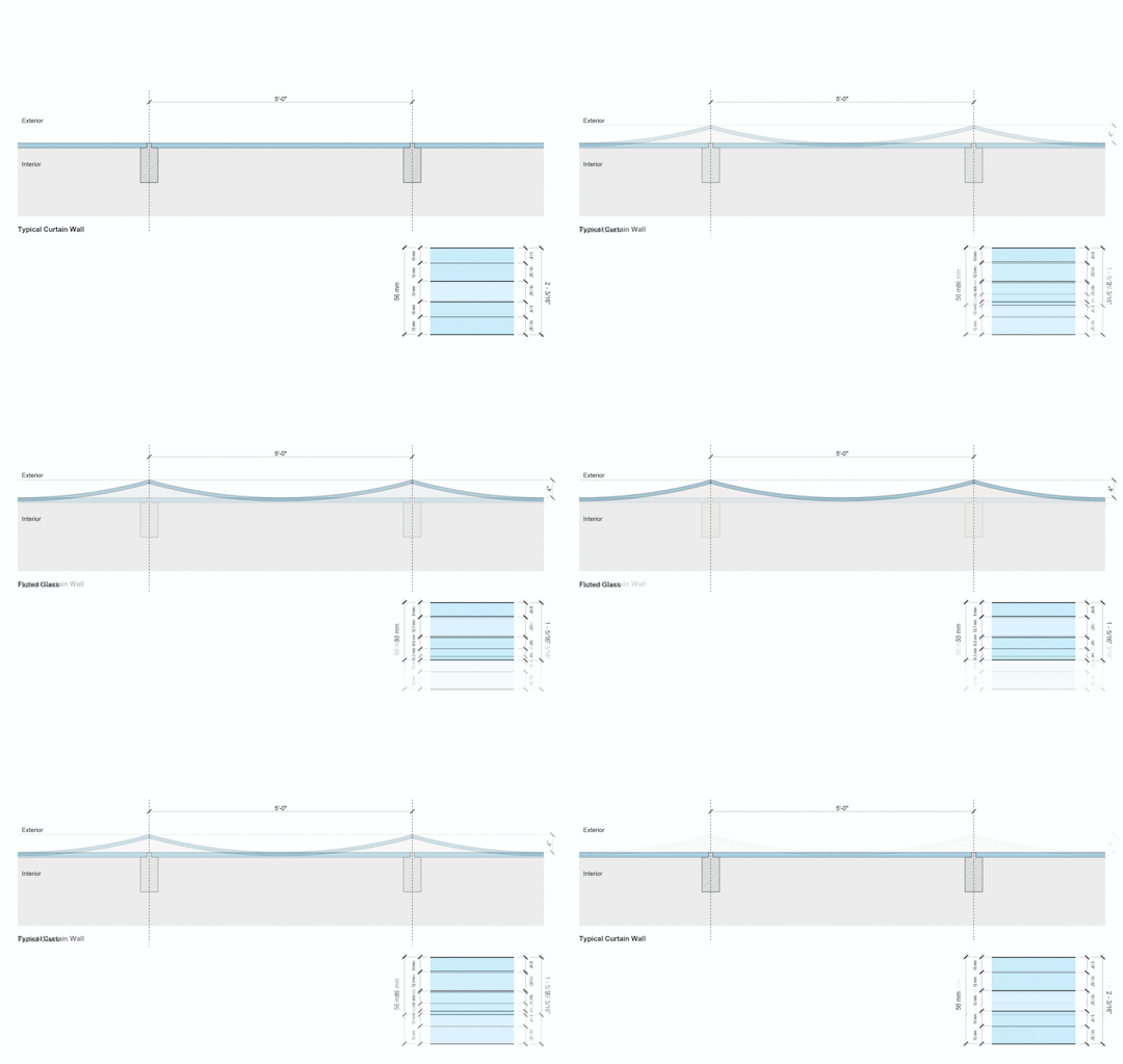
    Here’s what that looks like in plan (it’s a GIF that should show typical curtain wall vs. proposed fluted glass):

    Here’s a photo of the 1:1 mockup:

    And here’s a description from the architect:

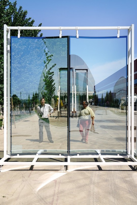
    The façade’s approximately nine hundred identical, insulated-glass panels—3.2 m tall by 1.5 m wide (11’-6” tall by 5’-0” wide)—are subtly curved to a 2.9 m (9’-6”) radius through a heat roller tempering process. The curve yields structural efficiency, which meets wind load requirements and enables a thinner monolithic outer lite than normal, providing greater transparency. 

    Because of the curve’s inherent rigidity in compression, only the top and bottom edges of the panels are supported from the floor slabs, while the mullionless vertical edges are flush-glazed for a minimalist aesthetic that improves sight lines, while gaining usable floor area.

    They are working in collaboration with Front Inc., which if you haven’t heard of, you should check out. They are a design/engineering consultancy that specializes in facades and building envelopes. They work with many of the big name starchitects. The developer of the project is Tishman Speyer.

    It’s worth noting that part of the impetus for the fluted glass facade was to try and innovate within the confines of DC’s draconian zoning – which mandates that no building can be taller than 130 feet. Because of this, developers and architects are usually forced to build out to the allowable area, leaving little room for architectural variation. 

    But in this case, the fluted glass removed the need for thick mullions and also allowed them to extend out beyond the lot area by 4 inches every 5 feet (the curves are considered “architectural features”). So this move has created both architectural variation and more rentable area.

    It doesn’t appear that the building will have any operable windows, but other than that, I think it promises to be quite beautiful. What do you think?

    All images from REX.

  • The change order (ruminations on innovation)

    If any of you are in the
    business of creating – whether that’s a mobile app or a building – I’m sure
    you understand that the product or thing you’re working on will naturally
    evolve and change over time – probably in unexpected ways.

    In fact, I usually take this as a positive sign. When I have my
    head in a project and I’m focused on solving problems, ideas will naturally
    start to flow. I start thinking of things that I never would have thought
    about at the outset. That’s why I generally think of creativity as a process,
    rather than as some divine gift.

    But the challenge with all of this is that many of our existing business
    processes are not set up to deal with this kind of ambiguity. If anything we
    try and punish these sorts of deviations. If it wasn’t pre-meditated at the
    beginning of the project, we call it “scope creep” and charge extra for them as
    “change orders.” These two words equal death in construction.

    Now, don’t get me wrong, I completely understand the realities
    of running a business and the importance of managing scope and resources. It’s
    a balancing act. Without some structure, nothing would get done. 

    But the more that iterative
    lean methodologies and “design thinking” can be embedded into our processes,
    the more value creation I believe we will see.

    My thinking is as follows: At
    least part of the reason that innovation comes from startups and new market
    entrants is that the founders aren’t usually sitting around talking about defined
    scope and laying out elaborate business plans. They’re focused on creatively
    solving problems and doing whatever it takes to get there.

    It’s also one of the reasons
    that conventional wisdom dictates that tech startups shouldn’t outsource development.
    It’s too core a competency and you can’t “move
    fast and break things
    ” if you don’t have that in-house and you’re constantly worried
    about eye-popping invoices hitting your desk.

    I have always seen lots of
    parallels between startups and architecture. In both of these worlds, the idea
    you start with is rarely what you end up with (at least that’s the case in
    architecture school). You research, learn, and iterate along the way and that
    leads you in new and unexpected ways.

    And in my view, that’s often what
    the path to innovation looks like. Because if you define the entire path at the
    outset, how can you expect to go anywhere new? And if you’re not going anywhere
    new, how can you expect to outperform the market?

  • Design, technology, and culture

    Every now and then I’ll come across a website, a product, or something that immediately resonates with me. Usually that means I’ll immediately subscribe to it, buy it, follow it, or do whatever the action is supposed to be. It doesn’t happen all that often – though I think it should be a goal of companies and organizations to delight – but that’s exactly what happened to me this morning when I stumbled upon Subtraction.com.

    Subtraction is a blog about design, technology and culture (all things I love) and it’s written by Khoi Vinh. Khoi is Principal Designer at Adobe. Prior to this, he was Design Director of The New York Times and co-founder of the design studio Behavior, LLC. Fast Company also named him one of the 50 most influential designers in America. But enough of all that. His blog is great.

    Whenever I write about blogging, I tend to get questions about other blogs I might recommend. So today I’m recommending Subtraction.com. I’ve also added it to my working reading list, which I don’t think many of you are aware of because you probably just read this blog in your inbox. But it exists and I’m happy to add to it if you have interesting suggestions. (Please leave a comment below.)

    P.S. Because of Subtraction, I now have the movie High-Rise on my watch list. Have any of you seen it? Because I don’t have cable or Netflix, I tend to be painfully out of the loop on these sorts of things. It’s based on a book by J.G. Ballard and it’s the story of a 1970s suburban London apartment building that starts to socially degrade. How could I not want to watch that?

  • 133 Wai Yip Street, Hong Kong

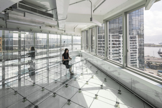
    Dutch architecture firm MVRDV recently converted an old industrial building in Hong Kong into new office space. The overall project size is roughly 200,000 sf. What’s unique about the project is the obsessive focus on transparency and glass.

    Here’s what the interior looks like:

    And here’s how the architect has described the project:

    “We are moving into a transparent society, businesses are becoming more open with the public, and people care more about what goes on behind closed doors. In that way, a clear workspace leaves nothing questionable, nothing hidden; it generates trust.” Tells MVRDV co-founder Winy Maas, “But also it is an opportunity for the building to become a reminder of the industrial history of the neighbourhood, monumentalised in a casing of glass.”

    I have written quite a bit about how I believe we are shifting towards a more transparent world – perhaps even a radically transparent world. And so it’s interesting to see an architect pick up on this broader theme and translate it into physical space.

    The floor is transparent. The partitions are transparent. The furniture is transparent. And you can clearly discern the interfaces between old and new.

    Good architecture, at least in my opinion, should reflect what is happening in our broader society. That’s why I believe that studying the history of art and architecture is really like studying the history of the world.

    For more photos of the project, click here.

    Image by Ossip van Duivenbode via MVRDV

  • Event: Community Consultation for Mirvish Village

    image

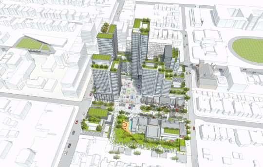
    One June 13, 2016 from 6:30 to 9:00 pm, the City of Toronto will be hosting a community consultation meeting for the proposed redevelopment of Honest Ed’s / Mirvish Village

    The meeting will be held at the Bickford Centre Auditorium at 777 Bloor Street West (across from Christie Pits Park).

    The purpose of the meeting is to present Westbank’s revised development proposal, which was submitted to the city last month. Their first proposal was submitted last summer (July 2015). 

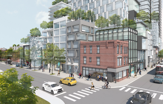
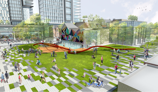
    Some of the key changes include a new on-site public park, the retention of additional heritage buildings (now 21 in total), more pedestrian porosity, and the retention of Honest Ed’s alley in its current location.

    I consider Westbank to be one of the most thoughtful developers in the city and so I’m pretty excited to see this one evolve. I’m planning to attend the community meeting and maybe I’ll see you there.

    Below are a couple of other renderings to give you a taste.

    imageimageimage

  • Photoblog: Cranbrook Schools

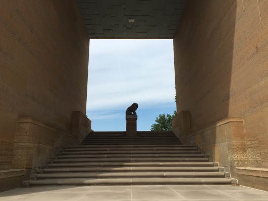
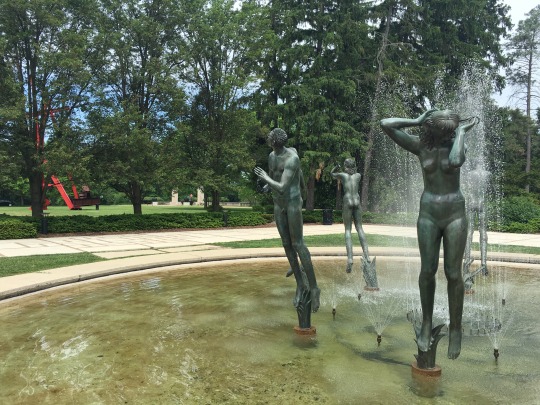
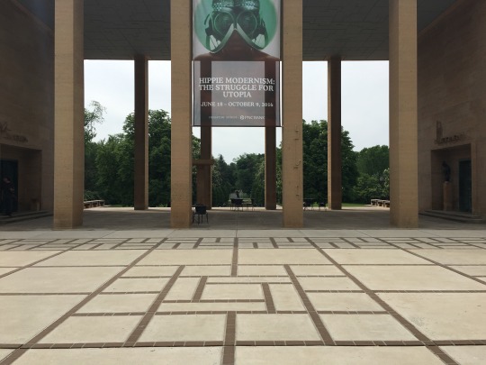
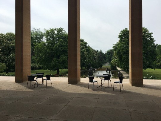
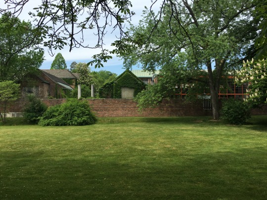
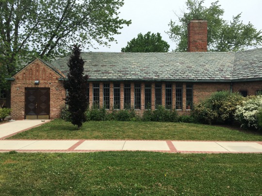
    My spring allergies have gotten the best of me today. So instead of a regular post, I’m going to share some of my photos of the Cranbrook Schools. I toured the campus this afternoon.

    Cranbrook Schools is a private boarding school (PK – 12) in Bloomfield Hills, outside of Detroit. It has an endowment fund of about $233 million, which is one of the largest of American boarding schools. In 1989, the campus was designated a National Historic Landmark.

    The photos are in the order in which they were taken.

    A man happen to be playing a violin in the space below.

    The stone shingles below get smaller as they move up the roof to give the illusion that the building is larger than it really is.

    And here are my fellow architecture nerds, Matthew and Rick.

  • Architect Profile: Omar Gandhi

    image

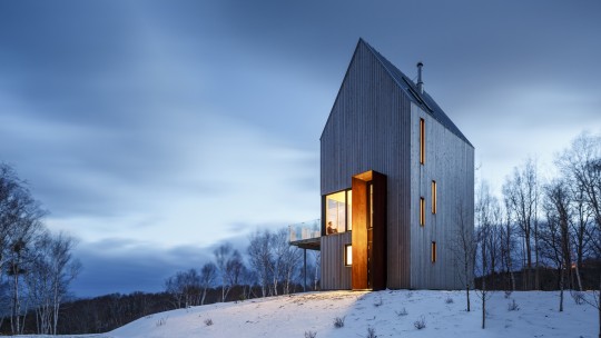
    This week – thanks to an introduction from a mutual friend – I had the pleasure of having lunch with architect Omar Gandhi. 

    Based in both Halifax and Toronto, the Globe and Mail has called Omar one of Canada’s next top architects and Wallpaper Magazine has named him one of the top 20 young architects in the world. So if you haven’t yet heard of him, consider this post as your heads up.

    What’s exciting about his work is how it really reflects the ethos of the places he works in (east coast Canada in many cases). At the same time though, his works seems to define a new modern and Canadian design sensibility. 

    And this is what I believe great architecture should do. It should respond to and reinforce local cultures, but also help to shape them as they invariably evolve. Architecture and culture are inextricably linked.

    I love seeing local talent thrive, so I hope you will take a minute to visit Omar Gandhi’s website.

    Image: Modern Cabin in Cap Breton from OG