Daily insights for city builders, delivered every morning at 6 AM ET. I’m Brandon Donnelly — a Toronto-based real estate developer and founder of Globizen. I’ve been writing here since 2013.

Tag: design

  • Constructing the tallest building in San Francisco

    Alexis C. Madrigal recently published a piece about the Salesforce Tower in San Francisco called: The Tower at the Heart of the Tech Boom. At 61 floors and 1,070 feet, it is now the tallest building in San Francisco and the second tallest building west of the Mississippi River after the Wilshire Grand Center in Los Angeles.

    Hines and Boston Properties are the developers of the building. Pelli Clarke Pelli is the architect. And Salesforce is the anchor tenant. In April 2014, it was announced that they had leased 714,000 sf on floors 1, 3-30, and 61. (Get that top floor.) So almost half of the building.

    Perhaps not surprisingly, Madrigal calls the Salesforce Tower the “the most visible monument to the industry [tech] in the region and the country.” It is a demonstration of the power and reach of Silicon Valley. San Francisco has a new symbol. The TransAmerica Pyramid now feels inadequate.

    Though interesting, this is actually not what I want to talk about today. I’d like to talk about what it took to build such a tall building in a seismically active city like San Francisco. Unfortunately, this feels timely given that the sinking Millennium Tower is getting so much attention right now.

    The structural engineer for the Salesforce tower is Seattle-based Magnusson Klemencic Associates (MKA). They are a world-renowned structural and civil engineering firm that have been around since the 1920s. Other projects they are currently working on include the third tallest building in Chicago.

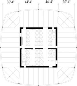
    The tower’s seismic force-resisting system is made up of reinforced concrete shear walls that surround the central elevator and exit stair core. These walls are 24 to 48 inches thick. Here is a plan taken from a STRUCTURE Magazine post written by Ron Klemencic of MKA:
    image

    The tower’s foundations have been well documented, or at least frequently mentioned, because of how deep they had to go down. The site has poor soil conditions (fill, sand, San Francisco “old bay clay”, and weak bedrock), and so given the weight of the tower the only option was to go down to bedrock – approximately 250 feet below grade.

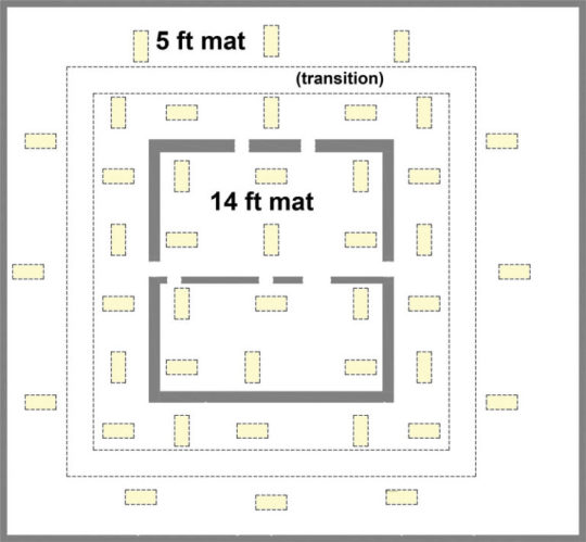
    The foundation system they ended up going with uses something called Load-Bearing Elements (LBEs). The typical LBE measures 5′ x 10.5′. The entire foundation system uses 42 LBEs and a mat foundation that varies in thickness from 14′ around the core to 5′ around the perimeter. (See image below.) The LBEs were brought down to rock. And in some cases, they went down more than 310 feet below grade.
    image

    As a condition of buying the site, the Transbay Joint Powers Authority required proof that any future tall building would not negatively impact the surrounding structures – including the adjacent Transbay Transit Center – and that it would perform under a Maximum Considered Earthquake (MCE) event.

    So while the tower itself may be a symbol for the new world, its structural system also achieves many firsts in terms of how to build a supertall in a seismically active region.

    Please keep in mind that I am not a structural engineer. I just pretend to be an architect sometimes. If you’re interested in more of the details, check out the post by Ron Klemencic. All of the above information was taken from there.
  • Bowling Lane House, Calgary

    I just finished going through the work of Studio North. My friend Peter introduced me to them through this Globe article

    They are a Calgary-based design-build practice that have completed a number of laneway houses, as well as bigger projects such as this 34 unit townhouse project in Canmore, Alberta.

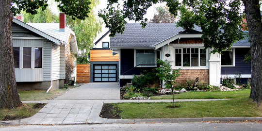
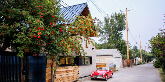
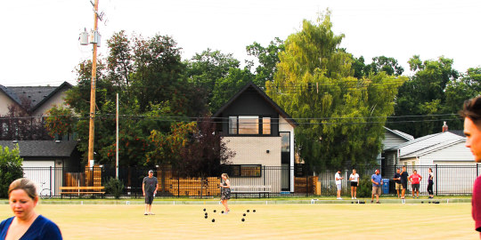
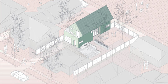
    What (not surprisingly) caught my attention was their focus on laneway/accessory dwellings. Pictured above is their Bowling Lane House in Crescent Heights, Calgary. 

    It’s a 700 sf one-bedroom house that sits behind a 1920′s heritage house. Here is an axonometric of that relationship (the existing house was made transparent):

    Here is an elevation from the main street. Look at how neatly it tucks behind the existing house. All you really notice is the garage of Bowling Lane House.

    Here is how Bowling Lane House fits into its laneway.

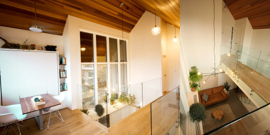
    And here are two images of the double height space that they managed to create within this 700 sf house.

    Notwithstanding that this is a wider lot than what you might typically find in Toronto, it is precisely the kind of housing – both in terms of design quality and scale – that I was trying to create with Mackay Laneway House. It’s also where I was planning to move.

    Kudos to the Studio North team for driving this initiative in Calgary. You can check out the rest of their projects here. They have a number of other laneway houses within their portfolio. And all of them are beautiful.

    All images from Studio North.

  • Junction House Community Meeting

    image

    Okay, last Toronto-centric post for the week. We are back to regular scheduled programming tomorrow.

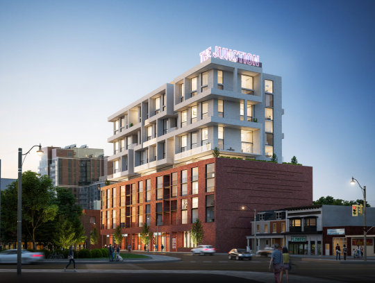
    Later this month, Councillor Gord Perks will be hosting a community meeting for Junction House (see conceptual rendering above).

    You can find all of the details, here, on the Globizen blog. But pop it into your calendars: Tuesday, November 21, 2017 from 7 to 9pm.

    Even if you can’t attend, definitely weigh in on the rooftop public art component over in the comments on the Globizen blog.

    I hope to see you all there. It’s always nice when happy people come out.

  • New Buca concept coming to midtown Toronto

    Earlier today Slate announced that King Street Food Company will be bringing a new Buca restaurant concept to the north west corner of Yonge + St. Clair in 2018. 

    (BlogTO calls Buca one of the best Italian restaurants in the city.)

    Below is a rendering of the new podium design at 2 St. Clair West, which is where they’ll be going. The design/rendering is by Gensler (the same talented group that did Ravine Bench).

    image

    The corner is going to be transformed into a double-height space and the architecture is meant to express that feeling of grandeur at the intersection. There will also be an outdoor patio at grade.

    We are all super excited about this.

    If you would like to read the full press release, you can do that here.

  • Strandkorb — a low tech solution to the elements

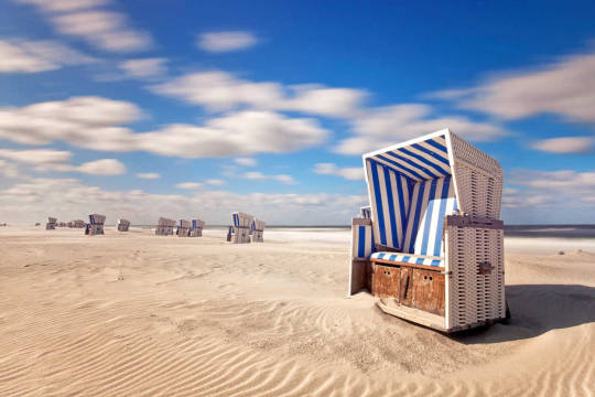
    I recently discovered this marvelous chair (image from here):

    image

    It’s called a strandkorb, which is a German word that translates into something along the lines of “hooded beach chair.” It was invented in the late 19th century by a basket maker looking for protection from the elements on the beach.

    Apparently they are fairly ubiquitous at resorts along the North Sea and Baltic Sea and are a bit of a cult object in Germany. They are a symbol of holiday fun, but also, to some, a symbol of German resiliency in the face of adverse weather.

    For me, the beauty of these beach chairs is that the “hood” blocks the wind. So if you orient yourself toward the sun, you could actually feel quite warm even when it may not be the perfect beach weather. They extend the season, which is paramount in cooler climates.

    I guess that’s why they have stuck around since the 1880′s. If you check out some of the (Google) photo spheres in beach towns in northern Germany, you will definitely find many a strandkorb.

  • A cohousing case study

    There’s a lot of interest right now in micro apartments. Here is a recent example from New York City. Generally speaking the model is driven by a need to increase housing affordability: shrink the apartments; lower the prices. 

    To compensate for these smaller units, the buildings are often equipped with larger shared spaces and a desire to create a sense of community.

    The below TED talk by architect Grace Kim is an interesting case study of a project that started, first, with a desire for cohabitation. Her thesis is that cohousing can make us happier, less lonely, and more socially connected.

    The cohousing community that she profiles is one that she both designed and developed and one that she now lives in and practices architecture out of.

    If you can’t see the video below, click here. It’s only 10 minutes. After you’ve watched it, let us know in the comment section below if this is a community you could see yourself being a part of.

  • Photoblog: 15 Union Square West

    image

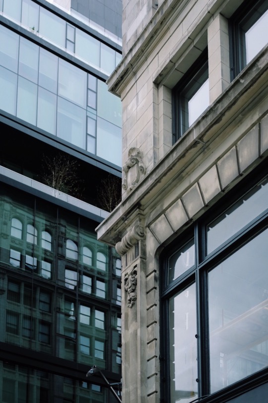
    I took the above photo this afternoon. The building on the left is 15 Union Square West in New York City. 

    It’s a re-cladding of a late 19th century building that was originally constructed for Tiffany & Company. The building’s original cast-iron arches were preserved and set behind new black framed, double insulated, laminated glass panels. 

    The arches aren’t that noticeable during the day, but at night they can really stand out. Click here for a few other photos and to see what that looks like.

    Front Inc. designed the framing systems. If you aren’t familiar with Front, you should check them out. They are a leading design and facade consultancy.

  • Starchitecture is dead — how OMA thinks about preservation

    I somehow stumbled upon this transcript from Columbia University’s Graduate School of Architecture, Planning and Preservation (GSAPP), covering a talk that architect Rem Koolhaas did at the school back in, I think, 2014. 

    The title: “Preservation is overtaking us.” It’s all about how his firm OMA thinks about and approaches preservation. 

    The overarching theme is that preservation, for them, has become a kind of refuge from the market forces – which they call the “The ¥€$ Regime” – that currently drive architecture and demand constant novelty. It is refuge from “starchitecture.”

    Here is an excerpt:

    At some point, I don’t know who was responsible, the word, “starchitect” was invented. And we all know what it is: a term of derision. And at some point, it becomes very hard to avoid. I would say that preservation is, for us, a type of refuge from this term. What we are hoping to do is propose a number of strategies in which we are working to undo, or escape, from this label.

    And here is a summary of “OMA’s Preservation Manifesto” taken from the GSAPP transcript:

    1. Starchitecture is dead
    2. New forms are no longer relevant
    3. Preservation is architecture’s saving retreat
    4. Preservation creates relevance without new forms
    5. Preservation is architecture’s formless substitution

    It’s a substantial read, but a fascinating one. In case you don’t get to it (understandable), I would like to leave you with this final excerpt:

    What we started to do was look at preservation in general and look a little bit at the history of preservation. Now, the first law of preservation ever defined was in 1790, just a few years after the French Revolution. That is already an interesting idea, that at the moment in France when the past was basically being prepared for the rubbish dump, the issue of preserving monuments was raised for the first time. Another equally important moment was in 1877, when, in Victorian England, in the most intense moment of civilization, there was the second preservation proposition. If you look at inventions that were taking place between these two moments—cement, the spinning frame, the stethoscope, anesthesia, photography, blueprints, etc.—you suddenly realize that preservation is not the enemy of modernity but actually one of its inventions. That makes perfect sense because clearly the whole idea of modernization raises, whether latently or overtly, the issue of what to keep.

    I like the notion that preservation is one of the inventions of modernity, rather than an enemy of it.

    Photo by Reginar on Unsplash

  • Celebrate the sidewalk (at Yonge + St. Clair)

    I have two quick announcements to make regarding Yonge + St. Clair in midtown Toronto.

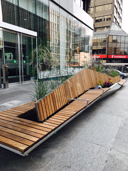
    The first is that Slate has just unveiled a new “ravine bench” at the northeast corner of the intersection. 

    Here’s a photo:

    And here’s another photo with people sitting in it. #SitTO

    Designed by Gensler (the same firm behind the renovation of 2 St. Clair Ave East), the design is all about celebrating both the sidewalk/public realm and the extraordinary ravines that cut through the area. Some people may not even be aware of these natural features, so perhaps this bench will help with that.

    The second announcement is the launch of our Yonge + St. Clair Pop-up Store at 1470 Yonge Street. I know this is short notice, but the launch party is on Thursday, September 21 from 6 – 10pm (drop in whenever). That’s tonight if you’re reading this post via email subscription.

    At the party we’ll be introducing 8 exclusive t-shirt designs from Toronto artist, Lucas Young. All of the tees will be screen-printed for you right on the spot and 50% of all proceeds from the opening night will be going to The Canadian Cancer Society. 

    Wine, beer, and snacks will be available. If you come find me at the party, I’ll give you some drink tickets. So if you’re around on Thursday night, come by for some drinks, a Toronto tee, and to check out the new ravine bench on Yonge Street.

  • My old Philly apartment

    I’m in Philly right now for a good friend’s wedding. 

    I always feel nostalgic when I come back to this city. Some of my most memorable years were spent here. I grew a lot in those 3 years. I also think that Philly is a highly underrated city – such an intimate urban scale.

    I’m staying at the newly renovated Warwick Hotel in Rittenhouse Square. The lobby is beautiful, as are the corridors, but the rooms already feel a bit a dated to me. However the Barcelona Chair in my room is a welcome addition. That thing will never go out of style.

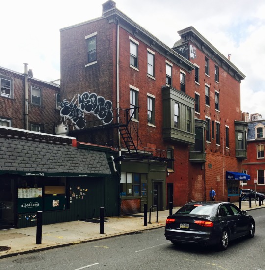
    My hotel happens to be two blocks away from my old apartment at 17th and Spruce. So I decided to do a walk-by while I waited for my room to be ready. My roommate and I had the entire second floor of this building:

    It was palatial, especially given the bargain price and its location in Rittenhouse Square

    The graffiti you see above is located on the north wall of the kitchen. I think that’s a recent addition. The fire stair you see provided access to the roof of the building (as well as the street, I hope). I’m not sure we were supposed to go up there, but we obviously used it for parties.

    Grillmaster Deli is still next door. They kept me fed when I was studying at home and too busy to cook. That was often. And across the street is the Italian restaurant with its sidewalk patio that I used to look out onto from my bedroom.

    This walk-up apartment was by no means fancy. Though it did have ensuite laundry, which was a nice improvement from my previous place. But it was unabashedly urban. My kind of place.