Daily insights for city builders, delivered every morning at 6 AM ET. I’m Brandon Donnelly — a Toronto-based real estate developer and founder of Globizen. I’ve been writing here since 2013.

Tag: demographics

  • This country has the highest fertility rate in Europe

    In 2023, there were 379,000 babies born in Italy. This is down from 393,000 babies in the prior year and represents a new record low. Already in 2022, the number of births was noted as being the fewest since Italy’s unification in 1861. The result is a “demographic winter.” Of course, this challenge is not unique to Italy. It is happening in most developed countries. Korea, for example, has a fertility rate somewhere around 0.72 babies per woman. Because of this, there are a lot of people in the world trying to figure out how to encourage more births.

    Here is Italy’s Prime Minister Giorgia Meloni:

    Meloni, herself a mother of a single child, has said it is a priority for her government to increase the birth rate and encourage women to have more babies “for the simple reason that we want Italy to have a future again”.

    So what’s causing this?

    One seemingly logical explanation could be that the employment rates for women and men are basically the same now. Fewer women are staying at home and so there’s less time to have and raise children. In fact, the opposite is true. If you look at fertility rates across Europe, high birth rates tend to correlate with high employment rates for women. I guess families need to be able to afford children. Here’s an excerpt from a Guardian article (c. 2015) on the topic of fertility:

    The map of the fertility rate in European countries more or less overlaps with that of women in work. In countries with relatively buoyant populations, such as France and Scandinavia, women play an important part in the labour market. According to data for 2010 published by the Organisation for Economic Co-operation and Development, the employment rate for women aged 24 to 54 in work was 83.8% in France, 84.4% in Finland, 85.6% in Denmark and 87.5% in Sweden, barely lower than the equivalent figures for men. In contrast, in southern Europe and Japan the share of women in work was much lower: only 64.4% of them had a job in Italy, 71.6% in Japan, 72.2% in Greece and 78.3% in Spain.

    Staying on the theme of being able to afford kids, another possible explanation might be that kids are expensive and so you need strong family-friendly government policies to help support them. While this I’m sure helps, there’s data to suggest that the correlation between these policies and birth rates is actually fairly weak. That’s why, even though many developed countries have expanded such policies, birth rates continue to fall. Here’s a graphic by John Burn-Murdoch from FT:

    So what the hell is it then? Well there is another possible explanation and it is that it’s more of a cultural thing. In the above article, John makes the argument that a number of other more important factors are leading to declining birth rates. Namely, more people are choosing to live alone, and not as a couple. Priorities have shifted, where family formation is no longer seen as central to a fulfilling life. And more young people are generally anxious. (He doesn’t get into why but I’m sure that it’s possible to blame TikTok.)

    But what really stood out to me was this graphic:

    Since the 1960s, parenting has gotten systematically more intense for parents. The average number of hours per day spent by mothers on “hands-on parenting activities” has grown significantly in most developed countries. However, there is one clear exception: France. It turns out that the French are, at least based on this data, less likely to be so-called helicopter parents. Parenting is less hands-on, kids get more freedom and — perhaps because of this — France has the highest fertility rate in Europe at over 1.8 babies per woman.

    This is not to say that France’s family-friendly policies aren’t doing something as well. I would imagine they are. But the above makes intuitive sense to me. If you create an environment where the threshold to be considered a good parent is constantly becoming more duanting and more life-consuming, it’s no surprise to me that more and more people are simply saying, no thank you.

  • Sticking close to home — two-thirds of young Americans live near where they grew up

    Here in Canada, there is often a belief that Americans tend to be more mobile than Canadians. Don’t like the cold weather? Just move south. Taxes too high? Just move south. Housing too expensive? Just move south.

    But just how mobile is mobile? A new study by the US Census Bureau and Harvard University found that by age 26, more than 2/3 of young adults in the US actually just live where they grew up, with 80% living within 100 miles, and 90% living within 500 miles.

    Migration distances were also found to be impacted by both race and parental income (though these two things likely exhibit a relationship on their own). If you are a young white or Asian adult, the “radius of economic opportunity” tends to grow and you’re more likely to live further away from where you grew up.

    The most popular destinations overall are New York, Los Angeles, Washington, and Denver (in this order). And while New York and Los Angeles remain at the top regardless of who you are, San Antonio and Phoenix are top destinations for Hispanics, and San Francisco is a top destination for Asians.

    Regardless, home appears to be a pretty sticky place.

    But what about Canadians? Are we less mobile? Looking at net domestic migration rates, Canada saw 254,143 interprovincial migrants between 2018-2019, whereas the US saw just over a million between 2020-2021. So on a per capita basis, Canada’s rate is actually higher.

    Statistics Canada also estimated earlier this year that as of July 1, 2016, somewhere around 4 million Canadians were living abroad — or about 11% of citizens. This is a much higher percentage compared to Americans.

    Of those living abroad, roughly half are believed to have received their citizenship through descent, meaning they were born abroad to Canadian parents. About 1/3 are Canadian citizens by birth. And about 15% are naturalized citizens.

    So it turns out that Canadians are in fact pretty mobile. We also seem to like going further afield.

  • Have three, or more if you can afford it

    At the beginning of this year, Singapore expanded its preschool subsidies and improved its support for assisted reproduction and fertility treatments. The goal: more Singaporean children. According to the World Bank (via the Wall Street Journal), Singapore has one of the lowest fertility rates in the world at about 1.14 children per woman as of 2018. This is down from about 3 in 1970, when the government was actually worried about the opposite problem — too many children.

    Of course, this trend is not unique to Singapore. This is generally the way the winds are blowing in the developed world. Young people are spending more time on education, career, and travel. And they’re delaying marriage (or not getting married). On top of this, family-sized housing has become fairly expensive in most big cities. The fastest solution is to ramp up immigration, but many countries, including Singapore, have concerns about what this does to the “national identity.”

    So there seems to be a preference for throwing money at the problem and promotional material with slogans like this one: “Have three, or more if you can afford it.”

    Chart: WSJ

  • The “jobs” of co-living

    Earlier this week I wrote about the age groups that are most likely to live in an urban neighborhood in the United States. It was people in their 20s and, to a lesser extent, baby boomers. The data I was relying on used population density to measure urbanity.

    Interestingly enough, the demand for co-living seems to mirror this. (Feel free to disagree.) From what I’ve been told, the fastest growing co-living segments are young people recently out of school and retirees. Intuitively this makes sense to me.

    If we think back to teachings of Clayton Christensen (another recent post), we “hire” products and services because we have “jobs” that need to be done. In the case of a McDonald’s milkshake that job might be a breakfast that’s appropriate for a long and boring commute.

    In the case of co-living, and in urban neighborhoods in general, one of those jobs has got to be social connections. (Again, feel free to disagree.) We do also know that single person households are increasing in many cities. Are these phenomenons related? How big could co-living get?

    Note: This post was written on my phone on a flight, which is why there are no links or images.

  • Birth rates in the United States last year

    The National Center of Health Statistics just released this update on births and birth rates for the United States in 2017. The provisional number of births last year was 3,853,472, which represents a 2% reduction from 2016 and the lowest number in 30 years. The general fertility rate was 60.2 births per 1,000 women aged 15-44, which represents a 3% reduction from 2016. Also a record low.

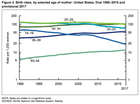
    Here is a chart from the report showing birth rates for selected age ranges from 1990 to 2016 (the 2017 numbers are provisional):

    image

    Many of the age ranges have remained stable. Notable are the decline in the teenage (15-19) birth rate and the increase in births to women aged 40-44. The teenage birth rate declined 7% from 2016 and has averaged a decline of nearly 8% a year since 2007. And the birth rate for women aged 40-44 has generally been rising since 1982.

    I am sure that you can all think of many explanations for the above phenomena without even diving into the report. I find all of this relevant because demographics obviously impact the real estate business and how we build cities.

  • Where the young and educated are moving to in the US

    City Observatory tracks something that they call “The Young and Restless.” It refers to the segment of the US population that is between 25-34 years old and has a bachelor’s degree or higher.

    We know that people in this age bracket tend to be relatively mobile and that the likelihood of moving decreases as people age. So it’s a potential leading indicator for the city regions of the future. It also adds a bit more nuance to the urban vs. suburban growth debate. 

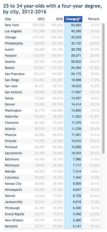
    According to City Observatory, between 2012 and 2016 the number of 25 to 34 year olds with a 4-year degree living in one of the 53 largest largest cities in the US increased by 19%. This is compared to a 4% increase in the overall population in these cities.

    This increase in young well-educated adults is also happening 50% faster in the largest cities. So the young and educated still seem to be demanding city living, even if the world is arguably still suburbanizing.

    Below is a snapshot of City Observatory’s latest data. I’ve sorted the list by total change in population (2012 to 2016). Happy to see Philadelphia near the top. If you do it based on percentage, Detroit wins with a 64% increase.

    For the full list of cities, check out City Observatory.

  • How many households in Canada live in a condominium?

    Click here to zoom in / download a copy

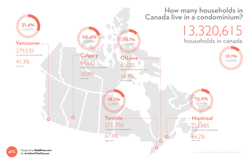
    I’ve been meaning to introduce infographics and diagrams into my posts at ATC for quite some time now, so I’m excited to introduce the first one: How many households in Canada live in a condominium? I hope to make this a regular feature.

    While a lot of the new development happening in Canada is condominium – particularly in cities like Toronto and Vancouver – the vast majority of households in Canada still live in non-condominium dwellings. Only 12.1% of households are condominium households, which could be high-rise, low-rise, row-housing, or other, according to Statistics Canada.

    Perhaps not surprisingly, the Vancouver CMA has the highest percentage of condominium households at 31.4%. I would have expected Toronto to come second, but Calgary (20.4%) actually takes that position (probably) due to an abundance of low-rise condominiums (38.8% of all condos in the CMA). However, Toronto has, by far, the highest percentage of high-rise condominium households at 67.4%. This isn’t surprising to me.

    All of the data for this infographic was taken from Statistics Canada and the total number of households in each Census Metropolitan Area (CMA) was assumed to be “occupied by usual residents.” StatsCan defines this as households that are permanent as opposed to ones that could be second homes and so on.

    I hope you like the first ATC infographic.