Daily insights for city builders, delivered every morning at 6 AM ET. I’m Brandon Donnelly — a Toronto-based real estate developer and founder of Globizen. I’ve been writing here since 2013.
Social media can be both fun and useful. Over the weekend, we were exploring a few different design options for an address sign at Mackay Laneway House and so I posted this image on Twitter and storied it on Instagram. I got a bunch of responses, as well as some great suggestions. And we ultimately ended up making a small change to the design. That process was both fun and useful. The final design is now out for pricing and production.
But as we all know, there is also a dark side to social media. The algorithms that power social media have been optimized to amplify whatever drives the most engagement. Oftentimes that means whatever gets people the most enraged. In this recent NY Times article, Stuart A. Thompson and Charlie Warzel make a compelling argument that Facebook has actually been coaxing many Americans into taking more extreme views on the platform — it made them more popular.
And we’re not talking about extreme views on home address signs.
Back in March and April, there was a belief that big and dense cities were going to pose a serious problem in the fight against COVID-19. The narrative was that the benefits of urban density suddenly flip to glaring negatives during a pandemic. Elevators are a problem. Public transit is a problem. Busy streets and public spaces are a problem. Instead of density, you want dispersion. There was also some speculation that COVID-19 cases would be somewhat correlated with colder climates.
The data that we are seeing today suggests the opposite. Note the above chart by Axios. On a per capita basis, COVID-19 cases are now the lowest — and below the national average — in large US cities with populations greater than 1 million people. Where cases are the highest, again on a per capita basis, is in rural areas. Non-metro areas less than 10,000 people. The county with the highest rate also isn’t the coldest of places. It’s Childress County, Texas, where the rate is about 1,265.3 cases per 100,000 people.
I have a lot of questions about the most important factors affecting transmission rates. Is mask wearing, for example, more important than average temperatures? What is the impact of socio-economic status? I am seeing maps that, unfortunately, suggest this plays a meaningful role. What is really driving these so-called “hot spots?” But what seems clear to me is that density is not necessarily destiny during this pandemic.
Seeing people out at bars and at amusements parks in this WSJ video about Wuhan, China is a little odd given that in this part of the world we are decisively in our second wave. But that is what is happening. In fact, the title of the video is, “Wuhan, Former Pandemic Center, Emerges as Tourist Hot Spot.”
Over a recent public holiday, the city saw nearly 19 million tourists — the most of any Chinese city. And while tourist revenues are still thought to be down by some 30%, Chinese people are seemingly feeling confident enough to get back out and do things.
Based on what the WSJ is reporting, this seems to be supported by a few things. International travel isn’t happening, so it’s becoming a boon for local tourism, which is not that dissimilar from what’s happening in other countries. (Domestic air travel is rebounding faster than international travel when you look at flight volumes across major airlines.)
At the same time, Wuhan implemented what sounds like some pretty extensive testing, which is in turn supported by a national healthcare platform that presumably makes contact tracing easier. These things seem to have given people the confidence to go out again. And I don’t doubt that the same will eventually happen in the rest of the world.
I posted this chart on Twitter last night. It’s from the WSJ showing new weekly confirmed COVID-19 cases in Florida, New York, and the U.S. as a whole. Now, the first thing I will say is that I relinquished my hopes of becoming an amateur epidemiologist back in April. I have no idea how this is all going to play out. But as an urbanist, it is interesting to note that back in April, many believed that New York City’s urban density was a real problem and the almost singular cause of its high number of cases (despite many other big and dense cities around the world doing much better). There was also a belief (or hope) that warmer temperatures might have a positive impact on transmission rates. That’s maybe why Florida was doing relatively better. But things have flipped. Cases in Florida are up and California just surpassed NY for the US state with the most number of cases. So who knows what will happen next. But what I do know is that wearing a mask isn’t a big deal (I have mine with me all the time) and that big urban centers will be just fine. City Observatory recently published apartment search data suggesting that dense cities have actually been getting more, rather than less, attention in the wake of COVID. That doesn’t surprise me.
The above chart from Bloomberg City Lab shows driving, walking, and transit mobility for 12 cities during this pandemic. The data source is Apple’s mobility index, which is based on travel queries within its app. So this isn’t going to capture how everyone is moving about, but presumably it is somewhat indicative. Although I couldn’t tell you the last time I used an app to tell me where to walk. Maybe that’s just me though.
A few things are worth point out. As we have seen before on this blog, Seattleites (do people actually use this demonym?) stopped using transit at a faster rate than most other cities in the US. And according to the above chart, they have also been slower to return to it. This has me continuing to wonder, “why is Seattle such an outlier?” Generally though, these graphs do seem to suggest that people are shying away from transit.
Taipei looks to have fared the best out of this subset of cities, which is consistent with what has been publicly reported about its handling of the pandemic. Taipei has turned out to be an exemplar city during all of this. This probably has a lot to do with the fact that it remembers SARS and knew what to do — the least of which was to simply take it seriously at the outset.
According to the WSJ, New York City is budgeting to collect $30.8 billion in property taxes for fiscal year 2021. These tax bills will go out on June 1 and payments will start becoming due on July 1, which is the start of the city’s fiscal year. Here’s how the collections break down across houses, apartments, and commercial properties:
Overall — and despite the fact that values have softened in the wake of COVID-19 — this year’s property tax budget represents a 5.7% increase over FY2020. The reason for this is that each year the city completes its annual assessments on January 5. And so according to the city’s January numbers, everything is just fine.
Supposedly this January 5 date is usually non-negotiable. A lawyer is quoted in the Journal article saying that under normal circumstances, if your house were to burn down on January 6, you would still have to pay all of your taxes for the upcoming fiscal year.
Time will tell if this time is different. But it is interesting, though not surprising, to note just how significant property taxes are to New York City’s overall tax collections. They represent a little more half of all taxes collected.
The University of Pennsylvania Stuart Weitzman School of Design — my alma mater — has just launched a new initiative with Surface Magazine called the Surface Summer School at Penn. A fairly unique partnership between a media company and an accredited university, the goal of the “summer school” is twofold.
One, it gives Penn students, who might otherwise struggle to find an internship in this climate, something productive and positive to do over the summer. And two, it applies design thinking to the problems of this pandemic.
Penn students will have the month of June to design a prefabricated COVID-19 testing structure — one that could be rolled out in dense and compact urban centers around the world. A jury will then review the submissions and a winner will be announced by mid-July.
The jury includes a host of noteworthy architects and designers: Winka Dubbeldam, Dror Benshetrit, Thom Mayne, Yves Béhar, Susan Sellers, Marion Weiss, Ferda Kolatan, Joe Doucet, and others. Starting on June 3rd at 6:30 PM eastern, members of the jury will also start delivering design lectures on Surface’s Instagram.
I am looking forward to seeing the submissions. Hopefully all of them will be made public.
People are starting to eat at restaurants again. Here is a recent chart from the WSJ showing seated diners at restaurants on the OpenTable network:
OpenTable has been publishing this data since the beginning of the pandemic in something they call “the state of the restaurant industry.” All of their datasets from around the world can be downloaded here.
Back in March, it was interesting to see this data, but most people basically just stopped eating out around the middle of the month. After that, in-person dining mostly flatlined. (This data wouldn’t capture takeout, delivery, and other activities not flowing through the OpenTable network.)
At this point, we are now seeing geographies reopen in different ways. Germany, for example, is ahead of many other countries (at least on the OpenTable network). Note the spike (i.e. lower year-over-year decline) on May 21st. It was a national holiday.
You can also drill down into individual cities:
I think this is a pretty good indicator for how people are feeling, and so it could be useful to follow this data. Governments can reopen things, but people need to feel confident to go out and spend money. It looks like a number of people already feel that way.
On Monday it was reported — by the Wall Street Journal, Tech Crunch, and others — that Uber will be laying off another 3,000 employees and closing 45 of its offices around the world. Here is a quote from TechCrunch:
“I knew that I had to make a hard decision, not because we are a public company, or to protect or stock price, or to please our Board or investors,” Uber CEO Dara Khosrowshahi wrote to employees today in a memo, viewed by TechCrunch. “I had to make this decision because our very future as an essential service for the cities of the world — our being there for millions of people and businesses who rely on us — demands it. We must establish ourselves as a self-sustaining enterprise that no longer relies on new capital or investors to keep growing, expanding, and innovating.”
According to this SEC filing, the company expects to pay approximately $110 million to $140 million in severance and other termination benefits, and somewhere between $65 million to $80 million in costs related to closing its offices.
All of this is, of course, being driven by a steep decline in ride bookings, which is about 70% of the company’s revenue. Ride bookings were down 80% in April from a year earlier. For Q1 2020, they were down about 5% compared to 2019.
Uber Eats has seen a spike in demand with people staying at home. Bookings were up 52% in Q1 2020 from a year earlier. The problem is that, unlike its rides business, their food delivery business is far from profitable. That’s the point of the possible merger with Grubhub.
The company has said that they are seeing some signs of a recovery in markets that have begun to reopen. But it’s too early to predict what that will really look like. The hole is pretty deep.
Either way, the company is making some really tough decisions right now. But it seems to be doing what it needs to do in order to get to the other side of this and become a self-sustaining and profitable business. Full disclosure: I own some $UBER.
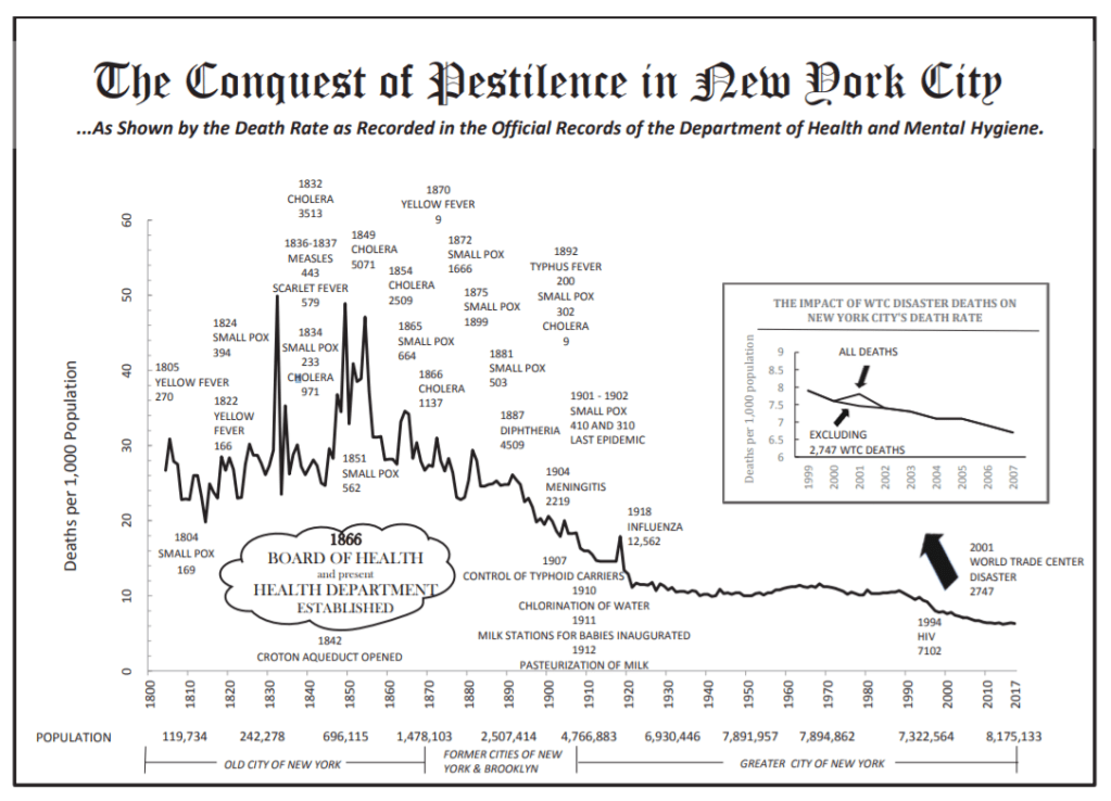
Nicole Gelinas’ recent piece in CityLab is a good reminder that — despite all of the debates around COVID-19 and urban density — New York City is actually a really healthy place to live. Part of this obviously has to do with the city’s investments in public health. But the biggest factor, Nicole argues, is the city’s transit network. Six million people move around New York City each day without a car. That translates into a meaningfully lower traffic fatality rate. New York State’s rate is about 4.8 per 100,000, whereas Florida’s is 14.7 deaths per 100,000. Taking transit (and having an urban morphology that supports taking transit) also brings along with it other benefits, such as increased walking. And I have to believe that is an important factor. The obesity rate in New York City is thought to be about 22%, compared to a shocking 42% for the country. All of this rolls up into a life expectancy of about 81.2 years for New Yorkers, as of 2017. This is compared to 78.6 years for the US as a whole.