Daily insights for city builders, delivered every morning at 6 AM ET. I’m Brandon Donnelly — a Toronto-based real estate developer and founder of Globizen. I’ve been writing here since 2013.

Tag: city hall

  • Which building or structure would you say best symbolizes Toronto?

    I tweeted this out last night:

    https://twitter.com/donnelly_b/status/1473880198256934918?s=20

    blogTO then picked it up and it got quite a bit of engagement.

    Some people, okay a lot of people, used it as an opportunity to be tongue in cheek and respond with things like: cheaply built condos, boarded up Starbuckses, Hooker Harvey’s, Drake’s house in the Bridle Path, the crumbling Gardiner Expressway, and that McDonald’s at the northwest corner of Queen and Spadina (this one is no longer a contender for me now that they’ve gotten rid of their walk-up window).

    Of course, there were also a lot of the usual suspects: The Sky Dome, The Gooderham Building (our miniature Flatiron Building), Casa Loma, The Royal Ontario Museum (specifically the expansion by Studio Libeskind), “New City Hall”, The Royal York Hotel, Honest Ed’s, The St. Lawrence Market, Robarts Library (University of Toronto), and a bunch of others that you might find displayed on the seat screen on your next Air Canada flight.

    But I’d like to unpack the initial question a bit more. Because what does it really mean for something to be a symbol of a city? And is there an important distinction between the symbols that resonate with locals on a personal level and the symbols that get exported around the world as a city’s brand and identity? Indeed, one of the criteria in most global city rankings is a prominent and recognizable skyline. Icons are important.

    Let’s consider an example. I agree entirely with Sean Marshall that “New City Hall” is a deeply symbolic building. Built in the early 1960s after decades of work, New City Hall was the outcome of an international design competition. And it was decidedly modern at a time when Toronto really wasn’t that modern. Montréal was the biggest and most global city in the country and multiculturalism hadn’t yet become a federal mandate. And so New City Hall symbolized our genuine ambitions to becoming something more.

    But does the rest of the world care? If you were to ask somebody my question on the streets of Rio de Janeiro or Tokyo, what would they say? What would they remember? The thing about most tall buildings or other city symbols is that they become abstractions. They turn into pictures on social media — like logos of a company. But maybe that’s all we can reasonably ask of the world. Maybe all that really matters is that a symbol has local significance; it’s then up to us to export it and tell that story to the rest of the world.

  • Those wretched rear houses!

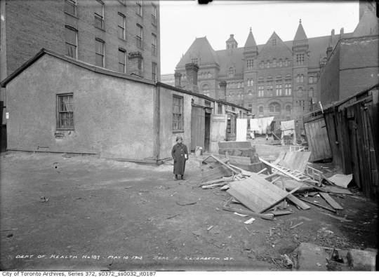
    Chris Bateman does some terrific sleuthing in the Globe and Mail this week to determine that the girl pictured in the below photo, dated May 15, 1913, is Dora (Dorothy) Cooperman – daughter of Morris Cooperman, a clothing presser.

    image

    Dora is standing in front of 3 wood-framed “rear houses” located behind 21 Elizabeth Street in an area known then as St. John’s Ward, or simply, The Ward. Behind her is City Hall, which we refer to today as Old City Hall. 

    If you’re familiar with Toronto, it shouldn’t take you long to figure out that she is standing in what is today the middle of Nathan Phillips Square in front of (new) City Hall. 

    The Ward no longer exists today, but as far as neighborhoods go its history is one of the most interesting. It was a high-density and mixed-use precinct that served as an important landing ground for successive waves of immigrants until it was deemed a slum and ultimately cleared. I wonder what it would look like today had it remained. Perhaps a bit like Kensington Market.

    It housed the Irish fleeing the Great Famine in the 19th century and was the center of Toronto’s Jewish community until the 1920s. The Cooperman family came from Kiev and identified as Jewish.

    There are so many interesting aspects to the above photograph. Everything from Dora’s pose to the juxtaposition between her surroundings and the grand (old) City Hall in the background. (Sidebar: I would like to try and recreate this same perspective. Would anyone like to model?)

    I also wonder why the city required a report to wake them up to the squalor that was living out in the Ward when they could have, presumably, just looked out their west facing windows.

    In 1911, Charles Hastings and Arthur Goss published what Batemen describes as a “landmark report that stunned civic officials, who had long ignored the poverty on their doorstep.” Hastings was the city’s medical officer of health, and Goss was the’s city first official photographer and author of Dora’s above portrait.

    One of the interesting things that Bateman explains about this report – and this is really the point of today’s post – is that it supposedly called out one particular housing typology as being highly problematic: rear houses. 

    These were houses that existed off the main street and could only be accessed via a laneway, like the one Dora is standing in. Today we would call them laneway houses. And so this report is evidence of over a century of anxiety around this particular housing type.

    It is obvious why overcrowding would have been deemed a serious problem at the start of the 20th century, but now one has to wonder how influential this report may have been in establishing the tone around these “rear houses.”

    Whatever the case may be, Dora’s story is an example of the role that this typology has played in housing people of modest means throughout this city’s history. It is also interesting, but perhaps not a coincidence, that affordability continues to be a part of the pitch around laneway housing and laneway suites. 

    Dora lived in a laneway house.

  • What is your city’s flag?

    How often do you see it around town? 

    Here in Toronto, I can’t say that I see ours all that often outside of city hall. Am I missing it? Here’s what it looks like:

    image

    In other cities, such as Chicago, the city flag seems to be far more ubiquitous. Here’s what Chicago’s looks like:

    image

    In the case of Toronto’s flag, the two white bands are meant to represent the architecture of Toronto City Hall. The maple leaf is the Council Chamber at the bottom. And there is some suggestion of a letter “T” for Toronto. Wikipedia says the “T” is supposed to be found in the blue space between and above the two towers of city hall, but I’ve always seen the two white bands as being the “T.”

    In the case of Chicago’s flag, the blue bands represent the lake and river (I like that) and the four six-sided stars represent significant events in the history of the city (positioned between the two bodies of water to mimic its actual geography).

    Roman Mars of 99% Invisible has a great podcast and TED talk on this topic. (The study of flags is known as vexillology.) In both instances, he outlines what he believes to be the 5 rules of great flag design. They are:

    1. Keep it simple
    2. Use meaningful symbolism
    3. Use 2-3 basic colors
    4. No lettering or seals
    5. Be distinctive

    Toronto’s flag generally conforms to these rules. But there’s something about the positioning of the maple leaf that makes the flag feel a bit arbitrary to me. I want to rationalize it.

    In any event, I think it could be really interesting if all of us shared our city’s flag in the comment section below and made a comment about how ubiquitous it is within the urban landscape.

    Roman makes the argument that a great flag gives people something to rally behind. And with cities only becoming more important on the global stage, there’s something to be said about having a well-designed flag today.

    I wonder if there will be a correlation between good flag design and ubiquity. My guess: probably.

  • The impression you are leaving

    image

    “Toronto is a city that has long struggled to make any sort of impression on the imagination.”

    That is how Monocle correspondent Christopher Frey started his recent architectural feature on Toronto’s iconic City Hall. To watch the video click here. It’s about 5 minutes long.

    As a born and raised Torontonian who loves this city, I absolutely hate that sort of introduction. But at the same time, it doesn’t surprise me. Growing up in this city, there were always the haters. However, I think it’s important to keep 2 things in mind.

    Firstly, Toronto has gone through a dramatic transformation over the last decade or so. In fact, I recently had a friend say to me: “Brandon, 10 years ago you told me that Toronto was going to be a super cool global city. I didn’t believe you then. But you were right.” This is what I was getting at in my Guardian Cities piece when I talked about how people are becoming noticeably more passionate about this city. (I actually wrote about what my friend said but they edited that part out.)

    Secondly, if you’ve ever read Seth Godin’s book All Marketers Are Liars, you might remember this line:

    To illustrate what he means by this, Godin uses the example–among many others–of Riedel wine glasses. Riedel is a high end glassware company founded on the belief that every type of wine needs its own unique glass shape. And indeed, their customers believe that the right glass makes all the difference in terms of how their wine will taste. That’s why they buy them.

    However, when you blindfold those same people, they are no longer able to tell the difference between a Riedel wine glass and some cheap alternative. The wine all of a sudden tastes the same. What that tells us is that when we believe something is supposed to be better, we actually experience it differently. You could say that we’re actually lying to ourself.

    And I’ve thought about this same phenomenon when it comes to cities. When people visit a place like New York they’re supposed to like it. That’s what everybody tells them. New York is great. You’ll love it. But ultimately, that “supposed to” changes how people experience the city.

    Which is why when Toronto gets introduced as being bland and banal I get upset. Not only because I disagree, but because I know it’s creating a “supposed to” in somebody’s mind. And that’s not the story we should be telling as a city.

    Image: Wikipedia