Daily insights for city builders, delivered every morning at 6 AM ET. I’m Brandon Donnelly — a Toronto-based real estate developer and founder of Globizen. I’ve been writing here since 2013.

Tag: chicago

  • Non-load-bearing curtain wall

    image

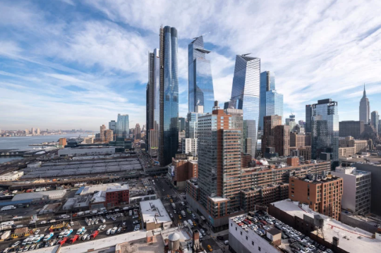
    Liz Diller of Diller Scofidio + Renfro was recently asked by designboom about how her firm approached the design of Fifteen Hudson Yards (the first residential tower in New York’s Hudson Yards).

    The firm had never designed a high-rise before. So while their typical approach would be to analyze program, here they were heavily informed by the views – both in and out from the site – as you move up the tower.

    The 88 storey tower transitions between two footprints. The base matches the street grid of the city, but as you move up the tower it transforms into a cloverleaf – allowing panoramic views of the city.

    It is a somewhat similar approach to what has been proposed by Studio Gang for One Delisle. Except for the transformation here is to a multifaceted cylindrical shape (a hexadecagon is what has been drawn).

    From the late 19th century when Chicago began to pioneer the modern skyscraper, architects and engineers have been thinking about how you treat a tall building as you move from top to bottom.

    Chicago architect Louis Sullivan responded to this challenge with his tripartite approach to design. He believed that tall buildings should be characterized by three main divisions: a base (bottom), a shaft (middle), and a cap (top).

    The technological innovation that allowed this thinking to flourish was the non-load-bearing curtain wall. Once the exterior walls of a tower no longer supported the actual building, architects then had the freedom to really experiment.

    This remains true to this day, but we no longer need to confine ourselves to only three parts. New technologies now allow for more.

    Today we have parametric modeling and other design tools that allow us to create new geometries and transitions; forms that would have been pretty complex to draw up in the past. 

    In the case of Fifteen Hudson Yards, every floor plate from 20 something and up is slightly different. I wonder what Louis would think of this.

    Image: Timothy Schenck via designboom

  • On good design

    Last summer, Zach Mortice published this article in Metropolis talking about two new buildings in Chicago. Here is his architectural description of the first:

    Ross Barney’s design is unabashedly cosmopolitan, yet welcoming. Conceived as a series of interlocking Miesian pavilions, it comprises a glass cube containing the dining room and a smaller opaque volume, which holds the kitchen. The glass envelope shows off the restaurant’s burly cross-laminated timber beams, the first time this ultra-strong, low-carbon structural system has been used in Chicago. The exterior pergola is clad with solar panels and provides shade across an entire city block while also generating most of the restaurant’s energy. With a landscaped plaza and outdoor seating, there’s a strong focus on attracting pedestrians to this green-starved section of the city, with a landscaped plaza and outdoor seating.

    Zach is describing the then new flagship McDonald’s in the River North area of Chicago. That’s maybe not what you were thinking as you were reading the description, but it is, of course, part of a broader transformation for the brand:

    “We don’t need to be loud anymore,” says David Vilkama, McDonald’s global creative director. “We’re trying to move away from the old, cheap, plasticky, in-your-face fast food culture.”

    It is a clear example of the value of good design and also how it has seemingly become table stakes for many firms and industries. 

    But as Zach points out in this article, is this also evidence that brands need to, not only invest in good design, but also move upmarket in order to maintain growth?

    In other words: Does good design inevitably equal more expensive?

  • US cities with the highest construction costs

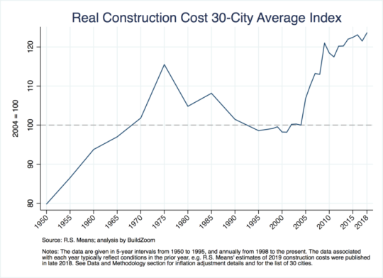
    BuildZoom, which is a tool to help people find local contractors, recently looked at construction costs across the US.

    Here is their 30-city average index running from 1950 to roughly today:

    image

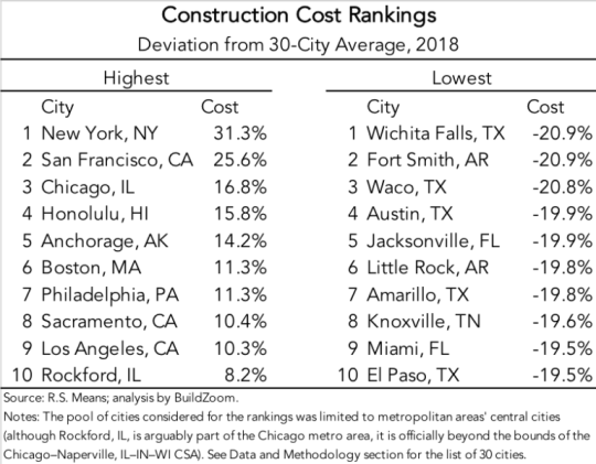
    Here is a chart showing the most and least expensive cities (that is, the cities that deviate the most from their 30-city average):

    image

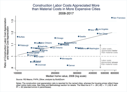
    And here is a chart that compares labor cost appreciation to material costs:

    image

    Labor costs account for the bulk of the geographic variation in construction costs and the most expensive cities to build in also tend to have the highest median home prices.

    The way to read the above chart is that any city with a y-axis value greater than 1 means that labor costs have appreciated faster than material costs from 2008 to 2017.

    In the case of San Francisco, labor costs have appreciated 32.8% (> 1.3) faster than material costs. 

    Part of this likely has to do with the fact that San Francisco is an expensive city in which to live. People have to be paid more if they’re going to work there.

    Full blog post from BuildZoom, here.

  • US cities with the most corporate HQs

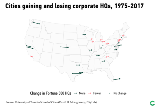
    The University of Toronto School of Cities recently looked at the changing economic geography of Fortune 500 companies across the US from 1975 to 2017. Here is a diagram of the results taken from CityLab:

    New York sits at the top with 70 corporate headquarters as of 2017. But the San Francisco Bay Area is now the second largest center with 35 headquarters – a testament to tech.

    The study does, however, omit service firms, as these weren’t tracked in Fortune’s list back in 1975.

    Also noteworthy is the specialization that has taken place across specific cities and regions. Here is another excerpt from CityLab:

    America’s headquarters geography reflects the substantial variation and specialization of the U.S. economy. New York leads in finance and business services, consumer services, and goods and materials. But Houston leads in energy, San Jose in tech, and Chicago in retail and wholesale. Chicago also ranks second in consumer services, and goods and materials, and Dallas takes third in energy. Other cities like Nashville and Minneapolis take third in consumer services, and goods and materials, respectively.

    The full article can be found, here.

  • Tech and the North American office market

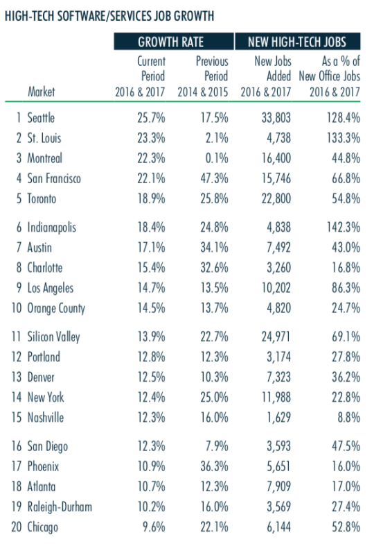
    CBRE recently published this report looking at the impact of the “high-tech software/services industry” on the North American office market. 

    Here are a few highlights:

    – Since 2010, tech has created ~1.1 million jobs in the US at an annual growth rate that is 3x the national average.

    – Seattle currently has the fastest tech job growth in North America. This is the first time in 7 years that San Francisco hasn’t been at the top of their list.

    – Silicon Valley, Toronto, New York, and Los Angeles all added more than 10,000 tech jobs from 2016 to 2017.

    – The biggest “momentum markets”, relying on 2016 and 2017 data, are Montreal, St. Louis, and Seattle.

    – Over the past two years (Q2-2016 to Q2-2018), Atlanta, Los Angeles, Orange County, Seattle, and Portland have all seen double-digit rent growth.

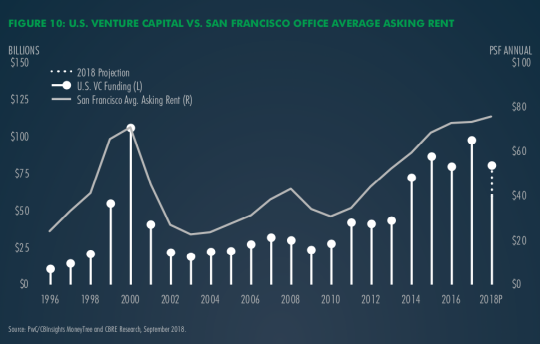
    One figure that also stood out for me was this one here showing the relationship between US venture capital investment and the average asking rent for office space in San Francisco.

    If you’d like to download the full report, click here. You’ll need to sign up for an account with CBRE, but it’s free to do that.

  • Decline of children in some, but not all, parts of Chicago

    The Institute for Housing Studies at DePaul University recently published this overview of the “socioeconomic factors affecting demand for housing in Chicago.”

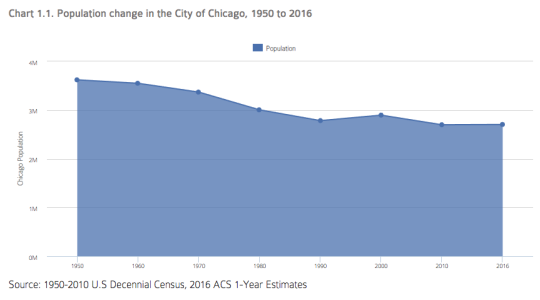
    Here is the change in population in the City of Chicago from 1950 to 2016:

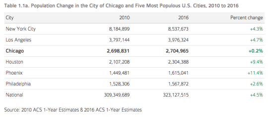
    And here is a comparison between Chicago and the five biggest cities in the US. Note the “sun and sprawl” phenomenon. Also note that the list below is for city proper boundaries.

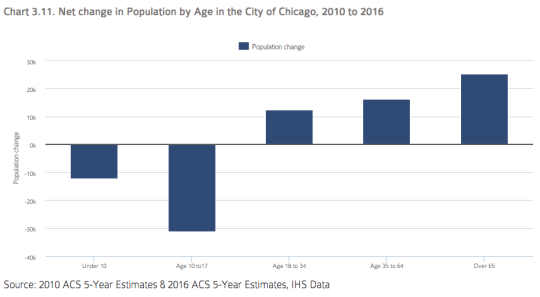
    One particularly interesting set of stats is the decline of children (population under the age of 18) in the city:

    Since 2010, the city has lost over 40,000 children and teenagers. 

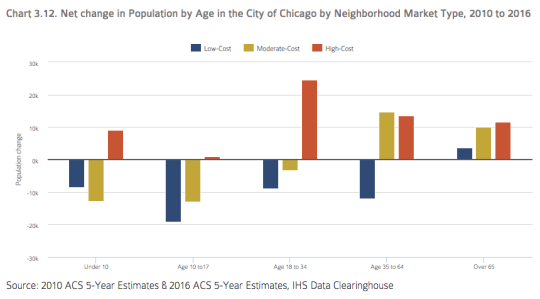
    But, if you break it down by neighborhood market type, it is the low-cost and moderate-cost neighborhoods that lost the population. The high-cost neighborhoods were up.

    The study posits that the old trend of moving to the suburbs after you have kids may not be for everyone – provided, of course, that you have the means. And it goes beyond Chicago. DC is predicting a 25% increase in K-12 students within the District.

    For the rest of the charts, click here.

  • Leading female architects

    Reed Kroloff has a noteworthy piece in the New York Times talking about how architecture is no longer just a ‘gentleman’s profession’. Though less than a third of AIA (American Institute of Architects) members are females, “offices led or owned by women are creating an ever-wider range of public buildings that address architecture and urbanism in new and invigorating ways”, says Kroloff.

    I am thrilled, but not surprised, to see Jeanne Gang of Studio Gang on the list (pictured above). Her firm is the design architect behind our One Delisle proposal. And I was also happy to see Magui Peredo of Estudio Macias Peredo on the list. She is based in Guadalajara and, if you aren’t familiar with her work, I recommend you check it out. I love the materiality of it.

    Image: New York Times

  • New Toronto architecture bike tour

    I have a friend visiting from Detroit this weekend. We went to architecture school together at Penn. But unlike me, he decided to become a full fledged architect.

    Not surprisingly, he wants to see some new Toronto architecture while he’s here. I say new because he has seen the classics. So I mapped out a short bike route this morning. It’s more or less a downtown loop that starts in the St. Lawrence.

    First we head west to the Queen Richmond Centre West by Allied Properties REIT (developer) and Sweeny&Co (architect). After that I’d like to show him the main drag of King West and point out two buildings by Saucier + Perrotte Architects and CORE Architects. I don’t think Unzipped Toronto is open yet.

    Next it is north to One Spadina Crescent – home of the Daniels Faculty of Architecture, Landscape, and Design. This is one of if not my favorite new building in the city right now.

    After that I figure we’ll cruise east along the Bloor bike lanes and look up at 1 Bloor East. Then it is back south to check out the River City collection by Urban Capital (developer) and Saucier + Perrotte Architects (they are getting good face time on this tour).

    Then we’ll do what every good new Toronto architecture bike tour should do and end with a drink on a rooftop patio somewhere. Maybe we’ll check out the Broadview Hotel. I like the neon in the lobby bar.

    If I missed anything critical, let me know.

    Photo by Tiffany Nutt on Unsplash

  • North American cities with the most construction cranes

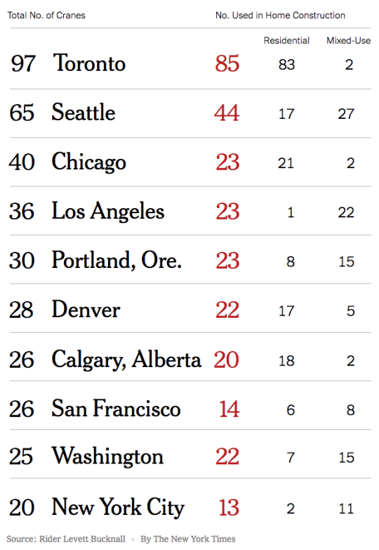
    Rider Levett Bucknall recently released its RLB Crane Index for Q3-2018. Here are the top 10 cities in North America (table via the New York Times):

    For the third consecutive reporting period, Toronto has taken the number one spot at 97 cranes – 85 of which are being used on residential projects. 

    I’m not at all sure how the study defines “mixed-use” projects. But given that Toronto only has 2 of them, it must not include projects with grade-related retail.

    Across North America, residential and mixed-use projects (whatever they are) make up approximately 70% of the total crane count. 

    I am surprised that Miami didn’t make the list.

  • Toronto: 2000 vs. 2025

    Last week, Joe Berridge, Partner at Urban Strategies, gave a presentation at the Institute on Municipal Finance & Governance titled, Toronto: The Accidental Metropolis. I’ve seen Joe give similar presentations to this one before, and I always thoroughly enjoy his focus on Toronto’s position as a global city.

    Here is a slide from the presentation that projects out Toronto’s population to 2071 and compares it to the largest cities in the US.

    image

    But the two slides that have been really making the rounds online are the following ones. The first is a rendering of what downtown Toronto looked like in 2000. 

    image

    I remember this time clearly. Queen West seemed to end at Spadina. King West and Ossington weren’t things. And “Richmond and Adelaide” felt like the greatest club district in the world. (If you’re not from Toronto, these references will likely mean nothing to you. Sorry.)

    The second slide is a rendering of what Toronto will look like in 2025. The transformation is just incredible.

    image

    I’ve seen some people comment that the Toronto of 2000 was relatively affordable; the Toronto of 2018 is unaffordable; and the Toronto of 2025 will be even more unaffordable with all of this new development.

    But I don’t understand that logic. Considering the growth rate shown in the first slide, imagine how unaffordable this city would be if we weren’t building new places for people to live and new places for people to work.

    For the full slide deck, go here. And for recent aerial photos of Toronto’s downtown core, check out my Instagram page.