Daily insights for city builders, delivered every morning at 6 AM ET. I’m Brandon Donnelly — a Toronto-based real estate developer and founder of Globizen. I’ve been writing here since 2013.

Tag: census data

  • Toronto’s unstable neighborhoods

    This is a telling map from Jens von Bergmann. It shows the changes in population density across Toronto from 1971 to 2021 (measured in people per hectare). What is obvious is the spikiness of our city. We have been very effective at adding lots of people downtown, along the central waterfront, and in certain other pockets. But at the same time, we have let our older inner city neighborhoods move in the opposite direction and lose people.

    The irony of this outcome is that we have long created policies that refer to these areas as being “stable” neighborhoods. The idea was that they weren’t supposed to change, at least not too much. But what this data shows is the opposite. By restricting growth, we actually created the right conditions for them to lose people as demographics changed and household sizes got smaller, among other things. We created unstable neighborhoods.

    Thankfully, we have started to change course and allow some intensification. We’re not there yet, but I do believe that the next 50-year map will look quite different than the one you see here.

  • Percentage of young Americans now living with a parent

    Here’s some data from the Pew Research Center looking at the percentage of young people (18- to 29-year olds) in the US that live with at least one parent. It it based on an analysis of monthly Census Bureau data and is obviously interesting/relevant given that this pandemic seems to have precipitated a number of people moving back home. As of July of this year, 52% of young adults were thought to be living with at least one parent, which is up from 47% back in February.

    At first I was surprised to see these numbers as high as they are. But it’s really the 18-24 age bracket that is driving this number up, which makes sense given that a chunk of this demographic is probably in school, not working, and now unable to do much on a campus. Among 25- to 29-year olds, the range is significantly lower, with just over a quarter (26% -> 28%) living with their parent(s).

    What I’m curious about now, after seeing this chart, is what is driving some of these regional, ethnic, and gender differences? Why are young midwesterners seemingly less likely to live with a parent compared to those in the northeast? Is it cultural? Economic? Or something else? And is the above an indication that maybe women are more independent than men?

  • An apartment dwelling city

    Toronto’s Chief Planner, Gregg Lintern, posted this on Twitter a few days (if you can’t see it below, click here):

    A couple things came to mind when I saw this.

    First, it’s a reminder that census data is painfully slow. Five years is a long time and a lot can and will change during that time period, including the kind of built form that people are living in.

    Second, I agree with Gregg. Toronto is in the process of transforming into a majority apartment/condo dwelling city (if it hasn’t already), and it signals a pretty important juncture in our city’s history.

    It also begs an important question: How should our planning response change and adjust as this percentage of urban dwellers continues to creep upward?

  • More than 1 in 4 Americans now live alone

    The percentage of single-person households in the US has been steadily increasing since the 1960’s (though the rate of increase has moderated in recent decades). As of last year (2018), 28% of Americans lived alone, according to the US Census Bureau. So about 1 in 4 households. This is in comparison to 13.1% of households in 1960.

    Here is a chart from a recent WSJ article on the topic:

    Not surprisingly, this is changing how marketers target households. Affluent, single-person households in urban areas have proven to be a boon to product makers because they tend to spend more per person and they tend to value time > money. Of course, this phenomenon also has implications for those of us who work as city builders.

    For more historical household tables from the US Census Bureau, click here.

  • From urban to suburban

    The US Census Bureau just released its population estimates for 2018. As has been the case in previous years, the counties that added the most people (largest numeric growth) are all located in the south and west. Texas holds 4 out of the top 10 spots.

    Here is a Tweetstorm by Jed Kolko, the chief economist of Indeed, with a couple of graphs summarizing the findings (click through to see the full thread):

    Despite the narrative that people are returning to cities and urban centers, the data is pretty clear: the flow of domestic migration within the US is largely from dense urban counties to more suburban — and affordable — ones. Big cities are expensive.

  • 2016 Census: Population and dwelling counts

    image

    Today marks the release of the first tranche of Canada’s 2016 Census data: Population and dwelling counts. The next data release is scheduled for May 3, 2017, and will include age and sex, and type of dwelling. For the full release schedule, click here.

    For policy makers, city builders, data nerds, and many others, today is an important day. And that’s because 2016 marked the return of the “mandatory long-form questionnaire”, which had been eliminated in the 2006 edition. The short-form questionnaire was used. That means it’s been over 10 years, since we’ve had access to long-form data about this country.

    Given that the 2016 Census had one of the highest response rates on record (98.4%), I think it’s safe to say that most Canadians understand the value of good data. In fact, when the Census was released it started trending on Twitter, with many people complaining if they hadn’t receive the long-form version. People wanted more survey. They wanted the ability to share more information.

    All of this is important because it helps decision making. Here’s an excerpt from a recent Toronto Star article:

    “The mandatory long-form census questionnaire provided regions and cities and communities with really valuable and reliable long-term information about the changing nature of the city and its neighbourhood that’s not available from any other source,” said David Gordon, an urban planning professor from Queen’s University.

    So stay tuned to the Census Program website. Regardless, I’m sure we will be seeing a surge of infographics and other activity following each data dump.

  • New York and Toronto population densities compared

    Today I came across this Reddit talking about how few census tracts there are in the United States with a population density greater than 150,000 people per square mile. 

    Basically, there’s a bunch in New York, one in San Francisco (Tenderloin), and one in Chicago that doesn’t really count because it’s an unusually small tract. Most other American cities don’t even come close.

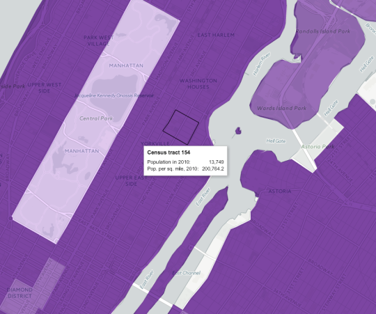
    Looking at this New York Times mapping of the 2010 US census data, it turns out there are neighborhoods in NYC that go well beyond 150,000 people per square mile. Here’s one census tract (#154) at just over 200,000 ppsm:

    If you convert 200,764 into the globally accepted standard for measuring distances and areas, you get approximately 77,515 people per square kilometer. Pretty dense.

    As a comparison, I thought I would see how this number stacks up against what is commonly referred to as the densest neighborhood in Canada: St. James Town

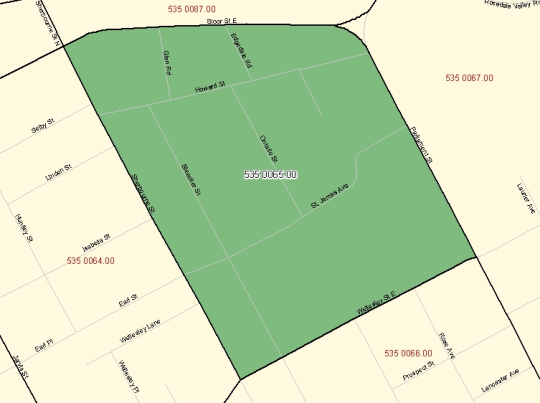
    If you pull up that geographic code in the 2011 Canadian census data (#5350065.00 in case you’re that nerdy), you’ll see a map boundary that looks like this:

    And you’ll also find a 2011 population density of approximately 60,915 people per square kilometer. Also pretty dense – though the population did decline from 2006.

    Now obviously St. Jamestown is only one example. The rest of the city is, by and large, far less dense. But maybe when our 2016 census data gets released next year, we’ll find that we’ve become even denser. I suspect we will.

  • Ethnic self-identification

    How do you self-identify in terms of ethnicity?

    I was having a discussion last night with a few friends about ethnic self-identification. In a multicultural city like Toronto where more than half of the population was born elsewhere, it’s an interesting topic.

    For new immigrants, I can understand that there often remains a strong connection to the home country and culture. 

    However, for subsequent generations, the attachment seems to manifest itself and wane (which I think is a natural tendency) in a variety of different ways. I am sure it partially depends on how determined the parents are to preserve the lineage vs. fully assimilate. In any event, it’s a somewhat subjective phenomenon.

    The best data I could find on this is from the 2006 Canadian census (I couldn’t find anything similar from the 2011 census). However, the question on the census was not about ethnic self-identification, per se, but rather how each respondent would classify the ancestry of their parents.

    There were a total of 31,241,030 responses. Some people gave a single response and some people selected multiple ethnic origins, which was allowed.

    In total, 10,066,290 people selected “Canadian.” Roughly 1/3 of the country. However, only 5,748,725 selected it as a single response. So only about 18.4% of respondents identified their parents as being only Canadian. The remaining group of people who selected Canadian also selected some other ethnic origin.

    The reason I pick out this stat is because – to answer my own question at the beginning of this post – I would self-identify as being only Canadian. I feel no emotional attachment to any other country.

    I would never support any other country at the Olympics and I would never fight for any other country.

    In terms of my background, my father wasn’t born here and so I am 1st/2nd generation on that side, depending on how you define 1st generation. However, on my mother’s side, I would be 3rd/4th generation Canadian.

    How do you self-identify? There’s no right or wrong answer here.

  • A look at net migration by age group in Vancouver

    I’ve written quite a few posts about family formation and, more specifically, about where Millennials will move once they start having kids

    Many seem to believe that – despite the current Millennial love affair with urban centers – much of this cohort is destined to repeat the pattern of the previous generation. Meaning, once the kids come along, they’re headed to the suburbs in search of bigger and more affordable housing.

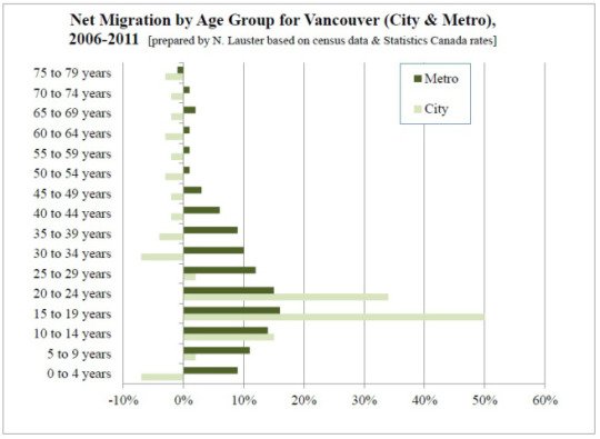
    If you look at the data, there’s a lot to support this prediction. Below is an interesting chart from Nathanael Lauster (Professor in Sociology at the University of British Columbia) that looks at net migration by age group for the City of Vancouver and the metro area.

    image

    What this chart shows is a flood of people in their late teens and early 20s migrating into the city (many of which are likely students), but then a fairly dramatic net loss of people leaving the city as they enter their 30s. The metro area, however, continues to grow – almost certainly because of people looking for more suitable family housing.

    But this data is from 2006-2011. We don’t yet have the 2016 census data. And I suspect that we will start to see an increase in the number of people opting to remain in the city across many different urban centers. 

    There are some very real economic pressures that successful cities today have to contend with. But I believe that the desire to remain in the city is there for a lot of young people.

  • Housing completions in Toronto from 1996 to 2014

    Whenever I read studies that cite census data, I’m often left feeling like the data is out-of-date. 

    Five years – which is how often Canada conducts its national census – is a long time. Somebody could move to this country for school, complete a 4-year degree, and then leave, and we wouldn’t even pick it up in our data.

    Thankfully, we’ve at least reinstated the long-form census for next year. Here are the questions, if you’re curious.

    But all of this is a digression. 

    This morning I read through a housing report that the City of Toronto published in October of this year. It’s about housing trends. And I wanted to share the below chart that covers housing completions for the period of 1996 to 2014. Keep in mind that this is for the City of Toronto, and not the Greater Toronto Area.

    What it shows is that over this 18 year period, 78% of all housing completions in this city have been either low-rise or high-rise condominiums/apartments. The remaining 22% is a mix of detached and semi-detached houses and townhouses.

    However, this 22% is an average. 

    Detached and semi-detached housing completions declined from 22% in the 1996-2001 period to 10% a decade later. And row and townhouses declined from 16% to 6% during this same period.

    At the same time, “many” of the housing units in this 22% were actually replacing existing and older housing stock. That is, according to the report, many were “knock-downs” and rebuilds. In these cases, it means that the completions actually do not represent net new housing units. So in reality, the supply of new single-family housing is even lower than it appears in the chart above.

    When you look at all of this, it should come as no surprise to you that our current combination of low interest rates and low supply has been leading to huge price increases on the single-family side of the market.

    And it’s for this reason that I believe Toronto will eventually start to look towards allowing more low-rise intensification. Laneway housing, as one example, would represent virtually 100% new ground-related housing in already built up areas. Where else are we going to find that kind of housing opportunity?

    So in my view, it is a question of when, not if, this will happen.