Daily insights for city builders, delivered every morning at 6 AM ET. I’m Brandon Donnelly — a Toronto-based real estate developer and founder of Globizen. I’ve been writing here since 2013.

Tag: carbon emissions

  • Mapping auto emissions in America

    This morning the New York Times published what they are calling the most detailed map of auto emissions in America. In it, they remind us that transportation is the largest source of greenhouse gases in the US today and that most of it comes from our driving habits within metro areas. See below charts.

    Not surprisingly, if you look at total on-road emissions, the biggest cities — New York and Los Angeles — are at the top of the list. But you also have car-dependant regions like Dallas-Fort Worth that punch above their (population) weight in terms of total emissions.

    Now, here’s where it gets interesting. The story flips as soon as you adjust for population.

    On a per capita basis, New York is pretty much at the bottom of the list. It is yet another reminder that one of the most sustainable ways to live is in a dense urban environment where it is possible to get around without the use of a car. New York is, of course, one of the best places in the US to do exactly that.

    Charts: New York Times
  • Shenzhen has just electrified its entire bus fleet

    image

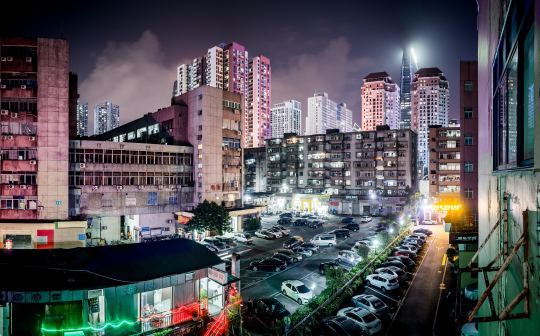
    This is impressive: Shenzhen recently finished converting its entire bus fleet to electric vehicles. That’s 16,359 buses and around 8,000 charging stations according to Electrek.

    It is estimated that this all-electric fleet saves 345,000 tons of fuel per year and reduces carbon emissions by 1.35 million tons.

    Shenzhen is now working on doing the same to its 12,518 taxis. Already 62.5% of them are electric-powered and the goal is 100% by 2020. 

    But let’s not forget that China still generates most of its electricity from coal. Coal represented 72% of its electricity generation in 2015. And in 2014, carbon emissions from China allegedly made up almost 30% of the world .

    Photo by Anton Strogonoff on Unsplash

  • Climate change gridlock

    I spent this morning reading an article called: How climate change is rapidly taking the planet apart. Here is an excerpt from the introduction: 

    “According to Naomi Oreskes, a great number of climate change scientists (she interviewed most of the top 200 climate change scientists in the US) suffer from some sort of mood imbalance or mild or serious depression. It is easy to understand why: we see the climate change taking the planet apart right in front of our eyes. We also clearly see, right in front of us, what urgently needs to done to stave off global disaster on an unprecedented scale. We need carbon taxes and the reconversion of industry and energy towards zero CO2 emissions systems. This route is without any doubt technically and economically feasible, but politically it seems to be permanently locked. If we do not unlock it, the future looks bleak, not to say hopeless, for humankind.”

    It’s clearly not a positive article. But it is an important read. We know we need to immediately and drastically reduce CO2 emissions (for all the reasons explained in the article), but we simply aren’t doing that.

    Part of the problem, I think, is that it’s easy to lull ourselves into complacency. We read about it and we notice the erratic weather patterns, but for the most part the status quo isn’t all that bad for most of us. Life just goes on.

    There’s evidence that revenue-neutral carbon pricing could actually increase productivity levels. It would force innovation. But it doesn’t yet appear to be 10x better than what we have today – which is often what you need to get people to accept change.

    So instead we hold largely ineffectual climate change conferences, which allow us to tell ourselves that we are, in fact, doing something. But I don’t think we’re being bold enough. And that’s too bad.

  • The new Toronto 2030 District

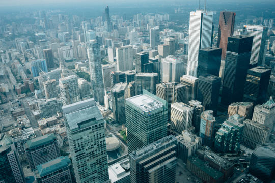
    Photograph Financial District, Downtown Toronto, Canada by Yeonju SEONG on 500px

    Image: Financial District, Downtown Toronto, Canada by Yeonju SEONG on 500px

    Today I learned about something new called 2030 Districts. They are: “designated urban areas committed to meeting the energy, water, and transportation emissions reduction targets of the 2030 Challenge for Planning.”

    Toronto’s new 2030 District is downtown, which is bound by the lake in the south, Bathurst Street in the west, Dupont Street and Rosedale Valley in the north, and the Don Valley in the east. 

    It’s the first district outside of the US. The other established districts are in Seattle, Pittsburgh, Los Angeles, Denver, Stamford, San Francisco, and Dallas.

    The goals for Toronto’s district are as follows (quoted from 2030 Districts):

    • To cut district-wide emissions in half, including zero-emissions from new buildings by 2030.
    • Support a better understanding of where and why energy use, water use, and GHG emissions occur across the District.
    • Work in partnership with building owners, service providers and conservation groups to accelerate the adoption of best practices for building design and management.
    • Facilitate broad stakeholder dialogues to uncover and overcome systemic barriers to long term reductions in energy use, water use and GHG emissions.

    I’m looking forward to following and learning more about this initiative. I think many of us can agree that producing less, not more, GHG emissions in the future would be preferable. And we know that the bulk of it comes from both buildings and transportation.

  • 80% of New York’s 150 million taxi trips could be shared

    I’ve been a big fan of MIT’s Senseable City Lab since I was a grad student at Penn. Their work sits at the intersection of cities and technology, and so I’ve always found it incredibly fascinating.

    Recently, the lab examined data from all of New York’s 13,586 registered cabs and looked for ways that technology and mobile tech could potentially optimize the way the system works today. In particular, they were interested in examining instances where people were heading to the same place at the same time, and were within no more than a 3 minute walk of each at the start of the trip.

    What they found was that, of the 150 million taxi rides taken in New York City during 2011, almost 80% of them could have been shared.

    That is, 80% of the time, there was an overlap in both time and route. That’s an hugely interesting stat because it starts to show just how much waste and inefficiency there currently is in the system. Think about all the trips and carbon emissions that could be potentially eliminated through optimization.

    Here’s a video they produced on the project. Click here if you can’t see it below.

    [youtube https://www.youtube.com/watch?v=Gyq_Zr96uzs?rel=0]

    It’s a great example of how technology is and will continue to creep into every segment of the economy. It’s exactly what I was talking about in my post, “Disrupting everything.”

  • Pick one or the other

    Two days ago I posted a neat interactive map of carbon footprints across America. It was taken from an Atlantic Cities article. But in the same post, I questioned the (Atlantic Cities) article’s headline and main assertion that increasing population density won’t help to curb greenhouse gas emissions.

    This didn’t make sense to me.

    Well it turns out that the supporting research data was slightly misinterpreted. According to the Per Square Mile blog, the UC Berkeley study associated with the interactive map reveals a more nuanced relationship between population density and carbon emissions. It turns out that people who live in the middle of nowhere (rural residents) actually have fairly low carbon footprints. Even though they’re reliant on cars, they tend to drive and consume relatively little.

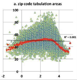
    And so initially, as population densities increase, so do carbon footprints. That is until it reaches about 3,000 people per square mile. At that point, carbon emissions start to drop off dramatically—roughly 35% on average from suburb to city.

    Below is a graph I found in the comment section of the original Atlantic Cities article that demonstrates this phenomenon. Population density is on the x-axis and carbon emissions are on the y-axis.

    image

    So here’s the big takeaway. If you’re looking to optimize around your carbon footprint, you need to pick a side: Either be urban or be rural. But don’t be somewhere in the middle. Don’t be suburban.

  • Interactive map of carbon footprints across America

    Atlantic Cities recently published an article called, “Beefing Up Population Density Won’t Curb Greenhouse Gas Emissions.” And in it, they link to a really neat interactive map created at UC Berkeley that outlines the carbon emissions of nearly every zip code in America (2013 numbers). 

    Not surprisingly, it shows that urban folk generally have a much smaller carbon footprint as compared to suburbanites. Here’s what New York City looks like (green is lower carbon emissions and red is higher):

    image

    But the article also goes on to say that the solution is not to work towards increasing population densities in either urban centers or suburbs. And that, in fact, efforts to increase population densities in the suburbs would only make things worse—emission levels have been shown to only go up and then new suburbs end up getting formed around the intensified ones.

    I understand the last point about endless suburbs, but I don’t fully understand this recommendation. Do carbon emissions go up in the suburbs when population densities are increased because it still remains car dependent and so all you have is more people driving?

    Intuitively, it would seem that if more people stopped driving, shopped locally and lived in more compact spaces, carbon emissions would fall. But perhaps I’m missing something.

    If anyone has any insights on this topic, I would love to hear from you in the comment section below or on twitter.