


Location: Laurentian Mountains, Quebec // Camera: DJI Mavic Mini
Daily insights for city builders, delivered every morning at 6 AM ET. I’m Brandon Donnelly — a Toronto-based real estate developer and founder of Globizen. I’ve been writing here since 2013.
Location: Laurentian Mountains, Quebec // Camera: DJI Mavic Mini
This is not a new video (click here if you can’t see it embedded above). It’s from 2015. But I still very much like the simplicity of the Vipp Shelter. It’s only 55 square meters.
One problem is that it cost USD 585,000 at the time it was prefabricated. It goes to show you that prefabrication and small don’t necessarily equate to affordability. For this reason, Lloyd Alter called it a “problematic prefab” back in 2015.
Of course, there are ways to make a home like this much more cost effective. I’ve been looking, on and off, for over a year for a piece of land that would be suitable for a project like this. I’ll let you all know if I find something.
Over the years on this blog I have posted the occasional “Project Profile”, where I have shared a noteworthy development project, an interesting piece of architecture, or some other kind of project that I thought would interest all of you. Everything is now a project.
This morning I decided that I should do that more often. I’m not sure if it will be every week, but hopefully it’ll be fairly regularly. I also have a few other alliterative blog series that I have started in the past and should continue.
This week’s Project Profile is the Pavillon du lac in Quèbec (somewhere) by Montréal-based Daoust Lestage. All of the photography used in this post is by Adrien Williams.
The first thing you may notice is that it is evocative of Philip Johnson’s Glass House and Mies van der Rohe’s Farnsworth House (1951) – but probably more the latter.
Le Pavillon du lac was completed in 2015. It has 2 bedrooms and is about 1,240 square feet. The entire glass pavilion is housed between two thin flat slabs with cantilevering overhangs on two of its elevation. They create a kind of portico that frames views of the water. All of the glass is triple-glazed.
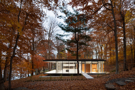
One of the key distinctions for me is how the house sits on the ground. As is the case with the Farnsworth House, le Pavillon du lac sits on stilts, elevated off the ground. The ground floor slab is then able to ignore whatever topography there may be beneath it.
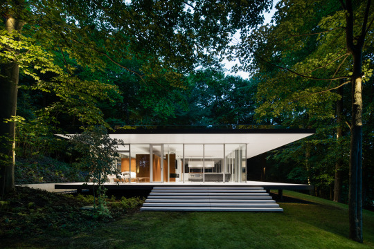
At the same time, there are elevations of the house where the ground has been carved into (see below). This creates a small moat around the perimeter and roots the building within the landscape.

For more photos of le Pavillon du lac, click here.
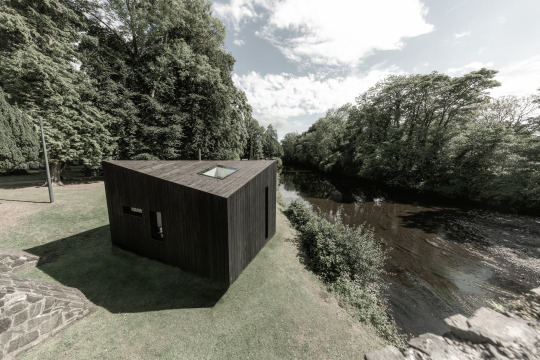
Johnathon Little (husband) and Zoe Little (wife) recently launched a new housing concept out of the UK called Koto, which is supposedly Finnish for “cozy at home.”
(Before Koto, Johnathon worked for Snohetta in Oslo.)
The goal of the company is to create beautiful, small, and prefabricated houses and cabins that allow people to connect with nature.
It is inspired by the Nordic concept Friluftsliv. The literal translation is “open air living” but, more specifically, it is about the benefits of nature on our mental and personal wellbeing.
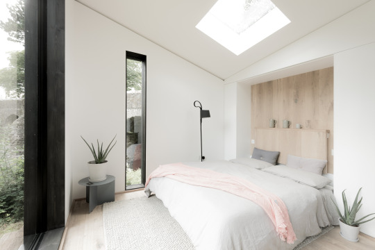
Their small cabin has a footprint of 15 square meters and their large cabin has a footprint of 40 square meters. Base prices run from about £33,500 to £63,500. A bathroom is optional.
The most obvious use case for me is that of a bunkie. For more on Koto, check out their website and Instagram.
Photos: Koto

Phaidon has a new architectural book out that surveys 55 homes, all of which have some sort of connection to water, whether that be an ocean, lake, river, or pool. It’s called Living on Water. I don’t (yet) have a copy, but it looks like the perfect coffee table book for a cottage, summer home, or studio apartment with zero connection to water. Monocle on Design recently interviewed the editor of the book (podcast episode here). So if beautiful homes on the water are your thing, maybe check it, and the book, out.
Author and professor Witold Rybczynski recently asked: “What’s with all the black houses that have appeared in recent years?” Black brick. Black paint. Blackened Timber. Lots of black.
Alongside his post was an image of a “backcountry hut” by Leckie Studio Architecture + Design. I am adding a picture of the interior for completeness, but he only posted a picture of its exterior.
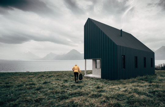
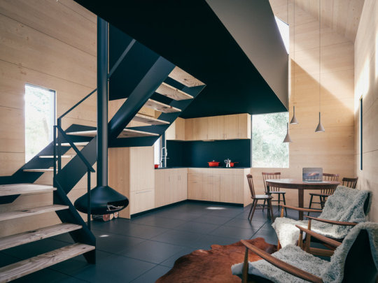
Witold makes a great point about shadows, but when I read the post this morning I immediately thought to myself: Wow. What a beautiful cabin and what a beautiful setting.
I like how the lighter carve out at the corner contrasts against the black. And because of this carve out, I assumed that the interior would have similar and lighter tones of wood. It does.
At the same time, I thought of Urban Capital’s River City complex here in Toronto, which also features “black” as a prominent architectural expression. I am a big fan of these projects.
So I guess it goes to show, once again, that beauty is really in the eye of the beholder.
Things have been far too serious around here this week with talk of interest rates, unrealized gains, flooding, and the EU referendum. So let’s change that and do a bit of an architecture roundup. It has been on my agenda for a few weeks now to move toward some sort of regular post about architecture and design.
1.
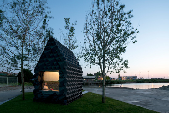
DUS architects of Amsterdam recently completed a fully 3D printed urban cabin (pictured above). It totals 8 square meters and was printed using “bio-plastic,” which means the entire structure could be shredded and reprinted into something else. The Urban Cabin is a research experiment, but the thinking is that 3D printed homes could serve as an “on-demand housing solution” in rapidly urbanizing cities, in disaster areas, and so on. That said, the niche use case can quickly become the mainstream use case.
2.
REX has just released their design for a Performing Arts Center on the World Trade Center site. The design is a minimalist “mystery box” that provides an infinitely customizable interior canvas for directors. I have long been interested in the work of REX because of the hyper-rationale approach they quite often bring to architecture. It’s about allowing architecture to emerge from the project’s constraints, programmatic requirements, and so on. Here’s a video of the project.
3.
Finally, this Swiss chalet (not the restuarant) in the town of Anzère has got me pretty excited about the upcoming snowboard season. It was designed by the Amsterdam-based firm SeARCH. And I love the dichotomy between the raw exposed concrete and the softer wood details. Also note how the garage, situated beneath the house, is built into the mountain. It is connected to the house above via an elevator that is also carved into the mountain. Sadly, my ski retreats don’t typically involve James Bond-style lairs.
Image: Copyright Ossip
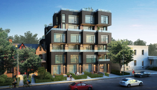
Last month,
Curated Properties submitted a
rezoning and site plan application for a 6-storey, 25-unit building at 45
Dovercourt Road in Toronto. The project is known to the market as Cabin and you
can register for it now.
The project
immediately caught my attention (because of its design, because of its
branding, and because I like the work of Curated), so I decided to dig in
further and get a copy of their architectural drawings. Development
applications and their supporting documents are all public. Anyone can request
a copy. But the city isn’t great at making this known.
Since I’m excited
to see more of these small scale urban infill projects in the city, today I
thought I would highlight some of its key features and some of the things that
are being proposed in order to make a project like this work.
The Homes
First of
all, 100% of the suites are 2-storey. 76% of the suites are also 2 bedroom or
larger.
The result
is that the project is essentially a series of townhomes stacked on top of each
other. I suspect that this will appeal to more end-users as opposed to
investors. Hopefully, it will also attract more families to the area.
Here’s the
third floor plan:
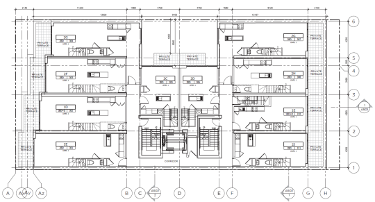
You
probably can’t see it, but all of the suites are marked as “Level 1”, obviously
indicating that there’s more than one level.
Also worth
mentioning is the notch or cut out on the north side of the building. This is
what makes the 2 suites in the middle of the floor plate possible. In order for
them to have windows, they need to be setback from the (north) property line.
It also means those suites get terraces.
The Parking
Turning to
the ground floor plan, it’s interesting to see that they are proposing 8 triple
car stackers that will be accessible off the rear laneway (right side on the plan below). That equates to 24 parking spaces in the building (8 bays x 3
cars per stacker).
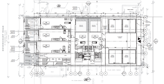
On small
urban sites like this one, it can be very difficult to accommodate parking. So
it’s inevitable that we will see more parking stackers in the city and a continual
reduction in parking minimums.
The Construction
Finally, I
have been told that this project is expected to be framed in wood, as opposed
to reinforced concrete, which is more typical of condominiums in Toronto.
As of the
beginning of this year (2015), the
Ontario Building Code was modified to allow wood-frame buildings up to 6
storeys. Before this change, the highest you could go was 4 storeys.
This change
was done with the intent of reducing construction costs so that it becomes more
feasible to develop smaller infill sites such as this one. So expect to see
more of this.
I know that
a lot of people would like to remain in the city even when they start having
children. But it’s becoming increasingly difficult to find affordable low-rise
homes. And not everyone wants to live in a high-rise tower.
That’s why I think
we will see more, not less, low-rise and mid-rise infill projects like Cabin.
If you’re interested in this topic, also check out a post I wrote called 3
stages of intensification.
The rendering at the top of this post is from Curated Properties and the
drawings are by RAW Design.