Daily insights for city builders, delivered every morning at 6 AM ET. I’m Brandon Donnelly — a Toronto-based real estate developer and founder of Globizen. I’ve been writing here since 2013.

Tag: berkeley

  • Measuring downtown recoveries using mobile phone data

    The School of Cities at the University of Toronto and the Institute for Governmental Studies at the University of California, Berkeley have been using mobile phone data to track the recovery of 62 downtowns across North America. This work has been being published at downtownrecovery.com, but it has also been widely cited.

    First, to be clear on how this works, the data they are collecting is not dependent on people actually making calls or actively consuming data on their phone; instead it is simply based on people having a phone with them and being physically located in one these 62 downtowns. It also covers the period between January 2019 and November 2022, and includes cities with least 350,000 people.

    I’m not exactly sure how long the phones need to be in a particular place or how they treat time in their data, but the unit of measure is something that they call a “Point of Interest.” This includes things like restaurants and shops, so presumably this data isn’t just saying, ” I went downtown and sat in my office for 8 hours.” It could also be, “I went downtown and ate good pasta.”

    I say this because, based on my understanding of the data, having a high Recovery Quotient (RQ) could mean a number of different things. It could mean that more people are back in the office, but it could also mean that the downtown isn’t a monoculture and that it has other things going on besides just work.

    In any event, here’s what they have found:

    The headline finding is that San Francisco has the lowest RQ at 31% and Salt Lake City has the highest at 135%. There does appear to be a bias toward higher recoveries with mid-sized cities, and one of the reasons for this is that these recovery quotients appear to be correlated with average commute times:

    Some of the other strongly correlated explanations, include the percentage of jobs in professional, scientific, and technical fields:

    And the number of days that events were shut down during the pandemic (note the Canadian cities on the right below; welcome, New Orleans):

    I suppose one way to grossly oversimplify these findings is to say that some people have been avoiding going downtown if they can’t quickly drive there (and have to take transit), if their job more easily allows them to work from home, and if things were shut down for too long during the pandemic. Because if it was, they maybe forgot about all of the fun things that typically happen downtown.

    Image: The School of Cities

  • Our cities are full

    One of the most common objections to new housing is that the place is already too crowded and potentially even full. But Jerusalem Demsas’ recently article in The Atlantic about how much people seem to hate other people is a good reminder that the topic of overpopulation can be a complicated one.

    Because what are we really saying when we say a place is too crowded or full? Is it just that this particular neighborhood is full, or are we talking about entire cities being full?

    Moreover, who determines when a place is full? Berkeley, California is, for example, a hell of a lot less dense than a city like Paris. So if a place like Berkeley can be considered full by some people, what does that mean for Paris? Presumably it’s entirely unliveable.

    Or could it be that the entire world is simply full and we should be looking at more drastic measures to curb population growth (in the places that are actually reaching replacement-level fertility rates)?

    It’s all very complicated. Thankfully Demsas offers up some possible solutions in her article:

    We have, of course, discovered an elusive technology to allow more people to live on less land: It’s called an apartment building. And if people would like fewer neighbors competing for parking spaces, then they should rest assured that buses, trains, protected bike lanes, and maintained sidewalks are effective, cutting-edge inventions available to all.

    The rest of the article is just as good.

  • How many people showed up to the Raptors’ championship parade? (Hint: We don’t know)

    Today was a historic day for Toronto, for Canada, and for the game of basketball in this country. The Toronto Raptors are world champions for the first time since their founding in 1995. Soak it in. Here is a photo that I took of the parade coming through the Financial District at around 2:30pm:

    Some of the estimates going around are that 1 to 2 million people attended today’s championship parade. But 2 million seems like a lot, even though today was frenetic (see above photo, again). I mean, that’s 1/3 of the population of the Greater Toronto Area.

    The fact that some of the “official” estimates also have a 1 million person spread tells me that, as of right now, we actually have no idea how many people were at today’s parade.

    So that got me thinking: How do people count crowds? And are we using drones to do it, yet? Subway and rail ridership for the day — which surely spiked — will give us some indication. But definitely not the full picture.

    It turns out that the typical approach to counting crowds is known as Jacobs’ Method. It was invented in the 1960s by a professor at UC, Berkeley, named Herbert Jacobs. He came up with the method while trying to count the number of students protesting the Vietnam War.

    The concept is simple: It’s area x density. And permutations of his method usually use this same principle. What you do is take the area filled with people, break it up into a smaller grid, and then come up with a population density estimate for each square.

    He had some rules of thumb for that. A light crowd was about 1 person per 10 square feet. And a dense crowd (such as a mosh pit or an NBA championship parade in Toronto) was about 1 person per 2.5 square feet.

    Using this method and aerial photos of today’s parade, I would imagine that we could eventually get to a more precise estimate than 1 to 2 million people. But surely somebody has figured out how to program a drone (or other UAV) and do this even more accurately.

    Crowd data is valuable information, particularly for political rallies and protests (I would imagine). If you know of a company doing this, please leave it in the comment section below. And if it doesn’t yet exist, well then, now you have a new business idea.

  • If man had developed a third arm, where might this arm be best attached?

    Roman Mars of 99% Invisible recently published an excellent episode called The Mind of an Architect. It has to do with a set of research studies completed in the late 1950s by an organization at the University of California, Berkeley known as the Institute of Personality Assessment and Research (IPAR).

    IPAR was founded by a personality psychologist named Donald MacKinnon. He initially worked for the precursor to the CIA and founded IPAR with the intent of studying “combat readiness and efficiency.” But over fears of how creative the Soviets were getting, the focus of IPAR shifted to instead studying creativity.

    And architects were deemed to be an ideal test subject (from 99percentinvisible.org):

    “Researchers saw architects as people working at a crossroads of creative disciplines, a combination of analytic and artistic creativity. As professionals, architects had to be savvy as engineers and businessmen; as aesthetes, they also acted as designers and artists.”

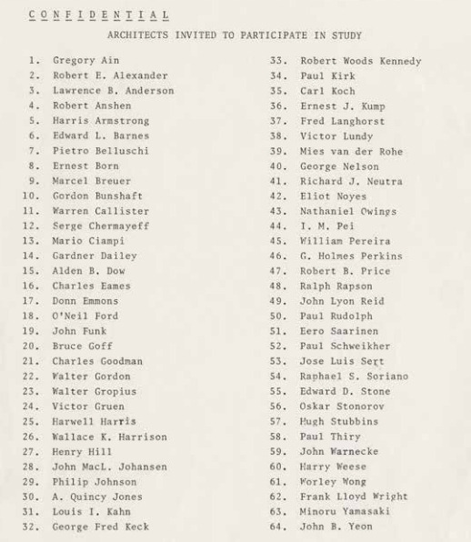
    So over a series of weekends in the late 1950s, some of the most celebrated minds in architecture – including people like Philip Johnson, Richard Neutra, and Louis Kahn – were studied and picked apart. 

    image

    They were asked to do quick sketches, create mosaics, and they were asked questions such as this one: “For the next 45 minutes we would like you to discuss this notion: if man had developed a third arm, where might this arm be best attached?”

    In the end, here’s what they concluded:

    The researchers began to notice certain patterns across creatives of all professions and genders, including a tendency to nonconformity and high personal aspirations. They also found many creatives shared a preference for complexity and ambiguity over simplicity and order. Creatives could make unexpected connections and see patterns in daily life, even those lacking high intelligence or good grades.

    In short: IPAR found that creative people tend to be nonconforming, interesting, interested, independent, courageous and self-centered, at least in general. Many of these traits may seem obvious today, but they were not necessarily obvious prior to these studies. Back when their tests were being conducted and findings presented in the 1950s and ’60s, the very idea of a “creative personality” was a novelty in academic and public discourse.

    The findings may not be groundbreaking to us today, but the documents and recordings produced during the study are certainly interesting. If you’re into this topic, there’s also this book you can pick up.

    Oh, and if we are to have a third arm, I would like mine to run almost parallel to my existing dominant arm (right). That way I could double up on my most potent dexterity. It would also be far less intrusive than an arm on one’s head or in the middle of one’s back. Then again, it would ruin our symmetry as humans. And perhaps that third arms need to be celebrated instead of being masked.

    What would you suggest?

    Image: Institute of Personality and Social Research, University of California, Berkeley / The Monacelli Press (via 99% Invisible)

  • Market vs. subsidized

    Miriam Zuk and Karen Chapple of the University of California, Berkeley, recently published a research brief called Housing Production, Filtering and Displacement: Untangling the Relationships

    It’s a nuanced look at the impact of both market-rate and subsidized housing production on affordability and displacement within the San Francisco Bay Area.

    The report is essentially a response to the debate around whether increasing market-rate housing production alone can address affordability and displacement concerns, or whether the only way to do it is through subsidized housing. What they found was that both matter, but…

    “What we find largely supports the argument that building
    more housing, both market-rate and subsidized, will
    reduce displacement. However, we find that subsidized
    housing will have a much greater impact on reducing displacement
    than market-rate housing. We agree that market-rate
    development is important for many reasons, including
    reducing housing pressures at the regional scale and housing
    large segments of the population. However, our analysis
    strongly suggests that subsidized housing production is even
    more important when it comes to reducing displacement of
    low-income households.”

    If you’re interested in this topic, I recommend reading the full brief. It’s only 12 pages. I particularly liked the information around filtering and how new housing steps down over time to ultimately serve lower-income households.

  • Privacy in the new world

    Remember when you first started using the internet and nobody wanted to reveal their actual identity? Everyone used aliases, because it was weird to share sensitive information – like your full name – on the internet. One of my earliest usernames was bdonn. I used it for everything. I had bdonn@aol.com.

    Well, things have certainly changed.

    Could you have imagined that we’d get to a world where “over sharing” is viewed as a real – albeit first world – problem and phrases like “I share therefore I am” get thrown around. It’s a pretty dramatic departure from how we used to feel about privacy. And for the younger generation, who grew up entirely with social media, I don’t even think privacy is on the radar.

    Some would argue that this is a problem, which is why a group of academics over at Berkeley created a web app called Ready or Not? What it does is allow anyone to enter a Twitter or Instagram username and see a plotted map of where that user has shared from.

    Here’s what it spit out for me based on my recent tweets:

    The hope is that this will promote awareness around the fact that even one short tweet could be potentially revealing your exact geographic location. But I wonder to what extent people are actually unaware that this is happening or is just that they’re comfortable sharing this information? What do you think?