Daily insights for city builders, delivered every morning at 6 AM ET. I’m Brandon Donnelly — a Toronto-based real estate developer and founder of Globizen. I’ve been writing here since 2013.

Tag: athiscity

  • Let’s fix the UPX train, together

    I am a big fan of the UP Express train that runs from downtown Toronto to Pearson Airport. 

    I love the station architecture, the branding and identity, the trains themselves (with wifi), and the local retailers they house at Union. I also happen to live a stone’s throw away from the downtown station. So I can go from door to bum in seat within 10 minutes.

    But despite all this, it has become clear that something needs to be done to fix the UPX train. Just last weekend a friend of mine and fellow urbanist, who was visiting Toronto from Vancouver, sent me a text message saying: “This UPX train is really nice, but why is it so expensive?”

    Indeed, that seems to be the general consensus. Here is the opening paragraph from a recent Globe Editorial article:

    Toronto’s high-end airport express train is a failure. A city that urgently needs better transit has been saddled with a deluxe boutique rail service that cost $456-million to build and runs nearly empty, 19 ½ hours a day.

    So today I thought we could collectively brainstorm some ideas for how Metrolinx – the public agency that operates the train – should address this issue.

    I’ll start by sharing my thoughts as a rider and then, hopefully, you all will share yours in the comment section below. I know that there are people from Metrolinx who subscribe to this blog, so I am sure your feedback will get through to them.

    My thoughts are twofold. Like many others, I think the pricing is off. But at the same time, I think there should be a focus on enhancing the value proposition of the service.

    Bur first, let’s talk about price.

    At the time of writing this, a one-way trip from Union Station to Pearson Airport on the UPX is $27.50. If you happen to have a PRESTO card, it’s $19.

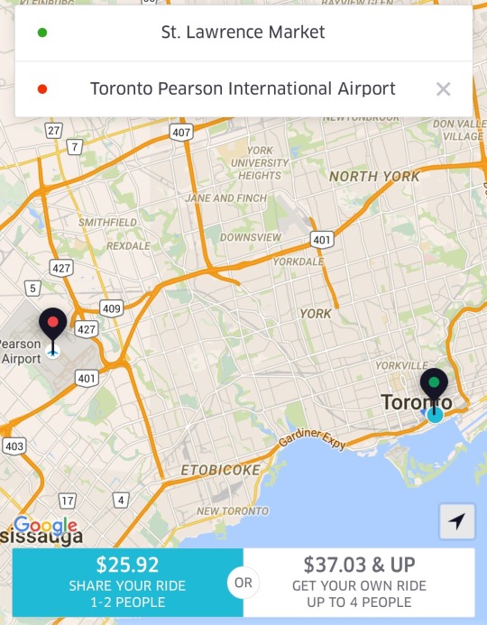
    The alternative for many is probably a taxi. So let’s also look at some Uber fare estimates. For someone like me leaving the St. Lawrence Market area, I’m looking at $25.92 with UberPOOL (meaning I’m sharing the car with 1-2 other people) or $37.03 if I insist on riding solo.
    image

    Against the non-PRESTO fare, UberPOOL is a cheaper option and it’s door-to-door service. Against the PRESTO fare, UPX is potentially $6.92 cheaper. But if you’re someone who has to take the subway to the UPX station, then it’s only $3.67 cheaper (add $3.25 for the subway) and it’s not door-to-door service. So for the vast majority of people, I suspect that UberPOOL would win out in this particular scenario.

    If you happen to be traveling with someone, then UberPOOL and UberX are probably going to be cheaper no matter how you slice it. And again, you’re getting door-to-door service. So I think the consensus is right: fares need to come down.

    But I don’t think Metrolinx should be solely focused on price. They should also be thinking about ways to create additional values for riders. 

    One of my favorite travel experiences is that of Hong Kong’s airport train. There, they have airline check-in counters in the city so you can collect your boarding pass and check your baggage up to a day before your actual flight. This is a huge value add because it means you can check out of your hotel, liberate yourself of your luggage, and spend the day in the city before leaving on the train to catch your flight. You can’t do that with an Uber. And lugging bags around a busy city, sucks.

    My point with all of this is simply that you can’t expect people to pay more or roughly the same, if they are not getting additional value. And right now, the train isn’t door-to-door and taxis are. (Though, the train has a travel time advantage during peak times.) So you either make it cheaper or you create additional value. Or, you do some combination of the two, which is where my head is at.

    What are your thoughts? Please respond in the comments below so all the feedback is public. Thanks.
  • Out of sight, out of mind

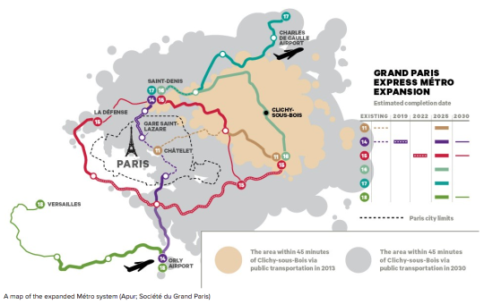
    Henry Grabar has an interesting piece in the March 2016 issue of The Atlantic talking about Paris’s ambitious metro expansion. By 2030, and after $25 billion of investment, the Paris system will gain four new lines, 68 stations, and more than 120 miles (192 kilometers) of track. 

    To put this into perspective, this additional track length is roughly equal to Toronto’s entire subway and streetcar network, including all under construction and approved lines.

    But the real focus of Grabar’s article was on how this transit investment will really stitch Paris back together:

    “Three of the new lines will run north and east of Paris, through Seine-Saint-Denis, the poorest of the 96 departments in France. Among French cities with at least 50,000 people, six of the seven with the highest percentage of foreign-born residents are in Seine-Saint-Denis. Residents of Clichy-sous-Bois, where the riots that swept the region in 2005 began, will for the first time find central Paris within a 45-minute train ride. The town of Saint-Denis, the site of the standoff between police and the terrorists who struck Paris in November, will be home to the project’s largest train station. Designed by the Japanese architect Kengo Kuma, the junction is expected to handle 250,000 passengers a day.”

    Below is a map (from the same article) showing the location of Clichy-sous-Bois to the east of Paris and the area reachable within 45 minutes from this suburb, both today and in 2030 when the new metro lines open.

    Having traveled to Paris in 2006, shortly after the riots took place, I remember some Parisians telling me that this was not a Paris problem. They told me that this was a problem of the banlieues, but not of Paris. Seeing how separate Clichy-sous-Bois is today, that is probably how it felt to some or most. But based on the above, the Paris region is about to be stitched together.

    What I love about Grabar’s article is this idea that transit and connectivity represent a kind of citizenship for urban residents. And that even today, in our hyper connected world, physical access matters a great deal. Because without it, you might be out of sight, out of mind.

    On that note, here is how the article ends:

    Benoît Quessard, an urban planner for the local government, told me that he sees the expansion as not merely “an economic wager but also a social one.” In this sense, it will test an old Parisian belief about the Métro conferring, beyond convenience, a kind of citizenship on its riders. In 1904, four years after the first line opened, the writer Jules Romains predicted that the system would be a “living, fluid cement that will succeed in holding men together.”

  • My approach to blogging

    In yesterday’s post about the city as an egg, I received a comment basically saying that I use this blog to carefully curate my own image and that I would never argue against “dumb Toronto planning” because, after all, I’m a developer. I am going to do what breads my own butter.

    I welcome intelligent debate on this blog. That’s why it is open to anyone who would like to comment. But since I’ve received similar comments in the past, I thought I would use the opportunity to talk broadly about my approach to blogging.

    Firstly, there will always be some level of curation involved. That’s inevitable. We see it all over social media. But I’m a big believer in transparency and I try to do exactly that on this blog. I am keen to push the boundaries in this regard.

    At the same time, part of what makes blogs unique is that they’re often personal. That is the origin of blogging. Some of my favorite blogs to read are the ones that have figured out how to combine a particular niche topic with personal stories. And since ATC is ultimately my personal blog, I am going to continue taking that exact same approach.

    Secondly, I only write about things that I’m passionate about. I get asked all the time to write about and promote specific projects, causes, and events. But almost all of them do not get written about it. Because if I don’t care about it, then I’m not going to write about. It’s as simple as that.

    Thirdly, I believe in positivity over negativity. I believe that optimists, not pessimists, change the world. President Obama won his first term with a message of hope, not despair. To me, that is a stronger motivator.

    I’ve been told before that I’m overly optimistic and that my youthful exuberance will one day wear off. Boy, I sure hope it doesn’t. Because would you rather have a beer with someone who is optimistic or someone who is pessimistic? I will always take the former.

    However, this is not to say that I want to be blind to the realities of the world. Last summer I disagreed with Toronto’s decision to rebuild the elevated Gardiner Expressway East along the waterfront, and I continue to disagree with that decision. 

    When I believe something is a mistake, I am happy to make it public and put it in writing on this blog. But as a developer, I suppose I have certain biases working against me. That’s just the way it is.

    In any event, this is my rough and ever-evolving approach to blogging. As usual, I welcome any and all comments.

  • The city as an egg

    This week I have been thinking and reading about monocentric and polycentric cities. In urban real estate economics, the monocentric city model has historically been an important economic model. Developed in the 1960s, it attempts to explain land use in cities with one core, or central business district (CBD).

    In its most simplest terms, the model states that as you move further away from that core, land prices will fall. But since retail and employment need to be at the center of large catchment areas, they will remain in the middle, while the residential will naturally spread out.

    When you begin to factor in transportation costs, there is an argument to be made for why inner cities neighborhoods were often poorer in North American cities (no car; higher transportation costs) and why the suburbs were often wealthier. In this latter case, the rich wanted to consume more home/real estate and their transportation costs weren’t as significant. They had cars and subsidized highways in which to drive them on.

    Of course, there are many ways in which you could argue against the above. Today, urban neighborhoods are some of the most desirable areas in many cities. 

    But perhaps the most obvious thing to question is the idea that cities only have one central business district. I mean, just look at all the employment nodes in Toronto. Yes, downtown Toronto is still the dominant zone, but could we really be considered monocentric?

    From what I remember, the model had mechanisms for dealing with polycentricity. But at the same time, so much has changed since the 1960s. The central business district with its big department store was only just getting introduced to the likes of fully enclosed, climate-controlled suburban malls. And of course today, we are now living in a world of Amazon Prime and independent workers.

    So what does this mean for cities?

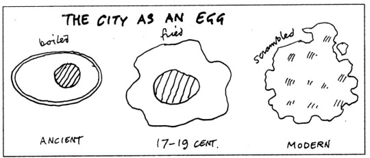
    Well, as I was reading up on this topic I stumbled upon this diagram by architect Cedric Price (1934-2003):

    I wish I knew exactly when this diagram was created, but I wasn’t able to find that online. In any event, the diagram uses different kinds of eggs – boiled, fried, and then scrambled – to explain the urban morphology of cities over time.

    In the ancient world, cities had a clearly defined core and a clearly defined perimeter – often a wall for defence (boiled egg). In the 17-19th centuries, cities started to expand outwards through the advent of technologies like rail. This gave them a more irregular shape (fried egg). And then finally, Cedric argues that the modern city had, or would, become all mixed together like scrambled eggs.

    I wouldn’t say that our cities have become completely scrambled. But I would agree that we are moving away from the simple fried egg of a city (or monocentric city model). So I guess the big question is really: How scrambled do you think we’ll get?

  • Urban, suburban, and rural home prices in the U.S.

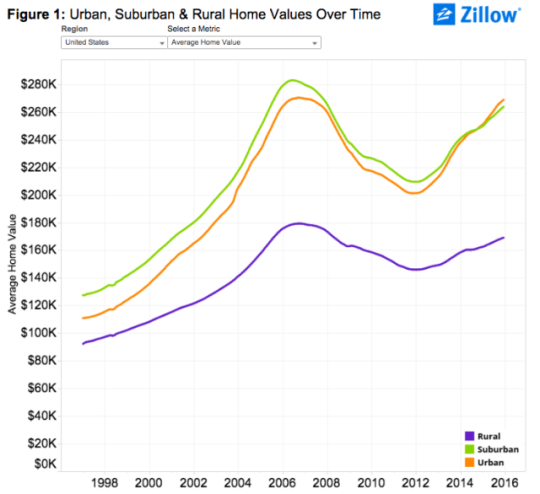
    Zillow.com recently published some research where they looked at U.S. home prices broken down according to location: urban, suburban, and rural.

    Here’s what they found:

    image

    As you can see, urban homes across the U.S. largely trailed their suburban counterparts in terms of absolute value up until the end of 2014. At that point, urban homes then surpassed suburban homes for the first time in the last two decades. (I wonder if this is a first or there was another crossover point before the late 1990s.)

    But if you dig a little deeper and look at both the rate of appreciation and prices per square foot (as opposed to just absolute value), urban home prices appear even stronger. 

    Here’s a snippet from Zillow’s post:

    “Over the past five years (2010-2015), average urban home values have grown 28.4 percent, compared to 21.1 percent for suburban home values. In the past year alone, U.S. urban home values grew 7.5 percent, compared to 5.9 percent for suburban homes.

    On a per-square-foot-basis, homes in urban areas nationwide used to be worth roughly the same as suburban homes, before a gap started emerging in the late 1990s which has become progressively wider over the past roughly two decades. Currently the gap stands at 24.5 percent, with suburban homes valued at $156 per-square-foot and average U.S. urban homes worth $198 per-square-foot.”

    And here is that same chart showing per square foot prices:

    Everyone who reads this blog knows that there is a growing interest in urban centers. But if you look at the above charts for specific cities, there are still many cases where urban home prices are well below suburban ones. 

    To me, that serves as a reminder of the spikiness of this urban transformation, but also that it is likely still in its infancy. As recent as 20 years ago, Toronto largely didn’t believe that people would want to live downtown in modern apartments. Today we take that for granted.

    So even with all of the gushing about urban centers, I still think we are only just getting started when it comes to creating the great urban neighborhoods of the future.

  • AMYGDALA — An installation that converts social media sentiment into audiovisual art

    It’s becoming harder and harder to think of tech as a distinct silo. Tech is embedding itself into so many traditional industries that, one day, every company will probably be a software/technology company in some regards. 

    It’s for this reason that I often think and write about tech and its impacts on the built environment.

    An interesting example of this phenomenon is a recent art installation by fuse* called AMYGDALA. What it does is translate collective social media sentiment (specifically from Twitter) into an audiovisual art installation housed within an urban space.

    Here’s how they describe the project:

    “The news and thoughts of users spread across social networks in real time. And so an event with worldwide implications immediately involves millions of people sharing their own opinions and emotions: happiness, anger, sadness, disgust, amazement or fear. Thus, imagining Internet as a living organism, we might think that its emotional state may be given by the overall emotions shared by users at any given time. AMYGDALA listens to shared thoughts, interprets states of mind and translates the data gathered into an audiovisual installation capable of representing the collective emotional state of the net and its changes on the basis of events that take place around the world.”

    And here’s a video of it in action (click here if you can’t see it below):

    [vimeo 154049756 w=500 h=281]

    What I like about the project is how it takes something digital and ephemeral and then both aggregates and translates it into something physical within the urban environment. It’s a perfect visual representation of how technology and networks are – for better or for worse – seeping into our daily lives.

  • Pocket two bedroom

    I recently started reading the blog of Michael Mortensen. Michael is a real estate developer and urban planner based in the UK. And if you like my blog, I think you’ll also like his.

    Last week he published a post talking about a UK development company called Pocket and a recent design competition that they organized called “Pocket two bedroom.”

    Historically the firm has been focused on well-designed and compact one bedroom apartments (38 square meters) that they deliver at a minimum 20% discount relative to typical market rate housing in London.

    But over time, they found that they had to turn people away because they were looking for larger – yet still affordable – two bedroom apartments. So the firm decided to figure out how to scale their model to larger units.

    To do this, they went out and asked 19 architects to come up with ideas for a two bedroom Pocket apartment. They then published all of the ideas online.

    Firstly, I applaud them for making their competition results public. Most real estate companies wouldn’t do this.

    Secondly, it’s interesting to take note of the recurring design themes, as they have on page 24-25 of their competition book. 

    Some of the themes include “deep thresholds” that blur private and communal spaces; “thick walls” that allow for storage and servicing; flexible spaces and fewer dedicated spaces; and dual entry apartments.

    This last item was particularly interesting to me. It’s a simple idea – two separate doors leading into one apartment – but it can allow for a number of flexible sharing scenarios. I am already imagining somebody creating an Airbnb rental out of their second bedroom.

    Housing is certainly undergoing a transformation.

  • The value of lifestyle in attracting human capital

    When I was in Revelstoke, BC last year I met a number of people who had made the move out there from Toronto. When I asked if they missed living in a big city, pretty much everyone gave me the same answer: “No, I love it here.”

    This past week when I was in Park City, Utah, I similarly met a number of people who had made the move from New York and other large cities. And when I asked them the same question, I heard statements like: “I used to live in New York, but then I got a life and moved out here." 

    In these two examples, the obvious draw is the mountains. But it’s not like everyone just moved and became a ski bum. In fact, Inc Magazine recently published an article talking about Park City’s robust startup scene. People are figuring out how to combine hard work with the lifestyle they want.

    What I find interesting about this is that it runs counter to the trend of young people preferring big cities. Here’s a quote from NPR:

    “But affordable real estate and waterfront views don’t have millennials biting. They continue "a multigenerational pattern of young adults preferring more expensive urban areas over lower-cost rural ones because the lifestyles and opportunities in such places make the extra burden of cost worth it,” says Robert Lang, professor of urban growth and population dynamics at the University of Nevada, Las Vegas.”

    However, some small towns clearly have a unique lifestyle advantage: mountains. And that seems to be a strong enough draw that some people are simply figuring out how to create the economic opportunities for themselves.

    For me, this is yet another reminder that if you’re trying to attract the best human capital to your city or town, you need to think about lifestyle. And since young adults aged 18-34 are far more likely to move around than any other generation, you should also be thinking specifically about what this generation wants.

    Here’s a chart from CityLab that shows how precipitously migration falls off (in the U.S.) once people finish school and get settled in a job:

    image

    Obviously, not every town or small city is blessed with mountains. But there are many lifestyle advantages that can be created. It’s for this reason that I keep talking about nightlife and Toronto’s laughable 2AM last call. Those are lifestyle things and we can do better.

  • [Video] Gang of Four

    Scott Galloway, professor of Marketing and Brand Strategy at NYU Stern, recently delivered a presentation on the Gang of Four: Apple, Amazon, Facebook, and Google. These dominant companies are also often referred to as the “Four Horsemen.”

    The video is about 16 minutes long and I would highly recommend that you give it a watch.

    It’ll be like drinking from a firehose, but there are so many fascinating takeaways. You’ll also quickly discover how far reaching the societal impacts of these companies have been and will likely be in the future.

    If you can’t see the video below, click here.

    [youtube https://www.youtube.com/watch?v=jfjg0kGQFBY?rel=0&w=560&h=315]

  • A mapping of single family home prices in Vancouver

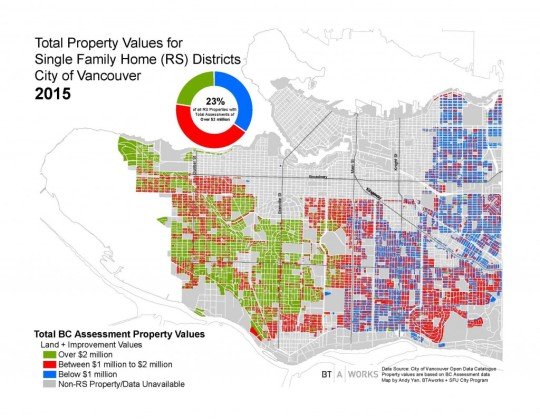
    Bing Thom Architects recently published a blog post looking at the property values of single family homes in Vancouver. The data was taken from the City of Vancouver Open Data Catalogue and is based on British Columbia Assessment data.

    The precise timing of the data is likely a bit off, but here’s how the city looked in 2015:

    23% of single family homes in the city had an assessed value over $2 million.

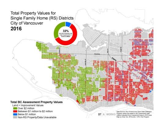
    A year later, this number increased 32% of all single family homes:

    It’s interesting to see how divided the city is along Main Street. But the big takeaway – thanks to BTA – is that $2 million seems to be the new $1 million.