Daily insights for city builders, delivered every morning at 6 AM ET. I’m Brandon Donnelly — a Toronto-based real estate developer and founder of Globizen. I’ve been writing here since 2013.

Tag: atc

  • Urban jungle

    Keeping with yesterday’s theme of urban density, here is a photo by Andy Yeung that I am embedding via his 500px page:

    Urban Jungle #04 by Andy Yeung on 500px.com

    https://500px.com/embed.js

    The photo is of Hong Kong and it was taken using a drone. Click here for other photos from his “Urban Jungle” drone series.

    If you remember the maps from yesterday, you might remember that Hong Kong had a peak residential density of around 111,100 people per square kilometre (2013).

    Above is what that generally looks like.

  • Residential population densities compared

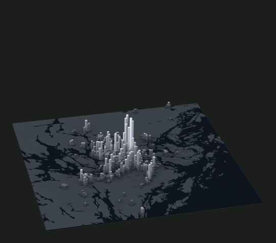
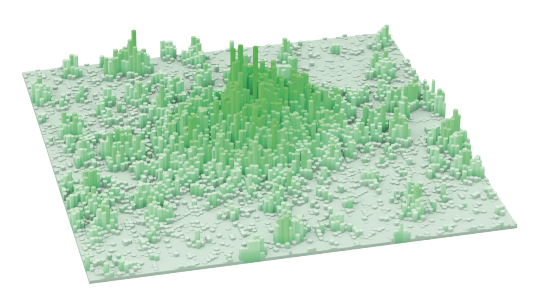
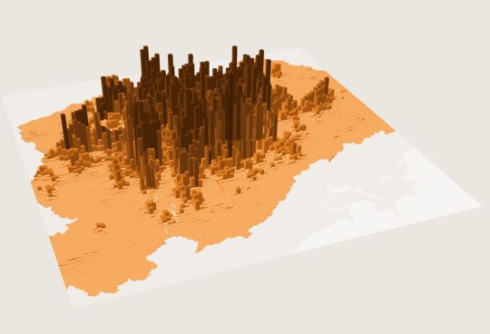
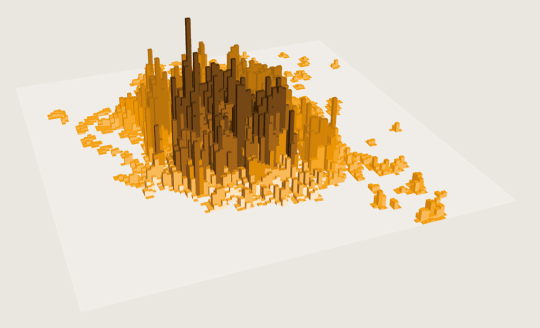
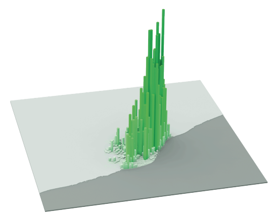
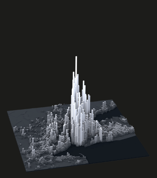
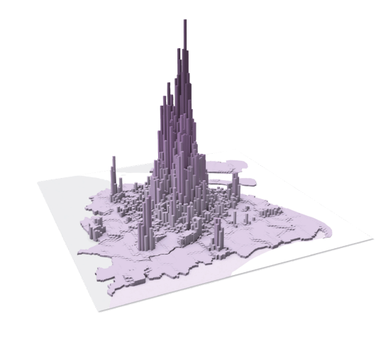
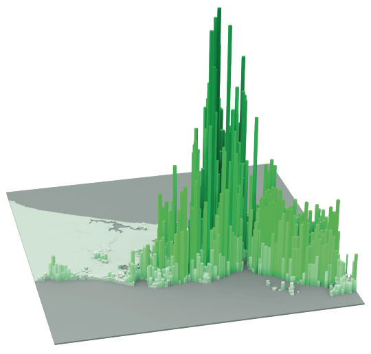
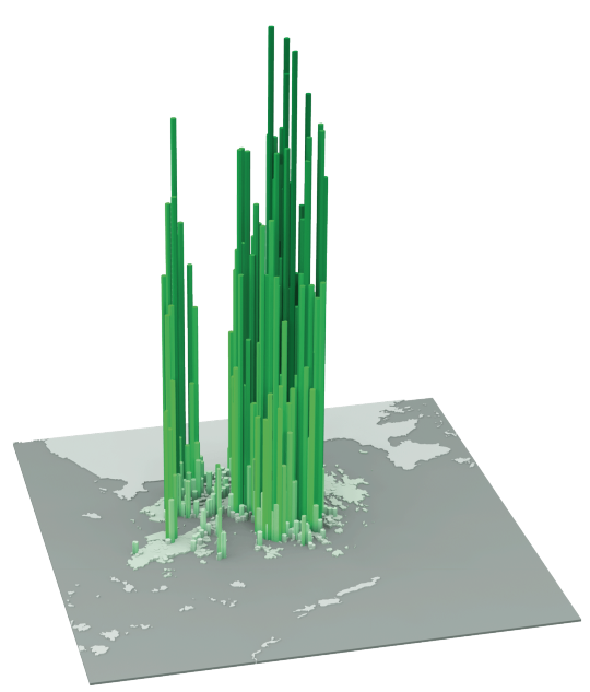
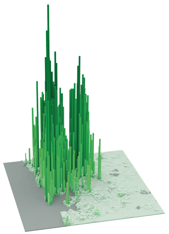
    The following diagrams were taken from LSE’s Urban Age website. I’ve sorted them from lowest to highest peak residential population density. In each case I’ve also included the year of the dataset. 

    It’s amazing how much these simple extrusion diagrams can tell you about the city. It also shows you that high population densities don’t necessarily need to equate to tall buildings. Barcelona, in particular, stands out for me.

    Berlin (Peak residential density: 21,700 people/km2, 2009)

    image

    Stockholm (Peak residential density: 24,900 people/km2, 2012)

    image

    London (Peak residential density: 27,100 people/km2, 2013)

    image

    São Paulo (Peak residential density: 29,380 people/km2, 2009)

    image

    Mexico City (Peak residential density: 48,300 people/km2, 2009)

    image

    Barcelona (Peak residential density: 56,800 people/km2, 2013)

    image

    New York (Peak residential density: 59,150 people/km2, 2012)

    image

    Shanghai (Peak residential density: 74,370 people/km2, 2011)

    image

    Istanbul (Peak residential density: 77,300 people/km2, 2013)

    image

    Hong Kong (Peak residential density: 111,100 people/km2, 2013)

    image

    Mumbai (Peak residential density: 121,300 people/km2, 2013)

    image

  • School of Real Estate

    I’ve been getting a lot of (email) questions lately about what to study in order to become a real estate developer. So I thought I would reblog this post that talks about exactly that. I wrote it over a year ago and I almost forgot it existed.

    At the same time, I’m reminded of something: I think these questions really speak to the fact that there’s a significant opportunity (particularly in Canada) in terms of real estate development education. 

    Oftentimes when I get these questions, I end up recommending the Master of Science in Real Estate Development (MSRED) at ColumbiaMIT, and USC. Why don’t we have something similar (and better) in Canada? We are falling behind.

    I have raised this with some Universities here in Toronto, but the response I got was that they felt the real estate courses being offered as part of their existing MBA programs were more than sufficient. I think we can do a lot better.

    One professor suggested that I line up a big donor and work with them to spearhead the creation of the (Insert Donor Name Here) School of Real Estate. I think that’s a great idea, but not something I have the capacity for right now.

    Hopefully somebody else out there is of the same mind.

    Post Update: 3 days ago the Schulich School of Business (York University) announced a one-year full time Master of Real Estate and Infrastructure (MREI) program – the first of its kind in Canada. 

    This is great news. 

    Now I would love to see the University of Toronto and Ryerson University (as well as others) step up and leverage their respective architecture schools. Schulich is already out of the gate on this one.

  • Global home prices at the end of 2015

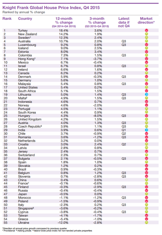
    Seeing how we’ve started looking at data from last year, I thought it would be interesting to look at global home prices as of Q4 2015. Here’s a chart from Knight Frank, which they refer to as their Global House Price Index:

    At the top of the list is Turkey, with an 18.4% increase from Q4 2014 to Q4 2015. (Supposedly this is because it has recently become easier for foreigners to buy property in the country.) Canada is 13th with a 6.2% increase (during this same time period) and the United States is 17th at 5.4%.

    This is obviously a high level analysis. There are lots of regional and local variations within each country. For instance in Canada right now, Calgary is a very different place than, say, Vancouver or Toronto.

    Nonetheless, it’s still valuable to see the relative performance of each country and see what their (Knight Frank’s) prediction is for 2016:

    “Our outlook for 2016 is muted. We expect the index’s overall rate of growth to be weaker in 2016 than 2015. The global economy is experiencing a potentially dangerous cocktail of low oil prices, a strong [US] dollar and a continued slowdown in China.”

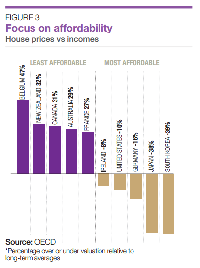
    It’s also interesting to see how the countries rank in terms of affordability:

    Once again, Canada ranks as being one of the least affordable countries in terms of home prices.

  • We’re driving again

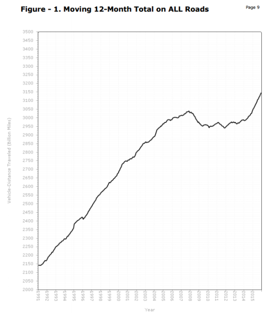
    For a number of years now, urbanists – including myself – have been thinking about “peak car.” And that’s because if you looked at vehicle miles traveled (VMT) in the United States since about 2007, the trend line was more or less flat. 

    This had us wondering whether or it was simply an outcome of the recession or some sort of broader shift.

    Well, if you look at the December 2015 numbers from the U.S. Department of Transportation, VMTs are once again growing. In fact, it’s now above the 2007 “peak.” Compared to December 2014, travel on all roads and streets in December 2015 was up by 4.2% or 10.6 billion vehicle miles traveled. 

    Here’s the chart:

    A lot of this could be because of lower gas prices. But I would be curious to hear your thoughts in the comments about whether or not you think 2007 to 2014 was (1) a recessionary blip or (2) a longer term trend in the making.

  • Getting distribution and how that is changing

    Aaron M. Renn recently published an article in The Washington Post talking about carless cities and driverless cars. It’s an interesting read, but I’m not going to talk about those topics today. So if that’s what you’re looking for, you’ll have to read his piece.

    I do, however, want to focus on one particular aspect of it. 

    In it, he talks about how Tesla is shifting the “locus of power in the auto industry” from Detroit to Silicon Valley and, at the same time, changing the way cars are sold. Tesla sells direct to consumers through its corporate stores, whereas franchise laws in almost every U.S. state mandate that new cars need to be sold through dealers.

    I’m not sure how these laws came to be, but it’s interesting to note yet another example of technology and the internet sparking disintermediation. That is, the removal of middle people, distributors, brokers, and so on. It’s the same thing that is happening as a result of companies like Uber and technologies like Bitcoin.

    I would imagine that lot of these legacy distribution models exist today because it was previously the most efficient option. If you were a car company based in Detroit, a network of local franchisees all across the country working to sell your cars was probably a great thing. But now there are other options, as is the case with many other industries.

    So what’s next? 

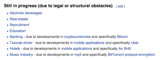
    Wikipedia calls out the following industries as still being in the midst of disintermediation:

    I bet you all know which one I’m watching closely.

  • The social shift

    Those of you who know me or are regular readers of this blog, will know that I’m an avid social media user. 

    My favorites – judging by battery consumption on my phone – are Twitter, Instagram, and Snapchat (donnelly_b). I think it’s incredible what these platforms are doing to branding, marketing, personal connectivity, city building, and the list goes on.

    To that end, the March issue of Harvard Business Review has an interesting article by Douglas Holt called, Branding in the Age of Social Media. Whether you’re running a company, a city, or a real estate development project, I think you’ll find the information relevant.

    The article starts by describing a shift, brought about by social, whereby big brands are now struggling to capture the attention of consumers. Instead, consumers are listening to individuals and more grassroots movements.

    “Or consider Red Bull, the most lauded branded-content success story. It has become a new-media hub producing extreme – and alternative – sports content. While Red Bull spends much of its $2 billion annual marketing budget on branded content, its YouTube channel (rank #184, 4.9 million subscribers) is lapped by dozens of crowdculture start-ups with production budgets under $100,000. Indeed, Dude Perfect (#81, 8 million subscribers), the brainchild of five college jocks from Texas who make videos of trick shots and goofy improvised athletic feats, does far better.”

    So what should brands be doing? Holt argues that they need to tap into these developing subcultures and emergent ideologies:

    “These three brands broke through in social media because they used cultural branding—a strategy that works differently from the conventional branded-content model. Each engaged a cultural discourse about gender and sexuality in wide circulation in social media—a crowdculture—which espoused a distinctive ideology. Each acted as a proselytizer, promoting this ideology to a mass audience. Such opportunities come into view only if we use the prism of cultural branding—doing research to identify ideologies that are relevant to the category and gaining traction in crowdcultures. Companies that rely on traditional segmentation models and trend reports will always have trouble identifying those opportunities.”

    For me, this ties into one of my favorite lines from Simon Sinek: “People don’t buy what you do, they buy why you do it.” And now, thanks to social, it has become a lot easier to figure out what people and communities care about. It has become easier to figure out your why.

    Do you see this as being relevant to your work? I am certainly thinking about it in the context of mine.

  • Easier said than done

    Earlier this week I saw the Chief Planner of Toronto, Jennifer Keesmaat, tweet this out:

    //platform.twitter.com/widgets.js

    I responded with the below quote retweet because I figured I should probably devote a blog post to this topic and not just a tweet.

    //platform.twitter.com/widgets.js

    Now, I don’t know for sure, but I am guessing that her tweet was in response to the criticism from architects and developers that Toronto’s design guidelines are creating homogenous architectural outcomes. Some people – and I’ve written about this before on ATC – believe they’re too prescriptive.

    So today I’d like to talk about why playing creatively within the guidelines/zoning envelope, particularly at the mid-rise scale, is a lot easier said than done.

    Generally speaking, the value of land is dependent on what you can do with it or, in this case, what you can build on it.

    If all you could do was plant things on it, then the value of the land would be correlated with crop yields. If on the other hand you could build a building, it would be correlated, at least in theory, with the amount of space you could build and the rents you could charge for that space.

    Of course, this isn’t a perfect science. That’s why I said “in theory.”

    Landowners obviously want to maximize the value of their asset when it comes time to sell. So they, along with their brokers, will naturally try and stretch what is possible with the land. Why else do you think the best neighborhoods seem to magically grow new boundaries?

    When you combine this with the fact that mid-rise buildings are inherently less efficient to build and with the fact that their smaller size creates diseconomies of scale, it can be exceptionally difficult to find development sites where the numbers make any sort of financial sense. That is, even if you “maximize the envelope” and push rents or sale prices.

    So, with all due respect, not maximizing the envelope is almost unthinkable, unless you somehow managed to get a bargain on the land.

    Many of you will likely respond in the comments saying that all of this is simply a result of real estate developers being greedy capitalist pigs. But what we are talking about is no different than in any other competitive business environment. 

    Developers rent and sell products – albeit products that take an incredibly long time to make and bring to market. To make those products, there are a many costs, ranging from the cost of land to the cost of drawings. But hopefully within all of those numbers sits a profit margin that makes sense given the amount of work and risk that the developer has taken on. 

    Put differently, telling developers not to maximize the envelope is like telling a pizza maker to throw out 10-15% of her dough before she makes every pizza – even though she already (over)paid in full for the dough.

    If you’ve ever created a development pro forma, you’ll know that it’s not easy getting the numbers to work when you’re operating in a competitive market. This is not a knock against creative design. Trust me, I am a design snob. This is just business.

  • Boondoggle or architectural icon?

    Today, the new World Trade Center Transportation Hub, designed by architect Santiago Calatrava, opened up – at least partially – in New York City. 

    Given that it was originally supposed to open in 2009 and cost about half as much (original budget was $2.2 billion), the critics haven’t been kind.

    Here are a few snippets from Michael Kimmelman’s writeup in the New York Times, called, Santiago Calatrava’s Transit Hub Is a Soaring Symbol of a Boondoggle:

    …at first blush, Mr. Calatrava’s architecture can almost — almost — make you forget what an epic boondoggle the whole thing has been. That virgin view, standing inside the Oculus and gazing up, is a jaw-dropper.

    The project’s cost soared toward a head-slapping, unconscionable $4 billion in public money for what, in effect, is the 18th-busiest subway stop in New York City, tucked inside a shopping mall, down the block from another shopping center.

    And it’s not really a hub. A maze of underground passages connects the site to far-flung subway lines, but there are not free transfers. The place is a glorified PATH station for some 50,000 weekday riders commuting to and from New Jersey.

    I haven’t been following this project, so I can’t really comment on the delays and cost overruns. But I sure wish that main hall (called the Oculus and pictured above) was a part of my regular travel routine.

    Image via Curbed

  • A breakdown of land use in Vancouver

    Last night when I was thumbing through Twitter before bed, I came across this blog post describing Vancouver’s land use types. The blog itself is called Mountain Doodles, but it’s not exactly clear who the author is. 

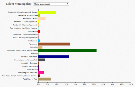
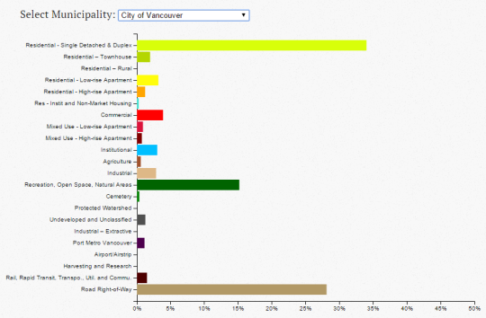
    In any event, what she/he did was analyze Vancouver’s land use dataset to come up with a series of charts that break down the percentage of each type: residential single detached, residential low-rise apartment, commercial, green space, and so on.

    Here’s what the chart looks like for Metro Vancouver:

    And here’s what it looks like for just the City of Vancouver, proper:

    When you look at the metro area, green / open space dominates. Although, the author states that, given the dataset, there could be a small overstatement of green space. There’s also the question of where the overall boundary was drawn.

    When you look at only the City of Vancouver, it’s land for residential housing (detached and duplex) and roads that dominate, with green / open space coming in a somewhat distant third.

    Of course, this does not speak to the intensity in which any of the above land might be used, such as the apartment lands (i.e., the third dimension). But from a two-dimensional perspective, you certainly get a sense of what we – for better or for worse – have chosen to privilege.