Daily insights for city builders, delivered every morning at 6 AM ET. I’m Brandon Donnelly — a Toronto-based real estate developer and founder of Globizen. I’ve been writing here since 2013.

Tag: art

  • Spaces for the Instagram age

    In 2017, the New York Times Style Magazine ran a piece on Harry Nuriev – and his design firm Crosby Studios – titled: The man designing spaces for the Instagram age

    Since then, Harry and his firm have been in Time Magazine, have had a solo show at Design Miami, and have been named to the Architectural Digest 100, among many other things.

    There has obviously been a lot of talk over the last few years about the impact that Instagram is having on physical spaces and design #IRL (in real life). 

    Some, or perhaps many, worry that it is having a “homogenizing effect on design.” Everyone is following a kind of global minimalism that looks good on social, but is maybe getting a bit monotonous. 

    There’s no question that online is having an impact on how we design offline. But I am far less fussed about it than most. 

    Architecture, design, and art have always reflected the cultural milieu at the time, and it just so happens that we are living through a period where the internet is transforming so much of what we know.

    It is always important to question what is going on. But I think Crosby Studios is doing some really great work.

  • Three nights only

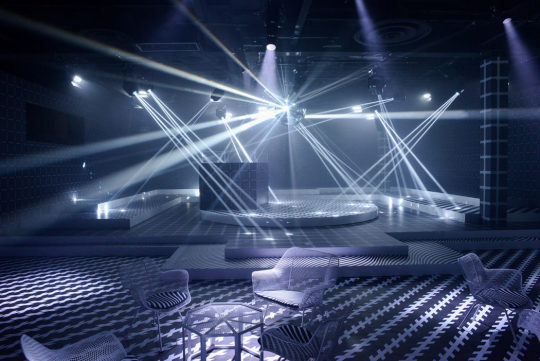
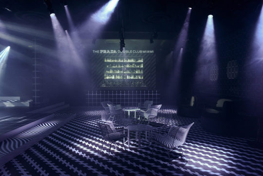
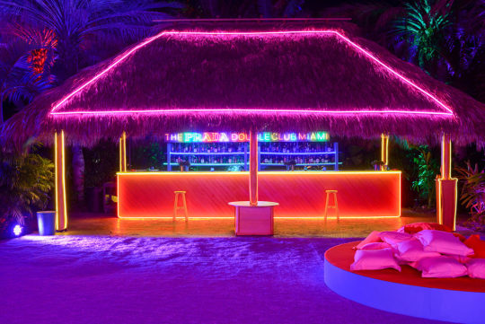
    For this year’s Art Basel Miami Beach, artist Carsten Höller collaborated with Fondazione Prada to create a 3-night-only pop-up club called, The Prada Double Club Miami.

    By time you read this post, the pop-up is likely to be over. But it is an interesting space nonetheless.

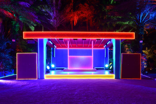
    The installation made use of an old 1920s film studio and was comprised of two distinct spaces – hence the double club reference. 

    The interior bar and dance floor were entirely monochromatic.

    Höller wanted all color to instead come from participants within the space. 

    The exterior bar, on the other hand, was “hyper-polychromatic.”

    Perhaps some of you might find inspiration here for your next condo sales office. That would be fun.

    Photography: Casey Kelbaugh, courtesy of Fondazione Prada and via The Spaces

  • Emma + Justin

    image

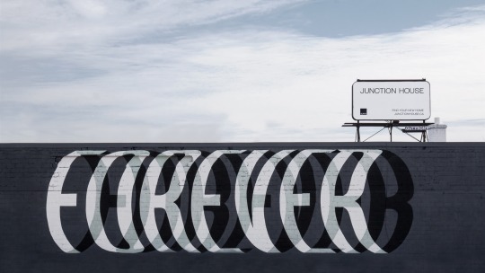
    Okay, I promise that after this post I will stop talking about the Forever mural that Ben Johnston recently completed at Junction House – at least for a little while. 

    I admittedly don’t know Emma and Justin, but I would like to congratulate them on their recent engagement at Junction House.

    Emma thought they were going to take anniversary photos, but instead Justin proposed in front of Forever. If you can’t see the embedded photo below, click here.

    //www.instagram.com/embed.js

    Forever certainly feels like the right message to me. Congratulations Emma and Justin.

    P.S. Junction House was in the National Post over the weekend. Link.

  • Forever mural now complete

    image

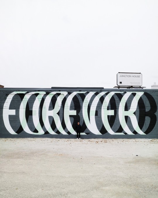
    Ben Johnston completed his “Forever” mural at Junction House last week. More photos on his Instagram.

    If you would like to see it in person (worth it), stop by 2720 Dundas Street West in Toronto’s Junction neighborhood. Here is a before photo of the wall (along with some directions).

    If any of you have any blank walls in need of art, I would encourage you to give Ben a shout. The wall certainly doesn’t need to be in Toronto.

    Thank you once again Ben. We really appreciate you collaborating with us.

    Image: Ben

  • “BRAND”

    image

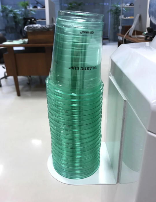
    For a number of reasons, I am fascinated by the streetwear label, Off-White

    It is one of the hottest labels in fashion, and yet there’s a part of me that doesn’t really get it. It’s mostly bold text, usually in quotations, on various apparel items. A set of Wellington boots might be plastered with “FOR RIDING.” A winter coat might be plastered with “DOWN JACKET.” And when they collaborate with Nike, the shoes might be tagged with “AIR.” Quotations included. Is that fashion?

    But then you hear Virgil Abloh – the founder of Off-White, who by the way was also trained as an architect before becoming creative director for Kanye West – talk about his brand and it starts to make more sense. The quotation marks are supposed to signal “ironic detachment and a comment on the idea of originality.” Okay, so a little more sense.

    Part of his inspiration comes from the work of Marcel Duchamp. In 1917, Duchamp shocked the art world with, Fountain. Some would consider this to be the most pivotal art piece of the 20th century. It was an off the shelf urinal that he simply signed, dated, and placed on a pedestal. Though initially rejected as art, it eventually redefined what art could be, shifting it from, “new physical creations to [the] moulding [of] ideas.”

    The corollary to this was that anything could be art, even something as utilitarian as the catch basin that you pee into. And this insight is something that Abloh has used to fuel his label. But he has taken it a step further. He has leveraged the ubiquity of these everyday-items-elevated-to-art as a way to elevate his own brand. Here’s a quote by Abloh from the Guardian:

    “The idea [that] an everyday object is art. Branding is generic and if I adopt the generic, then it becomes my branding, but it normally occurs in life.”

    In other words, he is co-opting generic and ubiquitous items – like, for instance, the patterning on caution tape – for his Off-White designs. And if you believe that a bit of brand equity is at least partially driven by brand ubiquity, well then you might start to see the value in this approach. He is simply assigning authorship to things that are already omnipresent.

    But, is that fashion? I guess that depends on whether you consider Duchamp’s Fountain to be art.

    Image: SSENSE

  • Forever

    About a month ago, I said on the blog that we had partnered with two local artists for our Junction House project. The first was Leeay Aikawa and the second was a surprise. 

    Well the second one is no longer a surprise. It is Ben Johnston and he started work on his mural this evening. Here is a photo (courtesy of Shanique Small – thank you!):

    image

    It should be completed this week if you’d like to stop by 2720 Dundas Street West. I am planning to be there this Saturday to take some photos and generally just hang out in the Junction. 

    Stay tuned for more surprises. 

  • Photoblog: Aga Khan Museum

    Today we visited the Aga Khan Museum here in Toronto, which is a museum dedicated to the arts of Islamic civilizations. I had been outside the building before but this was my first time inside and my first time seeing some of the collections.

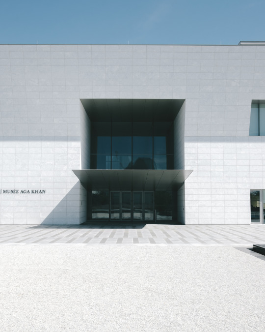
    Here is the main entrance:

    image

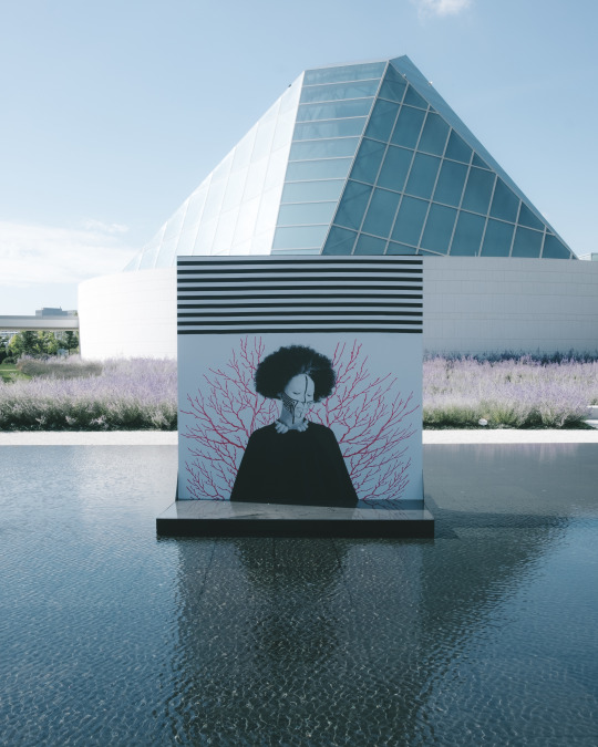
    Here is a photo looking the opposite way over one of the reflection ponds:

    image

    The museum was designed by Japanese architect Fumihiko Maki and was completed in 2014. 

    The site area is approximately 70,000 square meters and the building itself is approximately 11,600 square meters. Maki won the Pritzker Prize in 1993.

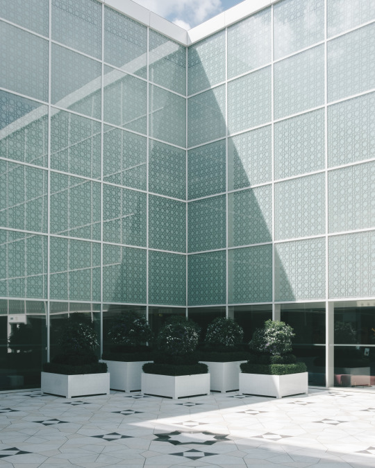
    Here is the building’s interior courtyard, which was one of my favorite parts:

    image

    The glass is patterned with the Islamic eight pointed star. But since the symbol is typically represented by two overlapping squares, the patterning was placed on two different sides of the double pane glass. Or at least that’s my guess as to why they did it that way.

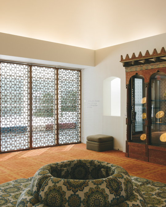
    Lastly, here is the Bellerive Room:

    image

    It was designed to be a contemplative room that could, on occasion, also host intimate events and performances. Note the shadows being cast by the screens in front of the windows.

    If you haven’t yet been to the Aga Khan Museum it is worth a visit, even if you just walk the formal gardens surrounding it.

  • Melting lollipops

    I’m out of office for the next week and so I’m going to try a bit of photoblogging. Here is a photo that I took this afternoon at Elena Bulatova Fine Art Gallery on St. Armand’s Circle. I really liked the art, and especially the melting lollipops and popsicles. They certainly felt climate appropriate.

  • In defense of Instagrammable moments

    Surface Magazine – and more specifically the CEO of Surface Magazine – recently published this article criticizing the “trend” toward designing for Instagrammable moments.

    Here is an excerpt:

    We—and yes, this includes architects, too—have succumbed to the pressures of gaining followers, likes, and comments. High-priced, difficult-to-attain architecture degrees are now, incomprehensibly, being used to create “Instagrammable” installations for things like impromptu selfie fashion shoots and hotel lobby photo booths. The whole thing is, I must say, sad. It’s embarrassing enough that our team at Surface has received press releases from architects promoting their latest project with “Instagram-friendly interiors.” They can’t be serious.

    And here are his final words:

    If retail is dead, then its rebirth will depend on creating memorable atmospheres that don’t call for #✌💙👯🙋📷.

    I certainly appreciate the push for lasting and memorable spaces, but, at the same time, I can’t say I’m nearly as fussed about lobby selfies and the alleged timelessness of Instagram. 

    In fact, I think it would be an interesting exercise to study how social media may be impacting the way we design physical spaces.

    Maybe it is simply a fad being promulgated by “knucklehead junior marketers” or maybe 100 years from now nerdy architectural historians will look back on that quaint period of time when we designed spaces to service rudimentary 2D images shared amongst friends.

    Whatever the case may be, I think that architecture, like all art, should embody the milieu in which it was designed. 

    But often we have biases telling us that what is new is not as good as what’s existing and already accepted.

  • Drip, subscription platform for artists and creators

    image

    Kickstarter has just relaunched a subscription service for artists and creators called Drip. It is an acquisition that Kickstarter made a few years ago and so that’s why it’s a relaunchHere is the blog post announcement.

    The simplest way to describe Drip is as follows: “Kickstarter is for projects, Drip is for people.” In other words, instead of backing a specific project, you back the human for, say, $10 a month. It’s a tool for people to fund creators so that they have the freedom to make their work.

    Now compare this model to that of the 19th century Salon in Paris. Arguably the greatest art event in the Western world during its prime, getting exhibited at the Salon was basically a right of passage for artists.

    But the Salon had specific criteria for what it considered to be good and acceptable art. Perhaps most famously, 19th century Impressionism – which some would call the first truly modern art movement in painting – was not considered acceptable.

    The Impressionists routinely had their work refused by the Salon, which is why they ended up having to organize their own shows. Good for them.

    So when I see something like Drip, I think about how amazing it is that we now have platforms where artists and creators have the freedom to make what they want to make and the market – instead of a stuffy institution – can decide what is good and worth supporting. 

    Check out Shantell Martin if you’re looking to explore Drip. I recently discovered her work and I’m a fan.

    Image: Coney Art Walls by Shantell Martin