Daily insights for city builders, delivered every morning at 6 AM ET. I’m Brandon Donnelly — a Toronto-based real estate developer and founder of Globizen. I’ve been writing here since 2013.

Tag: architecture

  • PAMM, hi

    Yesterday we visited the Pérez Art Museum Miami (PAMM), which has been on my list since it first opened in 2013. 

    The Pérez part of the name belongs to real estate developer and art collector Jorge Pérez. He donated $35 million in cash to the Miami Art Museum in 2011 – so that the below building designed by Herzog & de Meuron could be built – and another $15 million in 2016. 

    This latter donation included some contemporary Cuban art valued at around $5 million. Supposedly after he dies Pérez will be donating the rest of his art collection to the museum.

    Pasted below is a full copy of the architect’s description of the project to go along with my photos. It was taken from here.

    This first picture faces the main entrance (on the left) and Biscayne Bay. In the background, toward the end of the terrace, is also a playground with swings.   

    image

    This picture shows the relationship between the “veranda-like public space” that wraps the building and Biscayne Bay on the left. Also note the hanging plants. These were great.

    image

    And this last picture is my attempt to show a kind of section through the building. Here you can clearly see the raised museum and at-grade parking (described below). 

    I also enjoyed that the parking level housed vegetation that cut through the above veranda.

    image

    -—————————————————–

    An open structure

    The new Pérez Art Museum Miami (PAMM) is located in Museum Park, part of the redeveloping downtown waterfront on Biscayne Bay. Its direct neighbours are the Patricia and Phillip Frost Museum of Science and a major freeway, connecting mainland Miami with Miami Beach. Simultaneously oriented towards the park, the water and the city, the new PAMM is an open and inviting structure from all sides alike.

    Miami is known for its iconic art deco district, decorated boxes with no great relationship and exchange between inside and outside. What makes Miami so extraordinary however, is its amazing climate, lush vegetation and cultural diversity. How can these assets be fully exploited and translated into architecture?

    Nature

    As in previous examples of our work, such as the Dominus Winery in Napa Valley, the building’s environmental circumstances become central to its architectural concept. Due to its proximity to the water, the museum is lifted off the ground for the art to be placed above storm surge level. We use the space underneath the building for open-air parking, exposed to light and fresh air that can also handle storm-water runoff. Rising from the parking level, the stilts supporting the museum platform become columns supporting a shading canopy, which covers the entire site creating a veranda-like public space that welcomes visitors to the museum and the park. Facing the bay, a wide stair connects the platform to the waterfront promenade.

    In this exceptional location, we wanted the museum to offer generous views to the outside. Yet all the building’s expansive windows are recessed, with wooden planks under the concrete beams to minimize the sun’s impact on the glazing and to reduce the building’s energy consumption for cooling. Tropical plants selected for their resilience to the local conditions engulf the structural system. Roof and plants combined will create an overall microclimate reducing the extreme temperature gaps between outside and inside in the hot weather. The exterior surface of the museum’s massive concrete walls is chiseled in places and polished in others. When adjacent to the glazing, the concrete is smooth and reflective. When facing the outside, the concrete becomes rough, exposing its natural ingredients.

    Rather than being an isolated “jewel box” (Schatzkammer) for art lovers and specialists, the museum provides comfortable public space for everybody. It is an extension of the park, offering gradual transitions from the outside to the inside, from the warm to the cool, from the humid to the dry and from the street to the art.

    Specificity

    The expression of the building comes from the canopy, the platform, the columns, the vegetation: in other words, the Veranda occupying the entire site. The museum’s interior volume nests within it, suspended amid the structural framework, each floor assuming the shape it needs. Because the galleries did not have to fit into any given form, we had the freedom to develop the curatorial layout, in close collaboration with the museum staff, to what felt like an optimal configuration to exhibit and develop the growing collection as well as to provide ample space for temporary exhibitions.

    PAMM is organised around four different gallery types: Overview, Focus, Project and Special Exhibition galleries. They occupy part of the first and the entire second floor. The Overview galleries, displaying the museum’s collection, serve as the connecting tissue between the other gallery types. Fluidly connected in a non-linear sequence, they allow relationships to be formed between spaces. They are characterized by large openings with views onto the park, downtown Miami, the bay and the freeway. Along this flowing sequence of rooms, single enclosed spaces punctuated by windows show an individual artist, a theme, a specific collection or a commissioned work. These spaces are called Focus and Project galleries. The fourth type, the Special Exhibitions galleries function as spacious exhibition halls designed to accommodate contemporary art exhibitions. The Overview, Focus and Project galleries form a firm and rhythmic sequence through the building, varying in proportion and relationship to the outside. On the other hand, the Special Exhibitions galleries are flexible, with fewer openings to the outside and can be subdivided by temporary walls.

    The spaces at PAMM and their materiality are very specific. They can be considered an antithesis to the flexible, abstract white cubes that have been a dogma in most recently built art spaces. Concrete and wood are used in different combinations, reflecting the outside materials of the building. Typical drywalls are detailed in a way that they are legible as added to the main structure. In order to enhance the inside-out transition, we designed a customized concrete mullion system that holds the largest ever-used hurricane-proof glass in Florida.

    Community and views

    At the heart of the building, a stair as large as a gallery connects the two exhibition levels. This stair also functions as an auditorium, using sound-insulating curtains in different configurations to provide space for lectures, film screenings, concerts and performances. Our idea was to avoid for such events to be isolated in a space remaining unused for most of the time. At PAMM, events in preparation are visible. When the space is not actively used for events, it is used by visitors and staff for individual readings, introductions to groups and the like. The museum shop and bistro are located on the platform level and are oriented to the bay. Education and research facilities are on the third floor along with the museum’s offices. We place these communal spaces at the periphery of the building, maximizing their exposure to the Veranda, Biscayne Bay, and Museum Park.

    Herzog & de Meuron, 2013

  • Twin Palms turns 60

    2018 marks the 60th anniversary of the Twin Palms neighborhood in Palm Springs, California, and Houzz has just published an excellent story describing the subdivision’s history and its importance for mid-century modern architecture.

    Designed by architect William Krisel and developed by Alexander Construction, the community was initially built with 90 homes. Supposedly each lot was exactly 10,000 square feet and each house had the exact same 40′ x 40′ square floor plan. So 1,600 sf homes.

    In addition to this, each lot had a carport, an open courtyard connecting the house and carport, and a swimming pool. 

    Unlike some of his contemporaries, Krisel was less interested in building one-off homes for the wealthy. He was more interested in tract housing for the masses. And standardizing the plans was one way to achieve greater affordability.

    Krisel still found other creative ways to differentiate the homes, namely by rotating the square floor plan and by rearranging the carport, courtyard, and pool.

    He also employed different rooflines, all of which have become emblematic of this era of architecture and of Palm Springs in general. It was about optionality on top of and around the box.

    If you have a few minutes, check out the Houzz article. The homes are beautiful and the story is compelling: the modern American dream at an affordable price.

    Photo by Nainoa Shizuru on Unsplash

  • Live/work photography studio on Stoney Lake

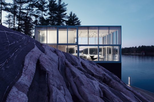
    It’s the dog days of summer right now and I suspect that some of you may be spending your time (or at least some of it) near water. So here is one of my favorite lakeside homes. It is a live/work photography studio sitting on top of a boathouse on Stoney Lake in the Kawartha Lakes region of Ontario. It is by gh3*. They do terrific work.

    image

    I love the relationship to the Canadian Shield (see above). And I love how it is a dramatic departure from the archetypal Ontario cottage. I am more impressed by a project like this (it has 1 bedroom) than I am by a 5,000 square foot “cottage estate.”

    Some of you may be wondering how a largely all glass curtain wall box performs environmentally during these dog days of summer and I am wondering the exact same thing. But it is north facing. And the goal was to create a space that would enable photos not possible in a conventional studio.

    For more on the project, including other photos, go here.

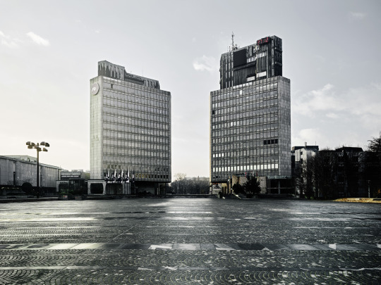
  • Toward a Concrete Utopia: Architecture in Yugoslavia, 1948–1980

    image

    A new exhibition on postwar architecture in (the former) Yugoslavia opens up today (July 15) at the Museum of Modern Art in New York. It’s called, Toward a Concrete Utopia: Architecture in Yugoslavia, 1948–1980and it runs until January 13, 2019.

    Here is a bit more about the exhibition:

    Situated between the capitalist West and the socialist East, Yugoslavia’s architects responded to contradictory demands and influences, developing a postwar architecture both in line with and distinct from the design approaches seen elsewhere in Europe and beyond. The architecture that emerged—from International Style skyscrapers to Brutalist “social condensers”—is a manifestation of the radical diversity, hybridity, and idealism that characterized the Yugoslav state itself.

    And here is a panel discussion about the exhibition (click here if you can’t see the video below):

    [youtube https://www.youtube.com/watch?v=M2S0bBTHu-8&w=560&h=315]

    Architecture tells you a lot about a place and what was happening at the time in which it was built. I would love to see this exhibition and I hope to do exactly that if I’m in New York City before the new year.

    Image: MoMA

  • More on One Delisle and the block

    image

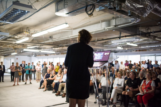
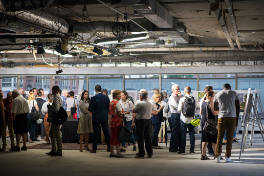
    Now that things have quieted down from last night, I would like to say that we are thrilled by the response to One Delisle and the broader ideas for the block. There was a lot of positivity last night at the open house and today the project team received countless emails and messages from people telling us that they are excited and/or looking forward to working with us over the coming years. Many were from the local community.

    image

    Following yesterday’s Globe and Mail piece by Alex Bozikovic, One Delisle was also covered in Urban Toronto (read the comments), designboom (they’re allergic to capital letters), ArchDaily, Canadian Architect, Dezeen, The Architect’s Newspaper, and probably other places that I am missing. The comments have been interesting to read and there seems to be a fatigue around boring glass boxes. This project team does not want to do that.

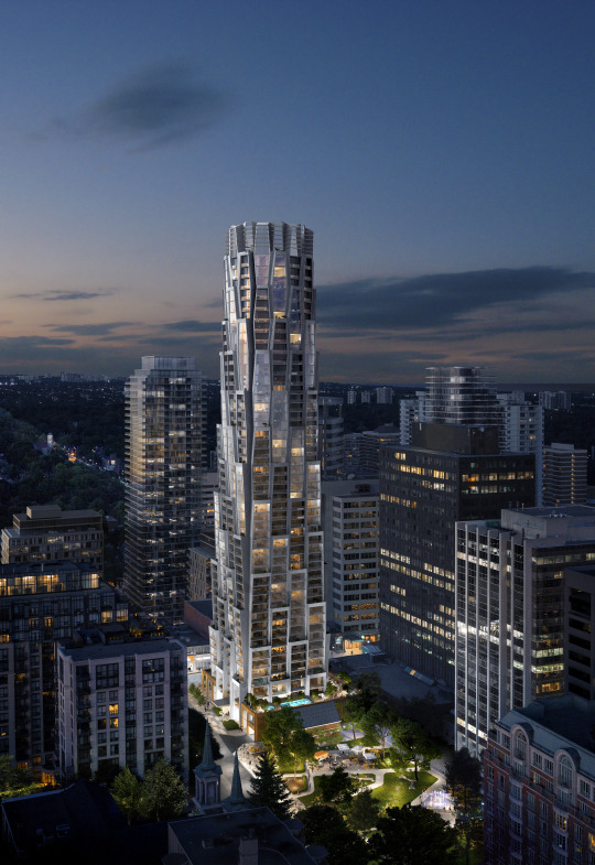
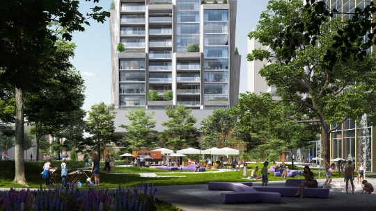
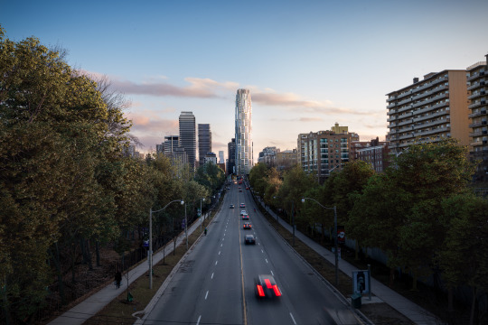
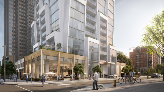
    Though the project has been making the rounds, there are two images that I don’t think have been widely shared and so I would like to do that today (below). Both were presented at last night’s open house. And they are intended to show the relationship between One Delisle and Delisle Park, which is proposed to be revitalized and expanded by ~50% as part of the project’s block and enhanced public realm strategy. Credit to ADHOC Studio for these renderings.

    imageimage

    In fact, it is important to keep in mind that while a lot of attention is being paid to the architecture of the building, there’s a broader city building strategy that is attached and integral to it:

    • Revitalize and expand Delisle Park by 50%
    • Add residential uses to a block of office buildings
    • Reduce the number of vehicular access points across the block from 5 to 3 in order to improve traffic flows in the area
    • Create below-grade vehicular connections across the block to consolidate and legitimize access/loading and once again improve traffic flows in the area 
    • Significantly widen the sidewalk along Yonge Street to eliminate existing pedestrian pinch point
    • Significantly widen the sidewalk along Delisle Avenue to strengthen connection to Delisle Park
    • Introduce pedestrian laneway with art canopy to connect St. Clair Avenue West back to Delisle Park
    • Create a unified and consistent public realm across the block and provide retail animation along its edges
    • Retain Art Deco facade along Yonge Street
    • Target the 2nd tier of the Toronto Green Standard (voluntary sustainability target)
    • Continue to explore the feasibility of district energy solutions across the block to take advantage of the different energy demand curves for office, retail, and residential uses

    Once again, a big thanks to the ~300 people who came out last night – in the rain – to engage with the project team. And a big thanks to the full project team who worked tirelessly to prepare for this week’s community open house. But as was said on Thursday night, in many ways this is really just the beginning. To stay informed about the project and to provide your feedback to the team, stay tuned to yongedelisle.ca.

    Photos: Khristel Studios

  • Studio Gang’s first project in Canada

    imageimage

    This evening Slate Asset Management hosted the community meeting that I’ve been writing about on the blog over the last little while. 

    And at this open house Jeanne Gang of Studio Gang introduced a new block plan and mixed-use building at the southwest corner of Yonge Street and Delisle Avenue in midtown Toronto.

    I think it went really well. We had over 200 people RSVP, but based on my imprecise head count, over 300 people actually showed up. 

    I would tell you more right now, but it’s very late. So I’m going to instead leave you with this article by Alex Bozikovic, titled, Studio Gang’s new Toronto tower follows the right recipe: tall, innovative and excellent.

  • Architecture’s great injustice

    This morning Jeanne Gang of Studio Gang published an op-ed in Fast Company detailing how her architecture and urban design practice closed the gender wage gap. 

    It is also a call to action and an example of something the firm calls “actionable idealism.” Here is an excerpt from the article:

    What we discovered was that, despite our ideological commitment to equality (and though our numbers were significantly better than all the U.K. architecture firms reporting, in all categories), a small pay gap nevertheless existed between the women and men in my office. We fixed that with this year’s raises and now have no wage gap as an organization.

    To learn more about how they accomplished this, check out the full article. And if you’d like to meet Jeanne Gang in Toronto this week and learn more about what we’re up to at Yonge + St. Clair, click here.

  • Construction costs are no joke right now

    I don’t know what it’s like in your market, but everyone is talking about it in the industry here in Toronto. Combine these rapidly rising hard costs with higher development charges and inclusionary zoning and you get significant upward pressure on condo prices and apartment rents. 

    This is also one of the reasons – perhaps it is the main reason – why you’re seeing some projects get cancelled. These are projects that maybe sold in one market (lower revenues) and are now trying to build in another (higher costs). The math no longer works. Sorry.

    I mention this today not to complain, although I’m always up for a good industry commiseration over beers, but because I often hear people lament that Toronto needs better design. Why aren’t developers using triple-glazed windows? Why aren’t developers thermally breaking the balconies?

    I will always advocate for better design. That is core to my belief system. But everything costs money. There are very real limits in this equation. And markets have a funny way of telling you exactly what those are.

    Photo by Filip Mroz on Unsplash

  • An open house with Jeanne Gang

    image

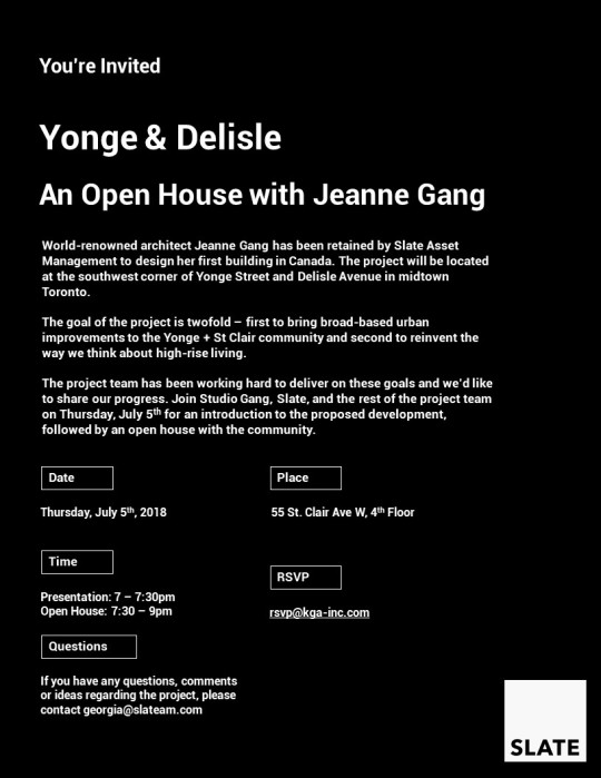
    On Thursday, July 5th, Slate Asset Management, Studio Gang, and the rest of the project team will be hosting a community open house where we will introduce designs for a new block plan and mixed-use building at Yonge + St. Clair. This will be Studio Gang’s first project in Canada. We’re pretty excited.

    It’s important to note that while the proposed design has been influenced by some of the early discussions we had with city staff and the local Councillor, we are still very much at the beginning of this process. Which is why alongside this community open house, we are also launching yongedelisle.ca.

    This will be our “neighbourhood engagement” website as we go through the planning process. You’ll find updates from the project team as they become available, and you’ll also have a direct way to get in touch. We’re also testing out this interactive page where you can vote on the city building principles that matter most to you.

    So hopefully we’ll see you on Thursday, July 5th. Invite details above. Please RSVP, here, if you can. But if you forget to do that, don’t worry, you can still just show up. For more on Jeanne Gang, click here.

  • We’re new here. Find your home.

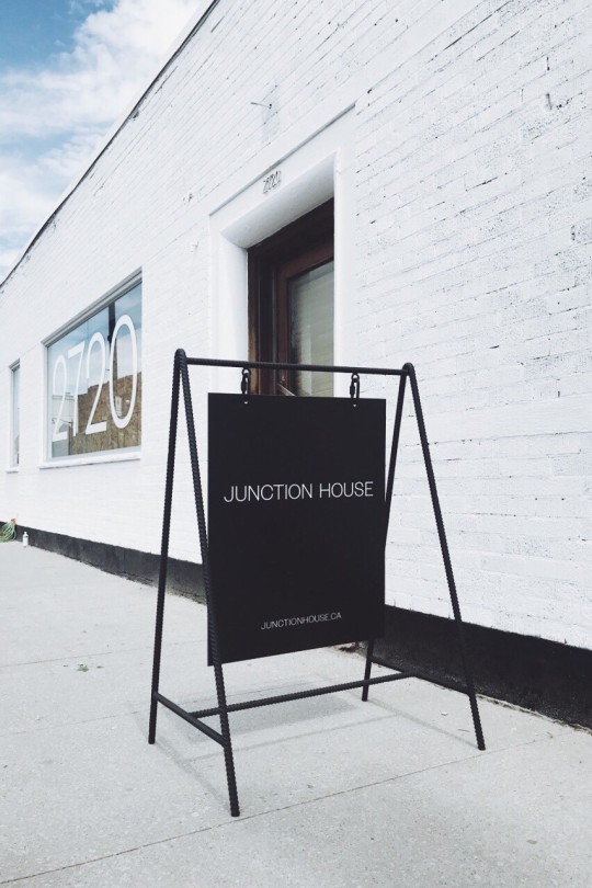
    A simple registration page is now live for our upcoming Junction House (condo) project. We also got this neat sign made:

    Of course, eventually there will be a full website, but this is for people who want to get on the early registrant list and tell us what they are looking for in a new home. Early registration. Early access to suites.

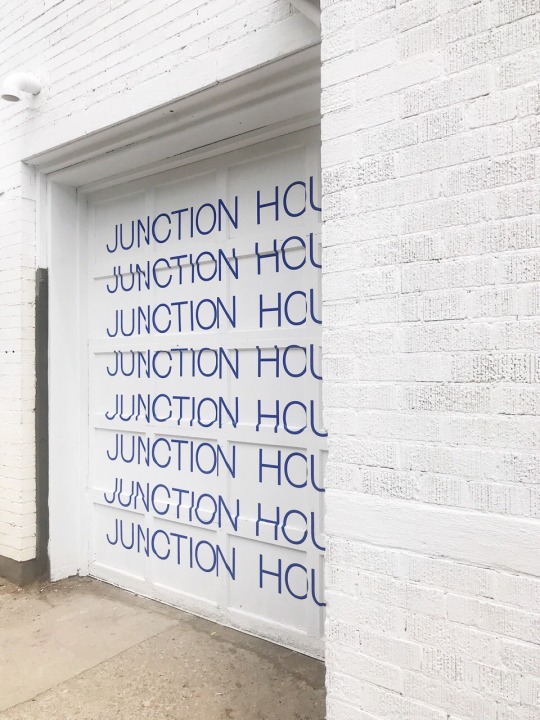
    We’re thrilled with the way the overall brand & identity is coming together for Junction House and we think it reflects the architecture and our project ambitions. 

    Hopefully you all like it as well.

    Photos by Vanderbrand