Daily insights for city builders, delivered every morning at 6 AM ET. I’m Brandon Donnelly — a Toronto-based real estate developer and founder of Globizen. I’ve been writing here since 2013.

Tag: architecture

  • A door and a street — walking Copacabana

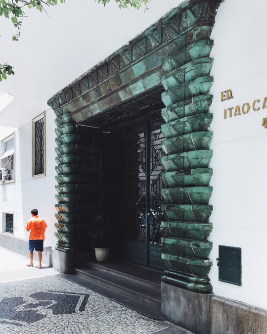
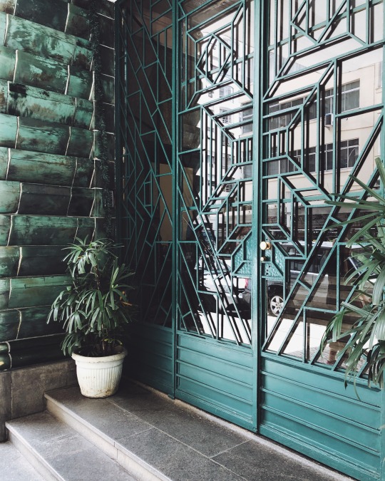
    Rio de Janeiro has some pretty spectacular entranceways. Here is one that I found today on Rua Duvivier in Copacabana:

    imageimage

    It is a magical front door located exactly one block from the beach.

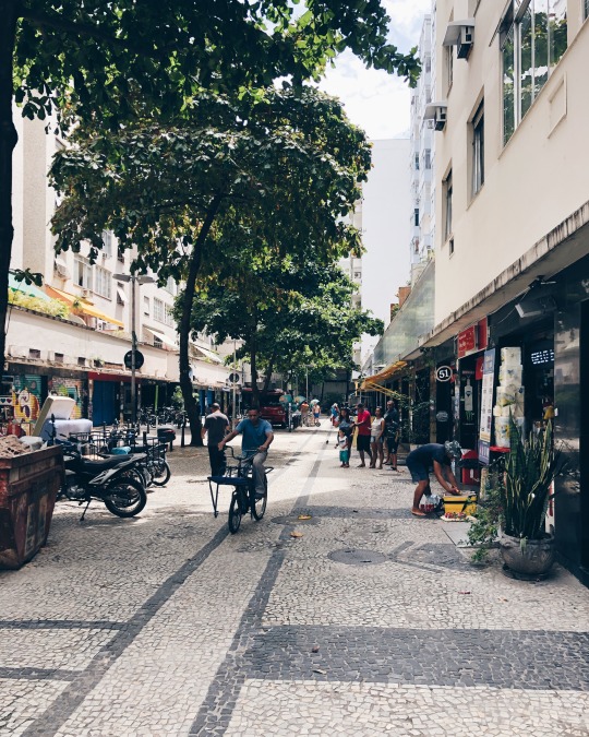
    The other gem I stumbled upon today was Rua Carvalho de Mendonça, pictured here:

    image

    Toward the left (above) is a narrow bollard-separated lane for cars. The rest of the right of way is dedicated to pedestrians and bicycles.

    When I was there today the sun was shining and the retail was in full swing.

    image

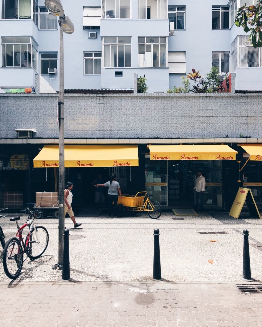
    But perhaps my favorite thing about this street is the residential terraces sitting on top of the single storey “retail podiums.”

    They add life (and eyes) to the street.

  • Unfinished: The Museum of Image & Sound

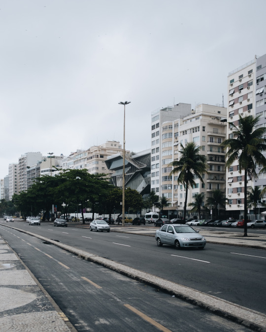
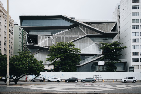
    Here are two images of the unfinished Museum of Image & Sound in Rio de Janeiro by Diller Scofidio + Renfro.

    imageimage

    The building sits across from Copacabana’s famed beach and tiled boardwalk. The street you’re looking at is Avenida Atlântica.

    The idea behind the architecture was to create a kind of “vertical boulevard” on the building’s beachside facade. Clever.

    It is particularly impactful when you see it within the context of Copacabana’s delightfully formidable streetwall and curving promenade.

    But it is unclear when the building will ultimately be finished. Construction started in 2010 and it first stalled in 2012. Too bad.

  • The new studio geography

    If any of you have gone to architecture school (or know someone who went to architecture school), you’ll know that everything revolves around something called studio. Studio – that’s really all you need to say – is worth many multiples of your other classes and consumes an even greater multiple of your time. What time will you be in studio? How’s studio going? I was in studio really late last night. This is how the conversations go.

    So I was intrigued by Seth Godin’s post this morning comparing “working in a studio” to working in a factory. The latter, he says, relies on compliance: “More compliance leads to more profits. Do what you’re told, faster and cheaper, repeat.” And this was very much the narrative of the 20th century and was the model that empowered small-town America to thrive (see yesterday’s post).

    However, the studio is different. Here is how Godin defines it:

    The studio, on the other hand, is about initiative. Creativity, sure, but mostly the initiative to make a new thing, a better thing, a process that leads to better.

    It’s peer to peer. The hierarchy is mostly gone, because the tasks can be outsourced. So all that’s left is leadership.

    Initiative plus responsibility. Authority is far less important, as are the traditional measures of productivity.

    It is not difficult to tell the two apart, which is how Godin ends his post. But it is worth noting that the studio model also thrives in a different kind of geography, compared to the factory model. So not only is the studio itself a different place, it also wants to situate itself in a different kind of place. So in a way, what we are seeing today is the new studio geography.

  • One Delisle unanimously supported at Design Review Panel

    One Delisle was at the City of Toronto’s Design Review Panel today where it received unanimous support. For those of you who may not be familiar with the process, at the end of every DRP session the panel members – who are all independent design professionals – vote on the project. They can support it, support it with conditions, or they can not support it and send it back for a redesign. One Delisle received 100% support.

    There were a number of positive comments around the need for more projects like this, and for better design in general, here in Toronto. That was really nice to hear. I also liked the comment that One Delisle feels like a tall building that one might find in London. And since every tall building in London has an endearing nickname – Gherkin, Walkie-Talkie, Cheese Grater, and so on – this too deserves one. 

    So let’s find a name. I have one in mind, but I’d love to hear from you in the comment section below.

  • Three nights only

    For this year’s Art Basel Miami Beach, artist Carsten Höller collaborated with Fondazione Prada to create a 3-night-only pop-up club called, The Prada Double Club Miami.

    By time you read this post, the pop-up is likely to be over. But it is an interesting space nonetheless.

    The installation made use of an old 1920s film studio and was comprised of two distinct spaces – hence the double club reference. 

    The interior bar and dance floor were entirely monochromatic.

    Höller wanted all color to instead come from participants within the space. 

    The exterior bar, on the other hand, was “hyper-polychromatic.”

    Perhaps some of you might find inspiration here for your next condo sales office. That would be fun.

    Photography: Casey Kelbaugh, courtesy of Fondazione Prada and via The Spaces

  • Photoblog: Sunrise at Ten York

    This morning I watched the sun rise from the the roof of Ten York Condominiums, some 735 feet up. This is what that looked like (the sky initially had a purple hue to it):

    It was cold as all hell, but sometimes you have to work for your photos.

    Some of you may also remember that I wrote about this building a few months ago. Tridel, the developer, is calling the project its first “smart condominium.”

    Regular scheduled programming will resume tomorrow.

  • Multi-storey retail

    I was at the St. Lawrence Market over the weekend and I saw a poster up for the original Yonge Street Arcade building, which was located at Yonge Street and Temperance Street here in Toronto. Initially constructed in 1884, the building was ultimately demolished in 1952 and replaced with today’s building by 1960.

    Here is a photo of the original arcade dated 1885:

    image

    The Yonge Street Arcade has been fairly well documented online (check out here and here). But what interested me when I saw the poster was the building’s retail characteristics.

    Modeled after the glass-roofed malls being constructed in Europe at the time – the Galleria Vittorio Emanuele II opened in Milan in 1867 – the Yonge Street Arcade is said to be Canada’s first enclosed shopping mall.

    The galleria was 267 feet in depth and 3 storeys high (pictured above). The ground floor contained 32 retail units, each 12 feet wide by 29 feet deep. 24 of the units were in the galleria and the other 8 faced outward toward each street frontage.

    On the 2nd floor were 20 more units. Some sources say they were intended to be offices, while others say they were retail units. The above photo makes me think they were retail. The 3rd floor then had offices and maybe some artist studios.

    Either way, the mix of uses is interesting (and maybe a first for Toronto). And if you know anything about retail, you’ll know how difficult it can be to successfully pull it off across multiple levels. The Yonge Street Arcade shows that we’ve been (possibly) trying it for well over a hundred years in this city.

  • Project Profile: Hotel Emiliano, Rio de Janeiro

    image

    This is not exactly a new project. The hotel, pictured above, opened in 2016 and was the brand’s second location (their first opened in São Paulo in 2001). But I like the story and how it was executed.

    Hotel Emiliano is the work of husband and wife team Gustavo Filgueiras and Andrea Colli Filgueiras. He is a hotelier. And she is a jewelry designer. Both wanted to pay homage to the glory days of Rio’s Copacabana Beach.

    Designed by Arthus Casas and Chad Oppenheim – who, by the way, recently built himself a stunning home in the Bahamas – the 90-room hotel is clad in white shutters that can be used to modulate the Brazilian sun. 

    image

    On the roof is an infinity pool with a glazed side. Here is a screen grab from the hotel’s website:

    image

    And here is an aerial view of the pool taken from Dezeen:

    image

    The uniforms for the hotel were designed by Barbara Casasola and a custom jewelry collection was created by Andrea Colli. 

    image

    For more photos, check out Dezeen and Wallpaper.

    Architectural photography: Fernando Guerra

  • Rendering of block 8

    I really like what has been put forward for Block 8 in the newly developing West Don Lands neighborhood of Toronto. Here is a rendering looking east from the Distillery District toward the proposed westernmost tower:

    image

    It feels like an extension of the Distillery District, which was clearly the intent. The materiality also reminds me of Junction House. Red brick at the base to fit within its context, and a more modern material palette on the upper floors. 

    I also like how, in this instance, the building steps out on its south side, as opposed to in. It’s something different. Not every building has to look like a wedding cake, right?

    The architecture is by COBE Architects and architectsAlliance. The developers are Dream, Kilmer Group, and Tricon. And the plan is for 756 rental apartments, of which 225 will be affordable and integrated throughout the 3 towers. 

    For more information, check out Urban Toronto.

  • “BRAND”

    image

    For a number of reasons, I am fascinated by the streetwear label, Off-White

    It is one of the hottest labels in fashion, and yet there’s a part of me that doesn’t really get it. It’s mostly bold text, usually in quotations, on various apparel items. A set of Wellington boots might be plastered with “FOR RIDING.” A winter coat might be plastered with “DOWN JACKET.” And when they collaborate with Nike, the shoes might be tagged with “AIR.” Quotations included. Is that fashion?

    But then you hear Virgil Abloh – the founder of Off-White, who by the way was also trained as an architect before becoming creative director for Kanye West – talk about his brand and it starts to make more sense. The quotation marks are supposed to signal “ironic detachment and a comment on the idea of originality.” Okay, so a little more sense.

    Part of his inspiration comes from the work of Marcel Duchamp. In 1917, Duchamp shocked the art world with, Fountain. Some would consider this to be the most pivotal art piece of the 20th century. It was an off the shelf urinal that he simply signed, dated, and placed on a pedestal. Though initially rejected as art, it eventually redefined what art could be, shifting it from, “new physical creations to [the] moulding [of] ideas.”

    The corollary to this was that anything could be art, even something as utilitarian as the catch basin that you pee into. And this insight is something that Abloh has used to fuel his label. But he has taken it a step further. He has leveraged the ubiquity of these everyday-items-elevated-to-art as a way to elevate his own brand. Here’s a quote by Abloh from the Guardian:

    “The idea [that] an everyday object is art. Branding is generic and if I adopt the generic, then it becomes my branding, but it normally occurs in life.”

    In other words, he is co-opting generic and ubiquitous items – like, for instance, the patterning on caution tape – for his Off-White designs. And if you believe that a bit of brand equity is at least partially driven by brand ubiquity, well then you might start to see the value in this approach. He is simply assigning authorship to things that are already omnipresent.

    But, is that fashion? I guess that depends on whether you consider Duchamp’s Fountain to be art.

    Image: SSENSE